Skip to content

Case Study

Three audiences, one identity

MCM Systeme — branding and online shop for pipe and hose systems

MCM Systeme sells pipe and hose systems to private customers, tradespeople and plant builders — three worlds, one shop. A workshop became an identity that recognizes each of them by its color: logo family, color system, pattern, typography and an online shop that adapts to the audience.
  • Retail & Wholesale
  • Manufacturing & Industry
  • Branding
  • Graphic Design
  • UI/UX Design
  • Web Design
  • 3D Visualization
  • E-Commerce & Online Shops
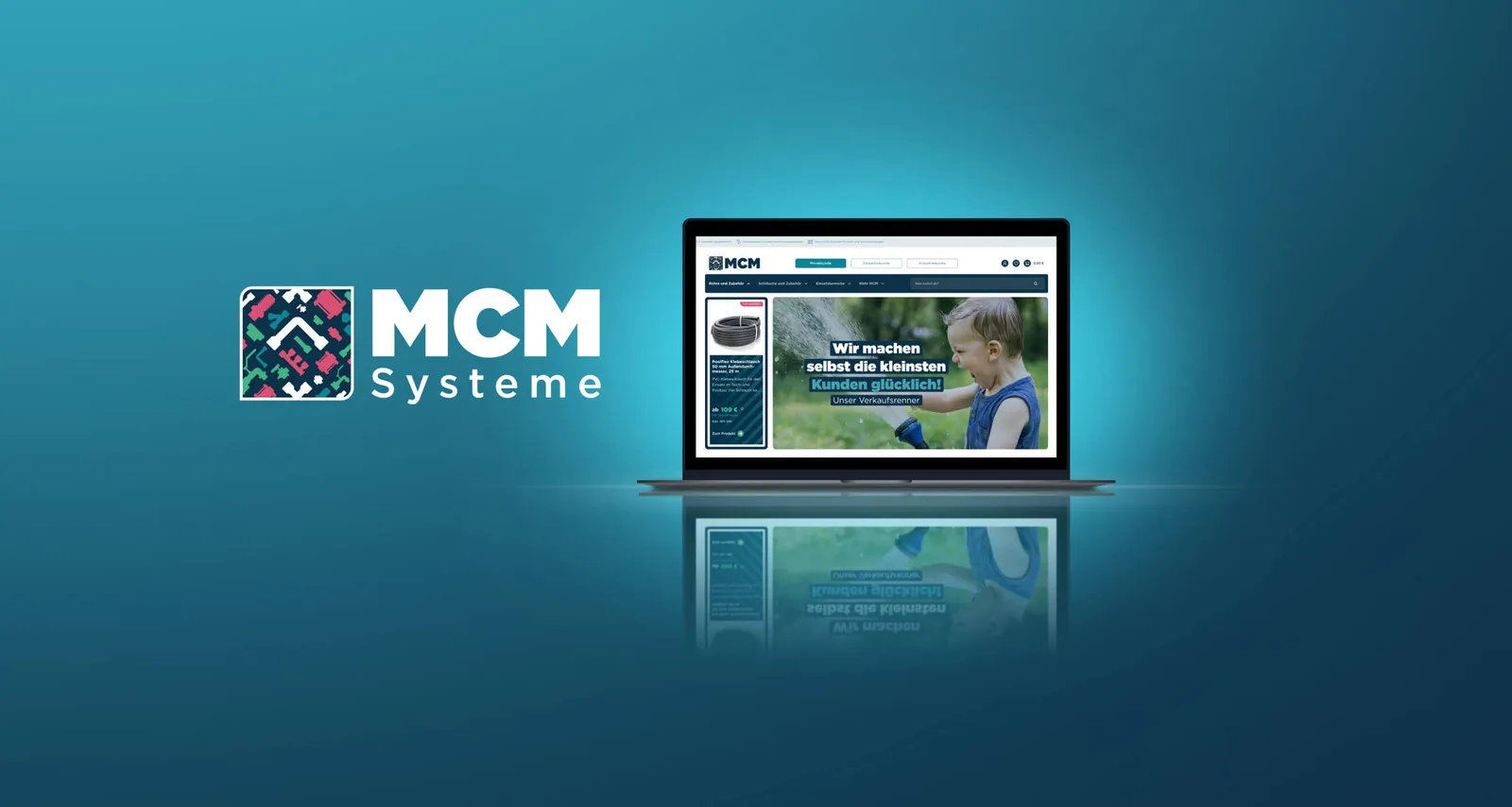
The “MCM Systeme” logo next to a laptop showing the new homepage, on a turquoise background

Six versions, one identity

Just the mark: a patterned square with an angle, on dark blue
The mark above the “MCM” wordmark, on dark blue
The mark above “MCM Systeme”, on light blue-grey
Horizontal version: the mark next to “MCM”, on teal
Horizontal version with “MCM Systeme”, on green
Narrow horizontal version, on pink
What stands out most is the precise choice of colors in the mark. It forms a lively composition that reflects the breadth of the MCM Systeme range. At the same time, every color serves a strategic purpose: to address different audiences directly and to optimize the UI design.

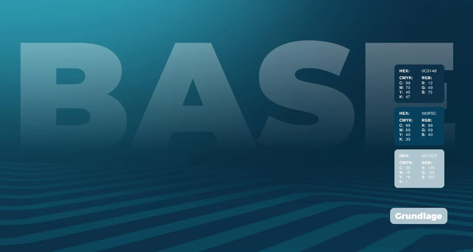
Blue as the foundation

Color chart “Base” with three shades of blue and their hex, CMYK and RGB values
The new color concept is based on dark blues that pick up the theme of water and at the same time provide a uniform background with enough contrast to support the secondary colors in their respective roles.

Every audience gets its own color

Three overlapping circles in turquoise, green and pink with the line “Communication is Key!”
The new secondary colors are assigned to the three specific audiences: private (blue), trade (green) and industry (red). This makes the customer journey clearer and helps customers see which segment they are in, which allows for a more targeted approach. It shows most clearly in the newly defined, audience-specific homepages: once they make their choice, the layout adapts to the customer individually, with the matching range and level of detail.

Pipes that don't leak. And jokes that land.
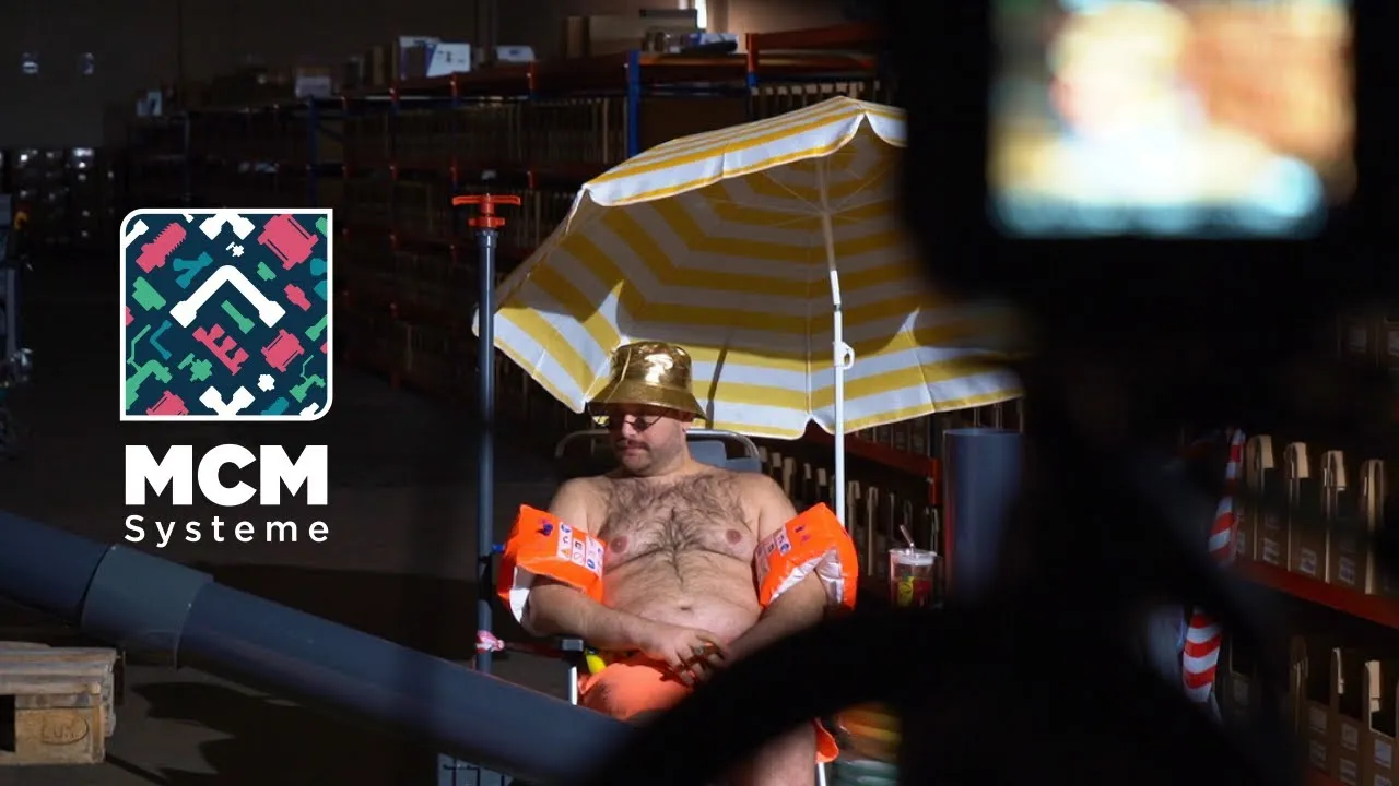
Brand film for MCM Systeme
And a company that shows what modern pipe technology looks like today. Precise, modular, well thought out and with more humor than you would expect at first glance.

Private, trade, industry

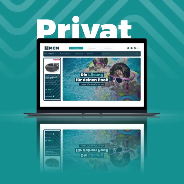
The homepage for private customers on a laptop, in turquoise
“Private customers” button in dark blue on turquoise
The same button in turquoise on dark blue
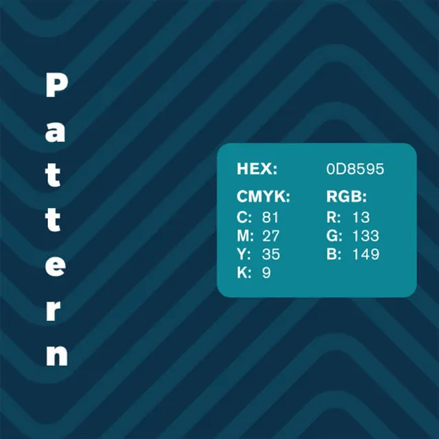
Pattern swatch in turquoise with the color value 0D8595
“Private customers” button on light blue-grey

Green for trade

“Trade customers” button in dark blue on green
The same button in green on dark blue
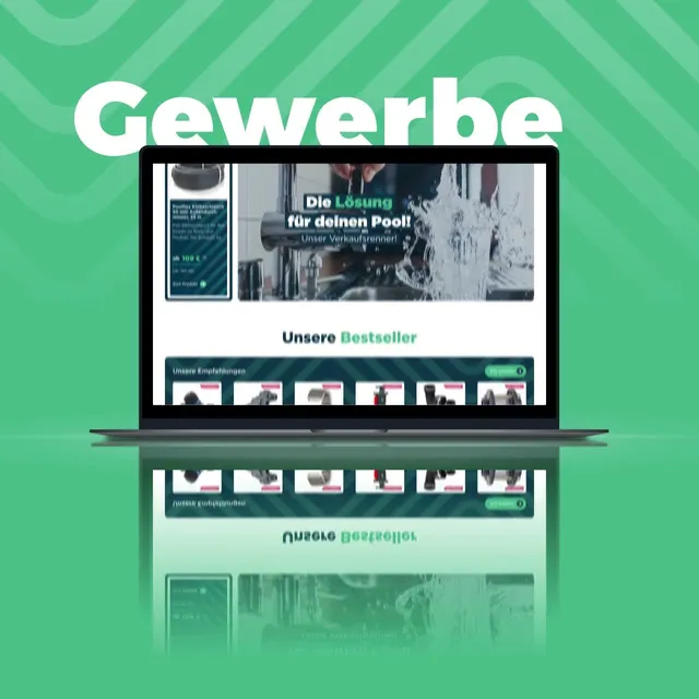
The homepage for trade customers on a laptop, in green
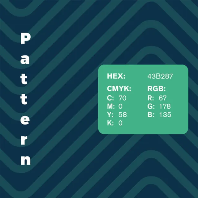
Pattern swatch in green with the color value 43B287
“Trade customers” button on light blue-grey

Red for industry

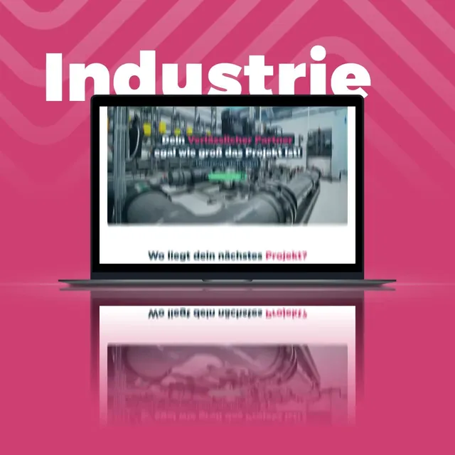
The homepage for industrial customers on a laptop, in red
“Industrial customers” button in dark blue on red
The same button in red on dark blue
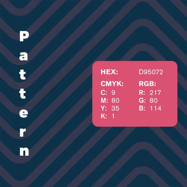
Pattern swatch in red with the color value D95072
“Industrial customers” button on light blue-grey
The brand's new visual design is supported by a geometric, wave-shaped pattern that is used flexibly and creatively to make the MCM identity even more distinctive.

Montserrat, clear and unpretentious
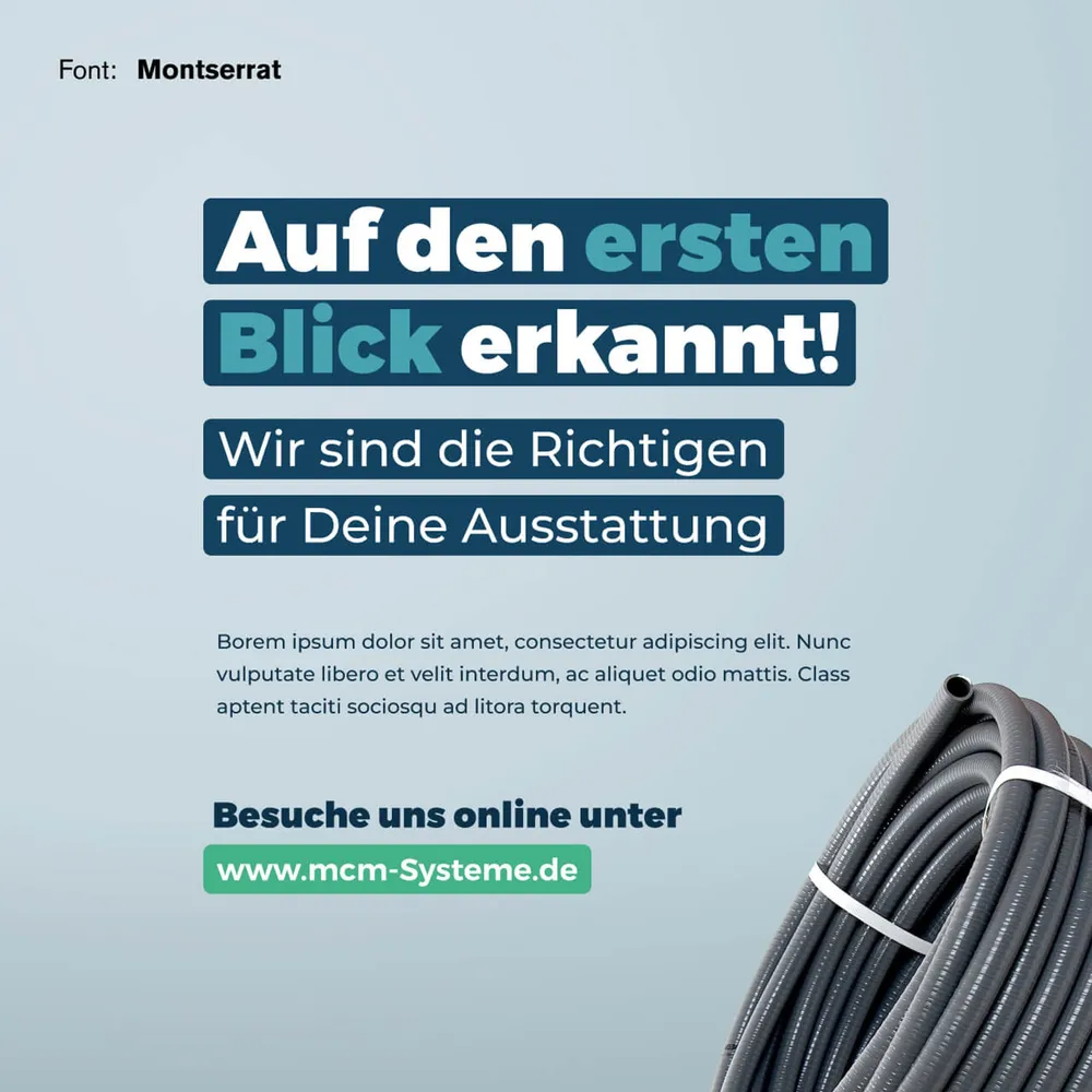
Type specimen: “Auf den ersten Blick erkannt!” next to a coiled hose
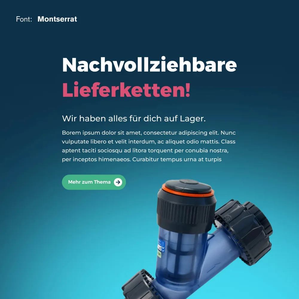
Type specimen: “Nachvollziehbare Lieferketten!” above a filter housing
MCM combines professionalism with warmth. An approachable tone is therefore decisive for communicating information clearly and understandably. For that we use the typeface Montserrat, whose versatile weights provide clarity and whose striking, unusually heavy headline weight conveys a certain lightness without taking itself too seriously.

From the parcel to the profile

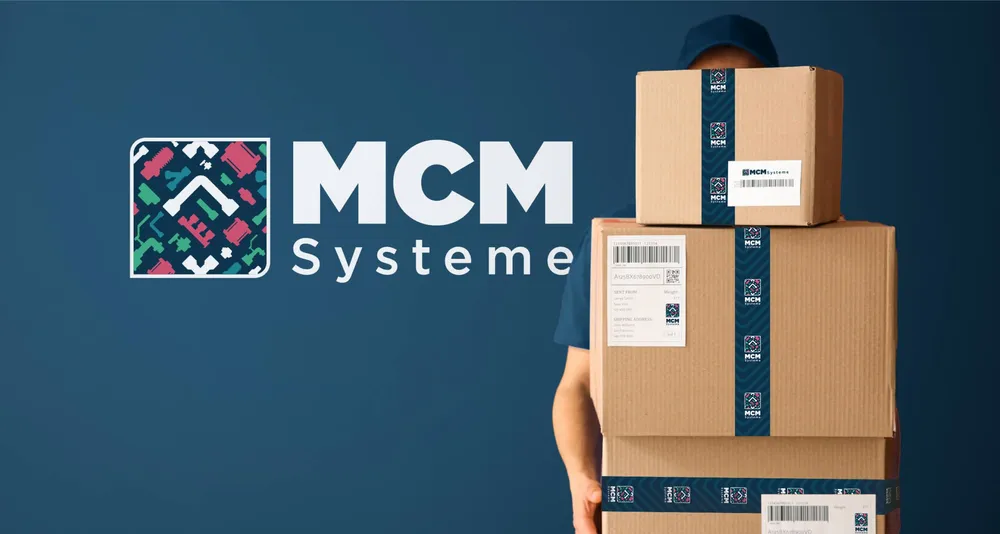
An employee carries stacked parcels sealed with MCM tape, the logo beside them
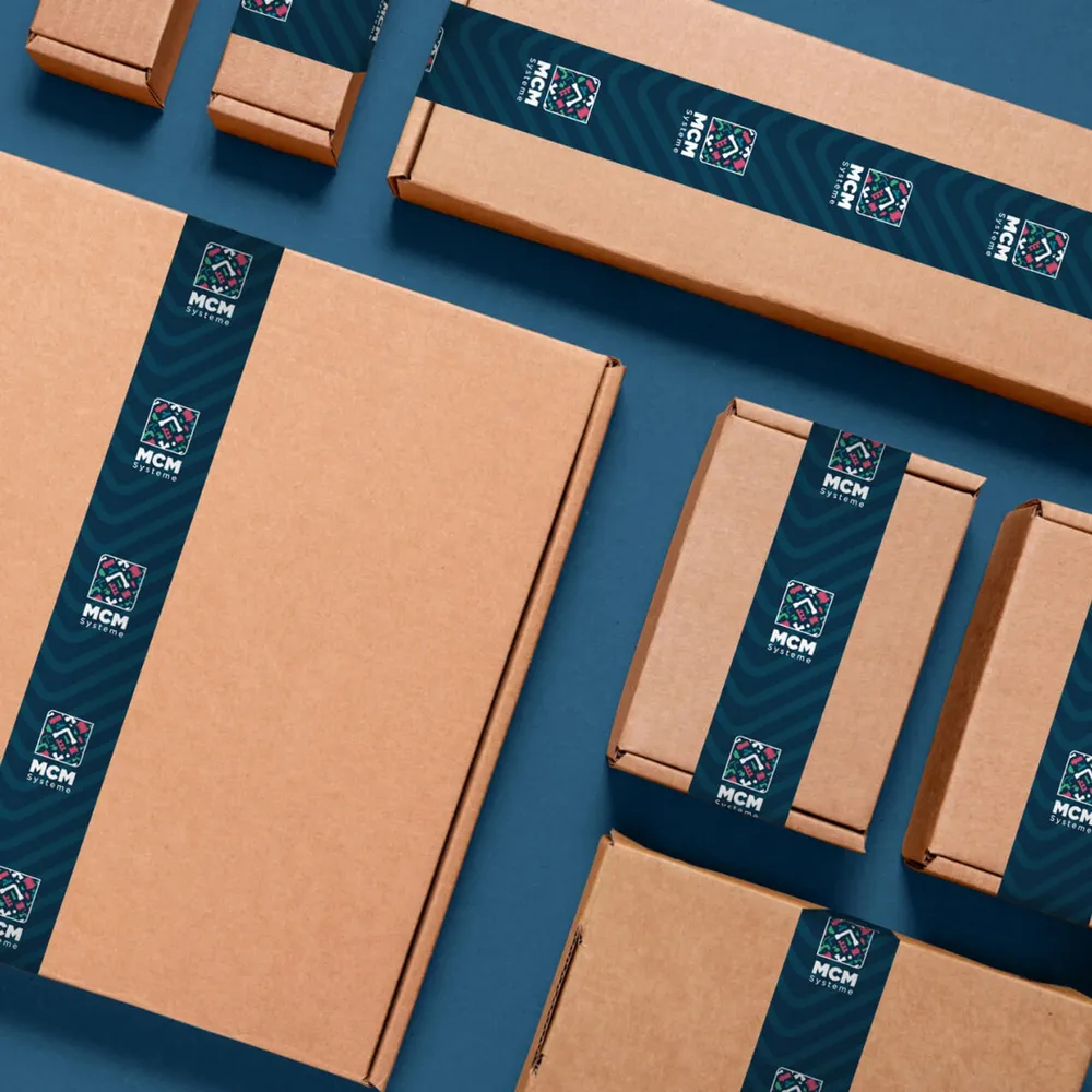
Cardboard boxes with patterned tape and logo, photographed from above
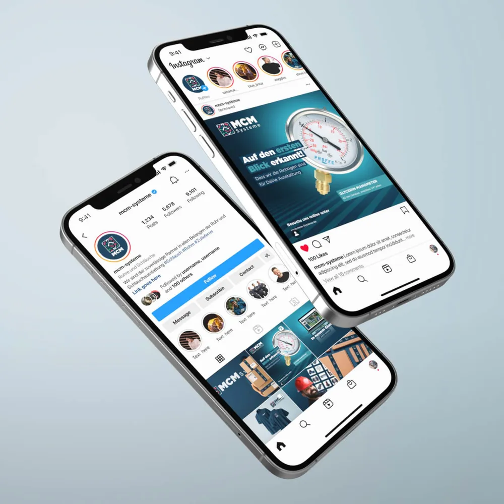
Two smartphones showing the Instagram presence of MCM Systeme
A holistic corporate and visual design has to convey the character, the message and the values of the brand at all times and in every application. Digitally as well as in print, the brand should be clearly and quickly recognizable.

Behind the scenes

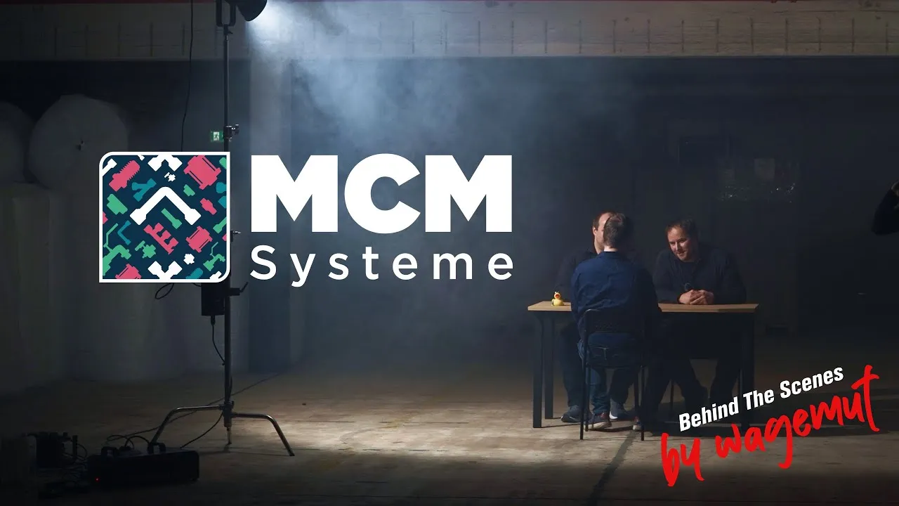
Behind the scenes at the shoot for MCM Systeme
For MCM Systeme in Willich we turned technology into an experience – loud, direct, a little over the top. Exactly as it should be.

Did our work inspire you?

Tell us about your project, short and to the point. It makes no difference whether you bring a rough idea or a polished concept.

Inside as much as out

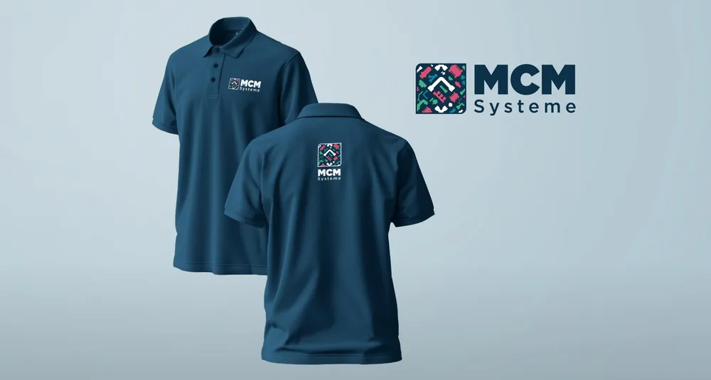
Two dark blue polo shirts with an embroidered logo, the wordmark beside them
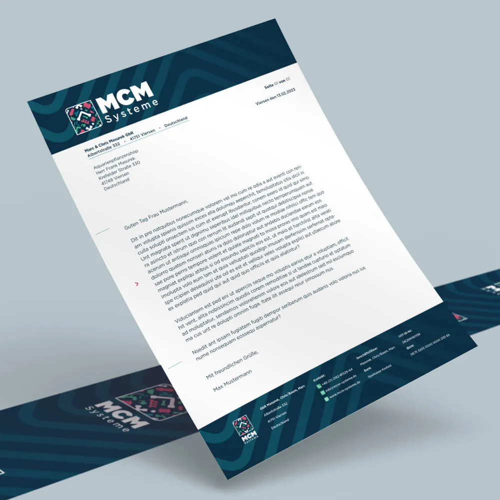
Letterhead with header and footer bar in the new design
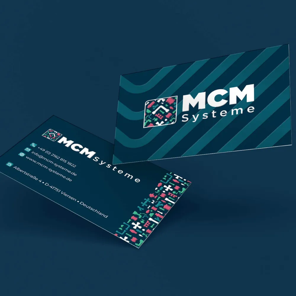
Business cards, front and back, with pattern and contact details
The brand identity should be reflected consistently not only outwardly but also inside the company, so that authenticity comes across as credible.

Recognizable on the road

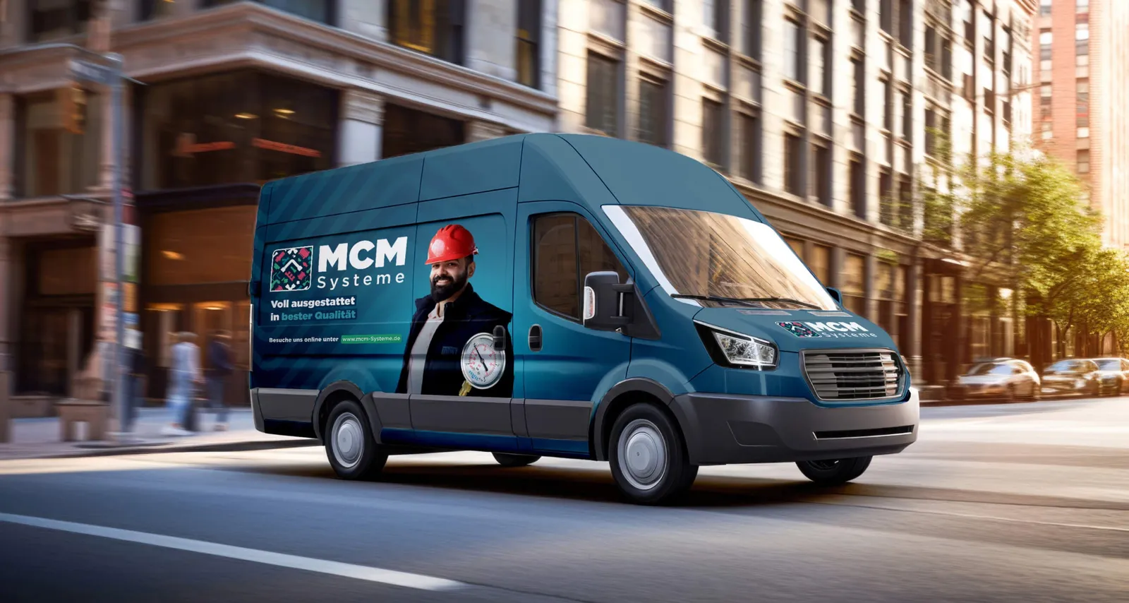
Van with vehicle graphics: the logo and a tradesman in a red helmet
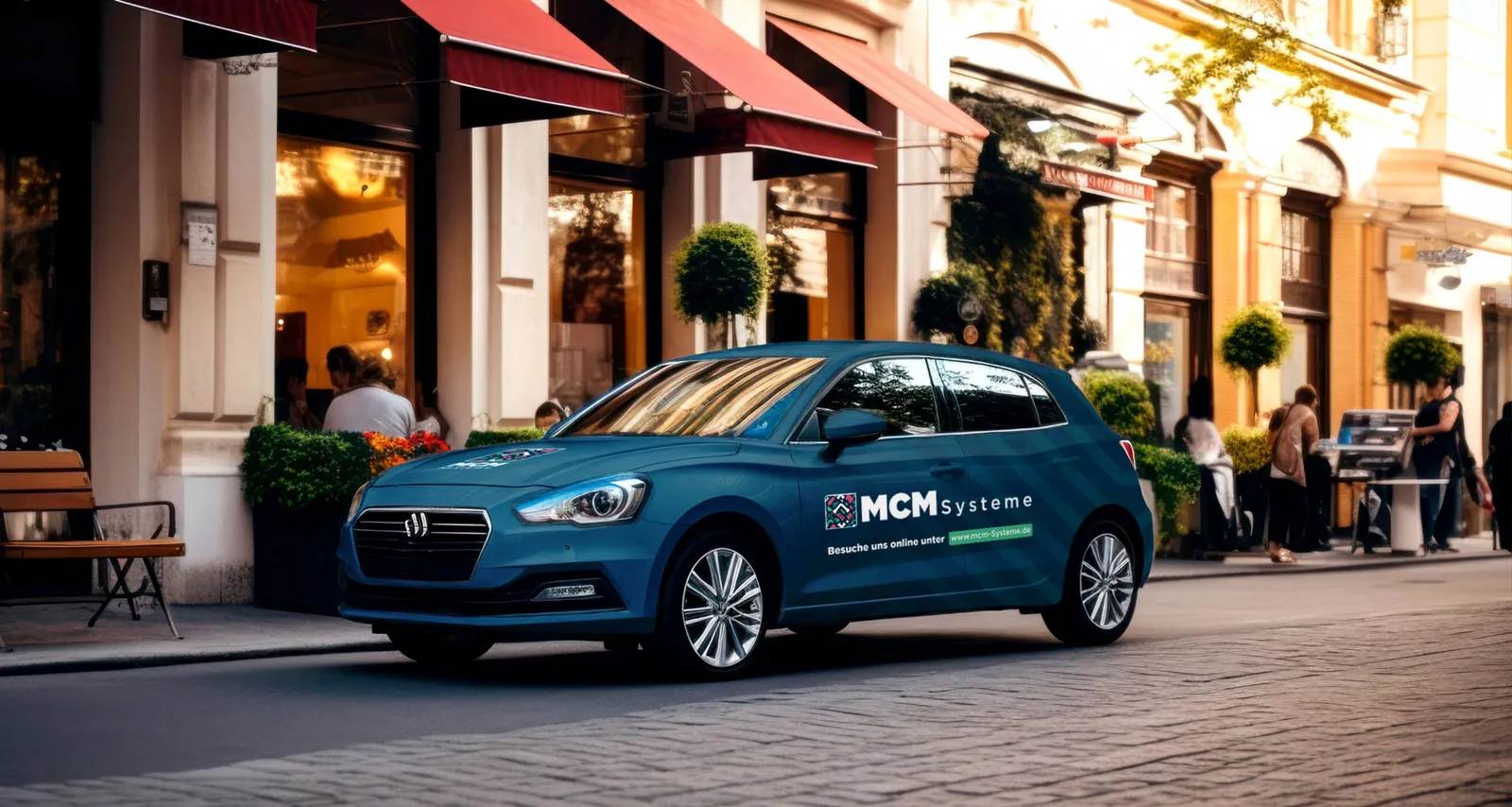
Compact car in teal with MCM graphics in an old town alley
The corporate design had to be thought through for the long term and designed so that it also meets future wishes and requirements.

And in public space

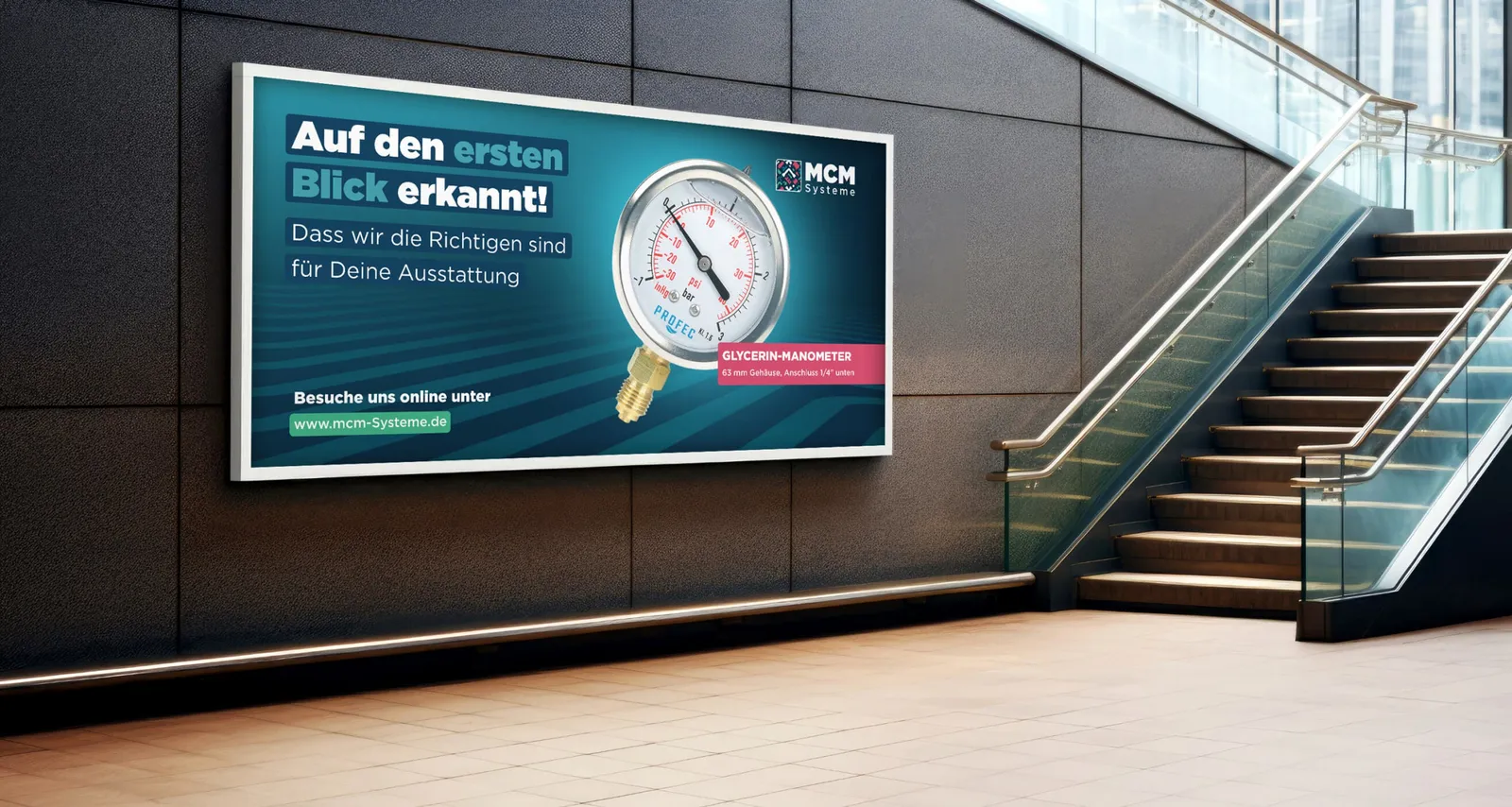
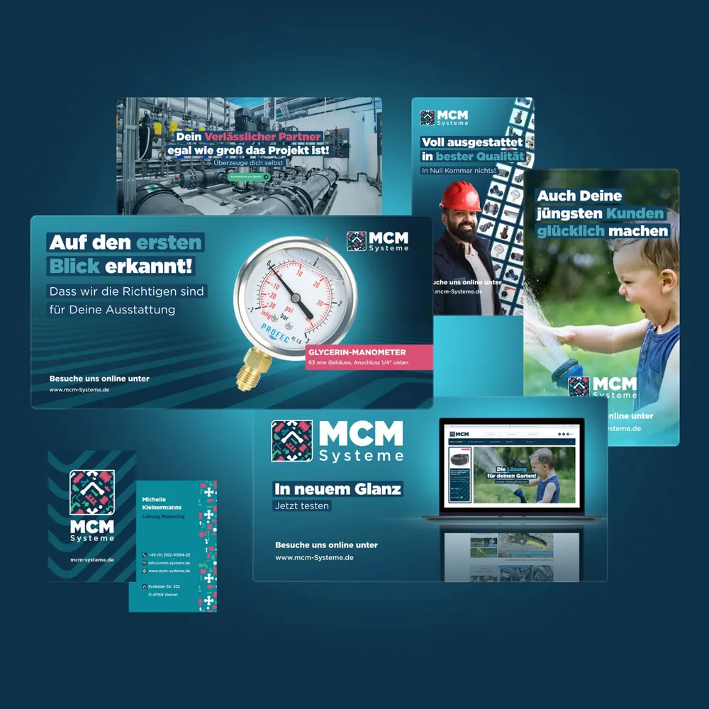
Advertising board in a foyer: “Auf den ersten Blick erkannt!” with a pressure gauge
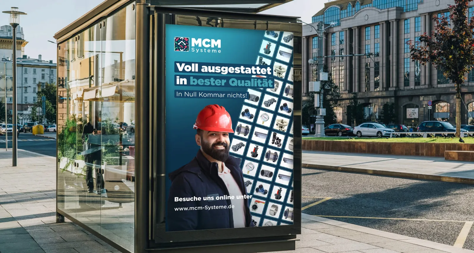
Poster in a bus shelter: “Voll ausgestattet in bester Qualität”
With the new concept, MCM is now well equipped to communicate its messages confidently in every medium, attract attention and stand out.

The shop, thought out three ways

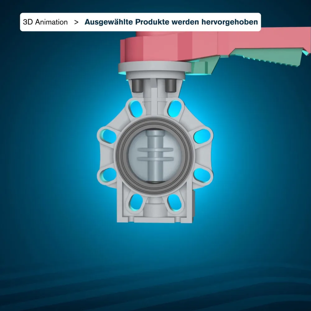
Product view in the shop: a butterfly valve turning as a 3D animation
3D view of a butterfly valve with a red lever against a blue background
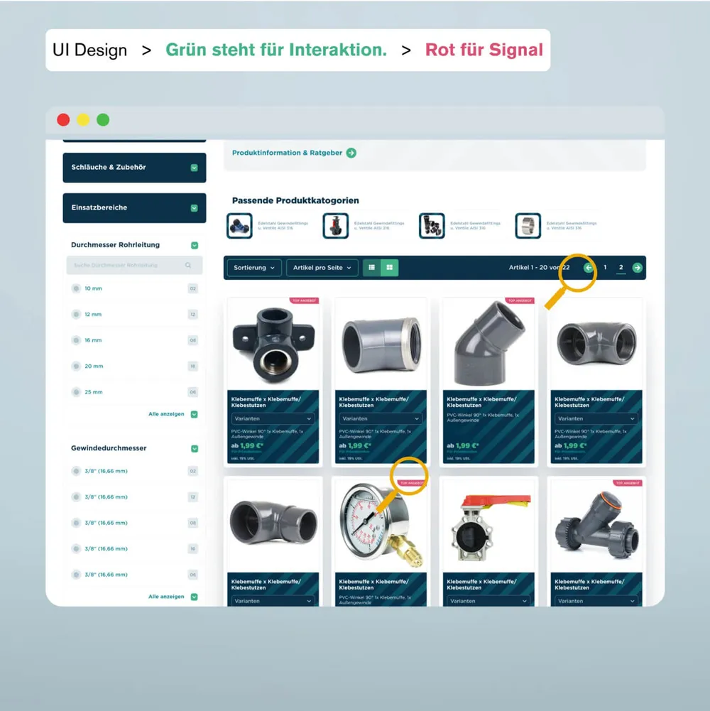
Product list in the shop, green for interaction and red as a signal
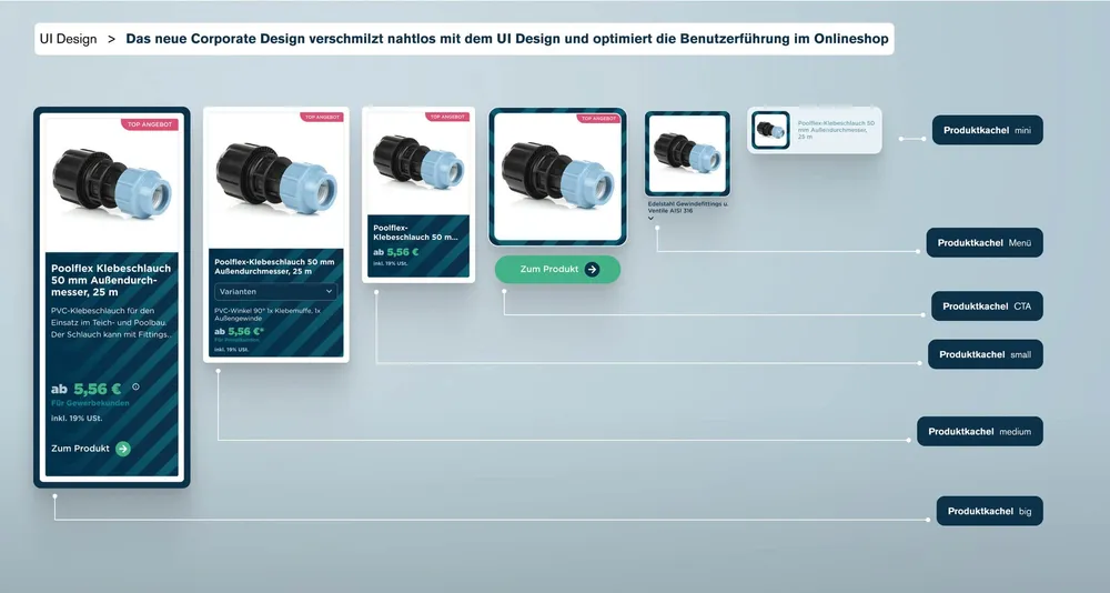
The product tiles in six sizes side by side, from the small teaser to the large card
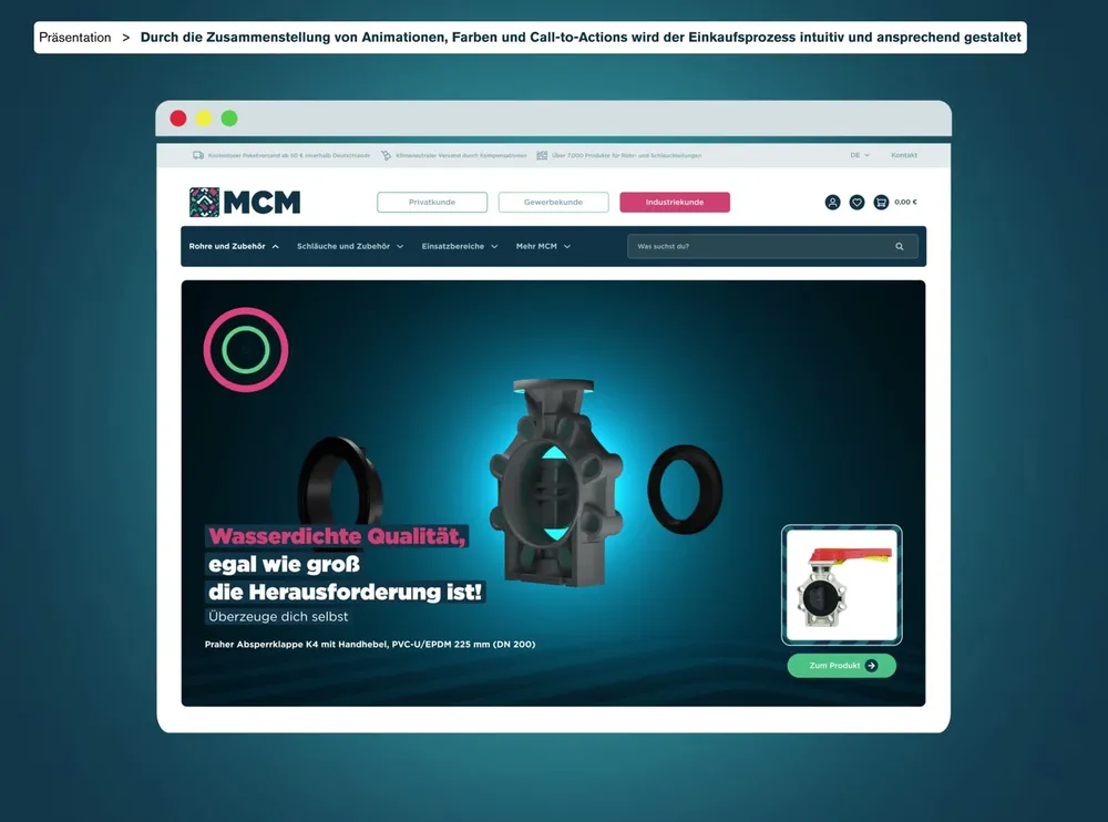
The online shop is now optimized so that selected products can be given particular prominence as 3D animations. The UI design was adapted to the new design not only visually but also functionally, which benefits the brand identity and both simplifies and enriches the customer journey.

Shopping with a good conscience

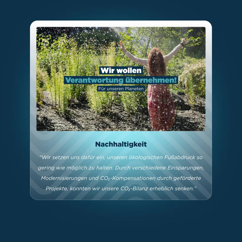
From the very first meeting with Managing Directors Marc and Chris it was clear to us that this would be a great project. They were open with us and honestly took us along into their ideas. MCM Systeme wants to be more than just a professional supplier: environmental protection, fair supply chains and sustainability matter to them.

They are experts with a passionate, almost nerdy enthusiasm for their work, without taking themselves too seriously. That is exactly the impression we anchored in the new corporate design. Starting with a unique logo, we carried the idea through to the smallest detail of the brand.

Addressing the diverse audiences was particularly important to us: private customers who want to upgrade their garden or tune their pool now find an intuitive user flow that takes them straight to the right solutions. Trade customers see at a glance that MCM offers them reliable and robust products. For industrial customers, the design radiates professionalism and technological expertise.

With this new identity, MCM Systeme can be experienced as a partner with character and expertise. We firmly believe the company is still at the beginning of an impressive journey when it comes to communication — and we look forward to accompanying it on that road in future.

Client
MCM Systeme
Studio
Creative Agency WAGEMUT
Services
Branding, Graphic Design, UI/UX Design, Web Design, 3D Visualization, E-Commerce & Online Shops
Industry
Retail & Wholesale, Manufacturing & Industry