
Case Study
A brand quieter than its product
Quiet Please — brand development and web shop for sound-absorbing interiors
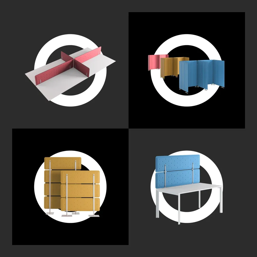
Quiet Please sells sound-absorbing furnishings for new work offices — colorful, flexible, modern. The brand had to step back behind them and still stand out. The initial Q became a brandmark that shows the product at the same time; its hollow circle becomes a stage across the whole brand, one on which every product can stand for itself.
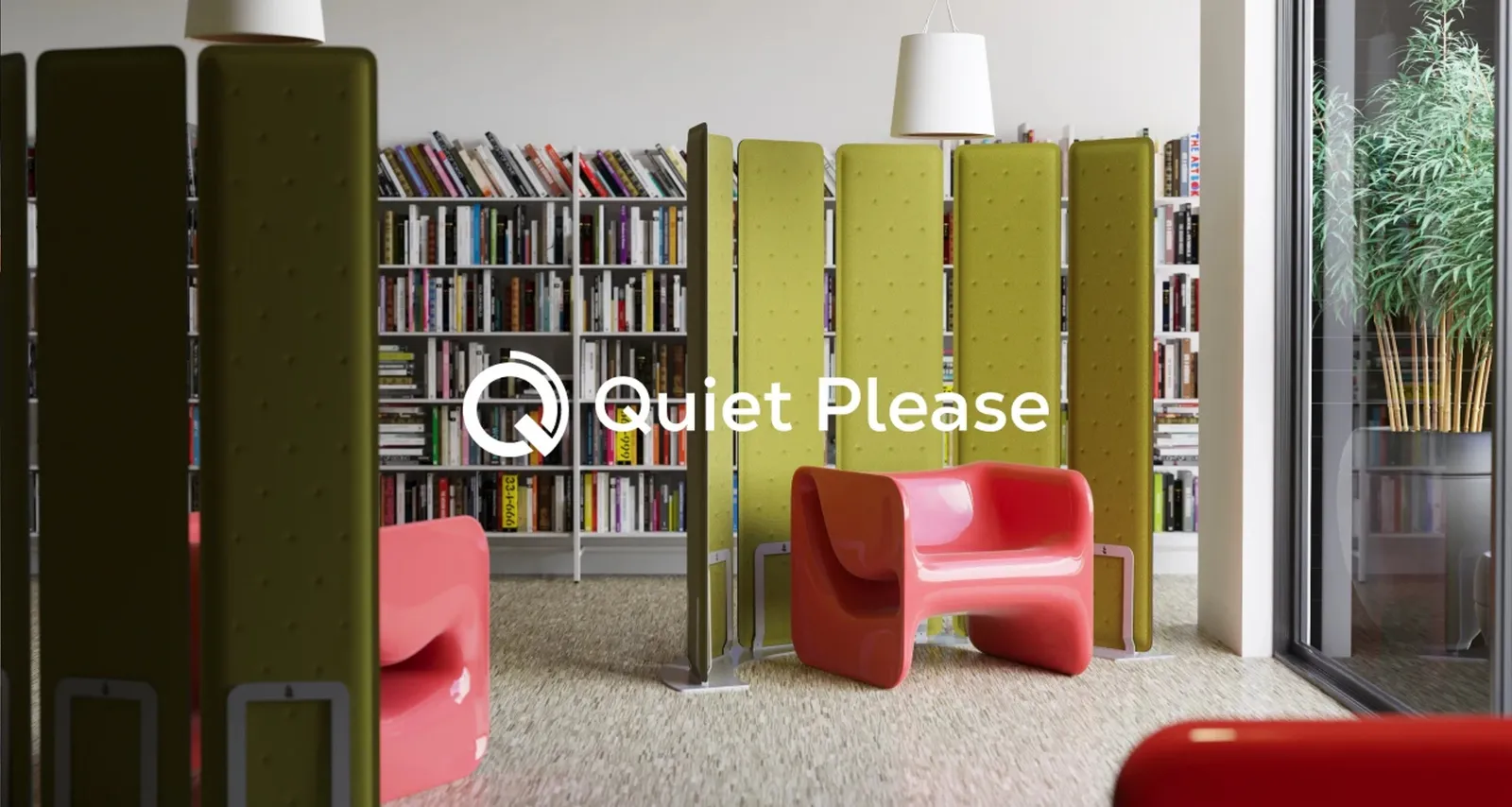
A balancing act between restraint and accent
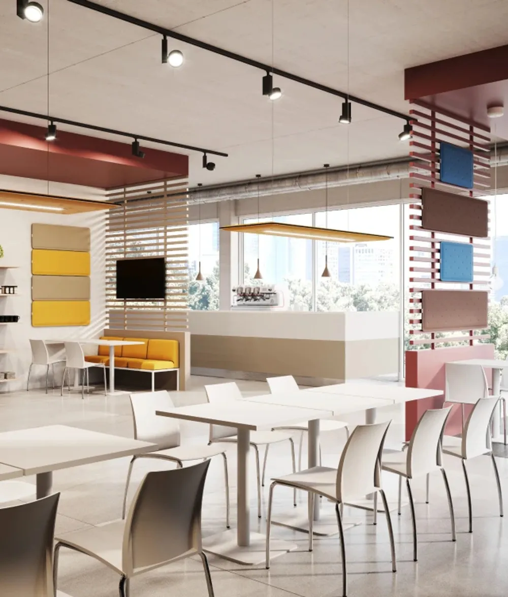
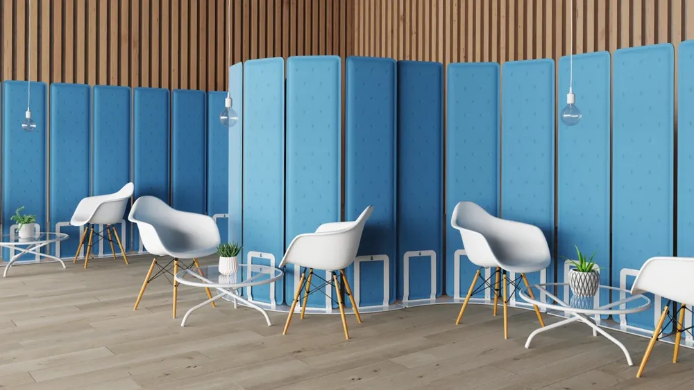
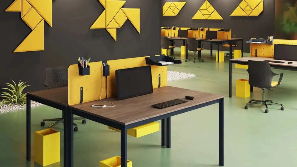
The Q becomes the product


Name, product and subject in one graphic


Everything comes out of the brandmark
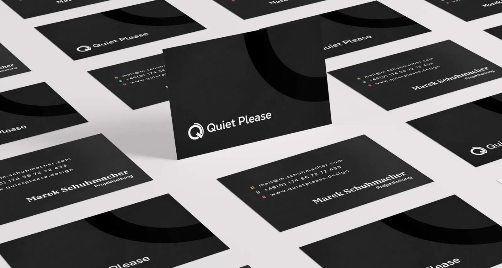
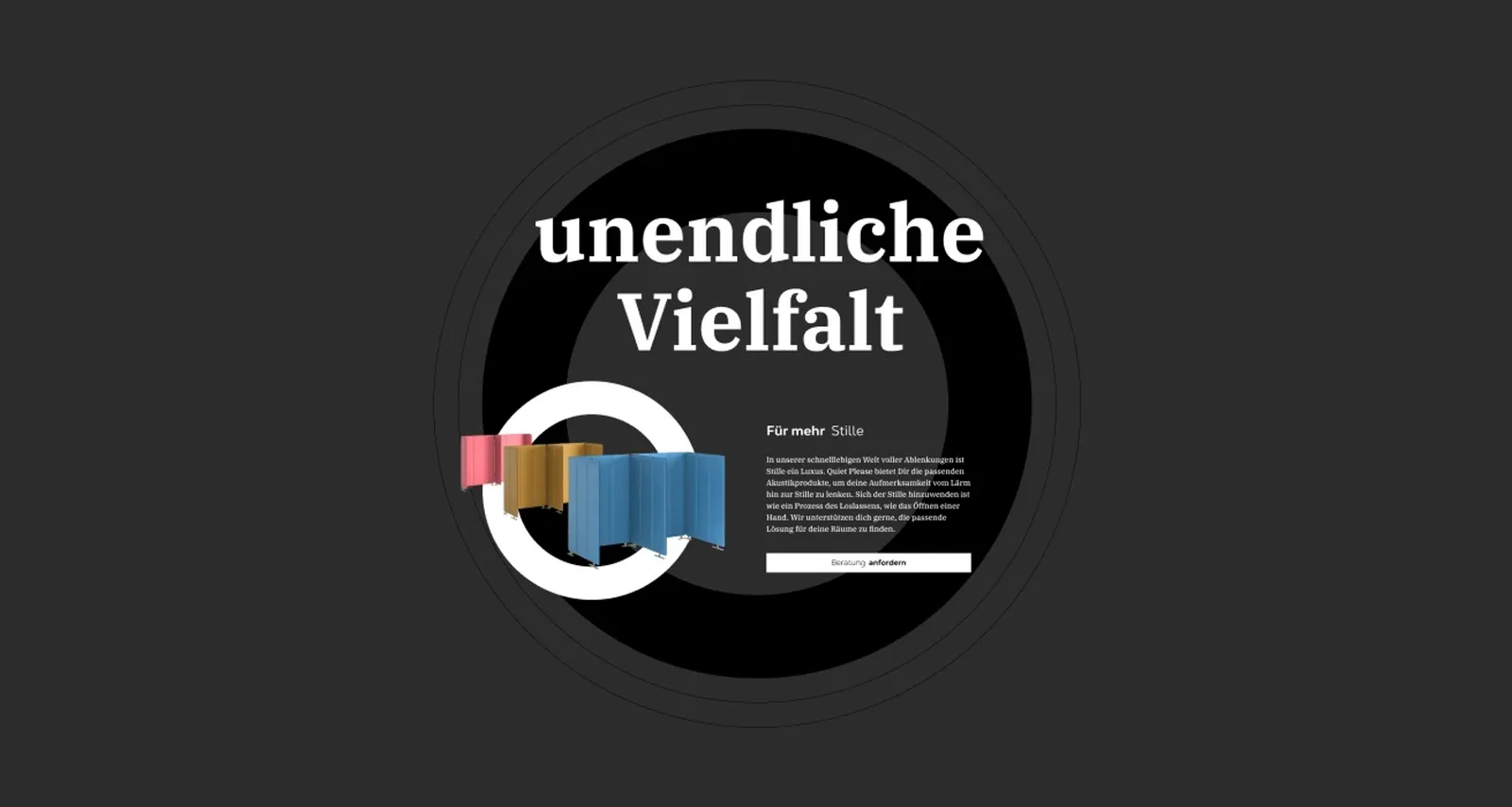
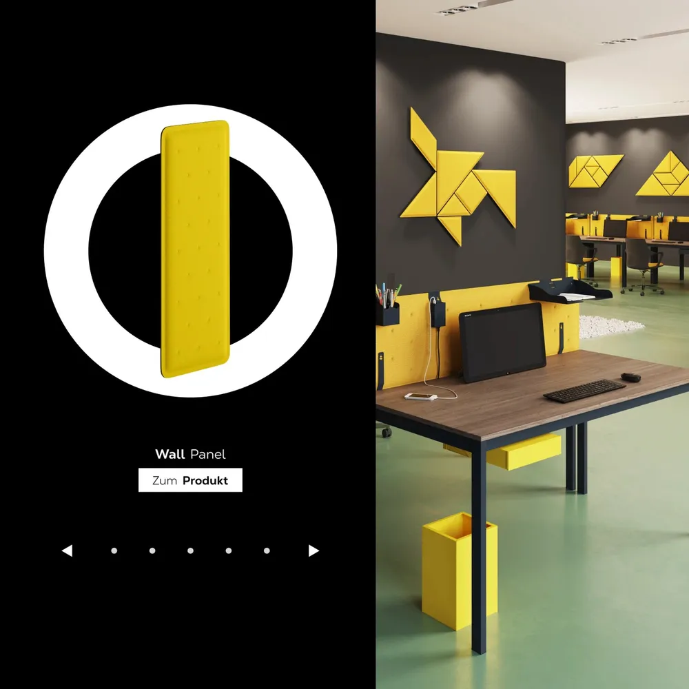
The hollow circle becomes a stage


Nexa Text and IBM Plex Serif
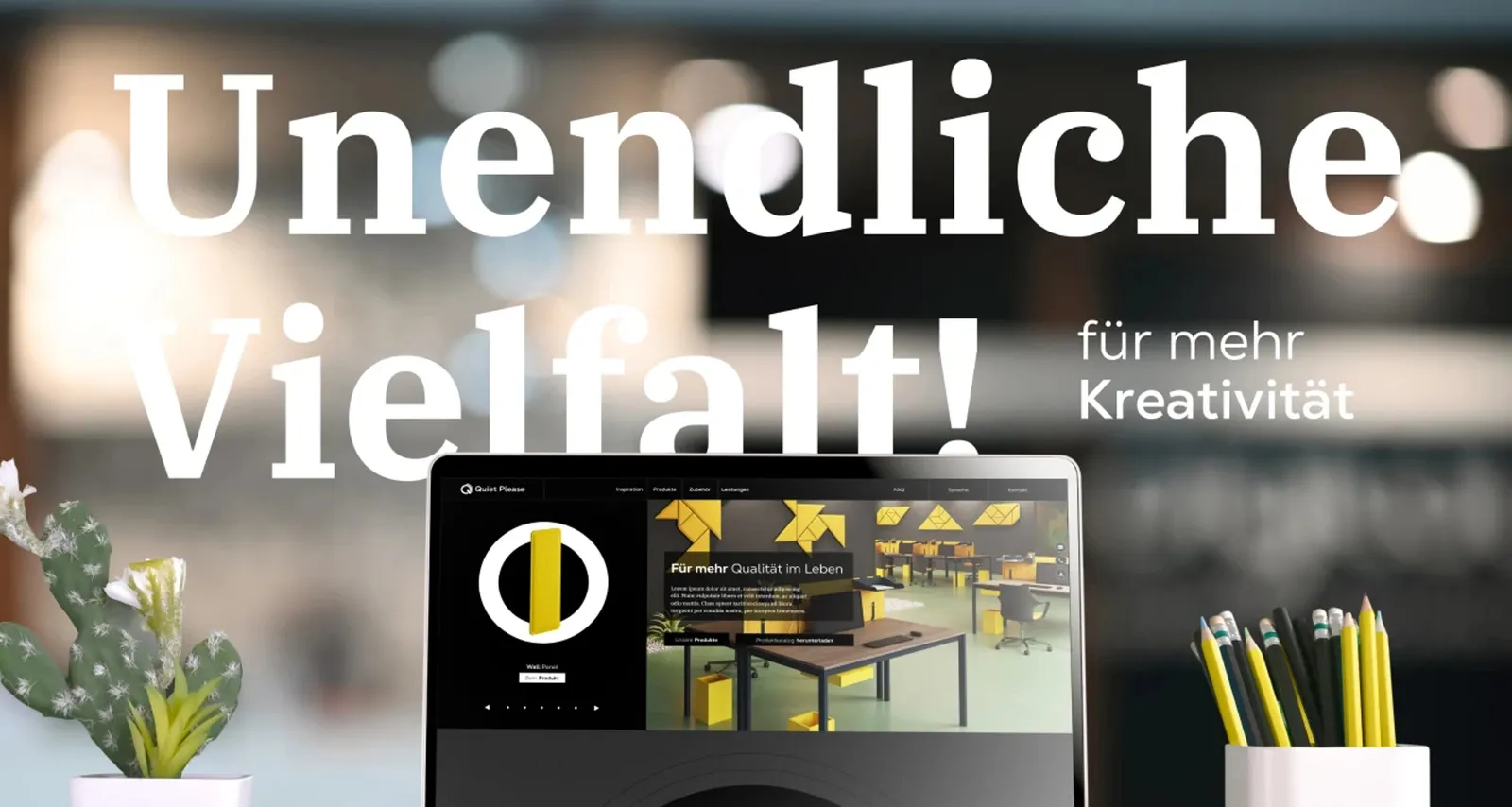

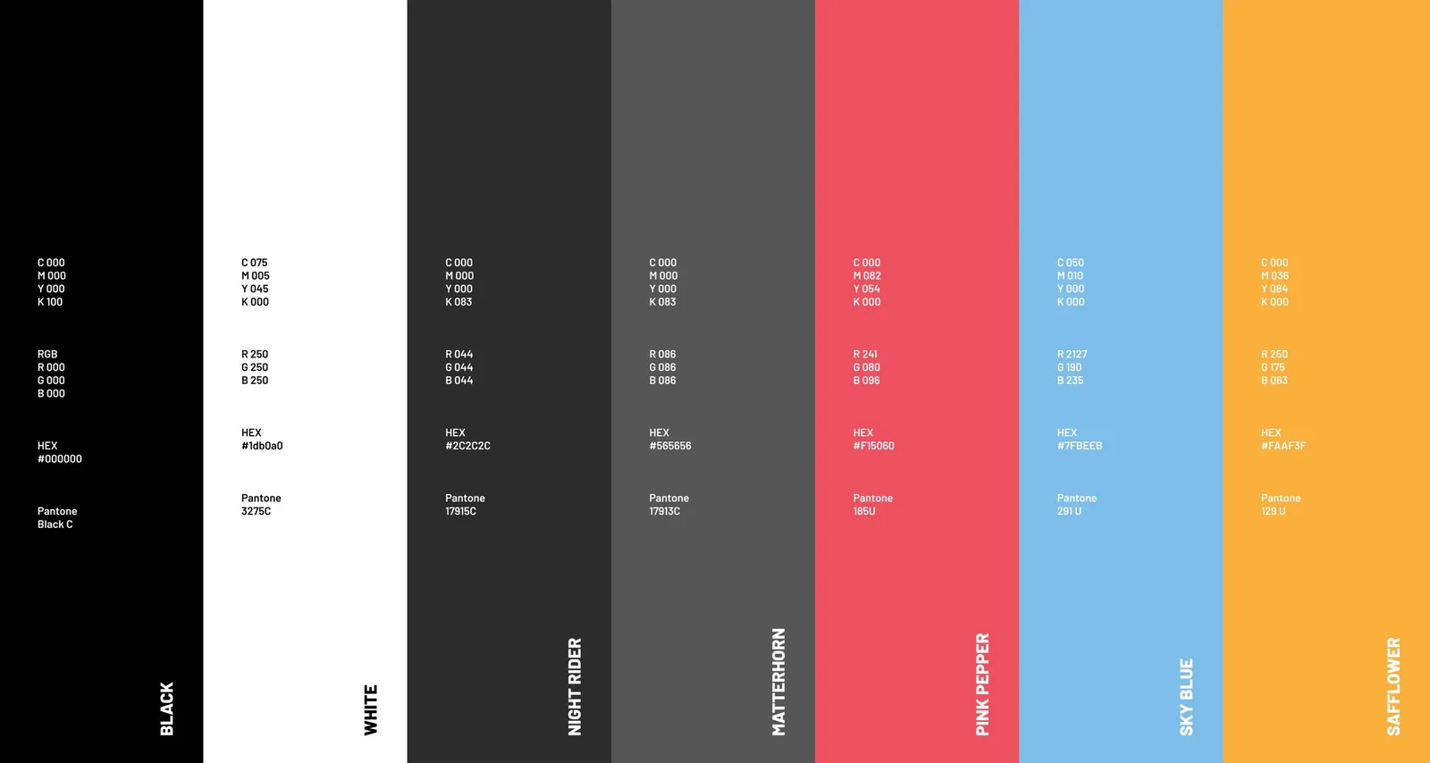
Dark, so the products glow
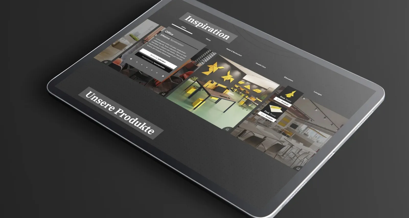
Accents only where they count
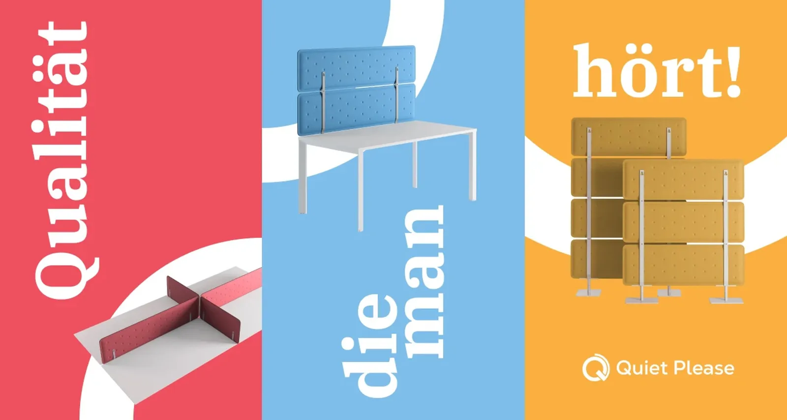
Three colors from the range
Dark ground, white circle, colorful product
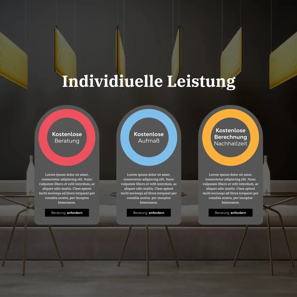
Discreet, but not invisible
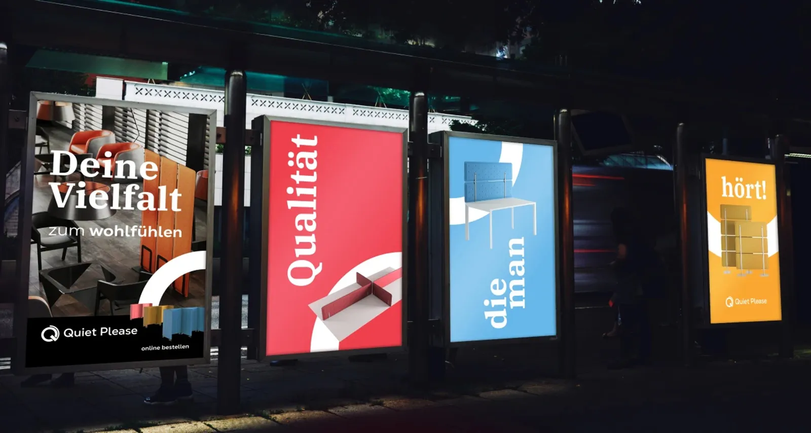
Every product gets its mood
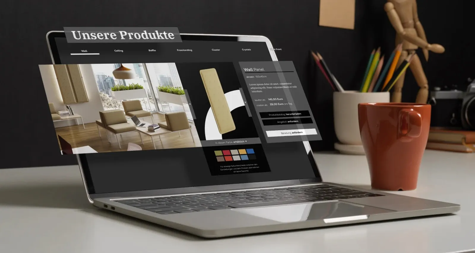
First the place, then the product
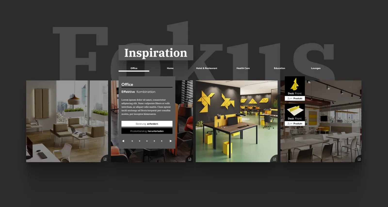
Then it gets specific
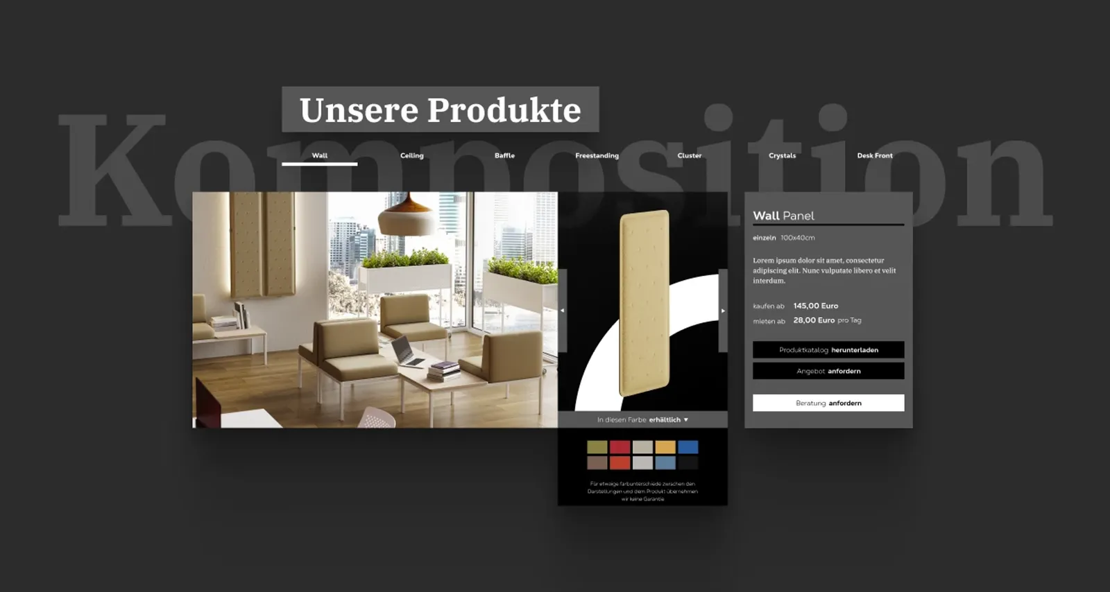
A concept with contrast
WAGEMUT does not stand for more of the same — WAGEMUT stands for making a mark, making a difference and creating contrasts. With the Quiet Please brand, that is exactly what happened.
We often see companies taking the competition as their model when it comes to communication, which frequently means the only way left to stand apart is on price. What it takes, though, are recognizable, memorable accents that catch the eye and anchor themselves in the memory. In Quiet Please we had a client who understood that one hundred percent and went a bold route against the current together with us.
In developing the brand in the audio new work interior field, with a minimalist web shop as its landing page, we perfected the conception of shapes, colors, typography, graphics and editorials in harmony with the imagery of the products on offer.
A thorough market analysis let us develop a concept whose implementation not only secures the company a place in the competitive field, but also makes the Quiet Please brand stand out and put it above eye level with the competition. We shaped a brand that lives up to demanding market conditions and at the same time stands powerfully next to its large rivals.
Our case study shows how a unique approach and a well-considered concept can lead to coherent results. From logo design and form-giving through to the color concept, we designed the entire web presence of Quiet Please from scratch, and exceptionally so. The success of our work shows that boldness pays off. ;)
- Client
- Quiet Please
- Studio
- Creative Agency WAGEMUT
- Services
- Branding, Graphic Design, UI/UX Design, Web Design, Naming
- Industry
- Design & Architecture, Manufacturing & Industry
Share our work

Manufacturing & Industry
Bando
Peak Attack – not a brand for everyone. One for the people who mean it. Scene, not standard. 3D, not a brochure.
Retail & Wholesale
MCM Systeme
Three audiences, one shop: a logo family, a color system and an online shop that recognizes private, trade and industry customers by their own color.
Technology
YASDA
At YASDA’s side since 2020: website redesign, timelapse film, 3D trade fair appearances and the “Mother Machine” campaign for EMO 2023.