Skip to content

Case Study

Two audiences, one interface

HR Benefit — brand relaunch and platform for corporate benefits

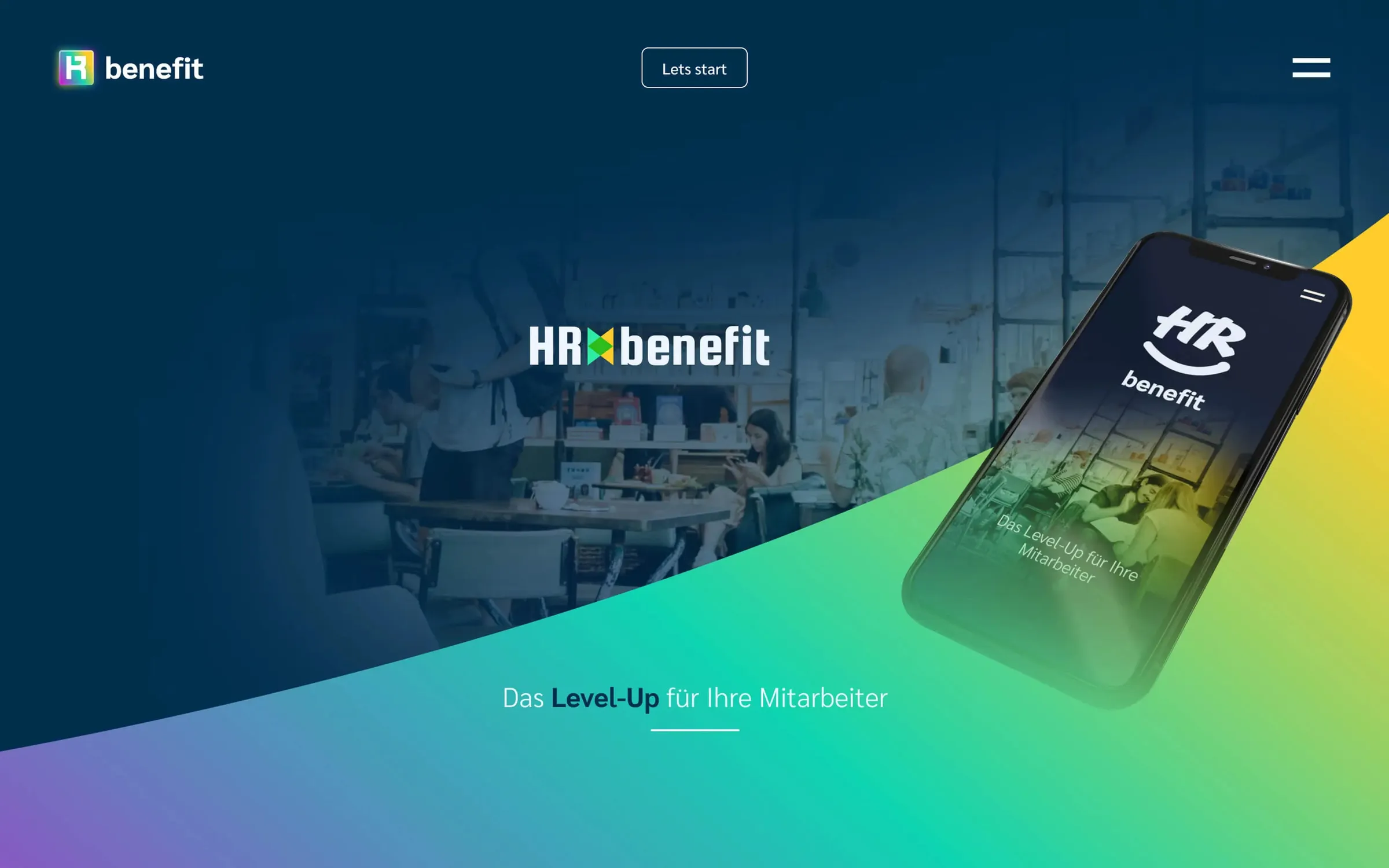
HR Benefit wanted more than a new design. A workshop turned into a complete brand presence: a logo that reads like a QR code, an icon system for every service, a color palette for two audiences — and a website that speaks to employers and employees alike.
  • Banking & Finance
  • Professional Services
  • Branding
  • Brand Strategy
  • Graphic Design
  • UI/UX Design
  • Web Design
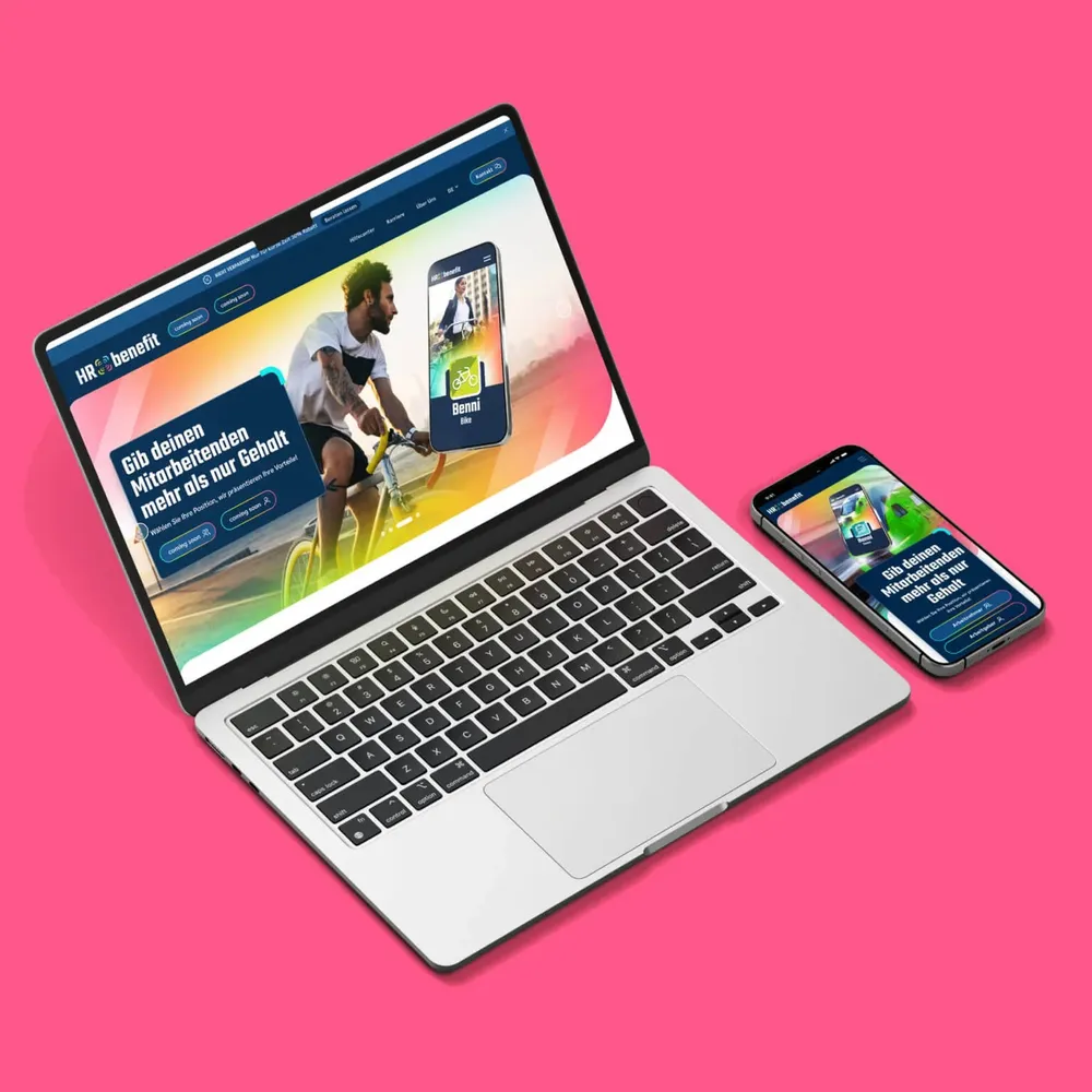
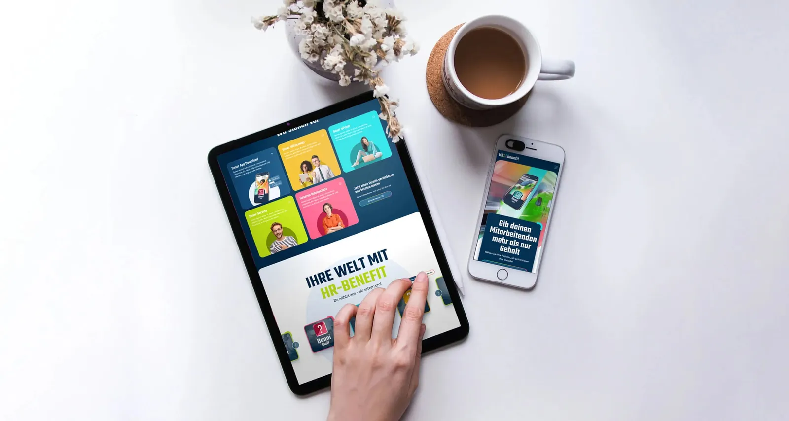
Tablet and smartphone on a light table, both showing the new HR Benefit website

Every version carries the same brand
Symbol above the “HR benefit” wordmark, white on a dark blue background
Horizontal version: the symbol sits between “HR” and “benefit”, white on dark blue
The same horizontal version in dark blue on white
Symbol above the wordmark, dark blue on a white background
The logo unfolds in its full versatility, with every variant showing off the brand's flexibility and adaptability.

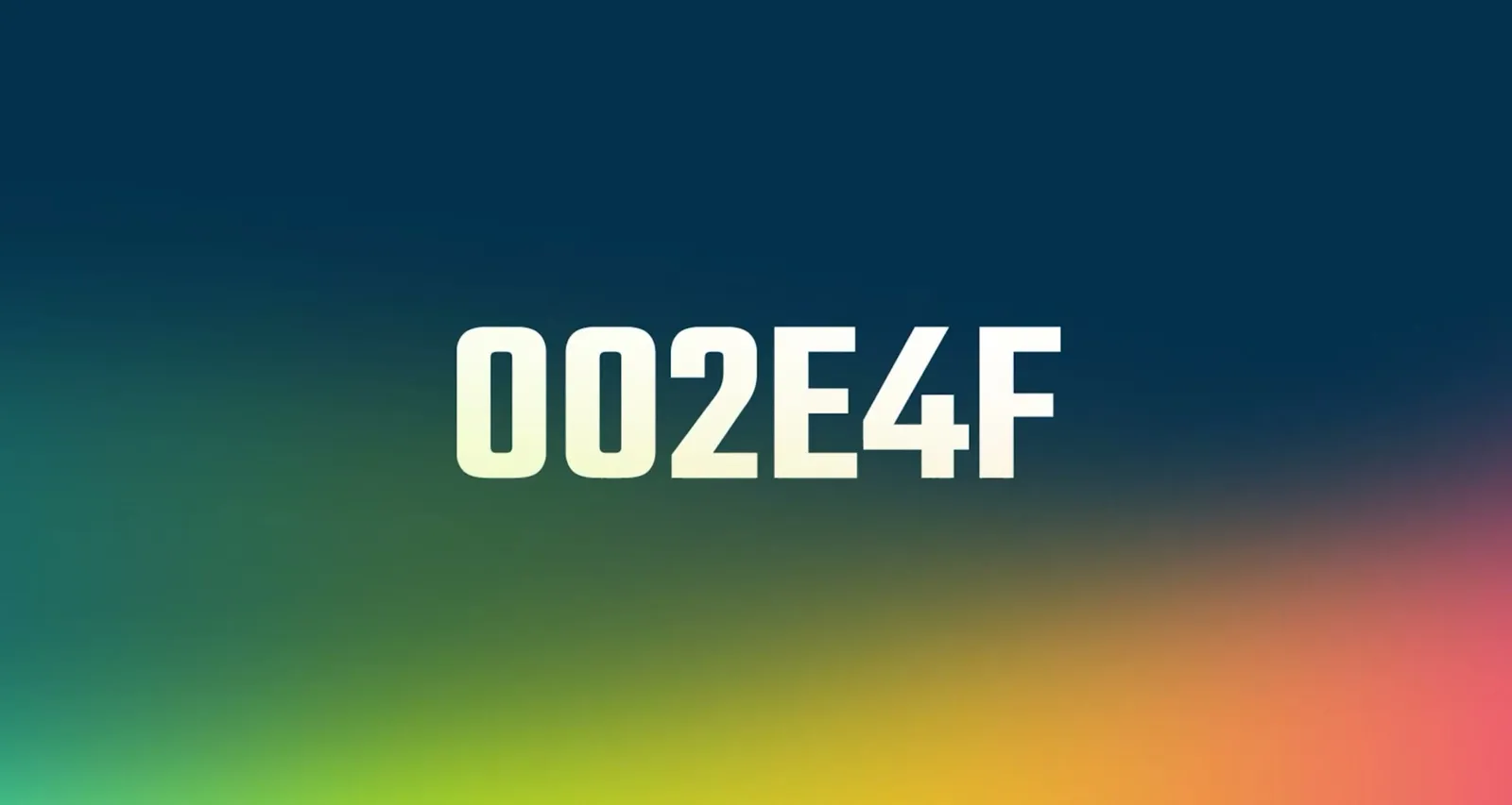
Color as a second voice

Animation of the color palette: color fields and gradients change, with their hex values
The video shows the colors at their full intensity, both in pure application and in flowing gradients that underline the brand's dynamic, modern aesthetic.

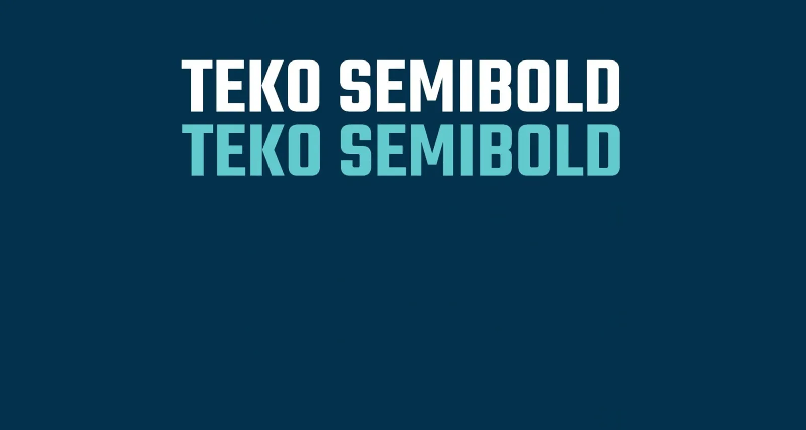
Sarabun and Teko, precision and pace

Animation of the type samples, showing “Teko Semibold” in two colors
The combination of Sarabun Bold, Sarabun Semibold and Teko Semibold creates a clear contrast between seriousness and dynamism. It unites precision and modernity and gives the brand a strong, contemporary presence.

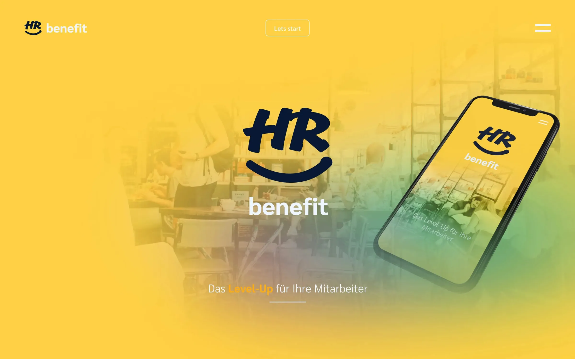
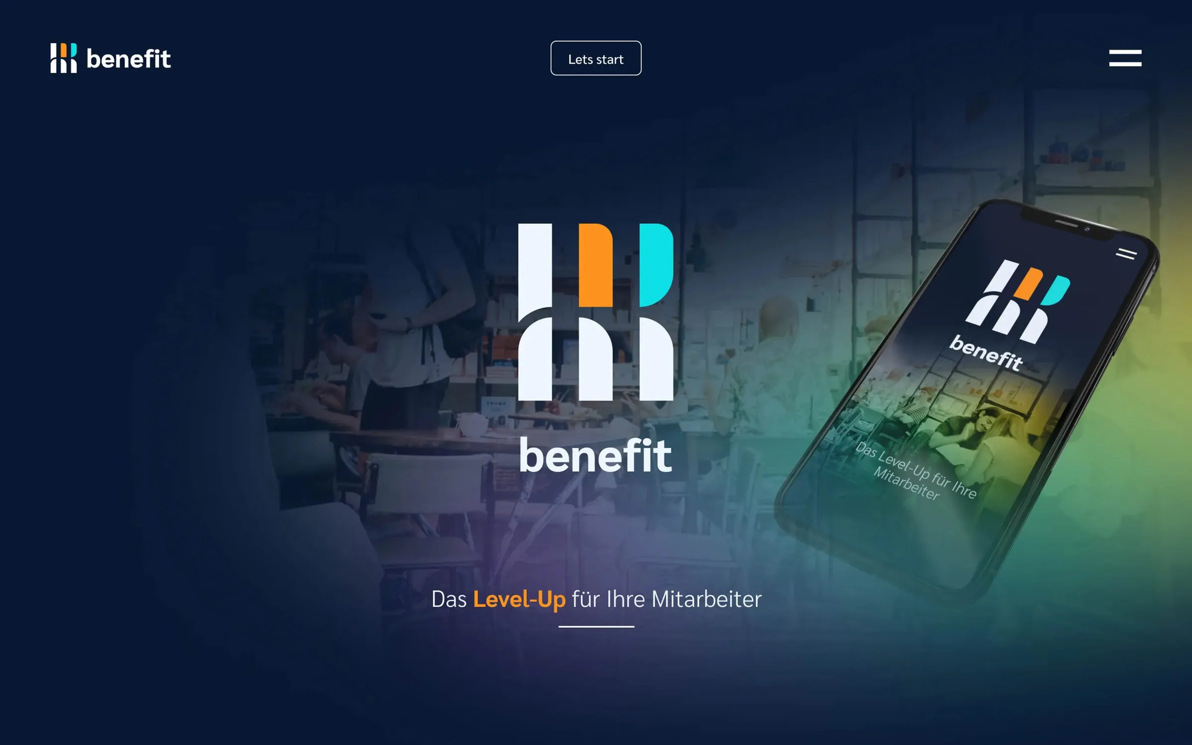
Three early routes to the brand

  • Home page draft in yellow with a logo whose curve under “HR” forms a smile
  • Dark home page draft with a symbol made of orange and turquoise bars
  • Home page draft with a gradient and a colorful symbol between “HR” and “benefit”
The slider shows the early mood boards, with different logo drafts built straight into them. These first steps make clear the creative range and the intense design process that finally led to the brand identity.

An icon for every service

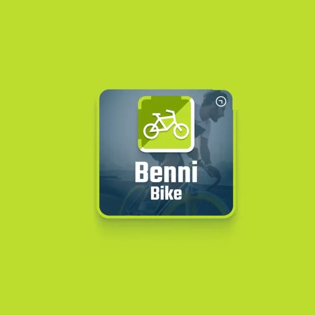
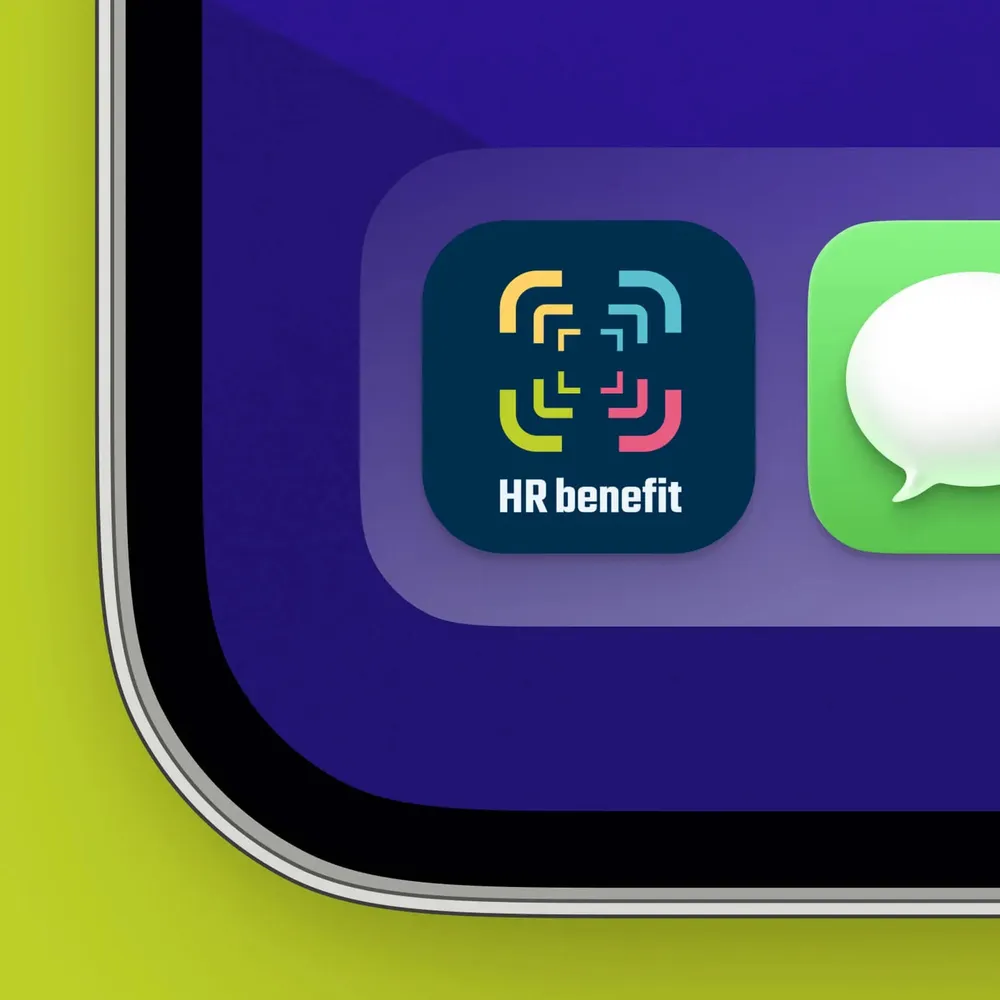
Animation of the app icons, showing “Benni Bike” on green
“Benni Ticket” icon: a train seen head-on, white on turquoise
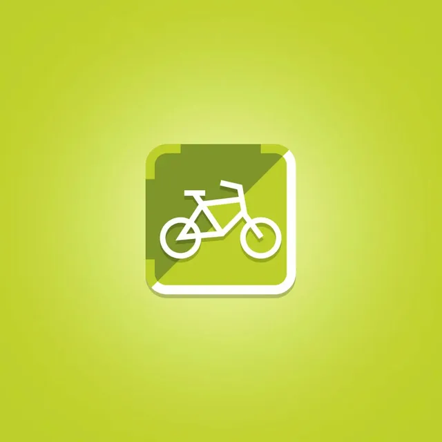
“Benni Bike” icon: a bicycle, white on green
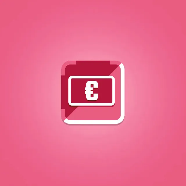
“Benni Card” icon: a card with a euro sign, white on pink
“Benni Food” icon: a plate with cutlery, white on yellow
The app icons, which take their cue from the new logo, represent the different services and round out the redesign with a clear, modern aesthetic.

Did our work inspire you?

Tell us about your project, short and to the point. It makes no difference whether you bring a rough idea or a polished concept.

The calculator that convinces both sides
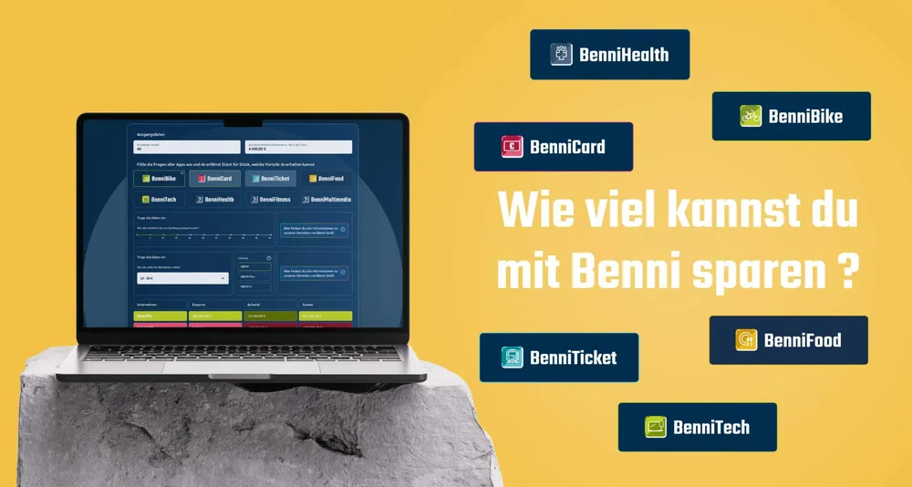
Laptop showing the benefits calculator, next to it the question “How much can you save with Benni?” and the Benni brands
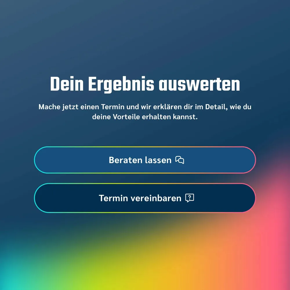
Results page of the calculator with the buttons “Get advice” and “Arrange an appointment”
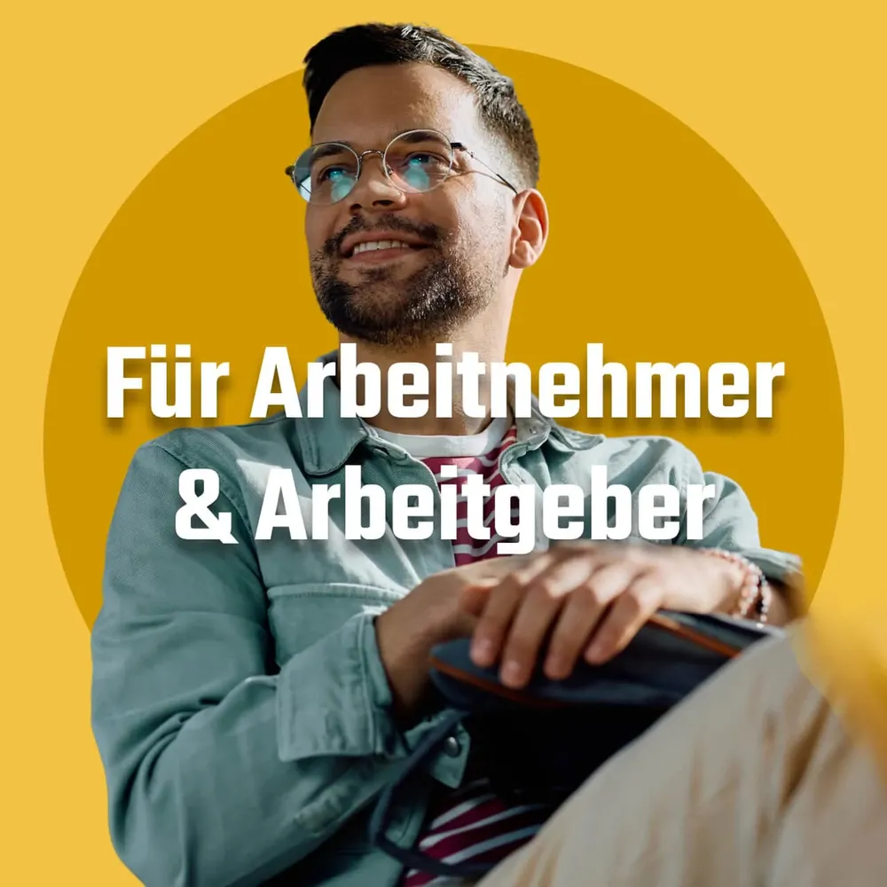
Image “For employees & employers”: a laughing man with glasses on a yellow circle
A central element of the new website is the Benni benefits calculator. Employees can use it to work out their extra net pay without any fuss, while employers get a clear overview of how much they can save by integrating corporate benefits with HR Benefit.

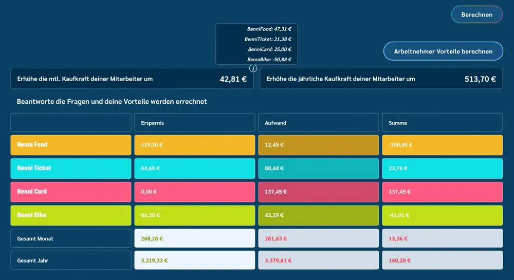
Every number out in the open

Calculator table with savings, cost and total for each Benni service
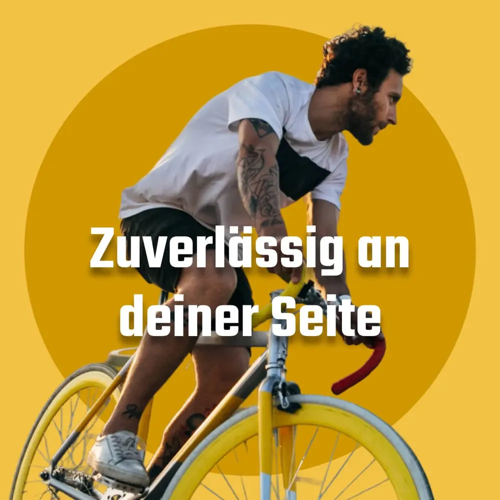
Image “Reliably at your side”: a cyclist on a yellow circle
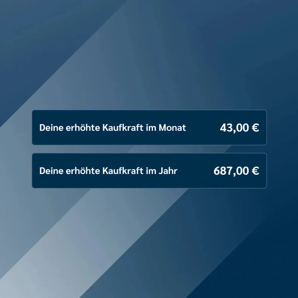
Two result fields: increased purchasing power per month and per year
The Benni benefits calculator not only gives a quick calculation of the financial advantage, it also shows transparently how corporate benefits pay off for both sides, employees as well as employers, and strengthen retention and motivation.

The same benefits, in your hand

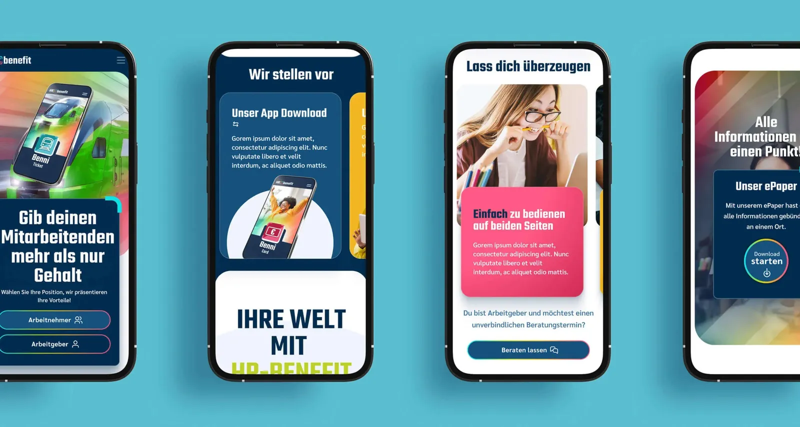
Four smartphones side by side showing views of the mobile website
The mobile version puts the advantages of HR Benefit straight into users' hands. On smartphones and tablets, employees and employers alike can reach the key functions at any time. Whether to calculate their savings or to manage benefits without any fuss. Flexibility that makes everyday life simpler.

Short, clear, recognizable

Three Instagram posts on Benni Ticket, Benni Bike and Benni Food on a pink background
Instagram posts for HR Benefit were meant to show clear, modern images with minimalist design. The color palette relies on vivid accent colors and neutral tones. Simple, legible typography is complemented by icons or small graphic elements. The style stays functional and appealing, in keeping with the innovative brand identity.

Standing out in public space

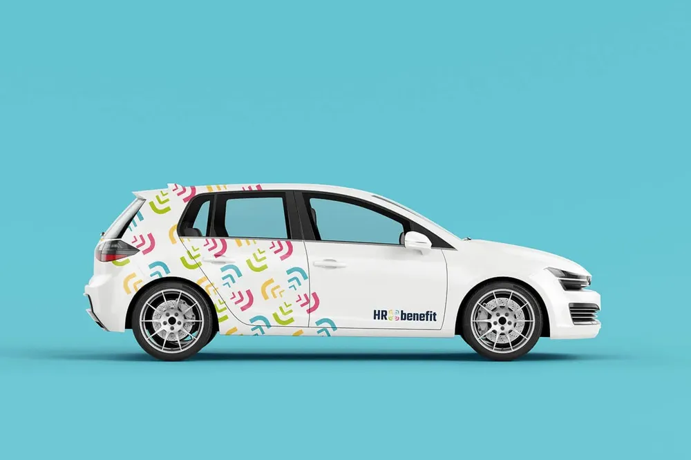
White compact car with a pattern wrap made from the brackets of the symbol and the logo on the door
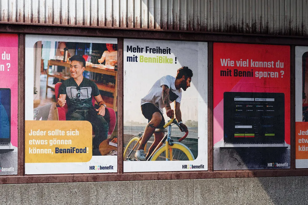
Three posters side by side on a wall, among them “More freedom with BenniBike!”
In public space the brand draws attention immediately with clear, strong visuals. Simple, striking designs combine modern typography and bold graphics that make the brand unmistakable, visible everywhere, always memorable.

A brand to take with you

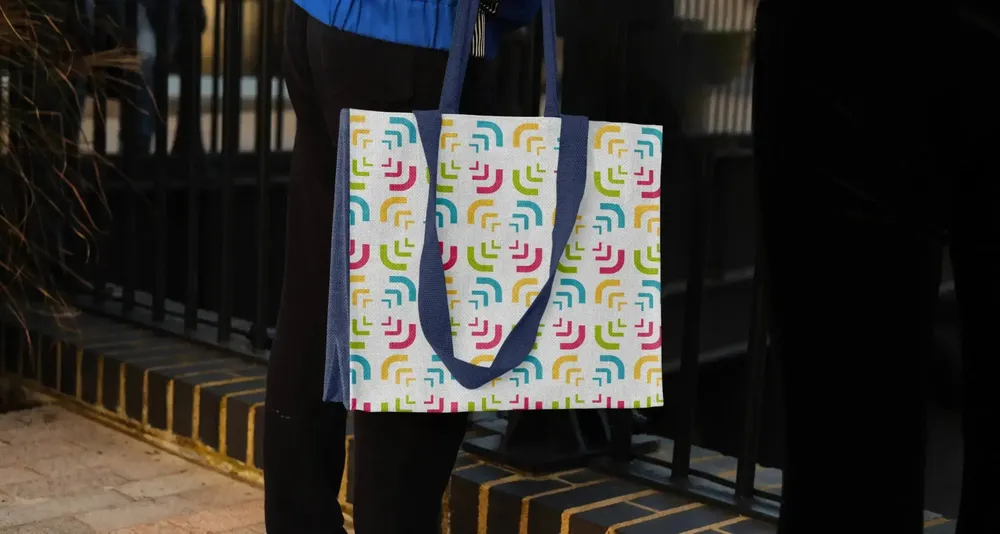
Tote bag with the bracket pattern in all four brand colors, carried on a staircase
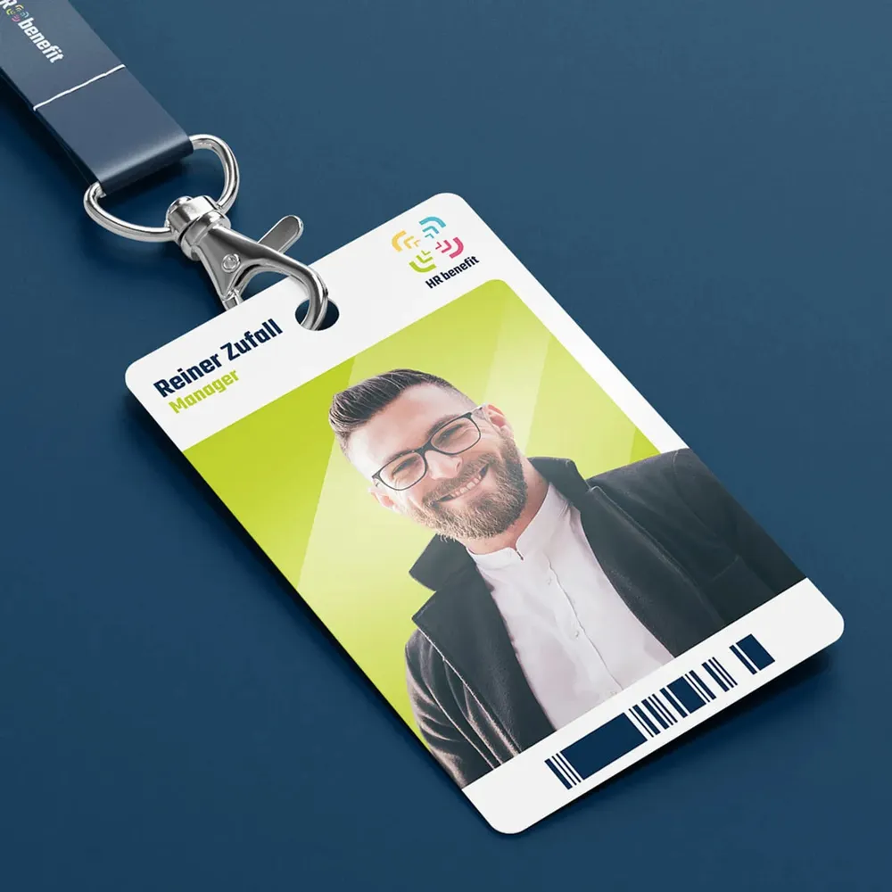
Employee ID card on a lanyard with photo, name and logo
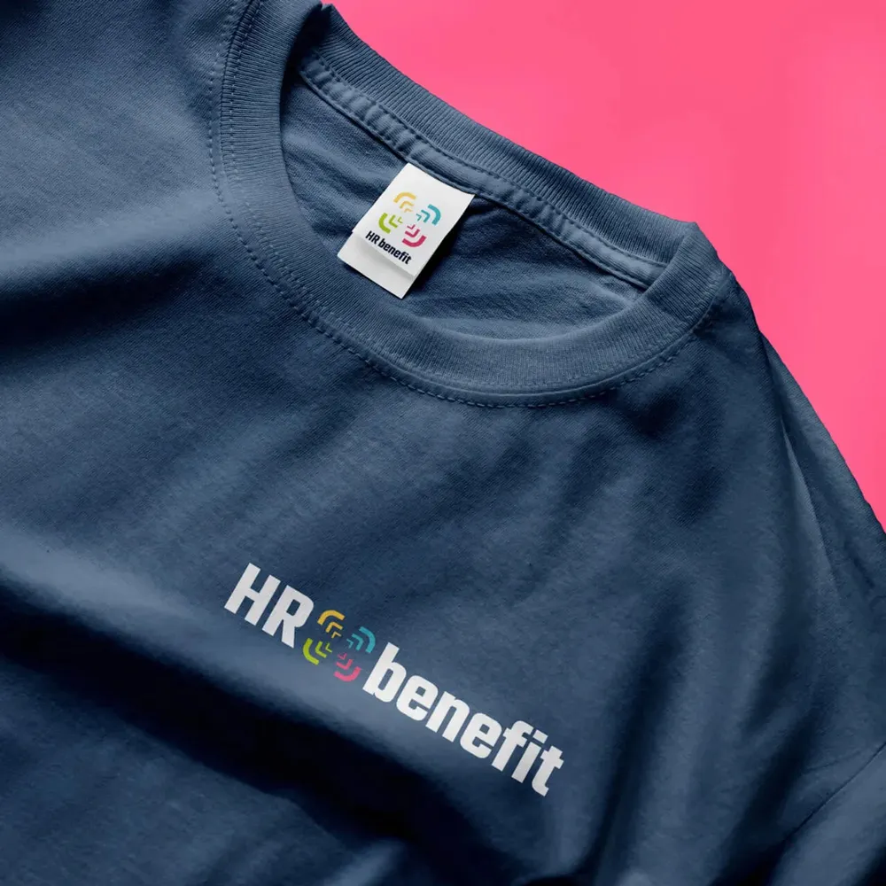
Dark blue T-shirt with the wordmark across the chest, close-up on pink
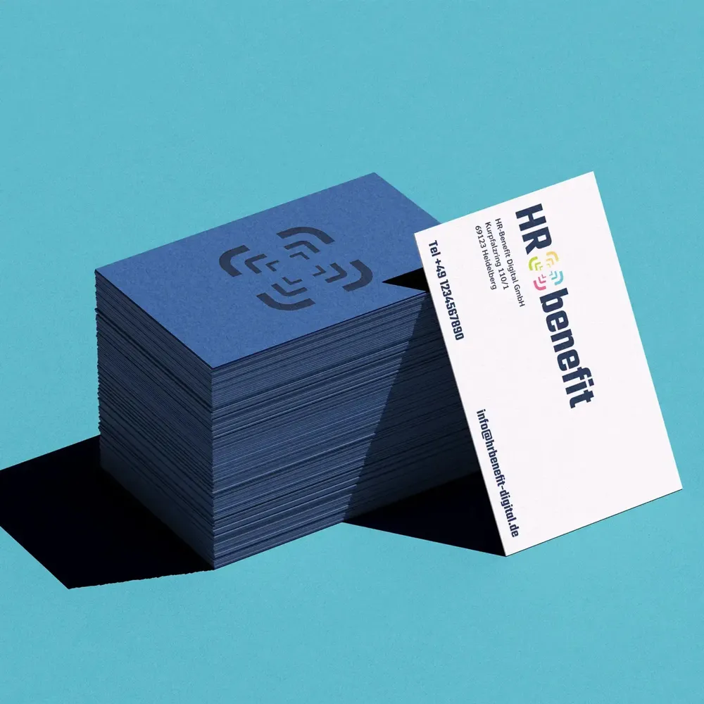
The designs find their way onto everyday products such as clothing, bags and ID cards. These practical applications carry the brand identity and keep the brand's visual language present in the working day – functional, stylish and memorable.

The digital redesign of a brand with a future

It was clear from the start: HR Benefit wanted more than just a new design – this was to be a complete, forward-looking brand presence. In an intensive workshop with considerably more participants than usual, we analyzed the brand identity precisely and worked out how the company's vision and values could be clearly reflected in the digital world.

The result was a complete redesign that began with a modern, clearly structured logo reflecting HR Benefit's digital and innovative direction. A new icon system and a thorough redesign of the flyer and the website were part of the project too. The website was to be more than a visual presentation as it had been so far; it was to offer a user-friendly platform that speaks to employers and employees alike.

We let ourselves be guided by the clear lines and structure of the brand. Every design element was to have a function and at the same time feel memorable and innovative. You want proof? Here you go: after only a short time we took one conversion option off the website because the company temporarily could not keep up with the huge number of enquiries.

The Benni benefits calculator is online by now as well: employers use it to work out in seconds how much they save through corporate benefits, and employees see what the benefits are worth to them.

With two referrals from HR Benefit already, we seem to have got everything right here.

Client
HR Benefit
Studio
Creative Agency WAGEMUT
Services
Branding, Brand Strategy, Graphic Design, UI/UX Design, Web Design
Industry
Banking & Finance, Professional Services