
Case Study
Time for change
Bernecker — branding, UI/UX and a web presence for 60 years of stock market experience
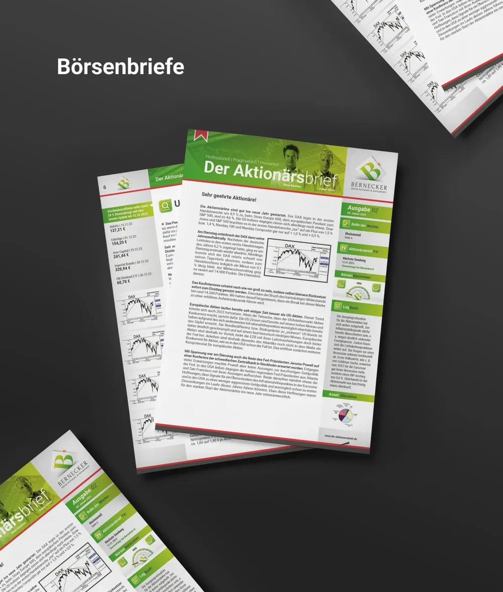
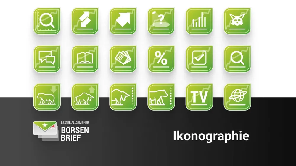
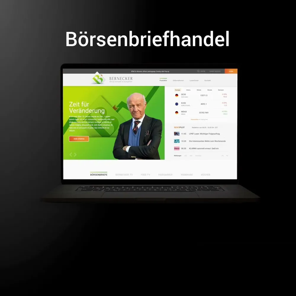
A firm with 60 years of stock market experience and a presence from yesterday: for Hans A. Bernecker Börsenbriefe GmbH we created a brand identity that swaps red for green — in the world of finance, the difference between a falling and a rising price. Plus a purpose-built iconography for the tight columns of the stock market newsletters, and a UI that puts shop, media library, account and reader forum side by side without friction.
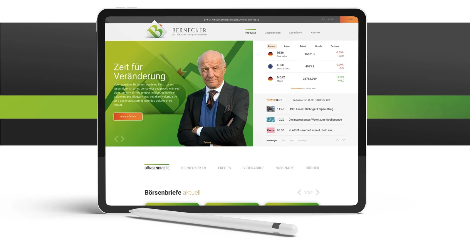
Waited a long time, then jumped after all
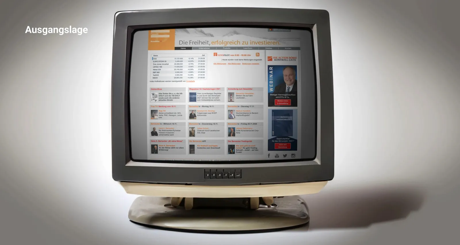
Red was the wrong course

Three-dimensional instead of flat
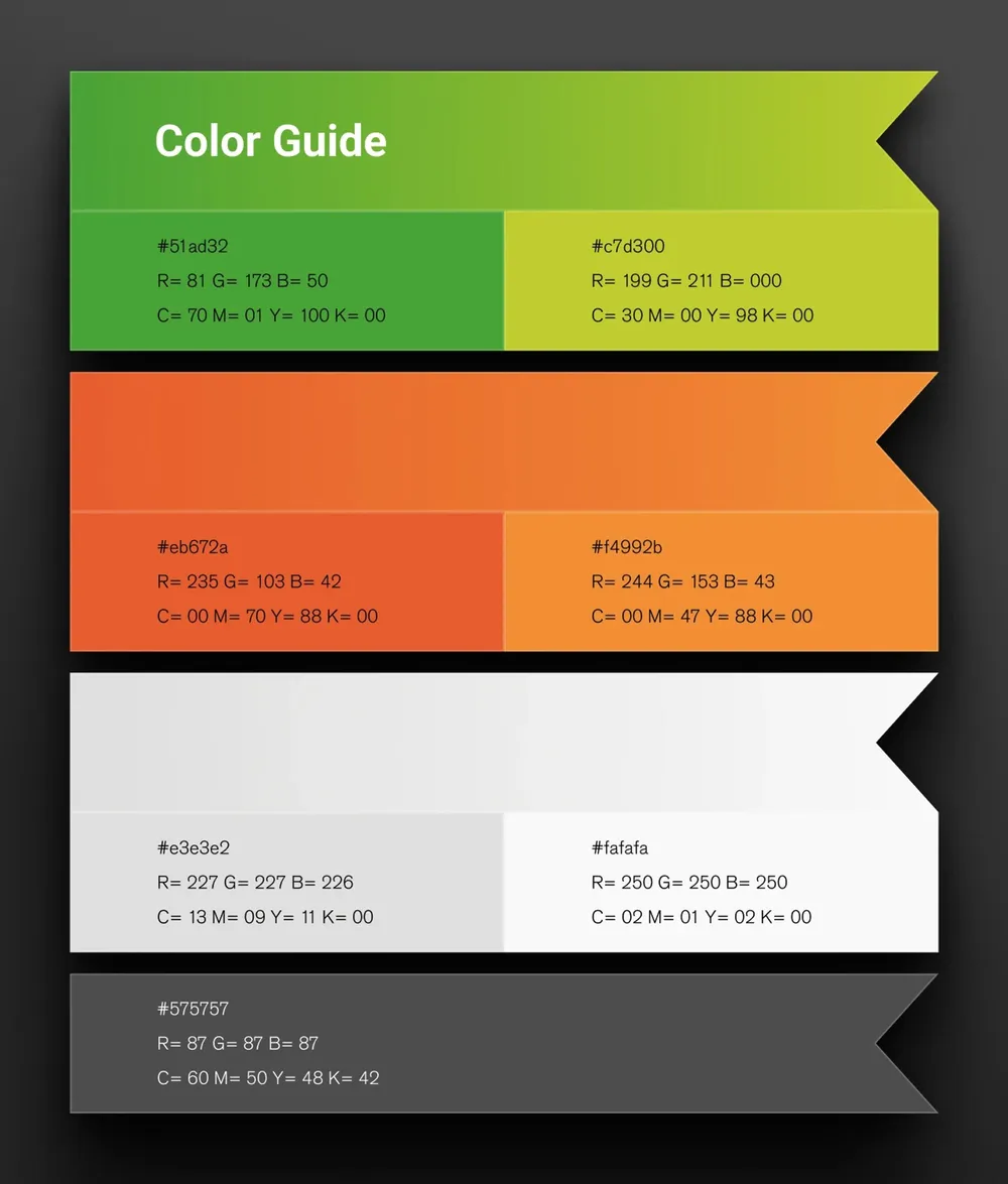
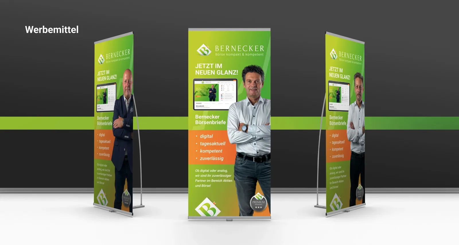
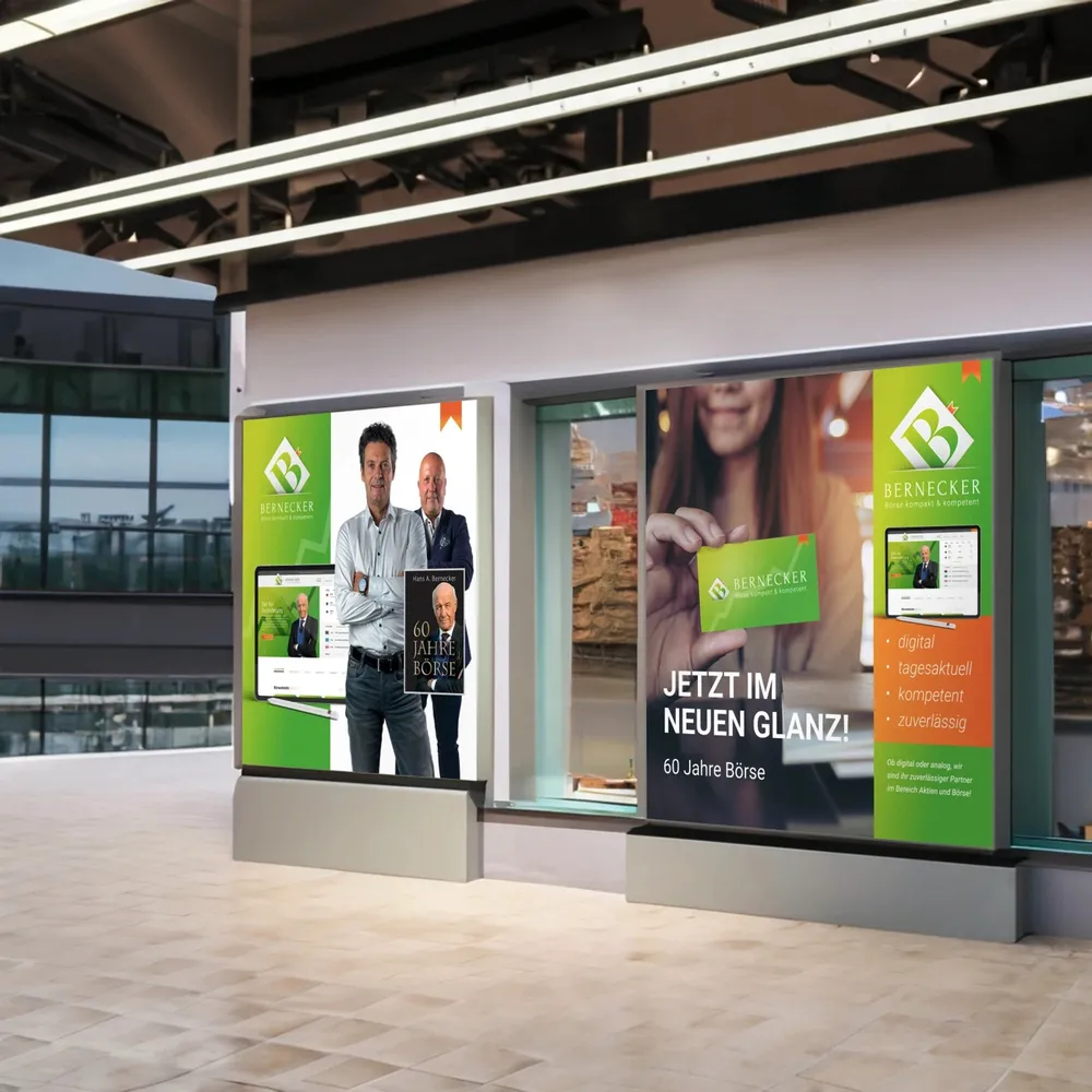
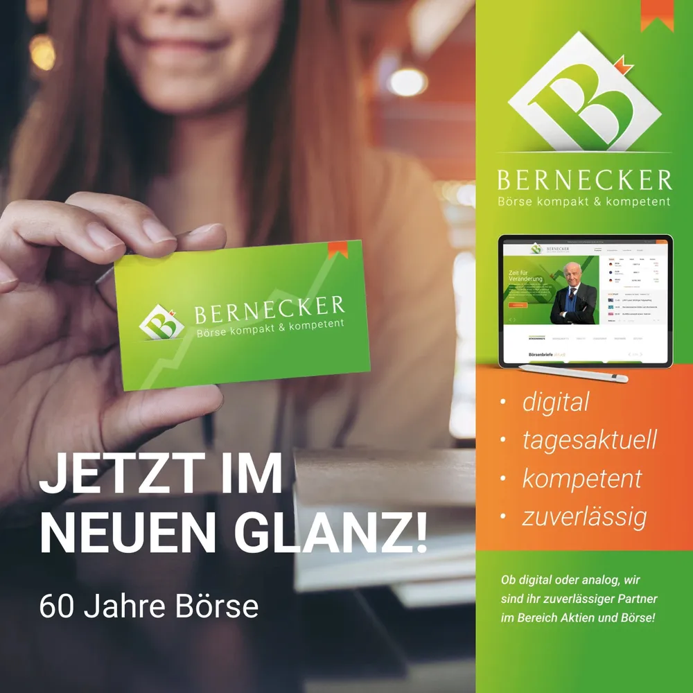
Green with an orange shout
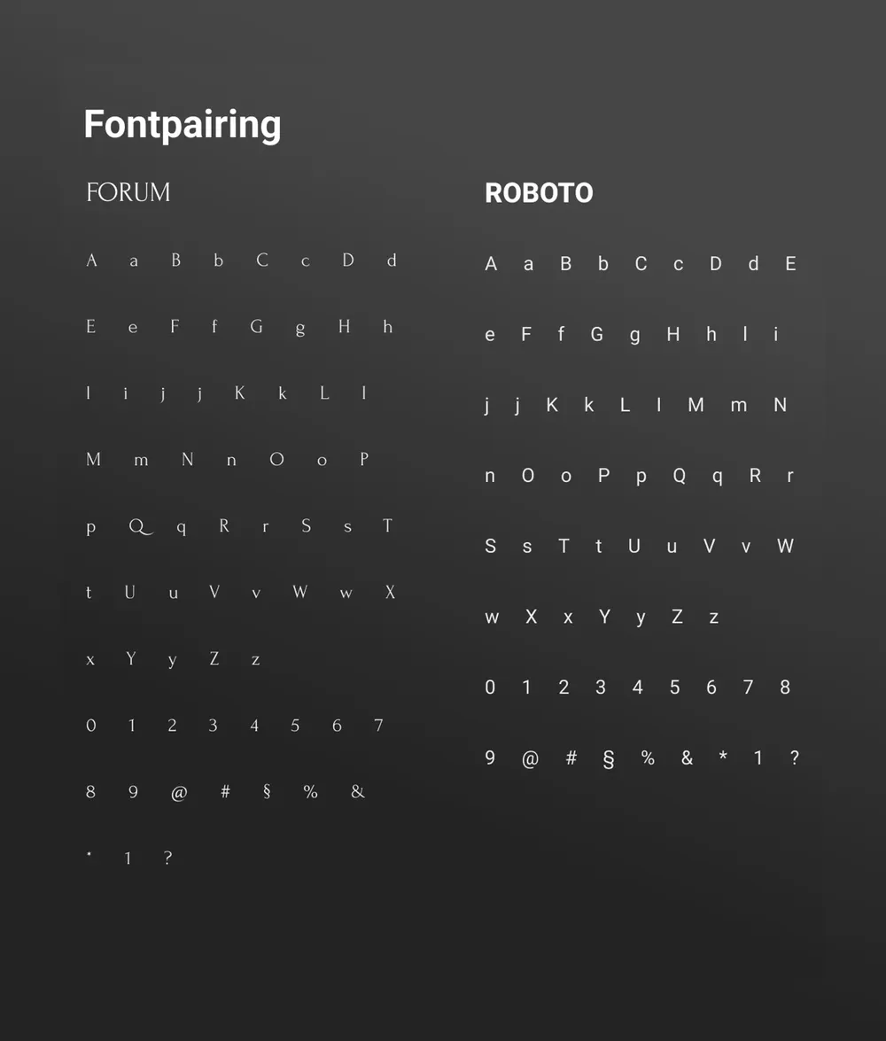
Custom signs for tight space

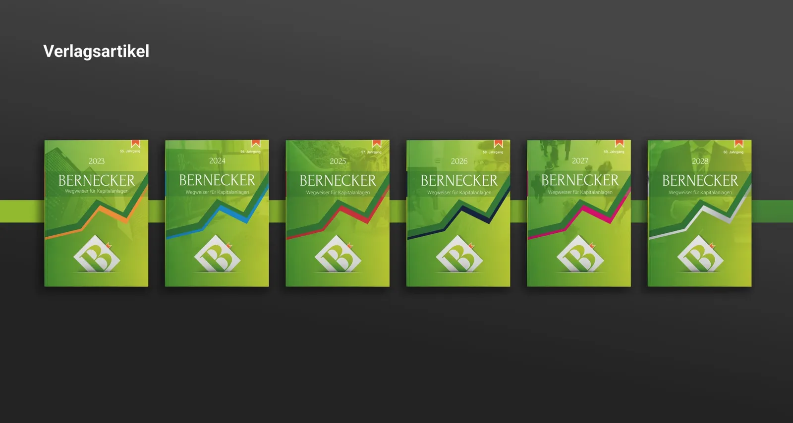
One Wegweiser per year
Every face at the same quality

The pivotal point remains the digital
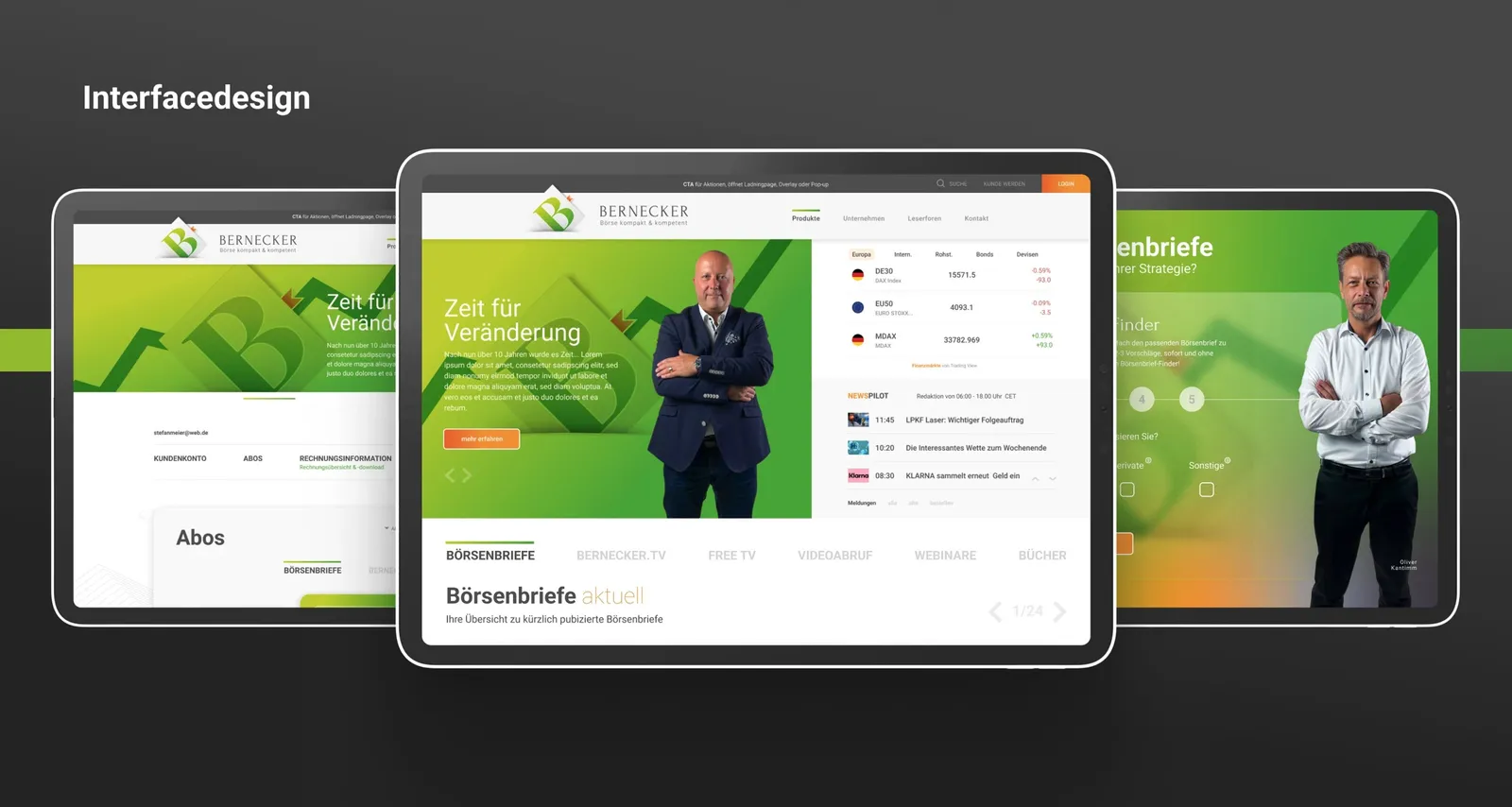
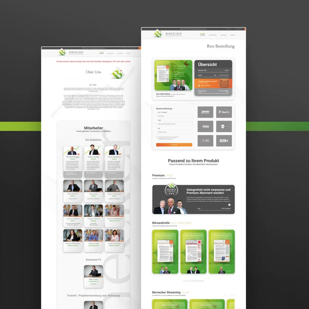
Clear boundaries, clear paths
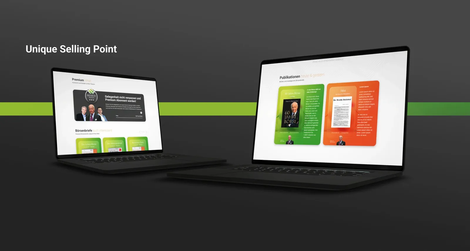
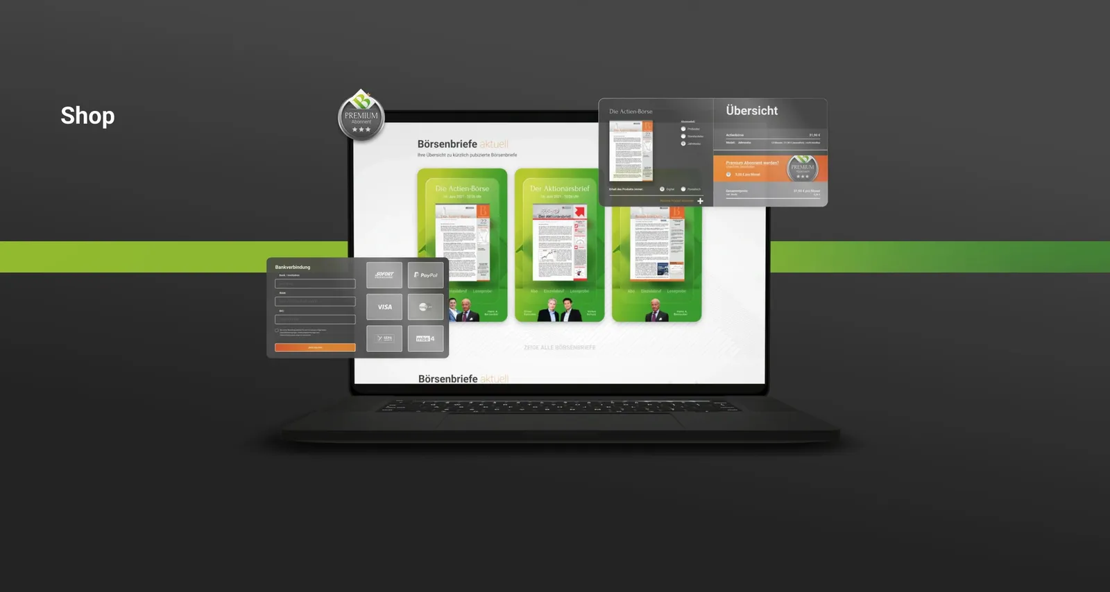
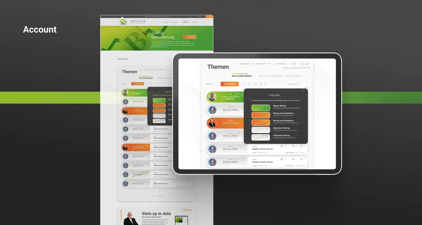
Shop, media library, account, forum
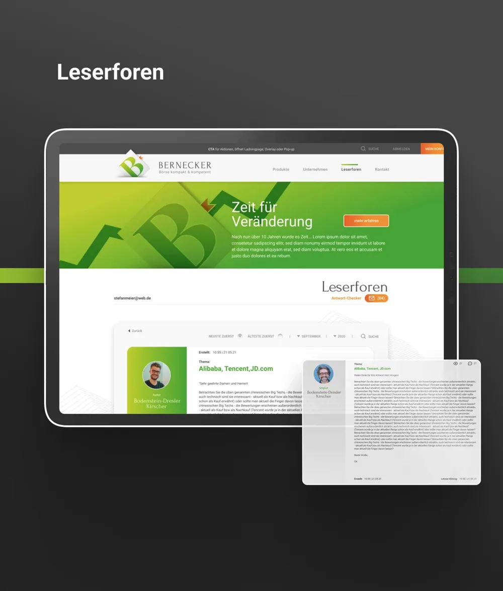
The forum knows its people
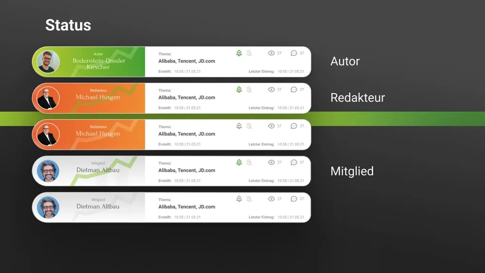
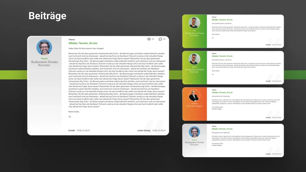
From the account to the partner presence
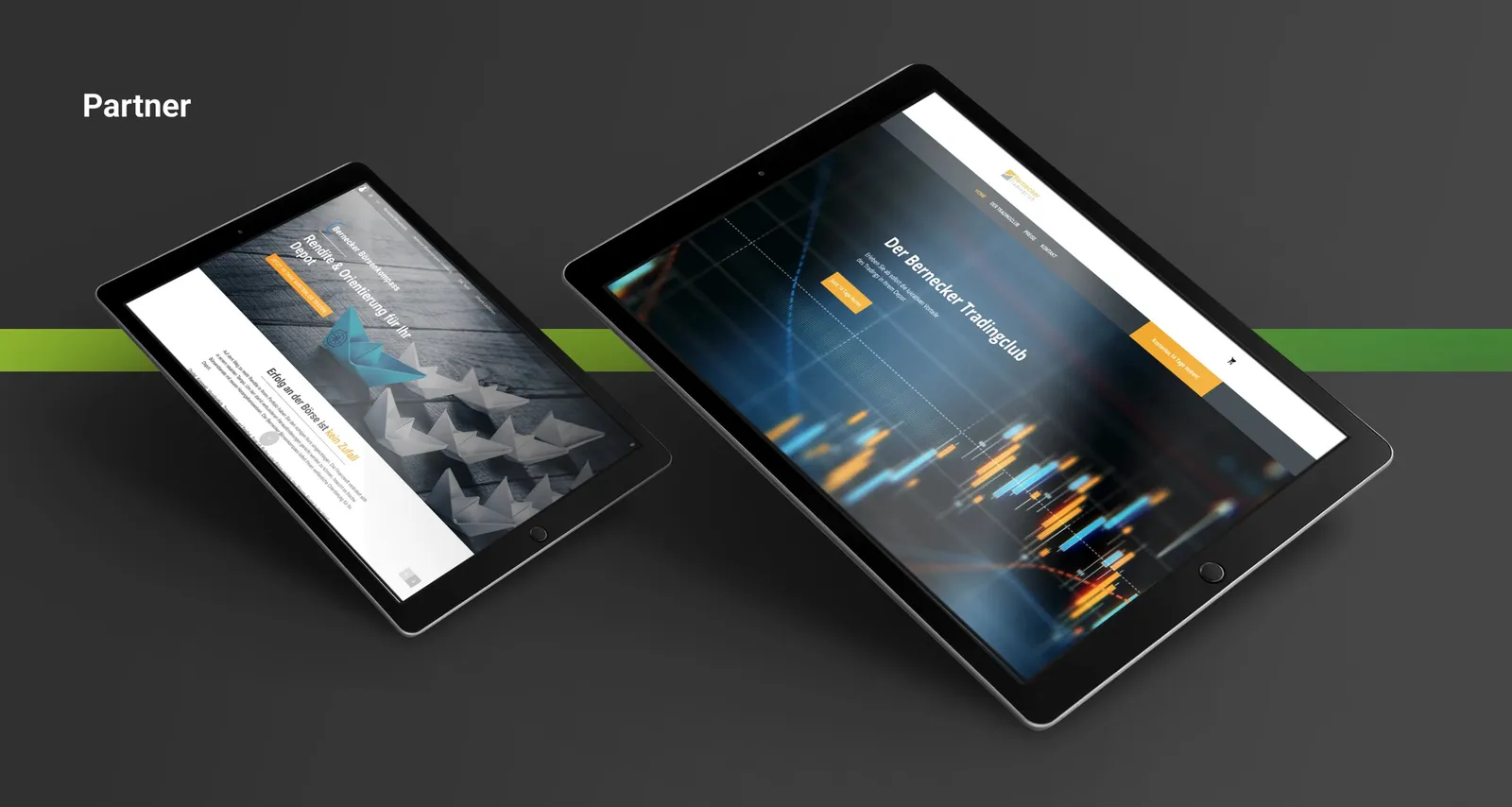
Being bold pays off
Keep developing instead of standing still
The Bernecker project was a very special challenge for us and at the same time a celebration in its result.
A complex subject with a high barrier to entry for newcomers, combined with the great figurehead Hans A. Bernecker in the encrusted coat of days gone by. It is understandable why a brand might shy away from wanting to change a system that works as it is. Even so, the ladies and gentlemen of Bernecker GmbH were far-sighted enough to recognize that this state of affairs would not hold forever. In a world where neobrokers are springing up everywhere and interest in the stock market and shares is growing, you cannot look to the future and rely on aging long-standing customers alone. You have to step boldly into the future to open up new markets.
Bernecker now shines in a new, function-oriented brand identity with a strong focus on UI and UX design, combined with a smart communication concept for selling their products. This work had to keep many different media, age groups and levels of knowledge in mind at once in order to achieve a coherent, working result.
With their new brand identity, Bernecker no longer needs to shy away from any comparison, nor from any future option. The concept we developed can be carried flexibly and far into the future, and comes with communication tools that can be relied on for a long time.
- Client
- Bernecker GmbH
- Studio
- Creative Agency WAGEMUT
- Services
- Branding, Graphic Design, UI/UX Design, Web Design, Exhibition Design
- Industry
- Publishing, Education, Banking & Finance
Share our work


Education
FOX SUMMIT
Action-packed web design for a new audience: Fox Summit shows how digitally strong holiday camps can be today.

Banking & Finance
HR-Benefit
A logo like a QR code, an icon system for every service and a website that speaks to employers and employees alike.
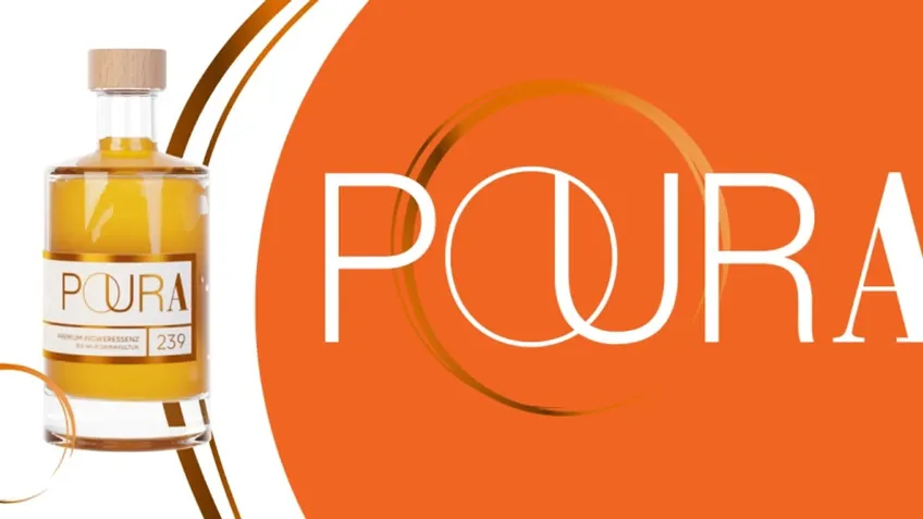
Food & Beverage
Poura
A 3D-animated bottle accompanies visitors across the whole page: website and moving image for the premium ginger essence Poura — with an Awwwards Honorable Mention.