Skip to content

Case Study

A hero for a dry business

Stöhr Faktor — brand relaunch and website for the procurement consultancy

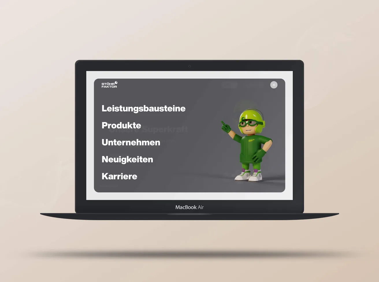
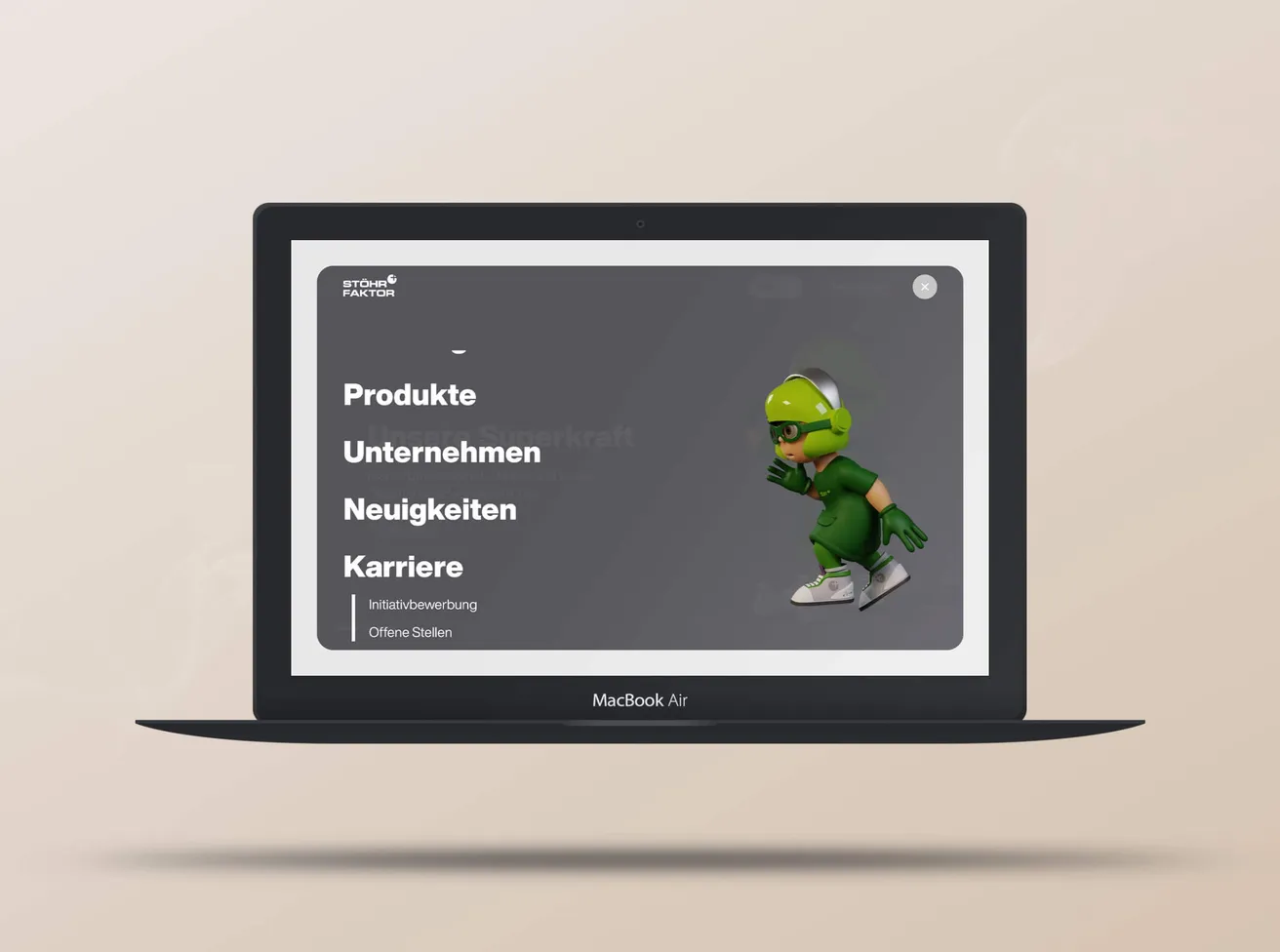
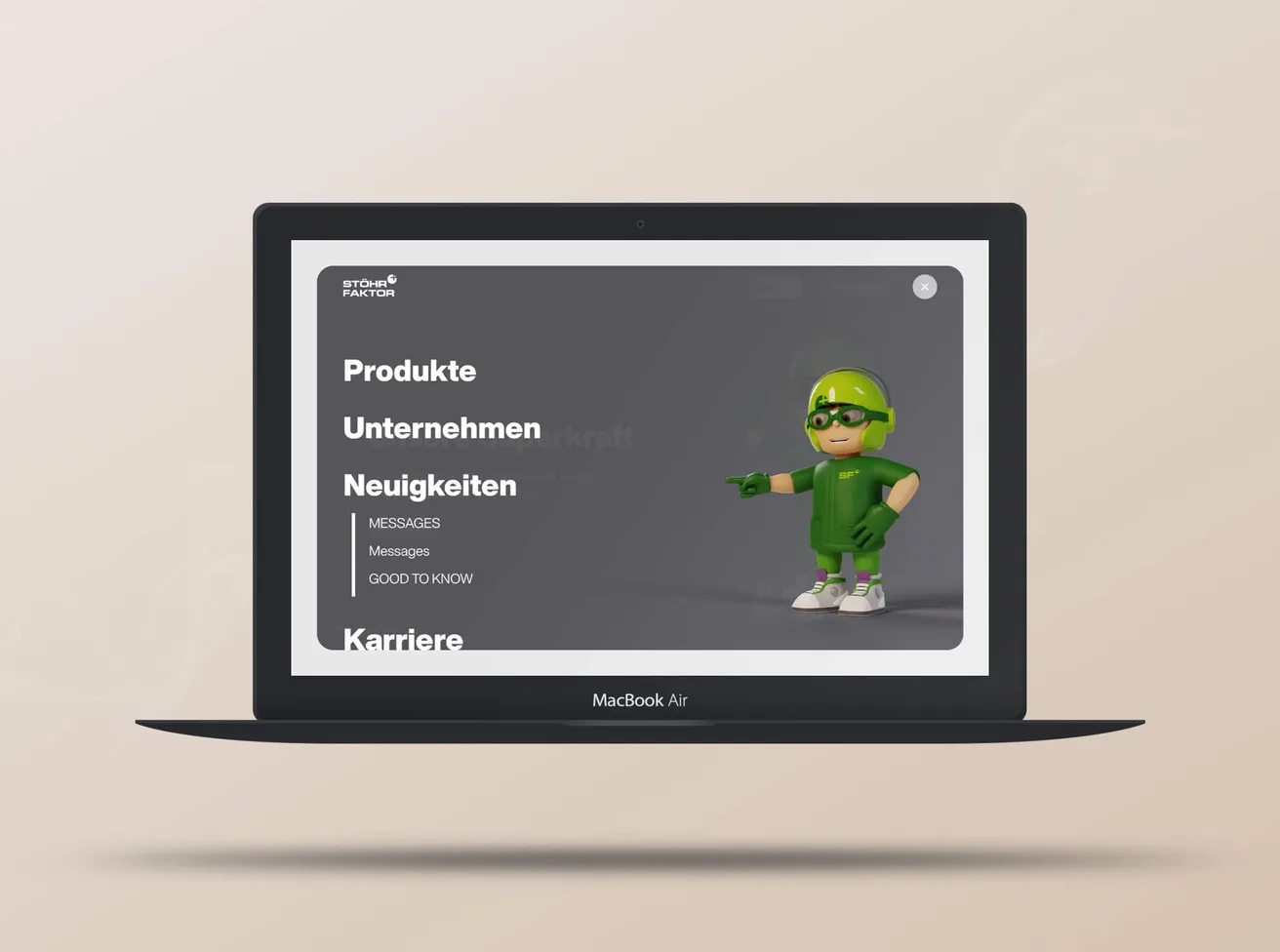
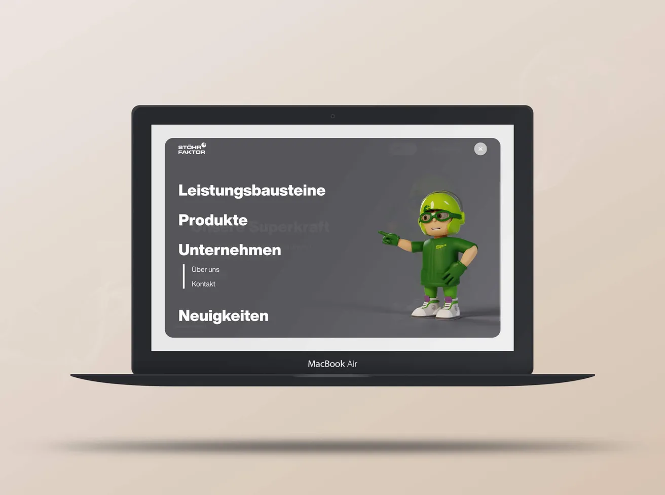
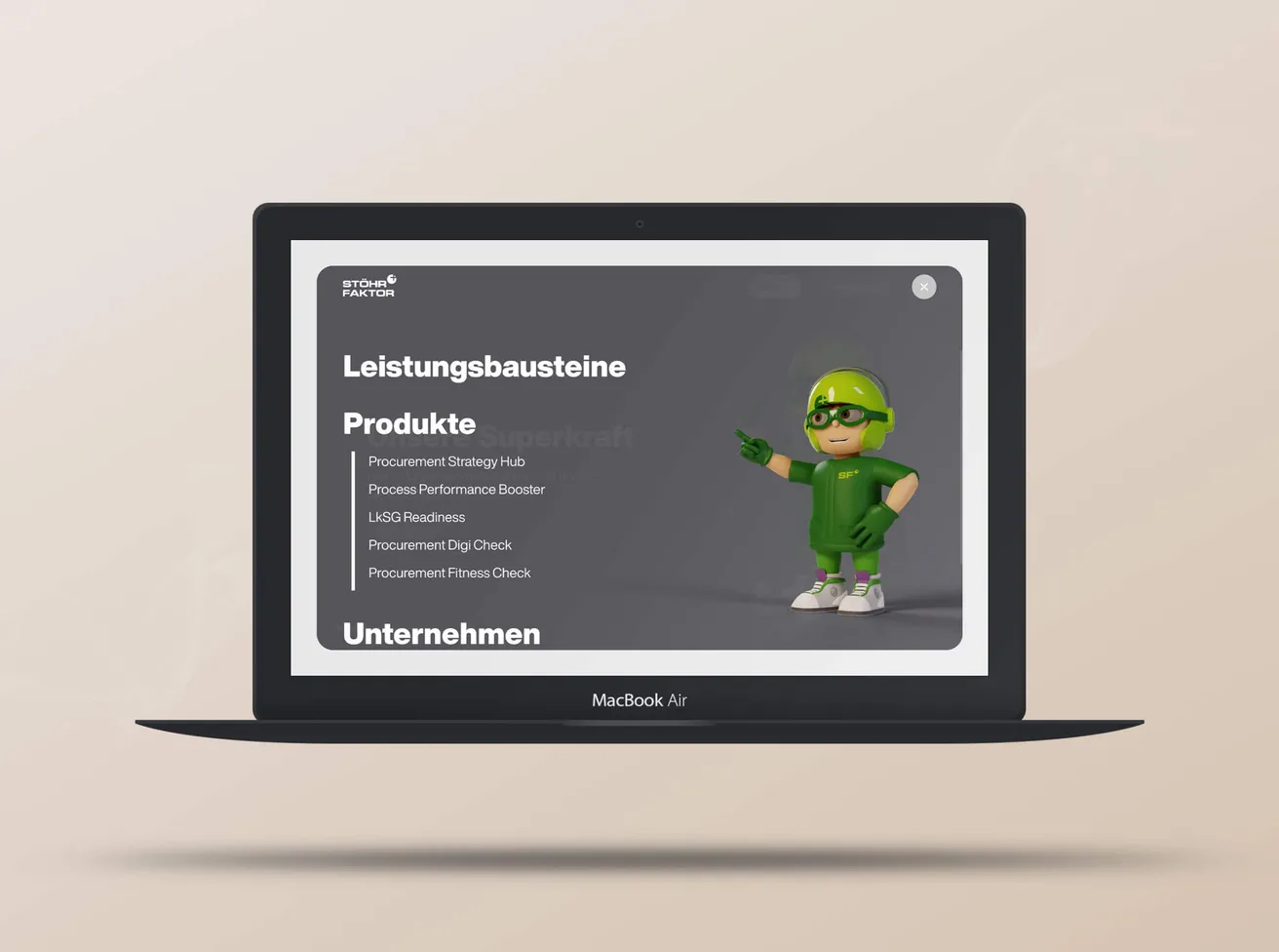
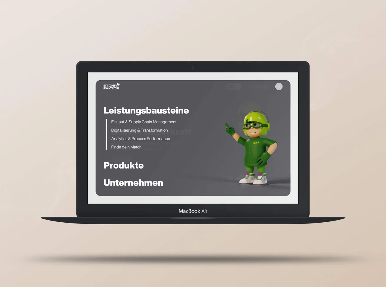
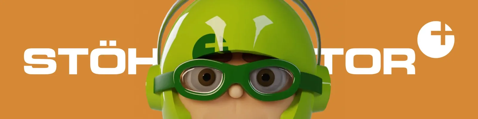
Procurement is a dry business — so we gave Stöhr Faktor a hero. Mio is 3D character, signpost and trademark all at once: he guides you through the menu and the site, poses in campaigns and turns a consultancy presence into something you recognize. Plus a color scheme that turns from restrained to loud at the click of a button.
  • Technology
  • Professional Services
  • Branding
  • Graphic Design
  • UI/UX Design
  • Web Design
  • 3D Visualization
The 3D character Mio in a green helmet peers out from behind the “Stöhr Faktor” lettering

Restrained or loud, at the click of a button
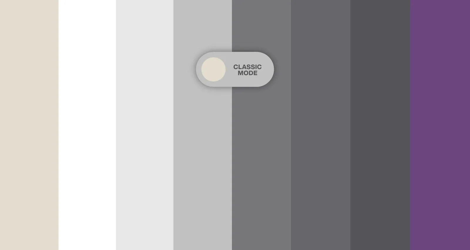
A “Classic Mode” switch flips the website’s color range from grey to violet
A flexible color scheme: one click turns the whole character of the website from “restrained” to “Bam, here we are!”. This unusual bit of personalization mirrors how adaptable the company is.

3D meets flat meets photography

The “Stöhr Faktor” wordmark in white on a violet background
The lettering “MIO” with a painted arrow, on blue
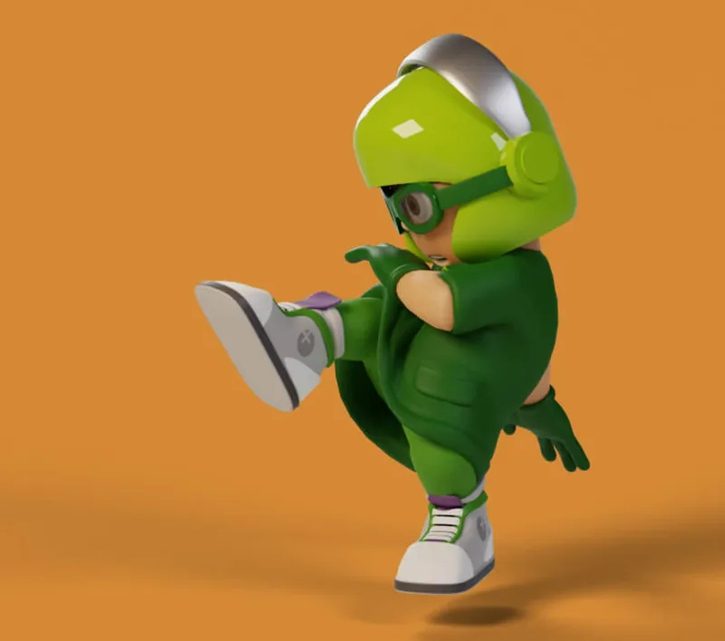
Mio in a lunge, seen from the side, on orange
A laughing woman in a yellow shirt high-fives, cut out on rust red
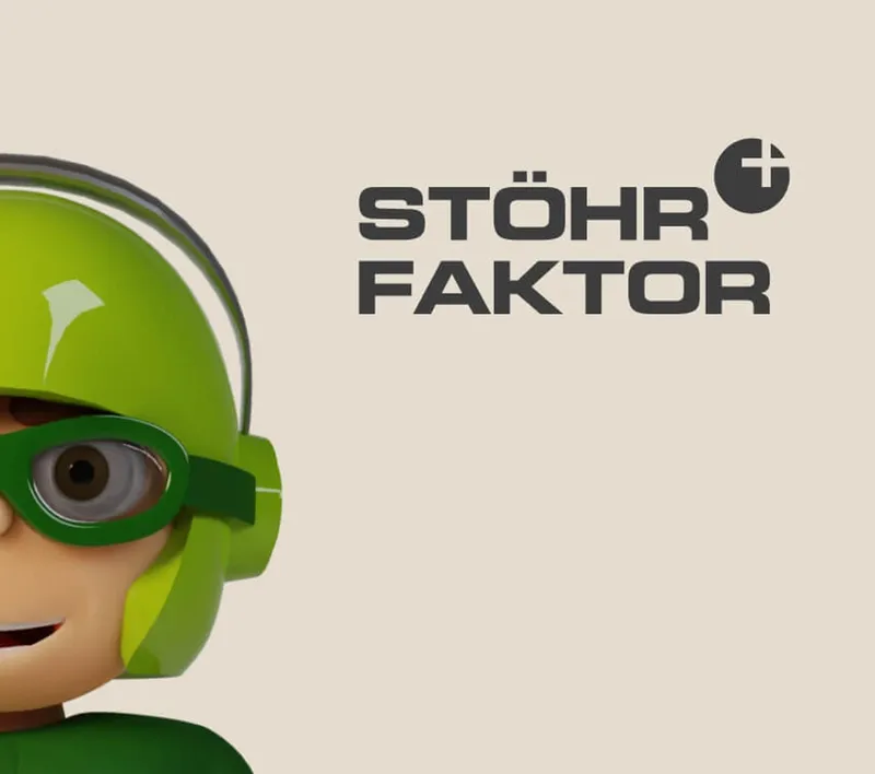
Mio’s face at the left edge of the image, the wordmark next to it on cream
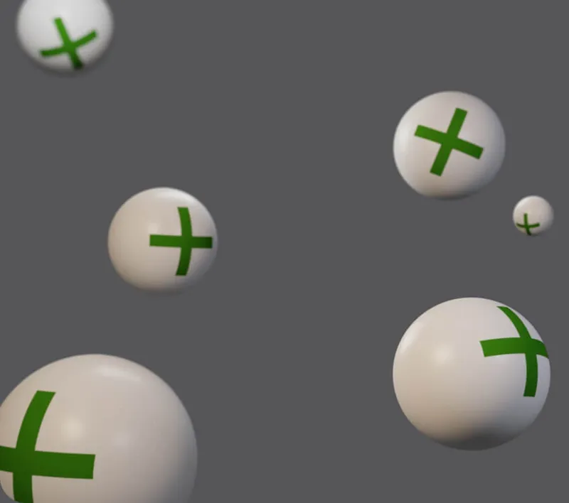
White spheres with a green plus sign floating on a grey background
3D meets flat design meets real people. The design is a composition that lets all these graphic worlds collide and harmonize.

The AI set turned into a character
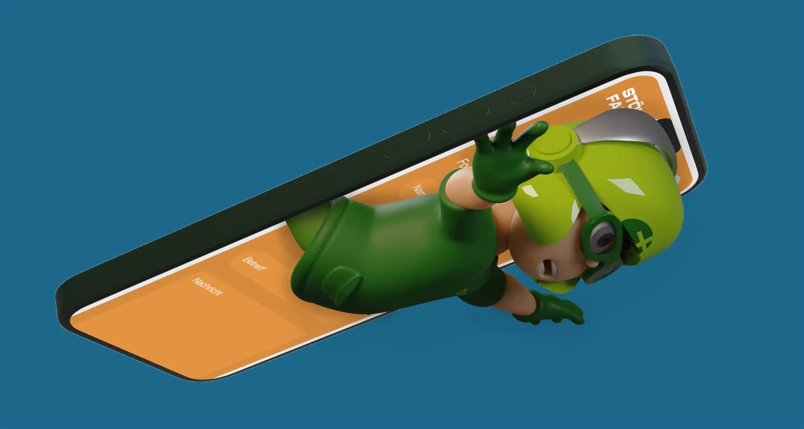
Mio emerges from a smartphone lying flat and waves, on a blue background
Aaaah! That is how quickly you slide from the original idea of “just an AI character set” into developing a full 3D character. Back then the AI could not keep up — we could!

The whole office watched

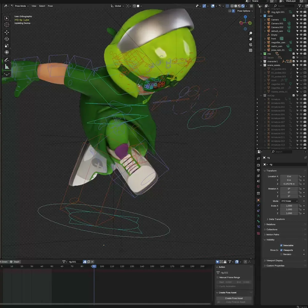
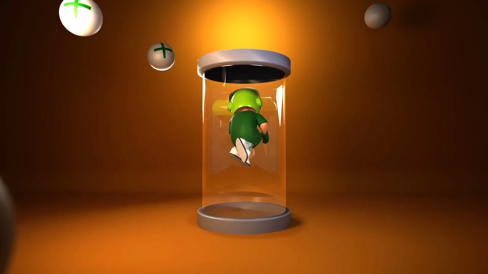
The modelling of the character in timelapse
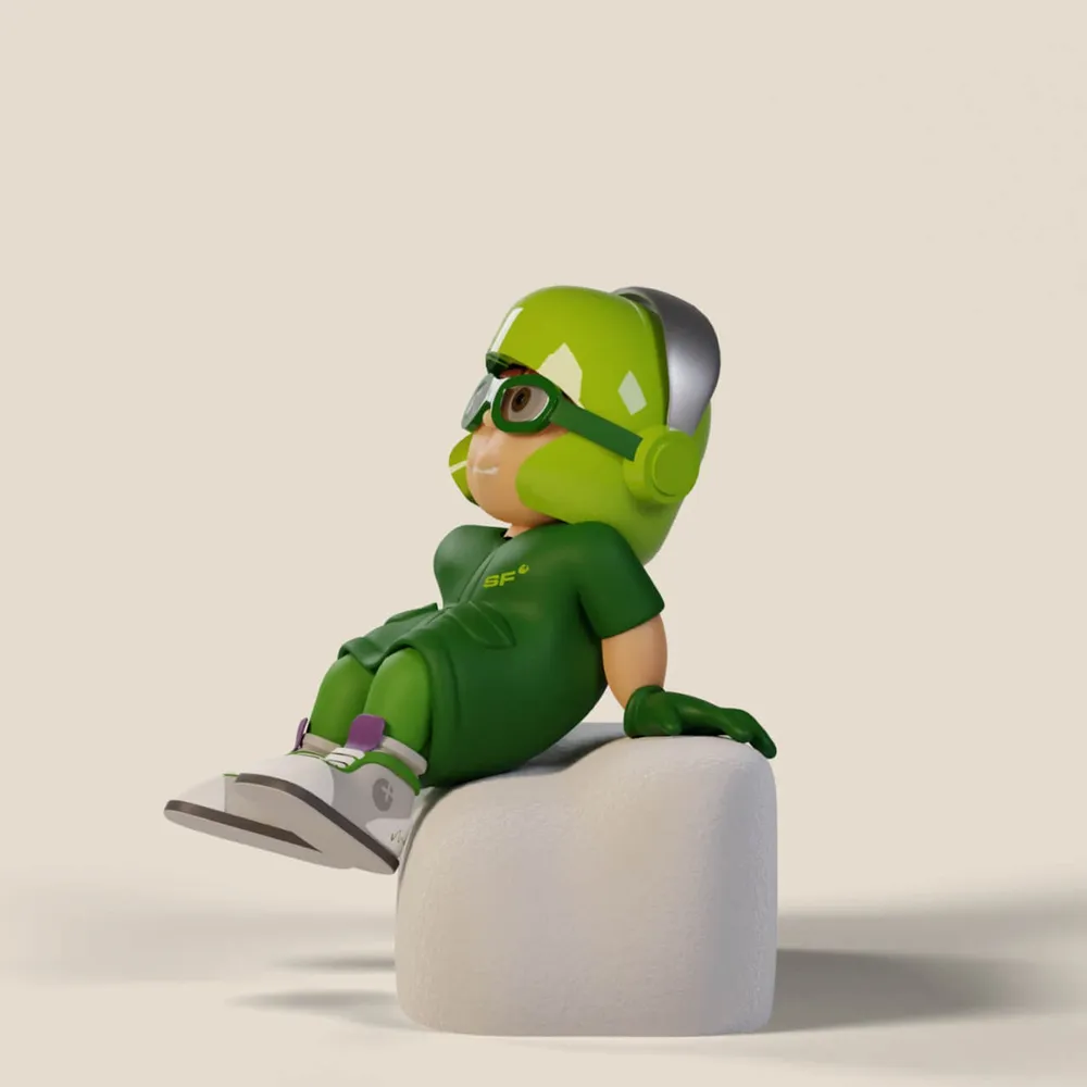
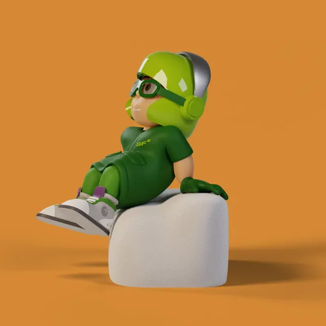
Mio sits on a white cube and looks up
Mio here on the right was not the only one watching closely: the whole office was on fire for the development of the little man with the big impact!

Mio becomes the face of the brand

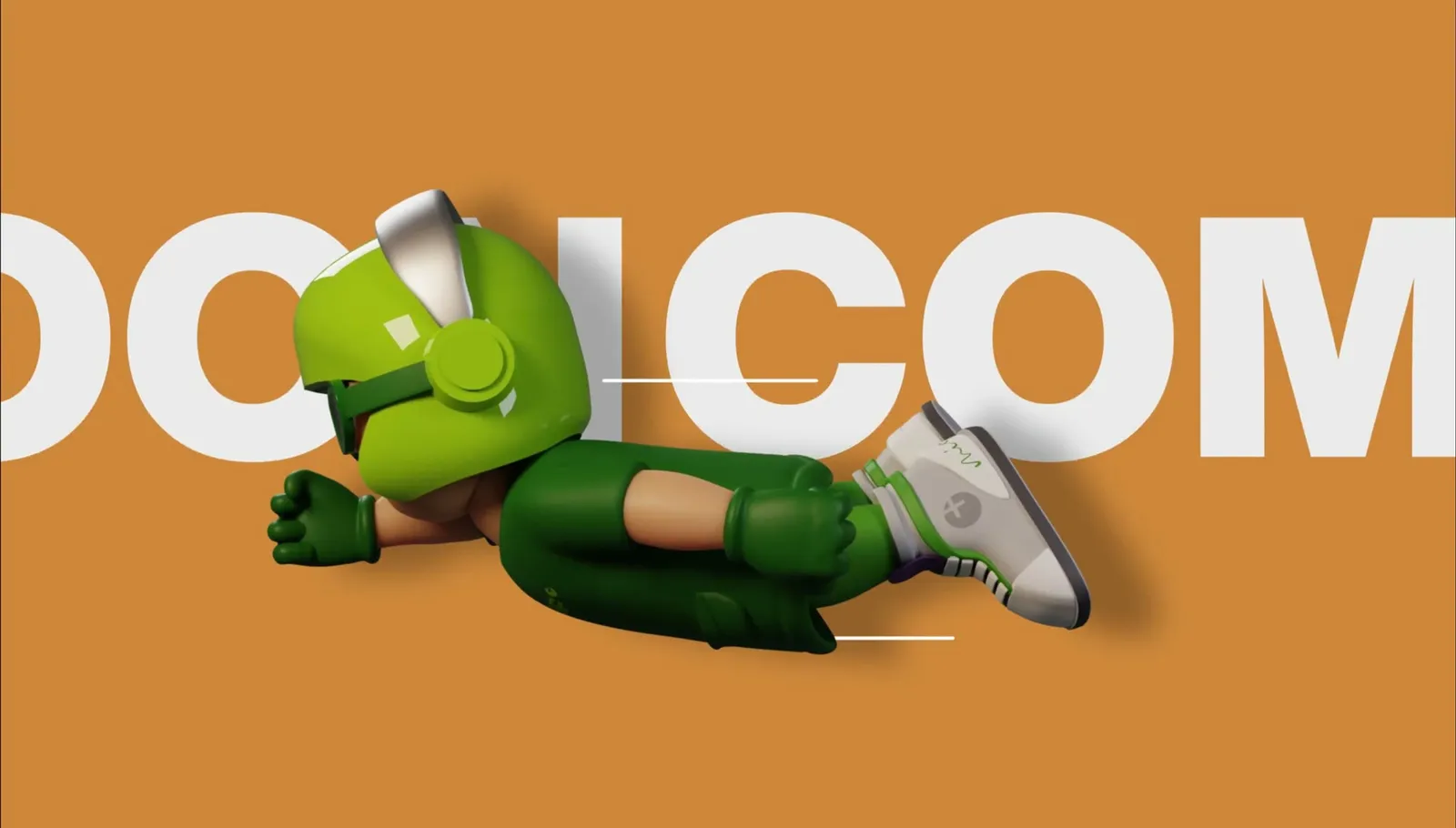
Mio lies in front of the words “Coming soon”, propping up his head
Mio is the new face of the newly built Stöhr Faktor brand and the core element of the branding. Ahead of the launch of the new website, Mio was put to work as a teaser right away.

And then he starts to run

Mio in motion: an animated sequence through several poses
The “Bam, here we are!” effect mentioned with the colors takes on a whole new depth once you make the most of Mio’s endless potential and put him in motion. A 3D character offers more options than a few static poses!

Every pose is his
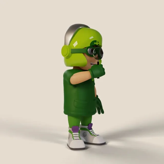
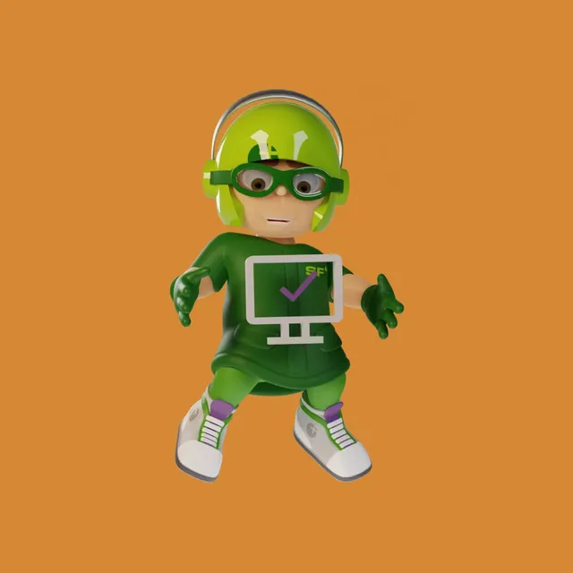
Mio holds a screen with a check mark in front of him, on orange
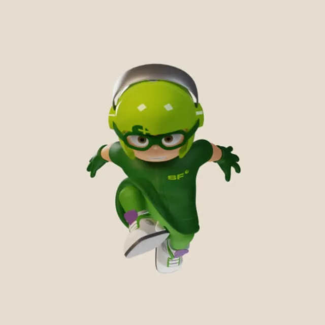
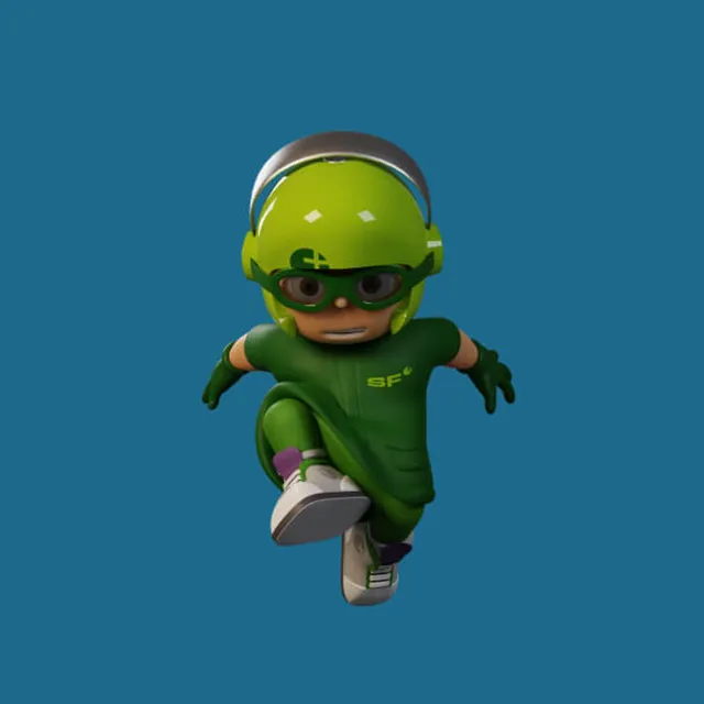
Mio walks straight towards the camera, on cream
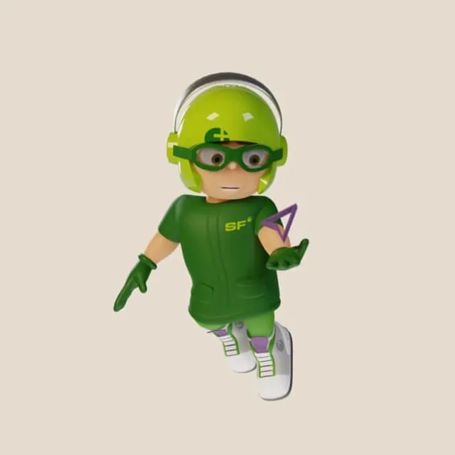
Mio holds a violet triangle in his hand
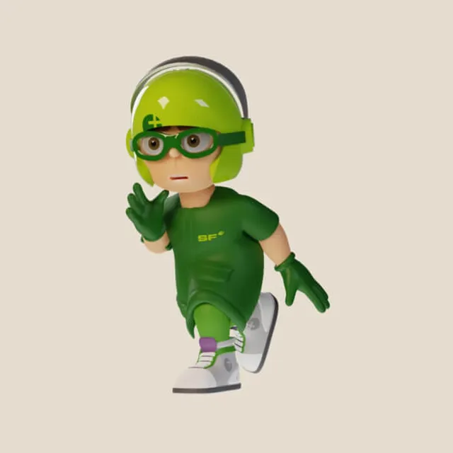
Mio raises his hand in greeting as he walks forward
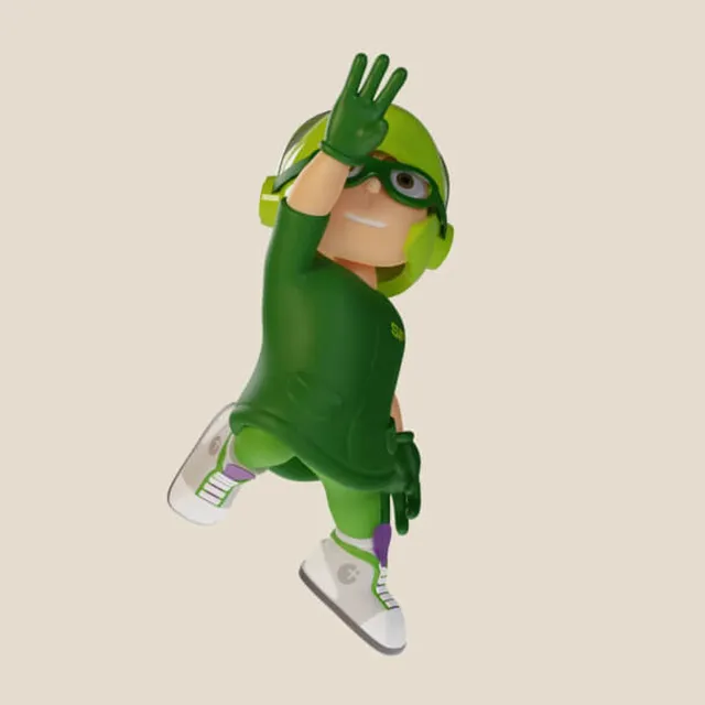
Mio salutes mid-jump, seen from above at an angle
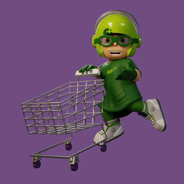
Mio pushes a shopping cart, on a violet background
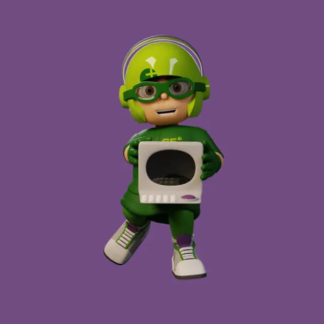
Mio holds an old CRT monitor in front of his belly
Mio sits on a white cube and looks up, on orange
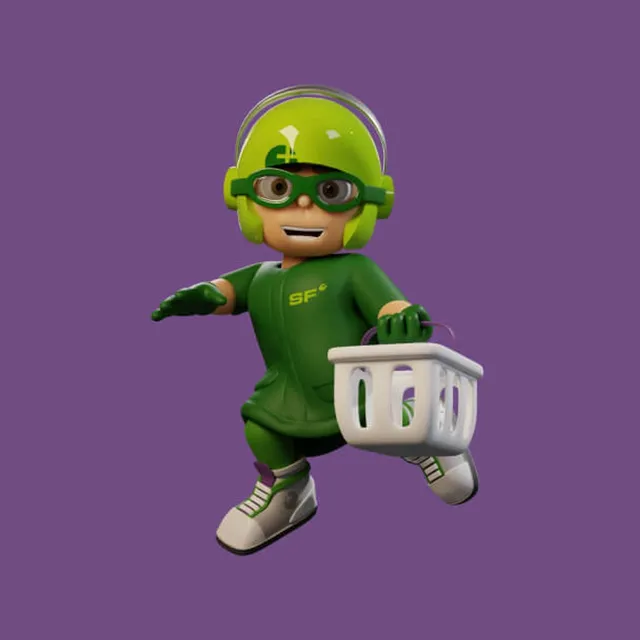
Mio carries a shopping basket and stretches out his arm
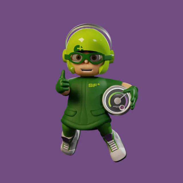
Mio gives a thumbs up and holds a tachograph disc
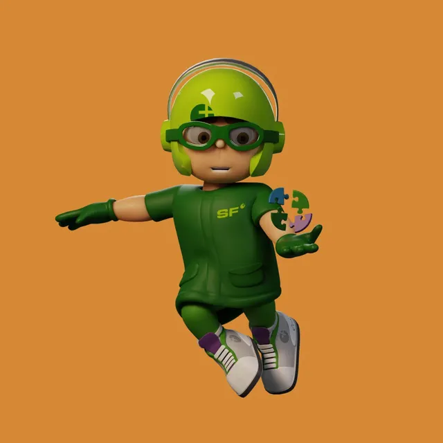
Mio balances a puzzle piece on his palm, on orange
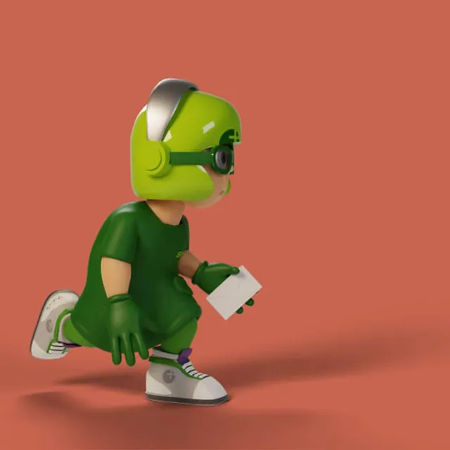
Mio walks hunched over carrying a letter, on rust red
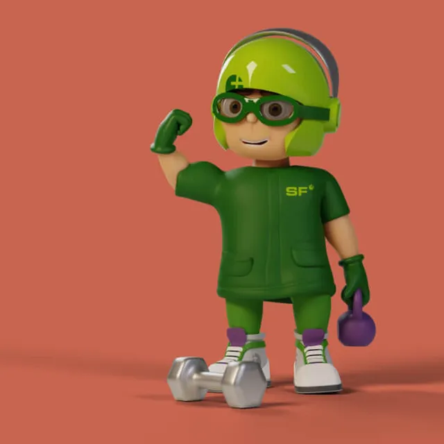
Mio flexes his biceps, a dumbbell and a kettlebell beside him
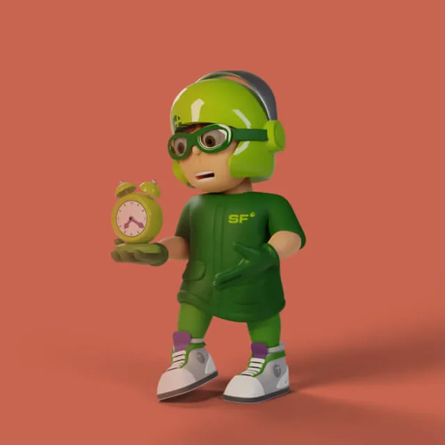
Mio holds a small alarm clock in his hand
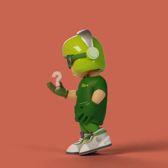
Mio looks at a question mark above his palm
Mio walks straight towards the camera, on blue
Mio raises his index finger, seen from behind
Mio balances a puzzle piece on his palm
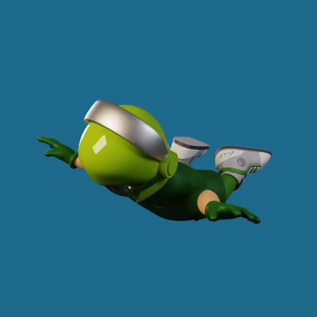
Mio flies horizontally through the frame, arms swept back
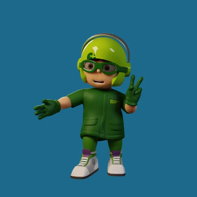
Mio makes the victory sign and stretches out his other arm
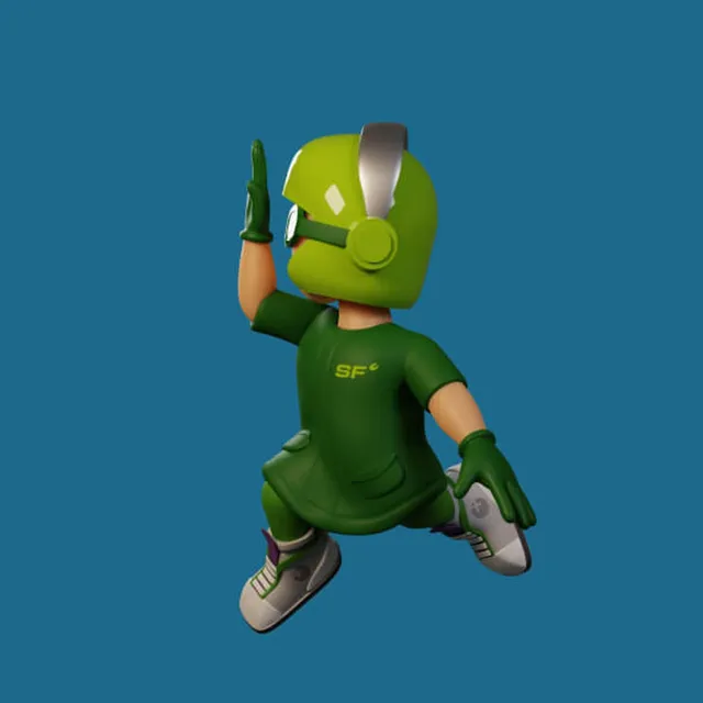
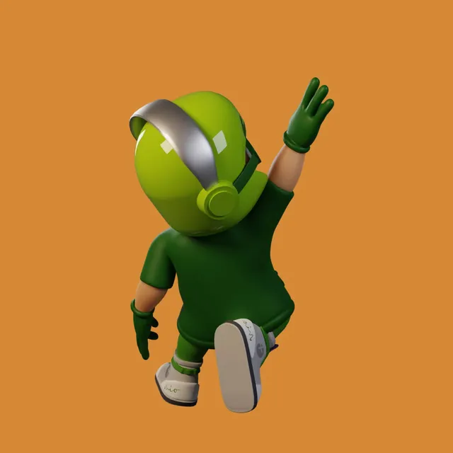
Mio from behind, his arm raised to wave, on orange
Mio puts two fingers in his mouth and whistles
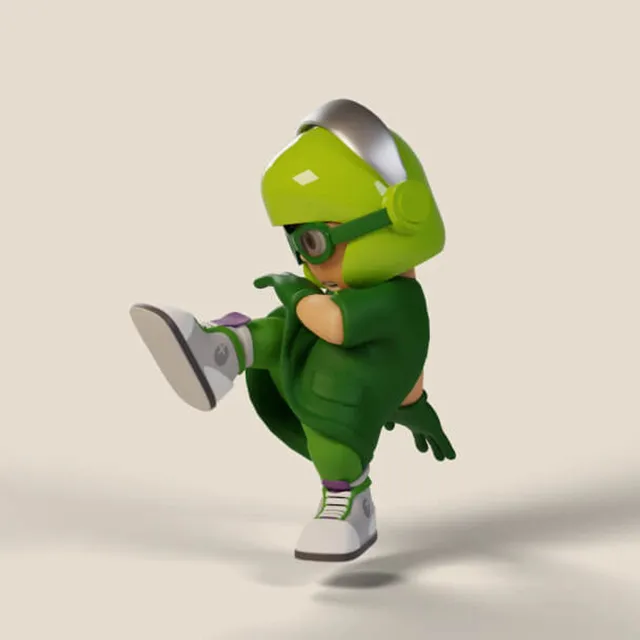
Mio in a lunge from the side, on cream
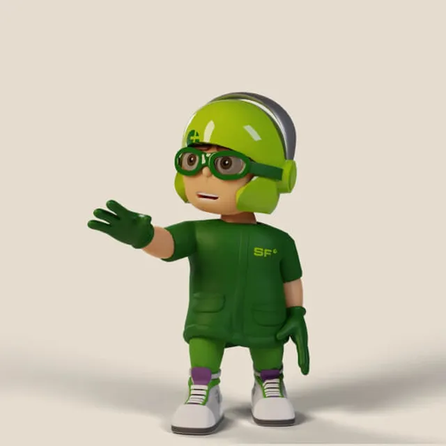
Mio holds out an open hand in greeting
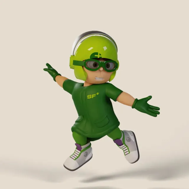
Mio jumps with his arms spread wide
The 3D model offers endless options for bending and pushing the character into a pose — and puts an end to hunting for stock material or painstakingly brushing new illustrations. #LongRunMoneySaver

Click, a new hero pose
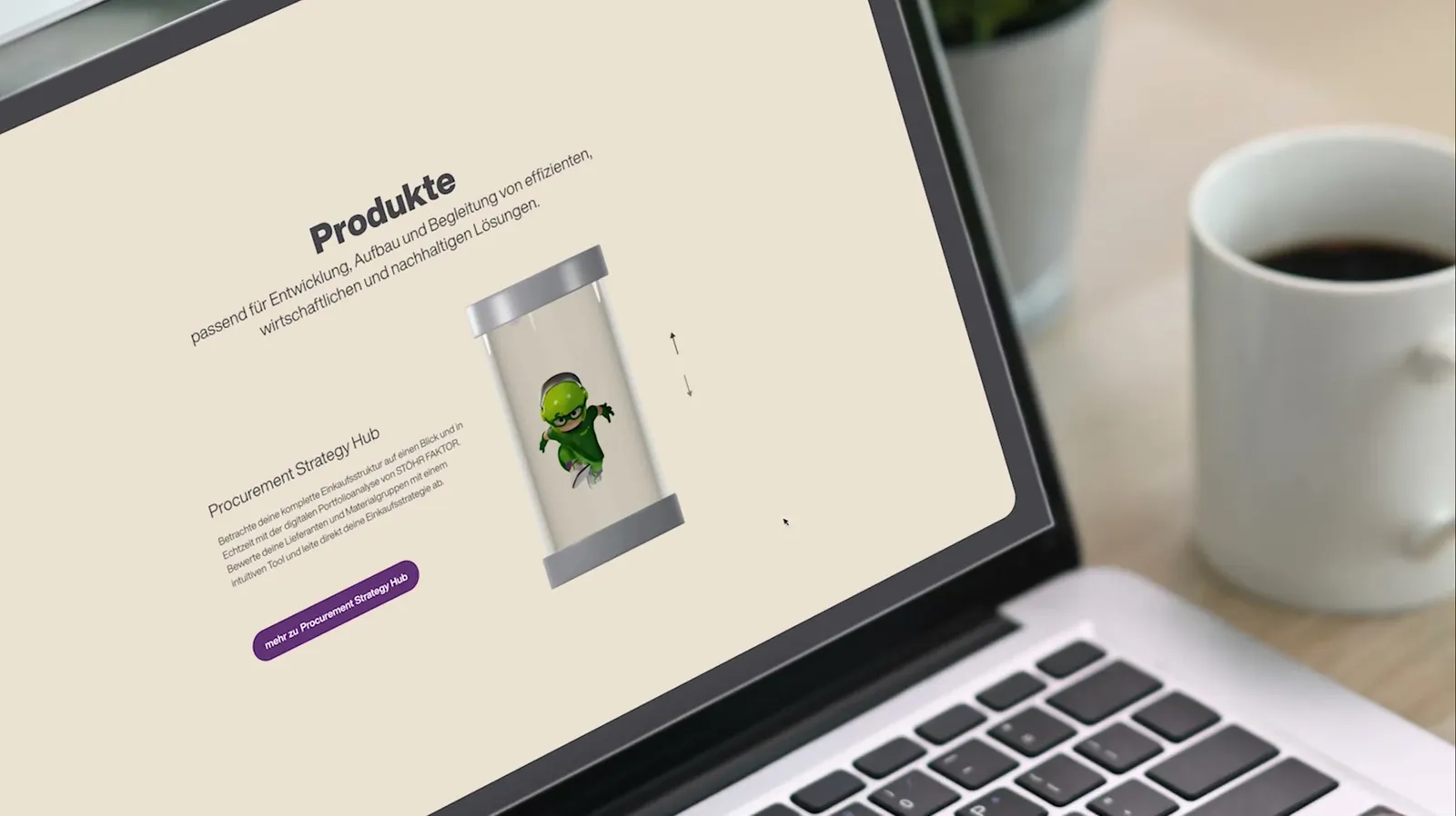
On the product page Mio switches to a new pose at the click of a button
Gamification is an obvious move too, as an impressive little plaything for the user. *Click* new hero pose *Click* and again...Like we said: ENDLESS POSSIBILITIES!

Did our work inspire you?

Tell us about your project, short and to the point. It makes no difference whether you bring a rough idea or a polished concept.

Mio makes the ask

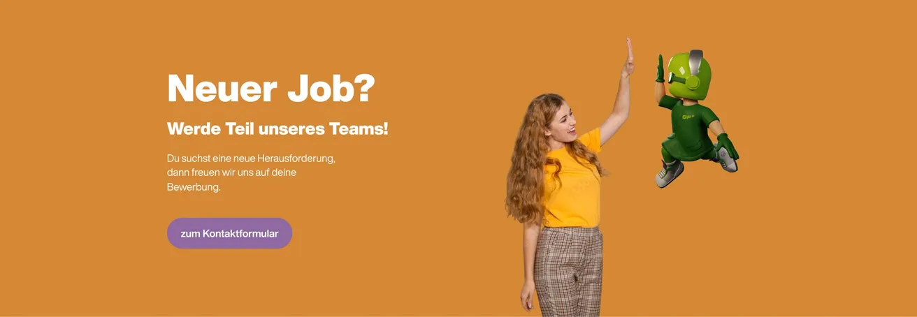
  • Banner reading “New job?” with a woman high-fiving Mio
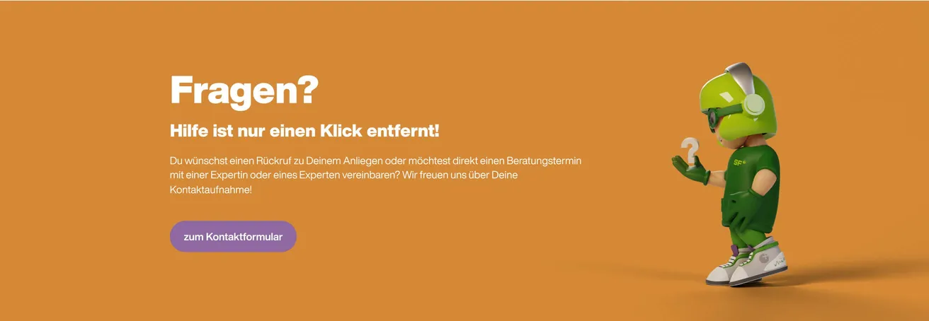
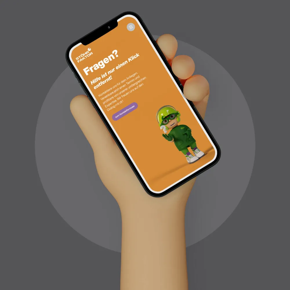
  • Banner reading “Questions? Help is only one click away!” with a quizzical Mio
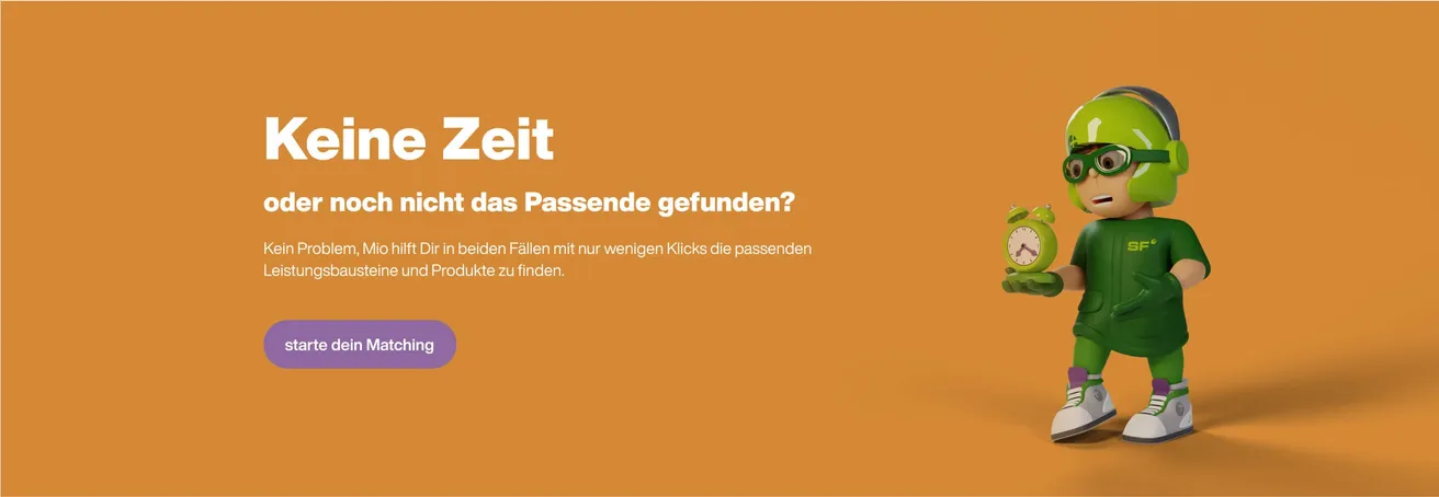
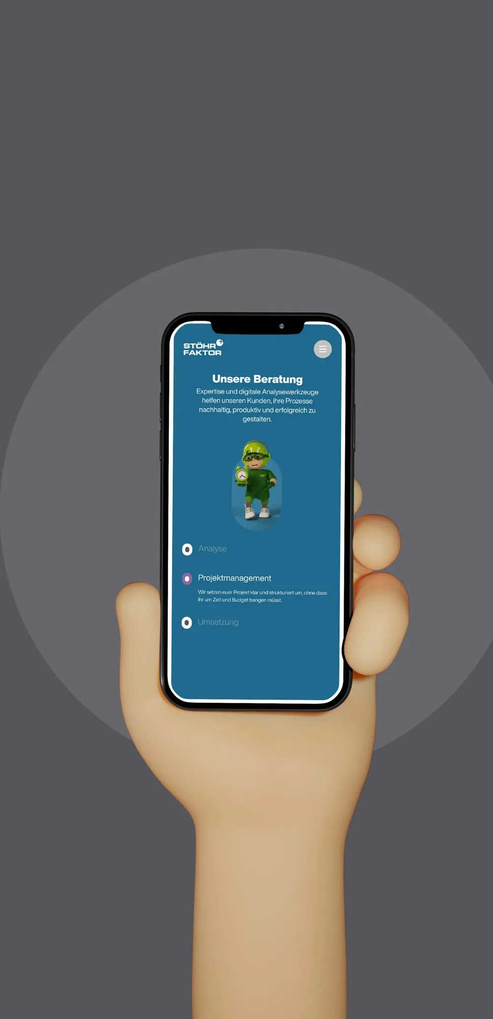
  • Banner reading “No time” with Mio presenting an alarm clock
Putting Mio’s superpower to targeted use makes CTAs a whole lot more likeable and convincing.

A place in the team

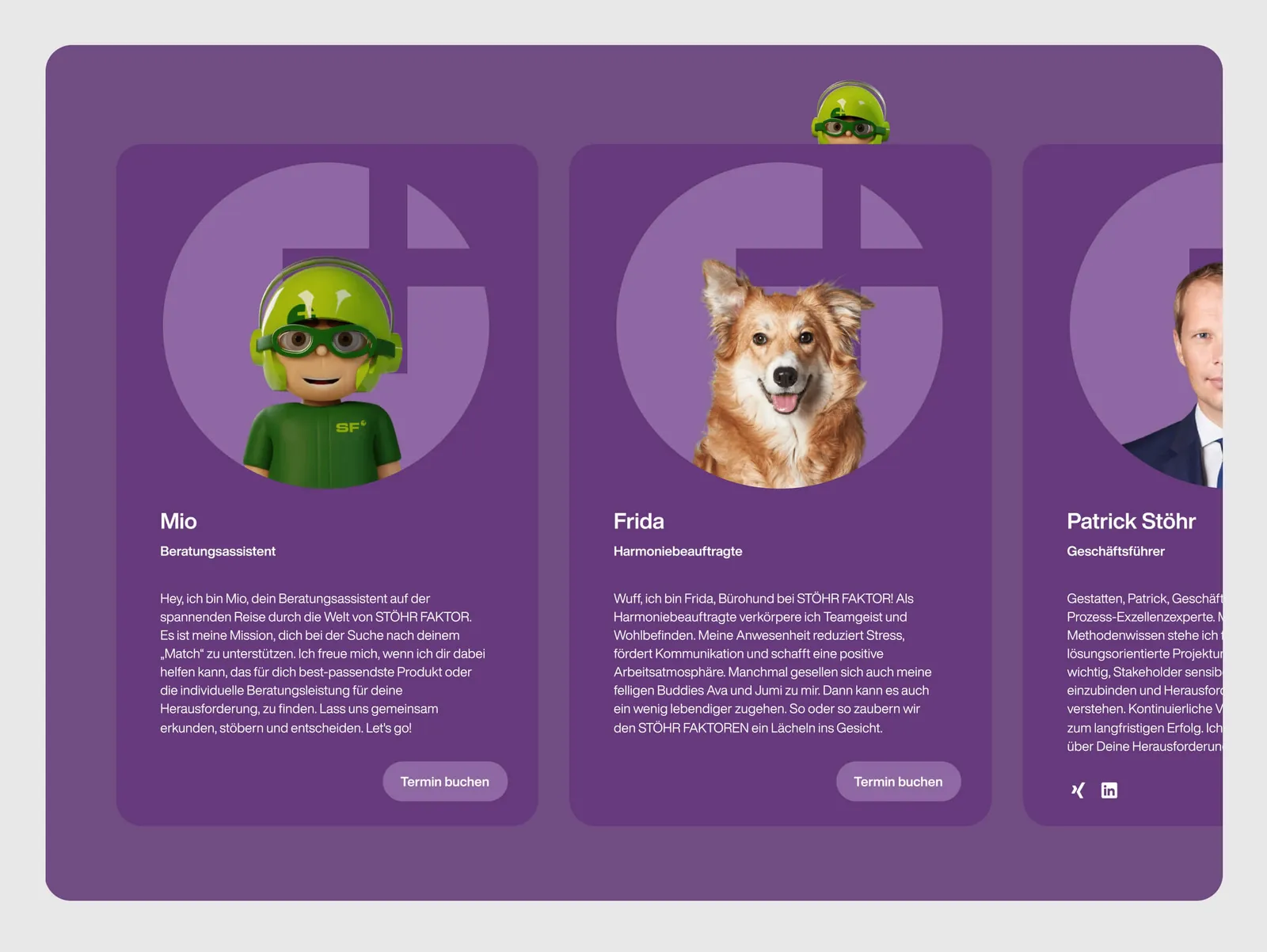
Team page with three cards: Mio as consulting assistant, Frida the dog and Patrick Stöhr
Just like Frida the dog, Mio is now a fully fledged member of the Stöhr family and has his place in the team introduction.

Down to the last animation

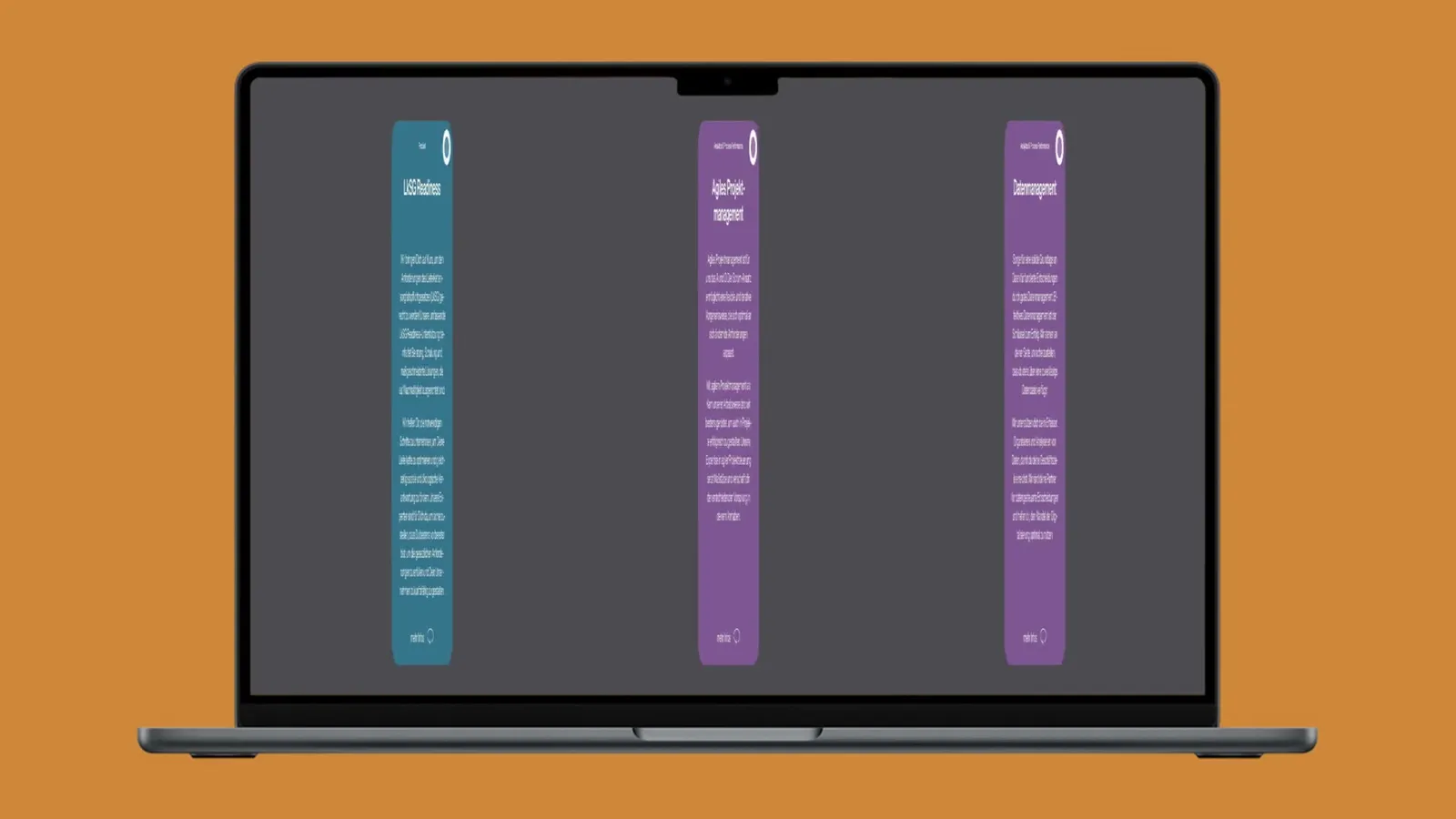
Three service cards on the website slide in one after the other
Mio is not everything, of course (even if he is genuinely cool). The whole website has a coherent, flowing design that is thought through down to the last small animation.

From serious to playful

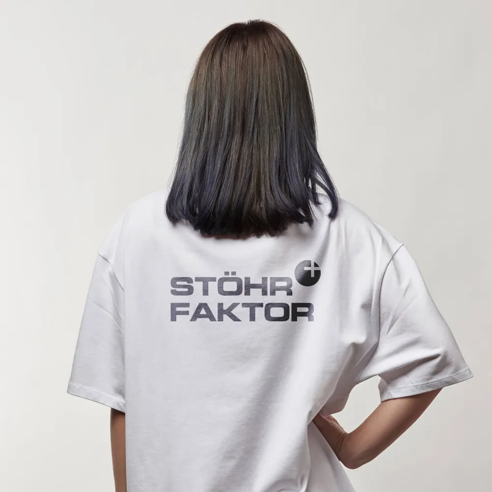
White T-shirt from behind with the wordmark on the back
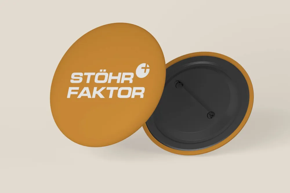
Two orange pin badges with the wordmark
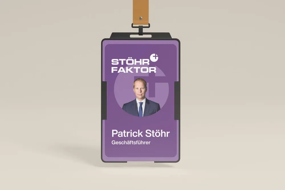
Employee ID card on a lanyard with a photo of Patrick Stöhr
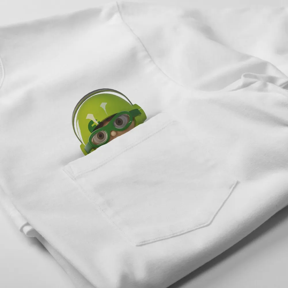
Mio peeks out of the breast pocket of a white T-shirt
We repeat: “Endless possibilities”. With the redesign, Stöhr Faktor and Wagemut discovered a whole new universe of applications. From serious and minimalist to playful.

An eye-catcher on mobile too

In a world where more than half of all users reach websites on mobile devices, a strong mobile presence is an absolute must-have. That is exactly what we watched out for in the Stöhr Faktor redesign: a lightning-fast, intuitive user experience – on smartphone or tablet alike. Because nobody likes waiting for a page to load, right?

But it is not only about performance. With Mio we created a 3D character that gives Stöhr Faktor a visual highlight which catches the eye instantly, wherever it shows up. On the website Mio delivers the wow effect and gives the brand’s presence that certain something which lifts it far out of the crowd.

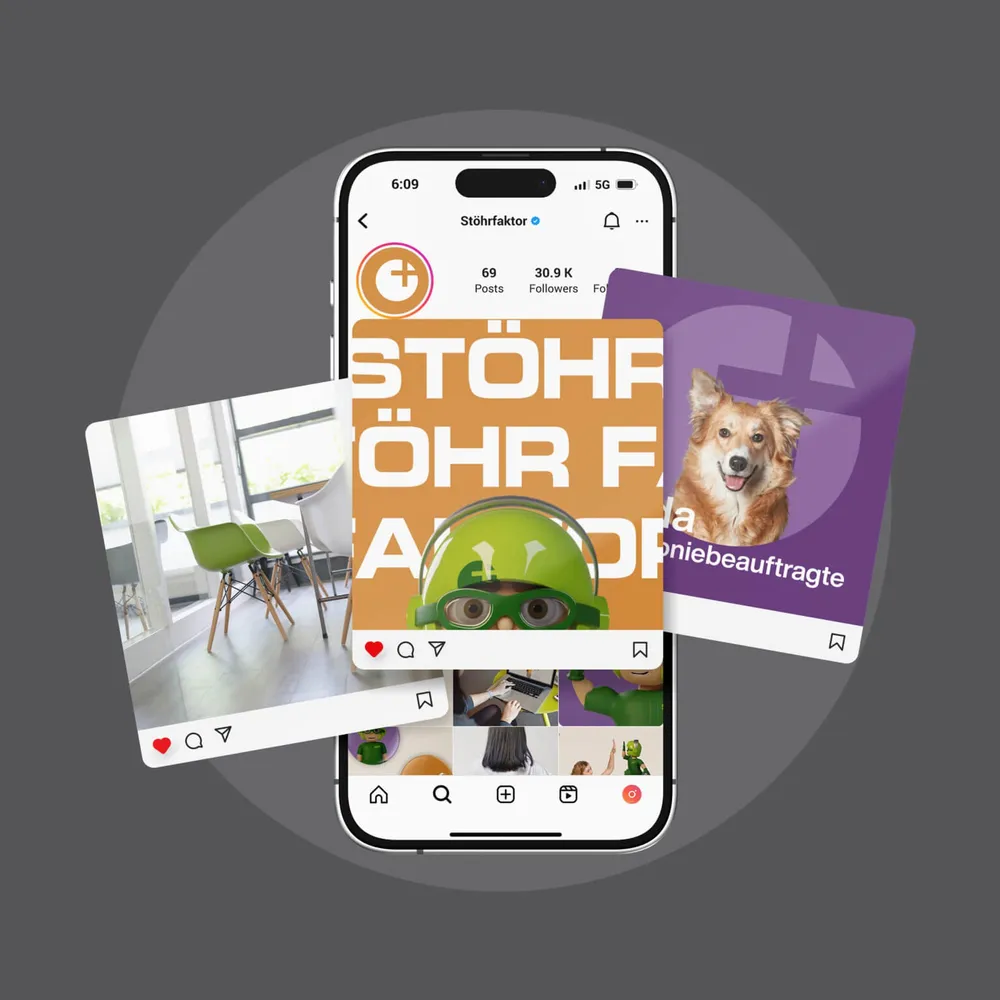
And last but not least, social media comes into play – Instagram in particular. Here Mio becomes the ultimate hero, drawing attention and inviting curious looks. His versatility makes him more than an eye-catcher – he is a visual unique selling point, made for creative campaigns.

Whether on the website or on social networks: Mio makes sure Stöhr Faktor is remembered.

Client
Stöhr Faktor
Studio
Creative Agency WAGEMUT
Services
Branding, Graphic Design, UI/UX Design, Web Design, 3D Visualization
Industry
Technology, Professional Services