Skip to content

Case Study

From invisible supplier to digital industry force

Bücker GmbH — software trading and IT licence consulting

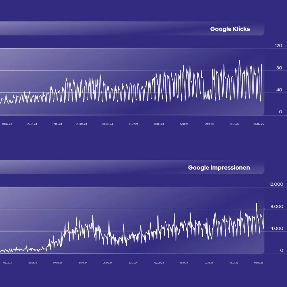
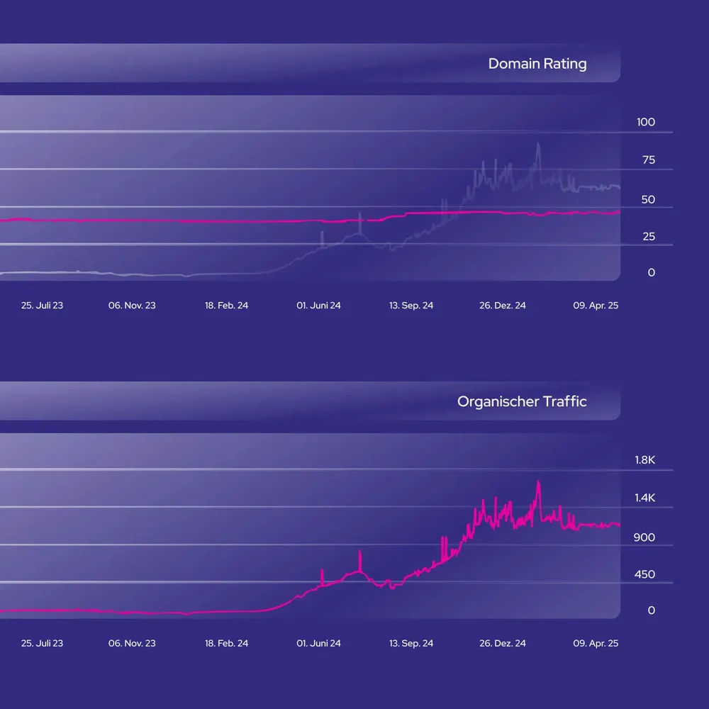
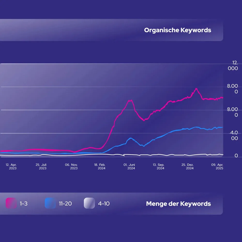
For Bücker GmbH, software trader and IBM partner, we rebuilt brand and website from the ground up — a logo with a pixel grid, a color code around a deep purple, and a shop-like system for more than 23,000 IBM licences. The result: from under 50 to more than 1,200 organic visitors a month, over 1,000 keywords in the top 100, without an advertising budget.

  • Technology
  • Branding
  • Graphic Design
  • UI/UX Design
  • Web Design
  • 3D Visualization
The Bücker logo over a photo of a consulting team at a desk

The introduction, AI-generated

AI-generated introduction: an older gentleman in a cap and glasses guides you through the Bücker brand
0:00 / 0:00
The website redesign for the software trader Bücker GmbH strengthened the company's digital presence. We developed a modern corporate design with a new logo and a clear structure to reflect their expertise better. (The protagonist and the animation are AI-generated and serve as an introduction to this case study.)

A B made of pixels

The final Bücker logo: a dark blue B with a grid of pink and blue squares, the BÜCKER wordmark below it, on white
The same logo in white on a purple background
The horizontal version: the mark on the left, the BÜCKER wordmark to its right, on white
The horizontal version in white on a purple background
The final brand in four applications: stacked and horizontal, on white and on the house purple. The grid in the bowl of the B picks up the tiles that run through the entire identity.

Many directions, one purple
Logo draft for Bücker: a check mark in a gradient circle above the BÜCKER wordmark and the line “Reliably digital, together”
Logo draft: the “Bücker” wordmark in soft pastel tones, every letter in a different color
Logo draft: BÜCKER with a green check mark replacing the umlaut dots
Logo draft: an angular B mark to the left of the BÜCKER wordmark
Logo draft: a composition of colored rectangles above the multicolored “Bücker” wordmark
Logo draft: a B constructed from lines with a yellow plus sign above the BÜCKER wordmark
Logo draft: a solid white B with blue squares in the cut-out
Logo draft: a B in a circle with a purple gradient
Logo draft: the B with a grid of pink and blue squares — the direction that became the final brand
Logo draft: the horizontal version with colored stripes next to the wordmark
The logo development for Bücker GmbH took many directions, but one thing stayed constant: the striking purple. This bold color gives the brand an unmistakable presence and reflects the company's strength and professionalism.

Two typefaces, alternating

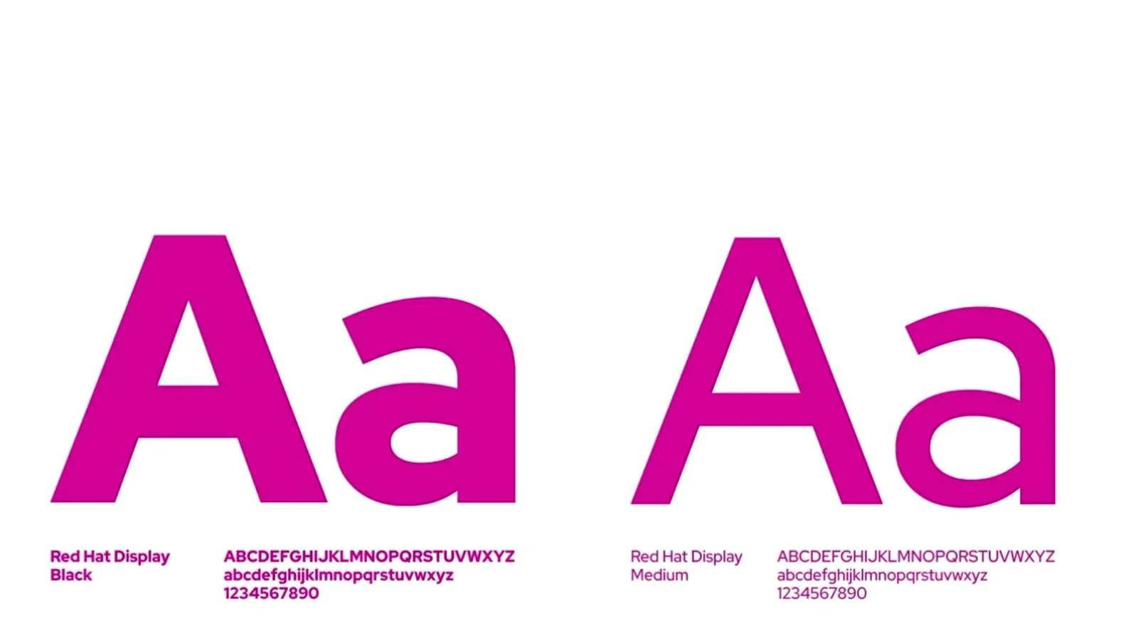
Animation in which the weights of the house typeface morph into one another
The sans serif brings clear structure and outstanding legibility. Its elegant rounded forms give the site a modern, unmistakable presence. PT Sans Regular takes over where Nunito has opened up the space — a dialogue of form and content, loud and quiet in turn.

Purple, pink, blue

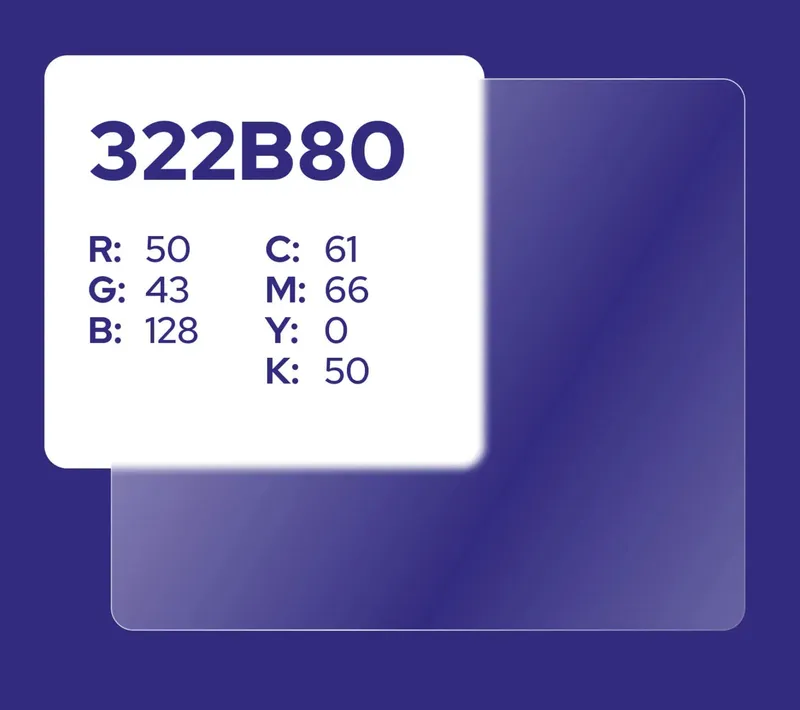
Color swatch of the house purple 322B80 with RGB and CMYK values
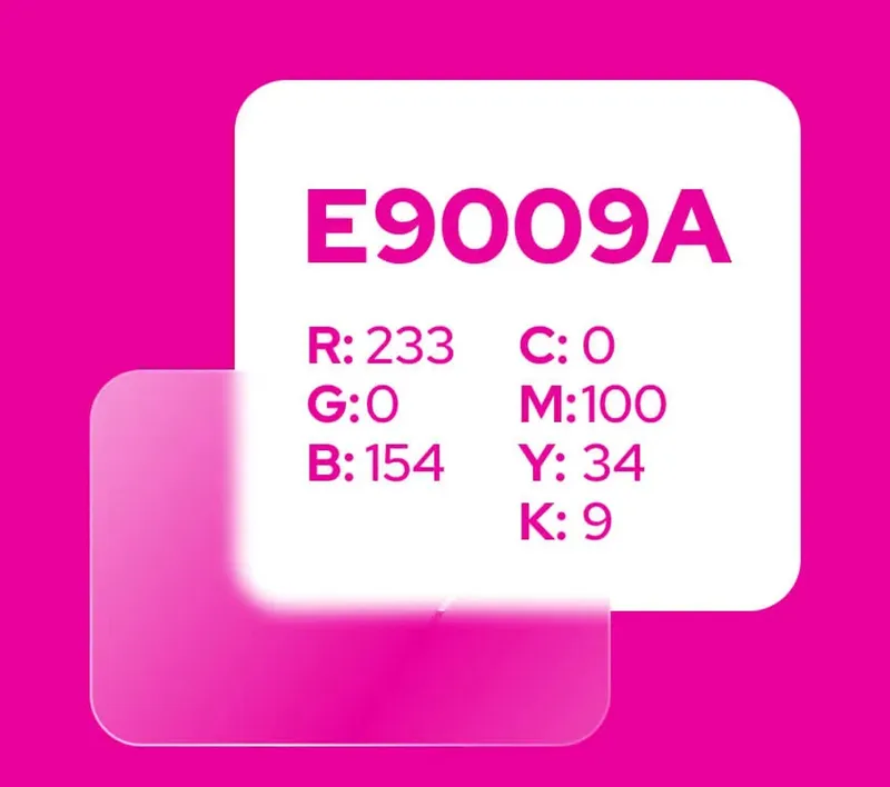
Color swatch of the accent pink E9009A with RGB and CMYK values
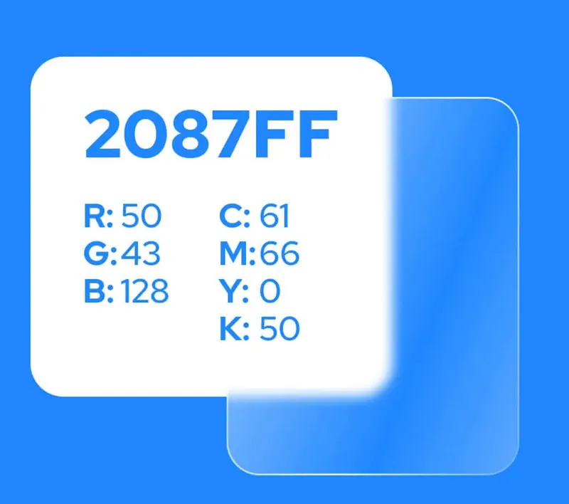
Color swatch of the blue 2087FF with RGB and CMYK values
The color scheme for Bücker GmbH combines bold but balanced tones that give the brand a modern and professional presence. A deep purple dominates as the primary color and conveys strength, confidence and creativity. It is complemented by an intense pink that sets lively highlights as the accent color and brings out important elements without becoming obtrusive. A clear blue provides a calming balance and gives the overall picture a fresh, harmonious note.

Glass tiles, before they were a trend
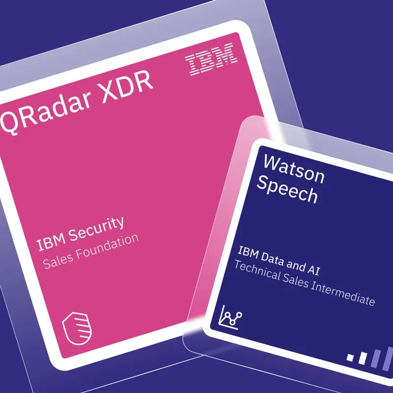
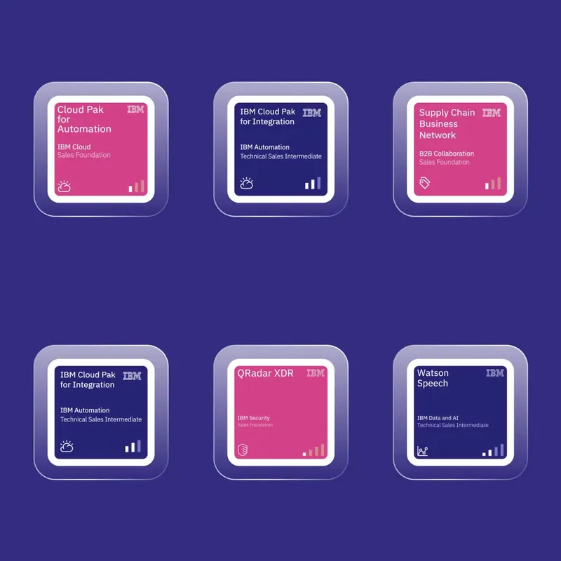
Two IBM certificates as floating tiles: QRadar XDR in pink, Watson Speech in dark blue
Six IBM product tiles in a grid, alternating pink and dark blue
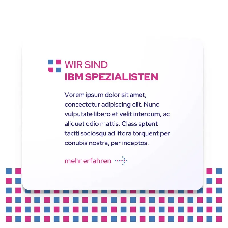
A light tile with the claim “We are IBM specialists” above a grid of colored squares
We were using glass tiles long before Apple made them a trend. These minimalist, transparent elements not only give the site a futuristic look, they make the content float. They bring an unmistakable elegance and technical finesse into the design.

Symbols that pick up the logo

  • Icon tile: a hand holding a coin — for fair prices
  • Icon tile: three people as a group — for consulting as a partnership
  • Icon tile: a person with raised arms among stars — for satisfaction
  • Icon tile: a person in crosshairs — for the exactly right licence
The iconography is simple and intuitive, perfectly matched to the target audience. It picks up the elements of the logo and translates them into clear, easily understood symbols. That keeps the design modern and underlines the brand identity.

Did our work inspire you?

Tell us about your project, short and to the point. It makes no difference whether you bring a rough idea or a polished concept.

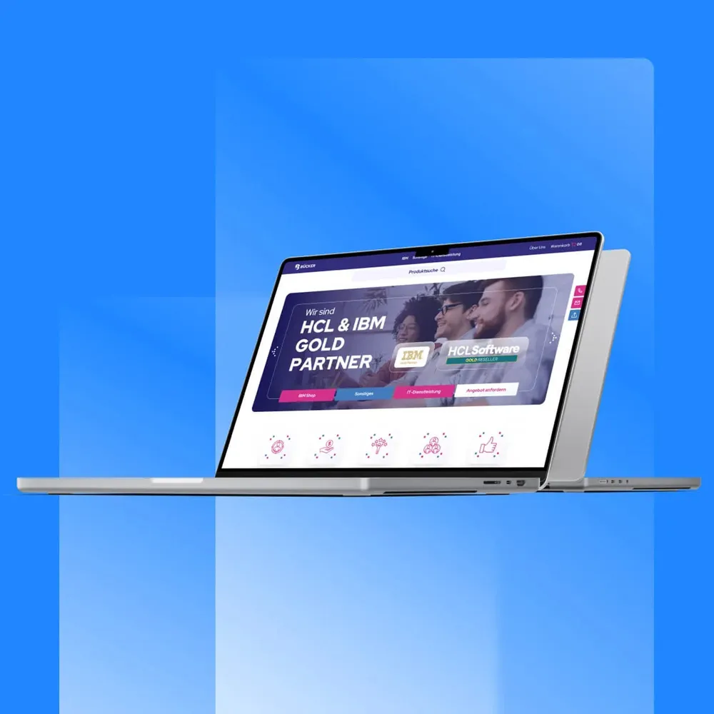
A website that works like a shop
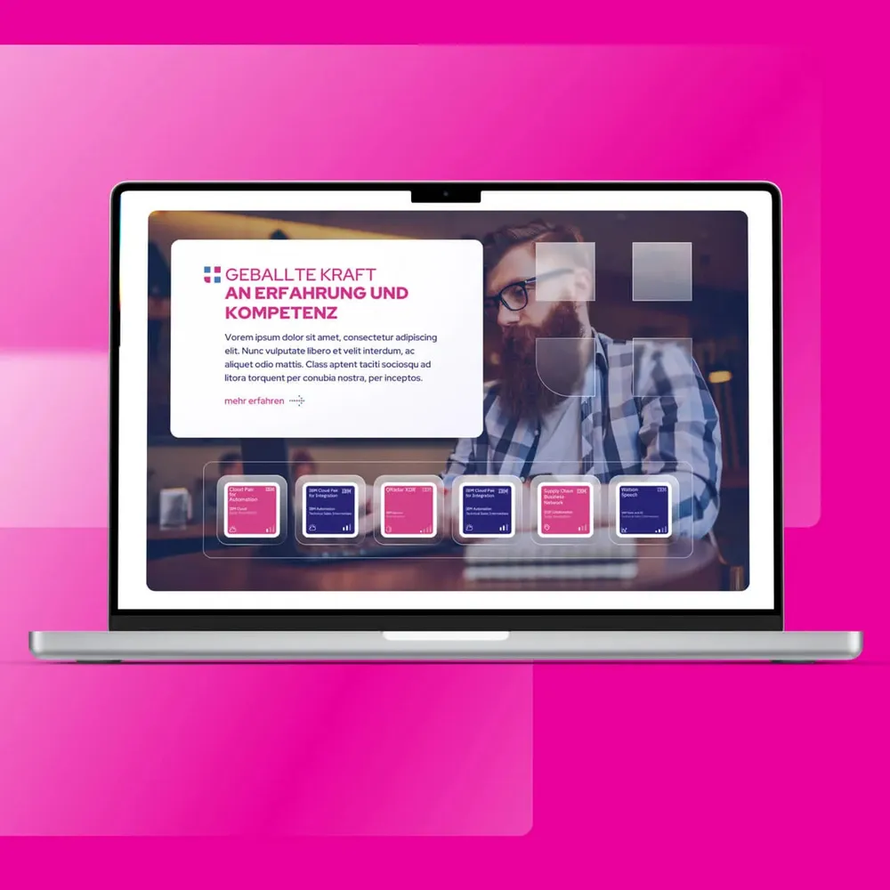
Laptop mockup of the home page on a pink background, with the claim “Concentrated power of experience and expertise”
Laptop mockup of the “HCL & IBM Gold Partner” landing page on a blue background
More than 23,000 IBM licences sit visibly on the shelf, list prices included. Only the path doesn't end in a checkout, it ends in the contact form — the way into the consultation.

A cool grandpa as the friendly face

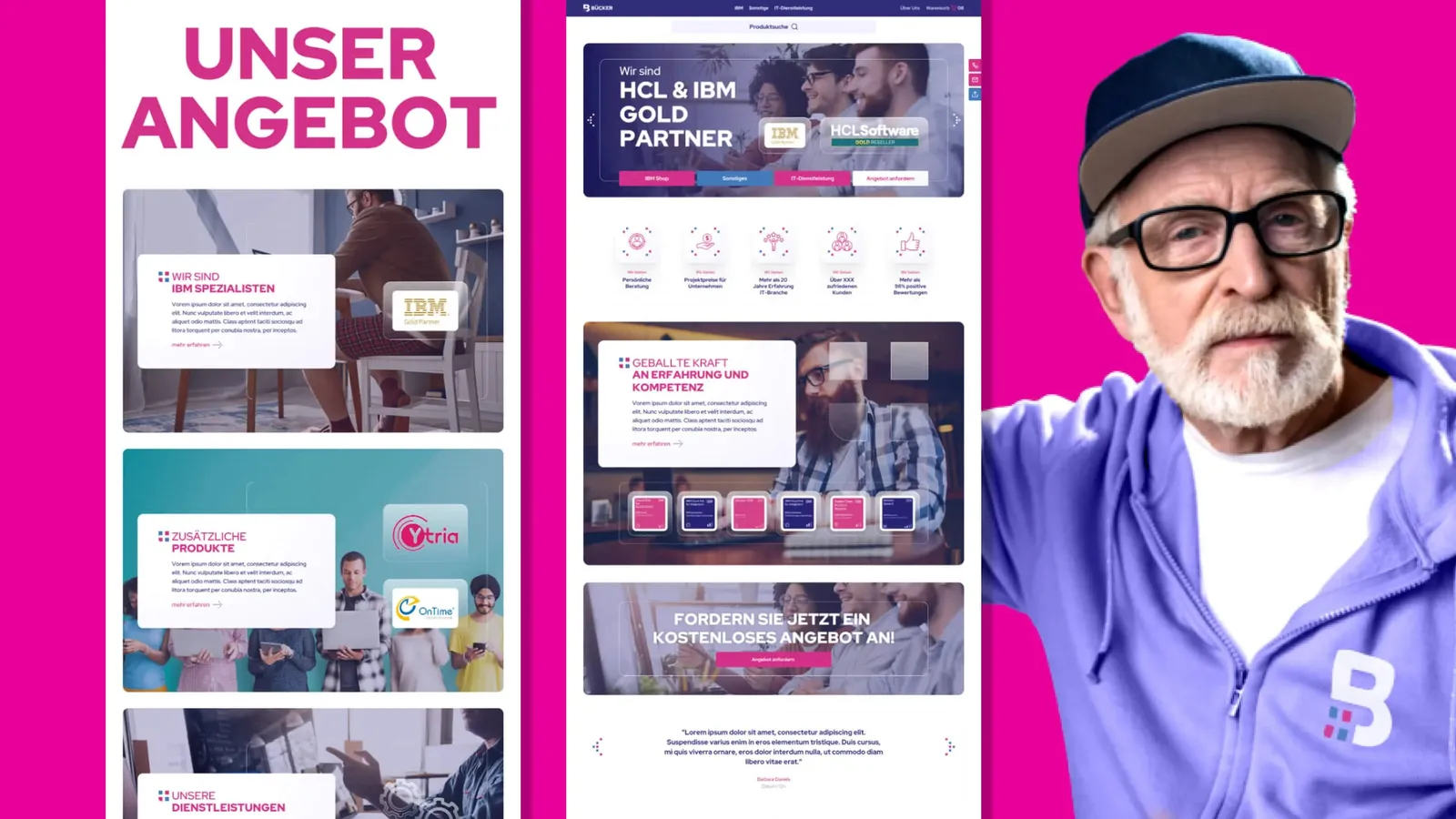
Several page layouts side by side, on the right an older gentleman in a cap, glasses and a purple jacket with the Bücker logo
The imagery was rethought from scratch, with people at the center. A “cool” grandpa was chosen as the friendly face, to show that even complex topics can be approachable and accessible. This character brings personality into the design and is also used on social media to create a modern, inviting atmosphere.

From the letterhead to the bus stop

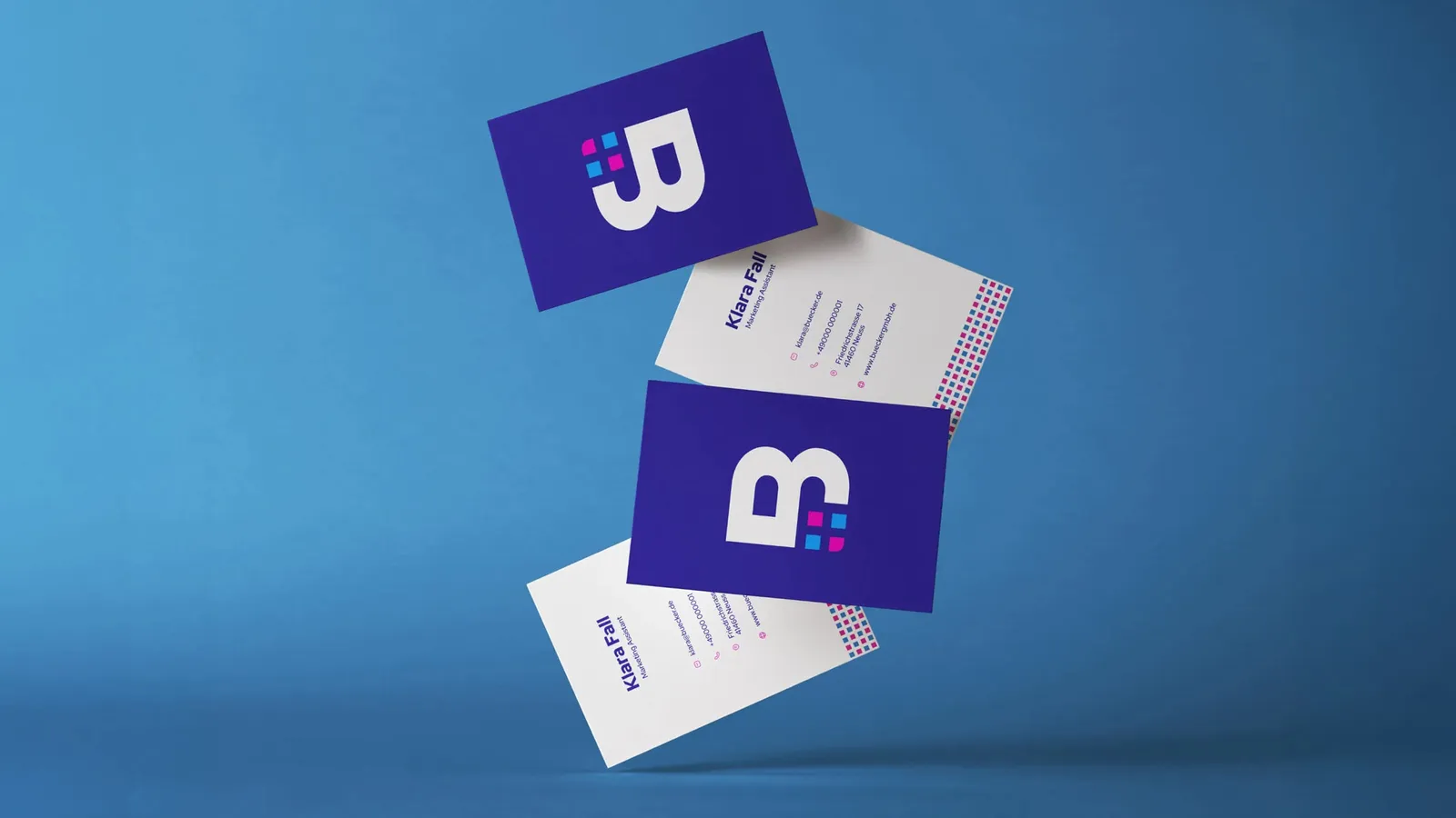
Business cards and letterhead with the Bücker logo, floating above a blue background
The new design is striking and easy to apply. Whether business cards, letterhead or a social media post.

A banner as an eye-catcher

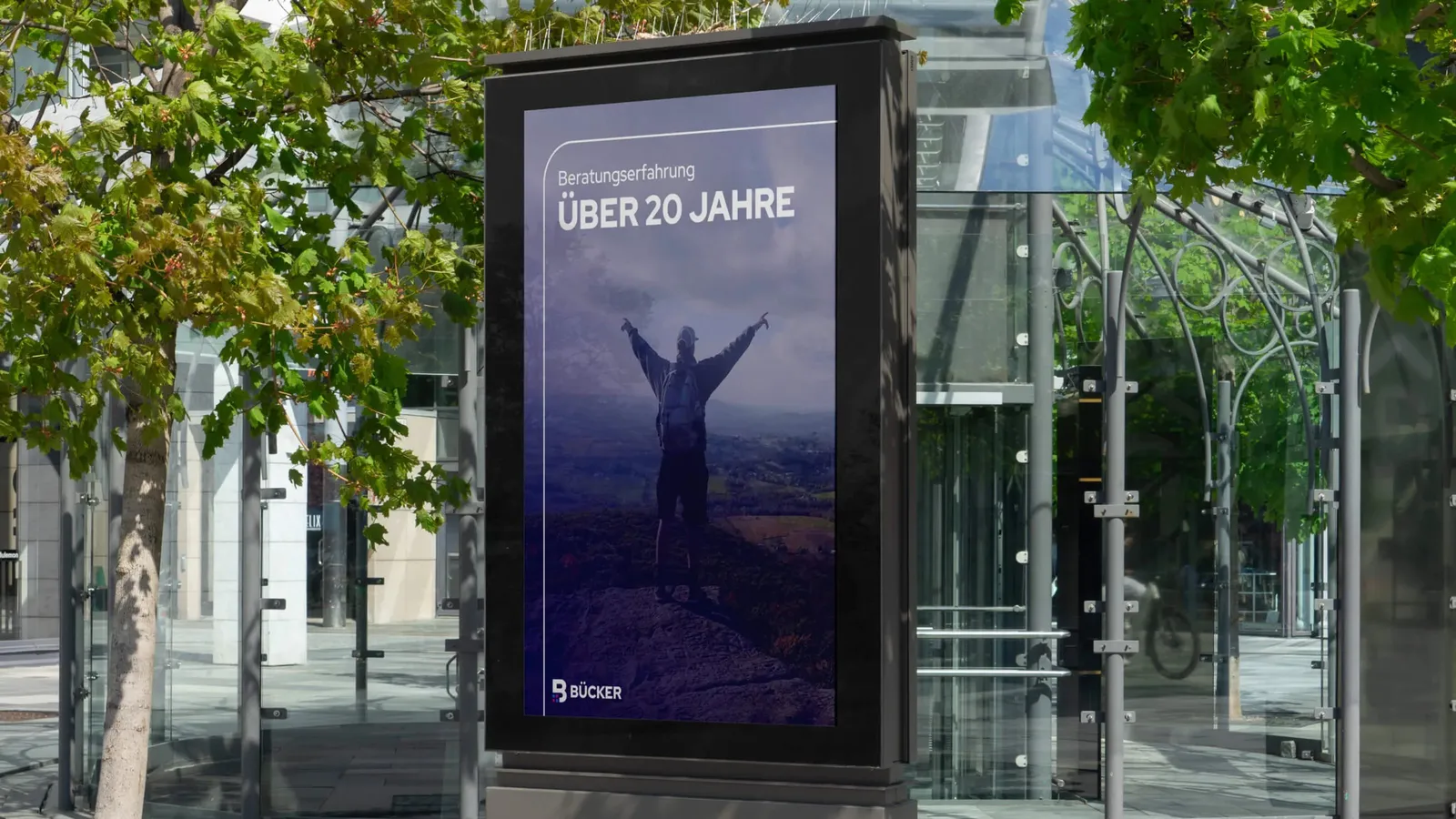
Advertising panel at a bus stop with the motif “More than 20 years of consulting experience”
An advertising banner as a modern eye-catcher. It doesn't just stand for creative advertising, it makes everyday design shine in a completely new light.

From underdog to industry force, with AI

Bücker online? Practically invisible. No conversions, barely any visitors, no organic reach. Anyone who found the site was more likely to get the feeling they had landed with a small local supplier. Not with a strategically positioned licensing and IT service partner with national reach. The discrepancy was obvious. It was time to correct the picture.

Our approach was clear. No readjusting, no digital make-up, but a complete restart with an attitude. The aim was to make Bücker look bigger, more structured and more assured in the digital space, without pretending to be something else, but with a clear statement. We developed a new corporate identity with a considered logo, a deliberate color code and precisely chosen typography. The new look was not only supposed to appeal, above all it had to work. Build trust, give orientation, prepare the next click.

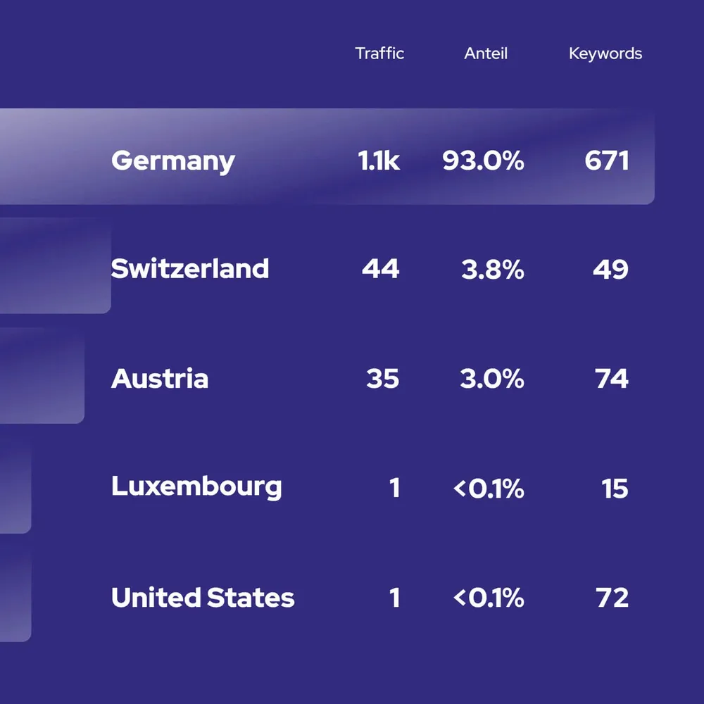
The heart of it: a website that doesn't look like an IT service provider, but like a digital sales professional. More than 23,000 IBM licences were built in, large and visible, list prices included. Users browse, compare and find the right product — only the buying process doesn't end with a checkout, it ends with a contact form, the way into a personal consultation. In parallel, together with the Berlin system house Dacher Systems, which wrote the entire backend, a technical foundation came about that convinces Google too: every single licence has its own page. The result is a massive rise in organic traffic — from under 50 monthly visitors to more than 1,200, over 1,000 keywords in the top 100, without ads and without an advertising budget. Today there is a brand that delivers digitally what it has long promised professionally.

Client
Bücker GmbH
Studio
Creative Agency WAGEMUT
Services
Branding, Graphic Design, UI/UX Design, Web Design, 3D Visualization
Industry
Technology