Skip to content

Case Study

A brand that doesn't need to explain itself

Bando — Peak Attack for snowmobiles, ATVs and agricultural machinery

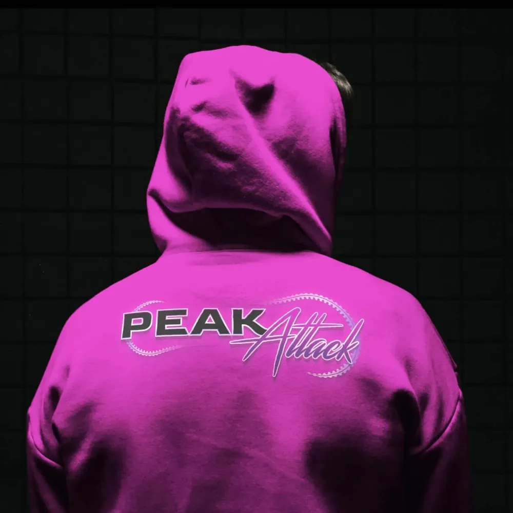
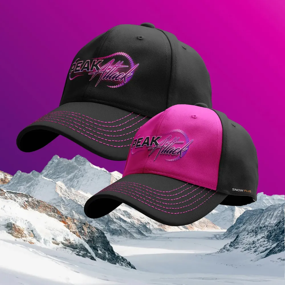
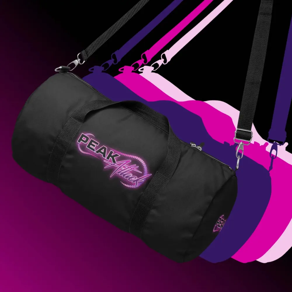
For Bando we developed Peak Attack, a premium brand of its own for action sports — from the naming through logo, color palette and packaging to the landing page, which stages the drive belt in 3D instead of explaining it.
  • Manufacturing & Industry
  • Technology
  • 3D Visualization
  • Branding
  • Brand Strategy
  • Film & Motion Design
  • Naming
  • UI/UX Design
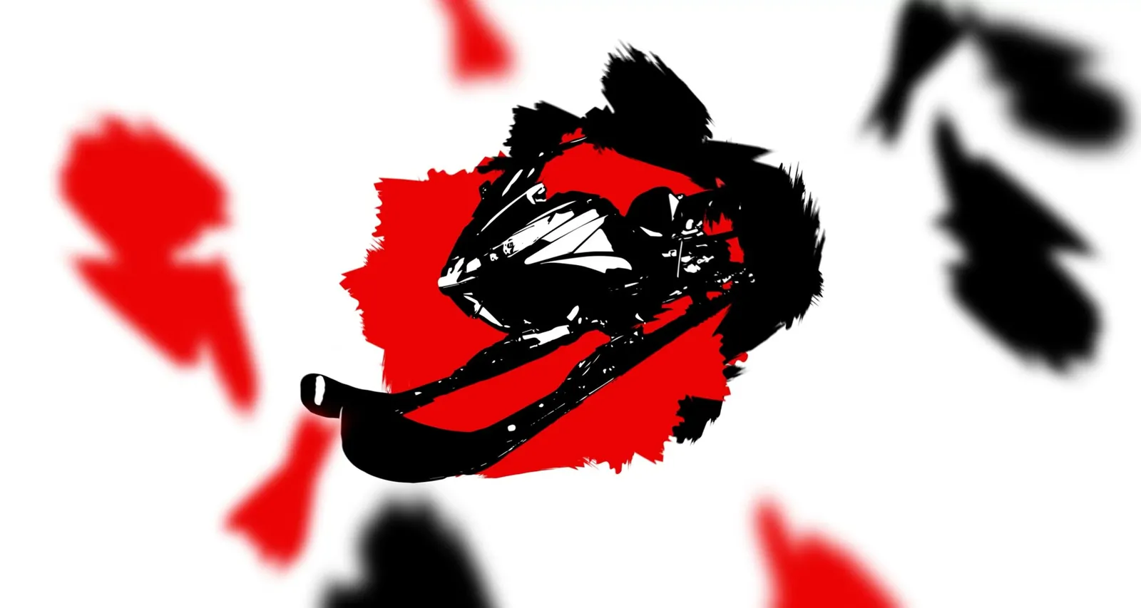
Animation in which silhouettes of a snowmobile, an ATV and a tractor swirl around the Bando logo

Seven directions, three colors
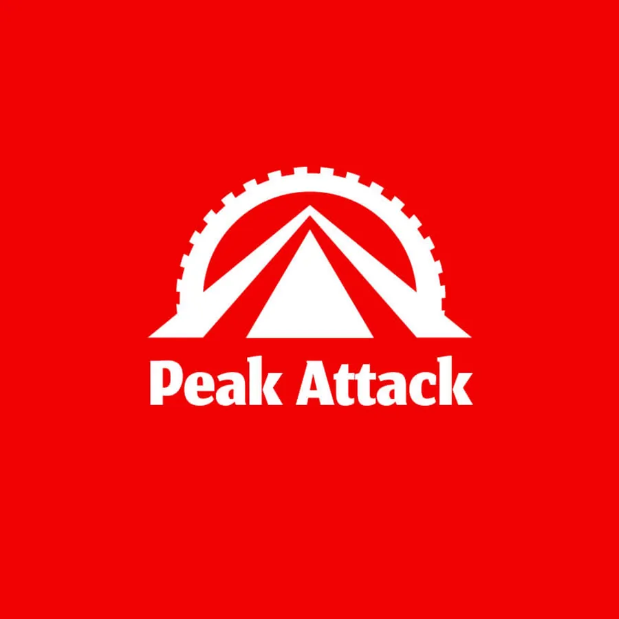
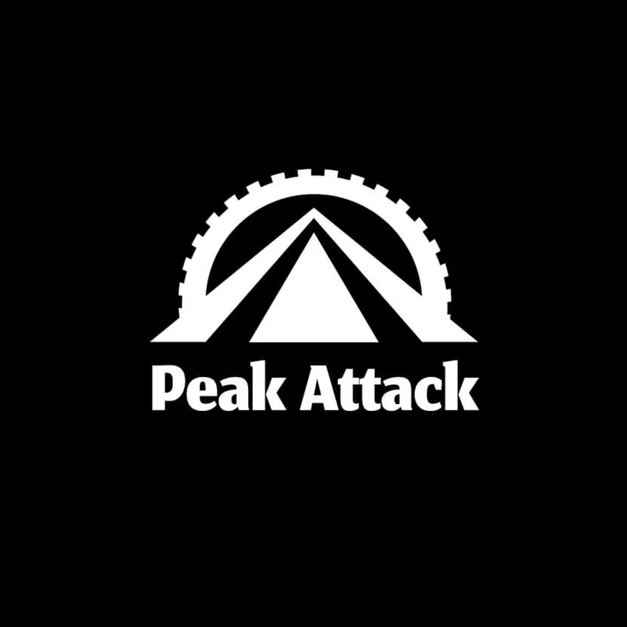
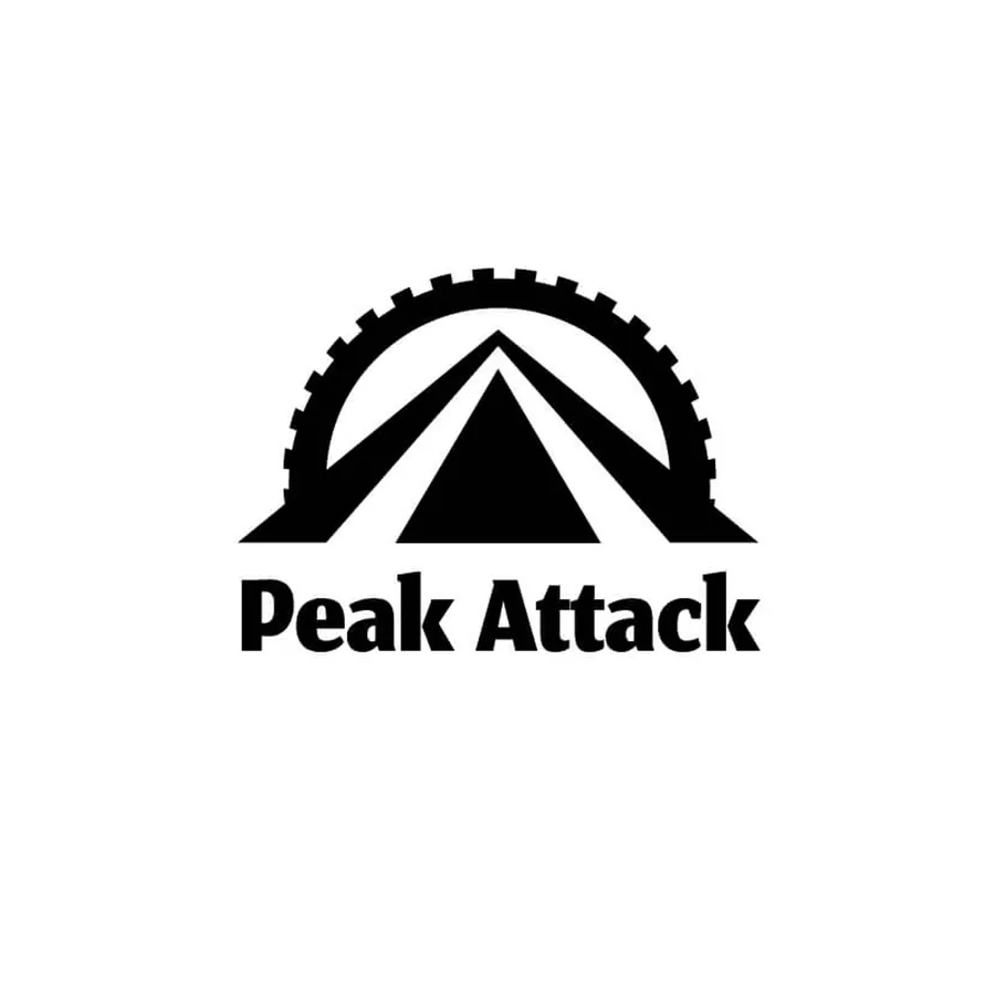
  • Logo draft: a mountain under an arc of sprocket teethLogo draft: a mountain under an arc of sprocket teethLogo draft: a mountain under an arc of sprocket teethLogo draft: a mountain under an arc of sprocket teeth
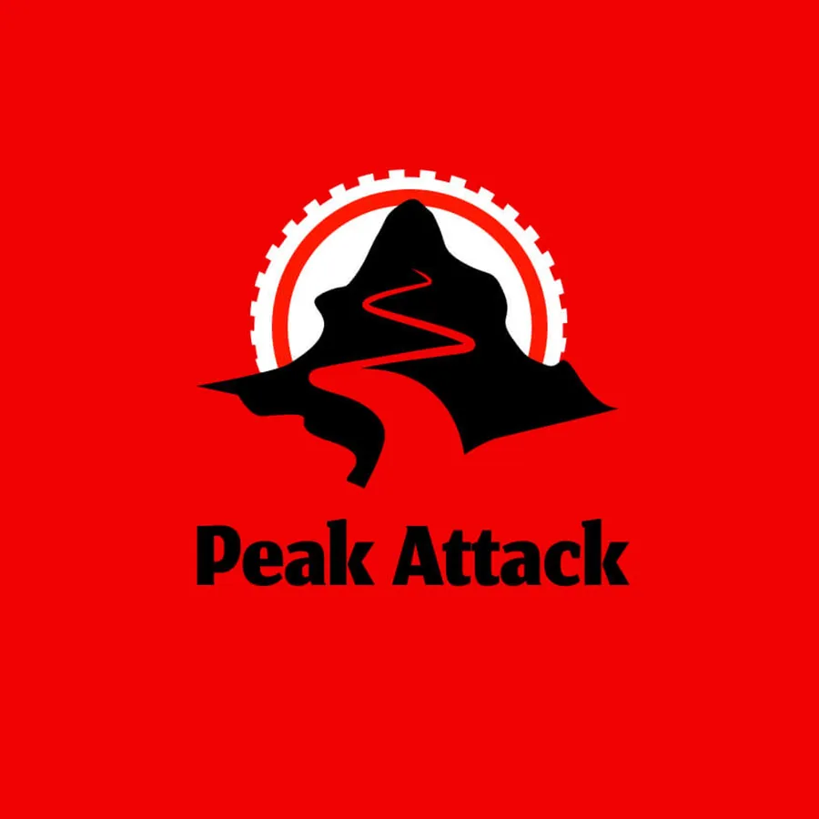
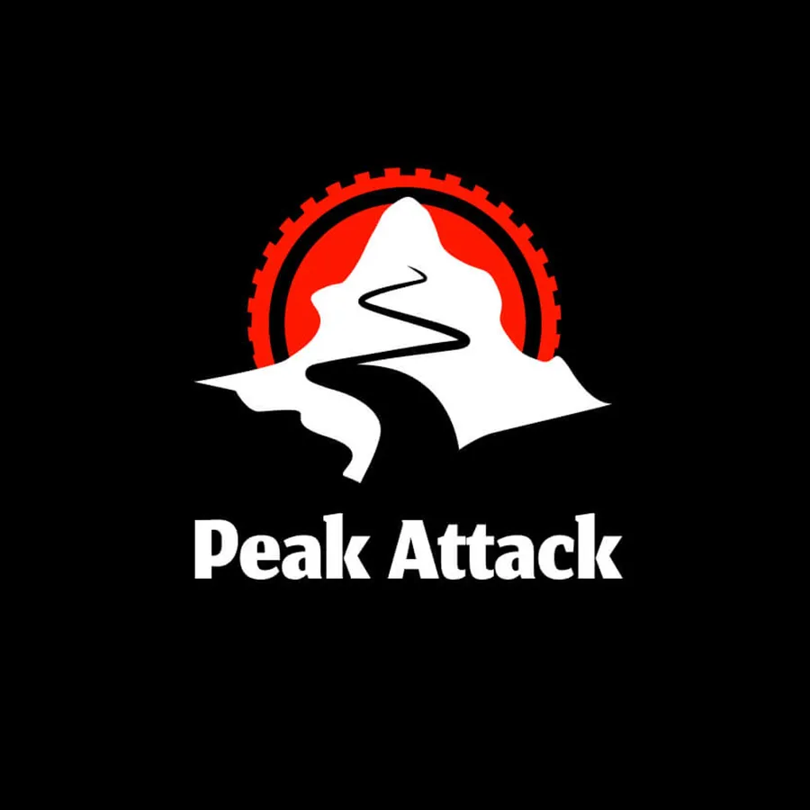
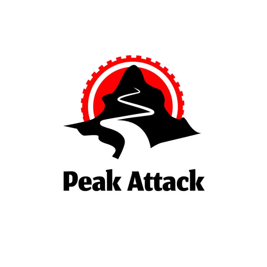
  • Logo draft: a mountain silhouette with a piste inside the sprocketLogo draft: a mountain silhouette with a piste inside the sprocketLogo draft: a mountain silhouette with a piste inside the sprocketLogo draft: a mountain silhouette with a piste inside the sprocket
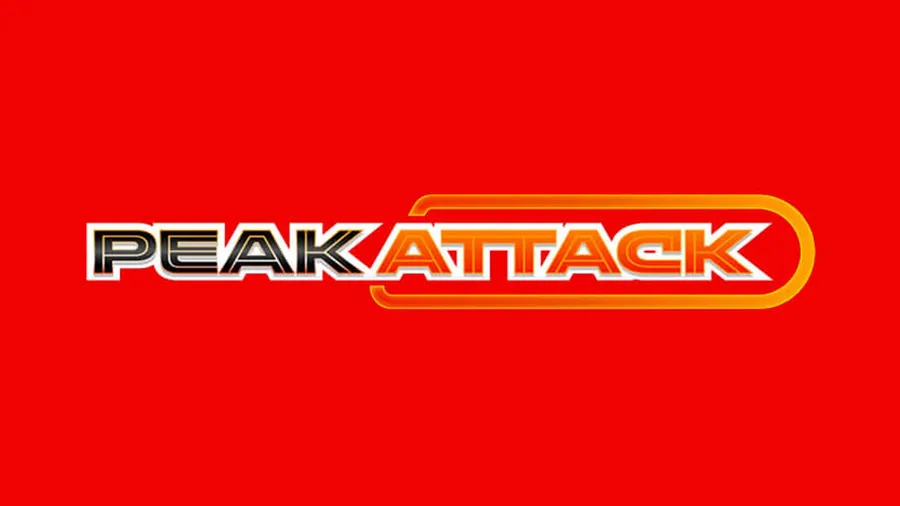
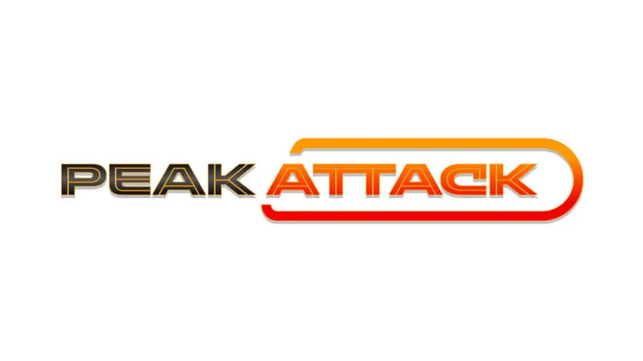
  • Logo draft: “Peak Attack” in a rounded outline, like a patchLogo draft: “Peak Attack” in a rounded outline, like a patchLogo draft: “Peak Attack” in a rounded outline, like a patchLogo draft: “Peak Attack” in a rounded outline, like a patch
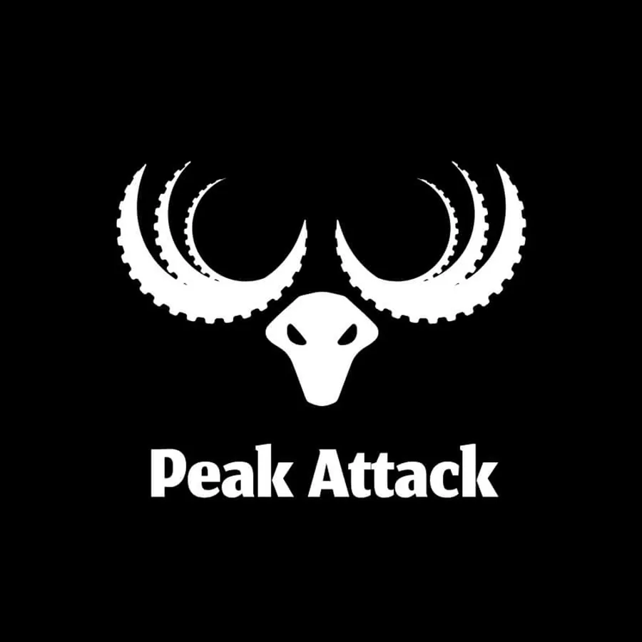
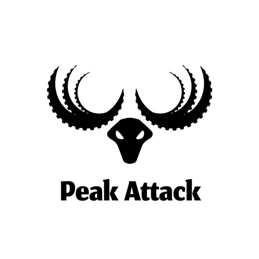
  • Logo draft: antlers made of sprockets above the wordmarkLogo draft: antlers made of sprockets above the wordmarkLogo draft: antlers made of sprockets above the wordmarkLogo draft: antlers made of sprockets above the wordmark
  • Logo draft: the word “Peak” in capitals, “Attack” in script next to itLogo draft: the word “Peak” in capitals, “Attack” in script next to itLogo draft: the word “Peak” in capitals, “Attack” in script next to itLogo draft: the word “Peak” in capitals, “Attack” in script next to it
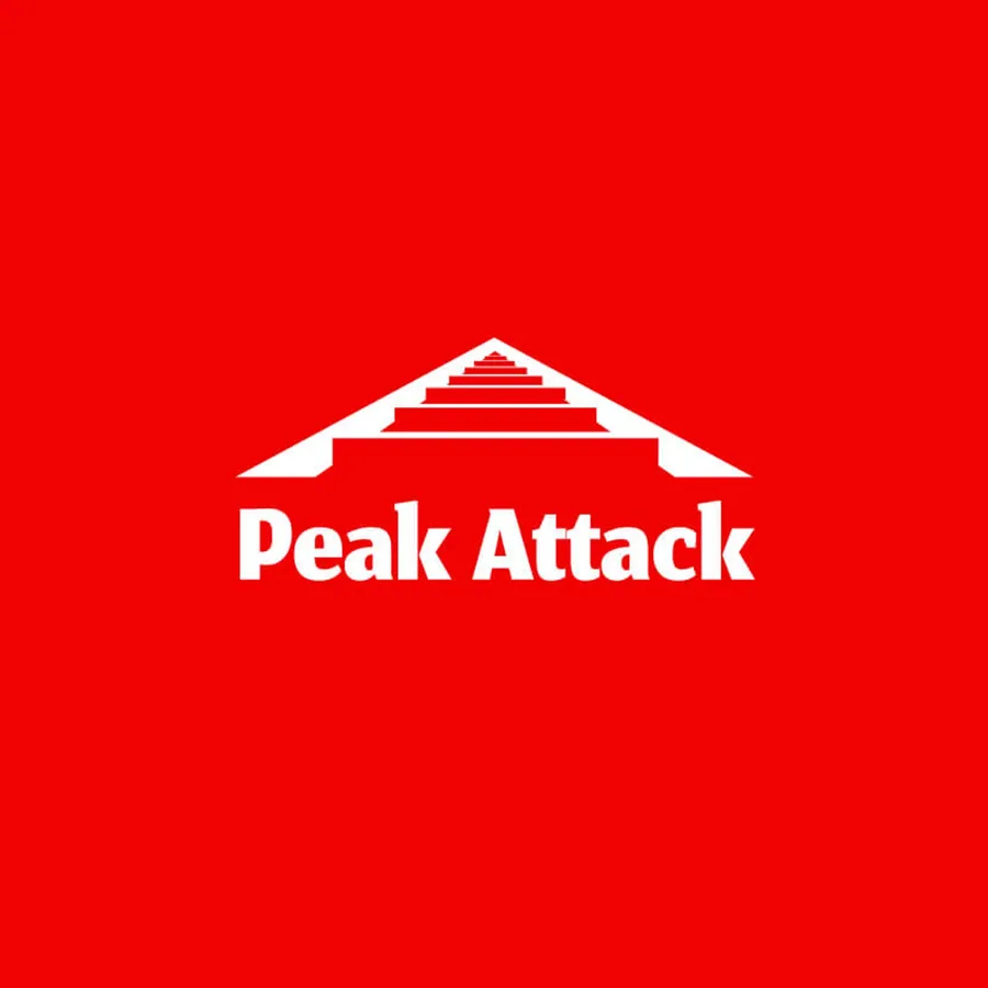
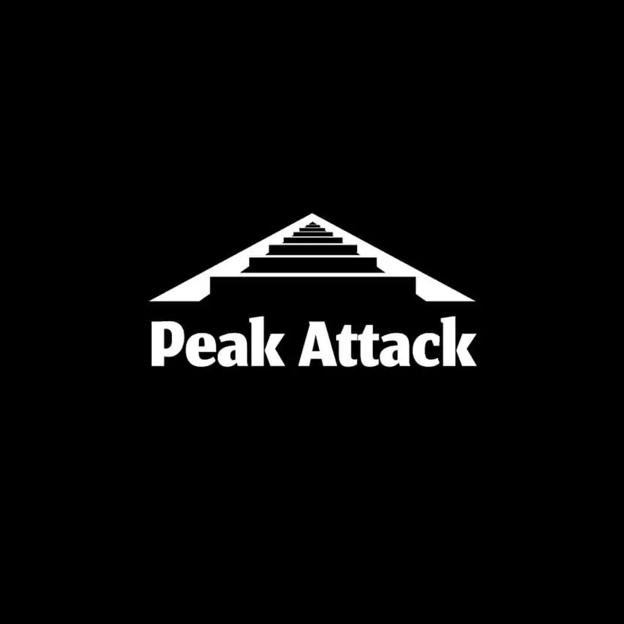
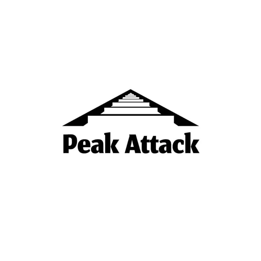
  • Logo draft: a stylized mountain range with steps above the wordmark “Peak Attack”Logo draft: a stylized mountain range with steps above the wordmark “Peak Attack”Logo draft: a stylized mountain range with steps above the wordmark “Peak Attack”Logo draft: a stylized mountain range with steps above the wordmark “Peak Attack”
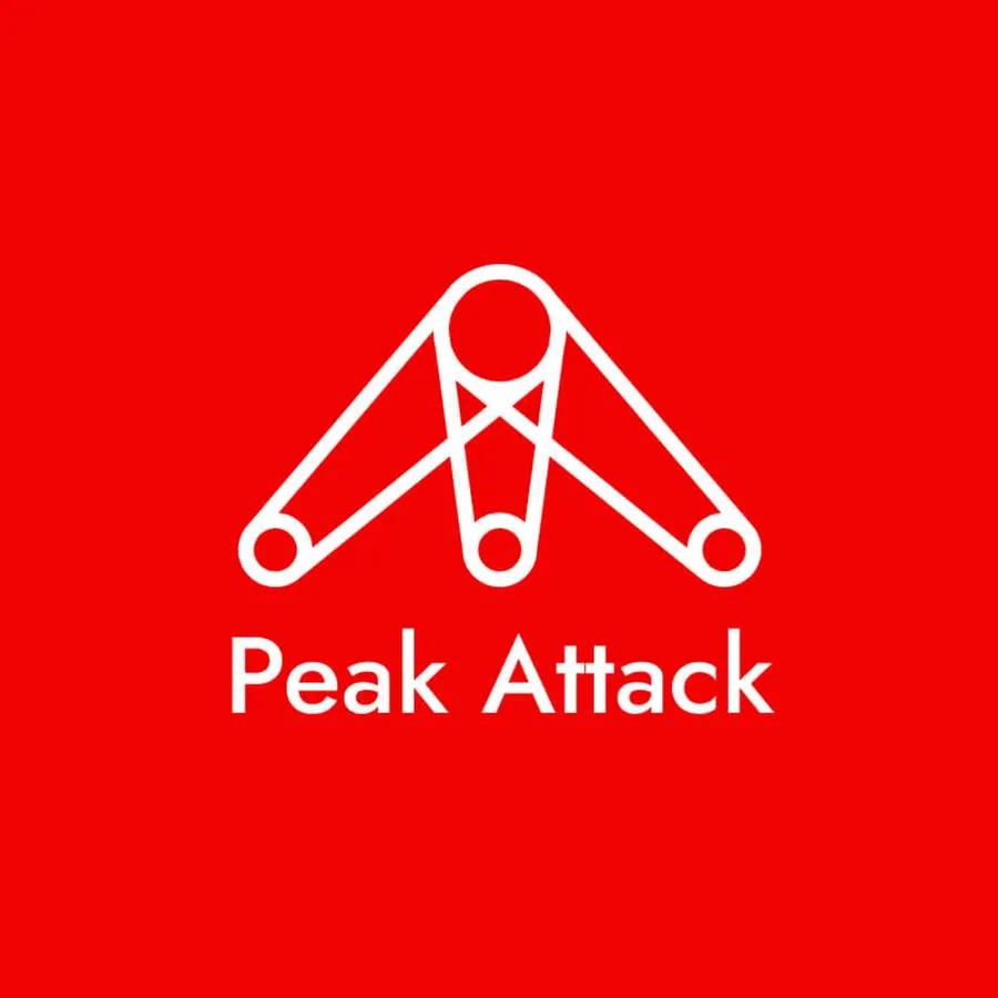
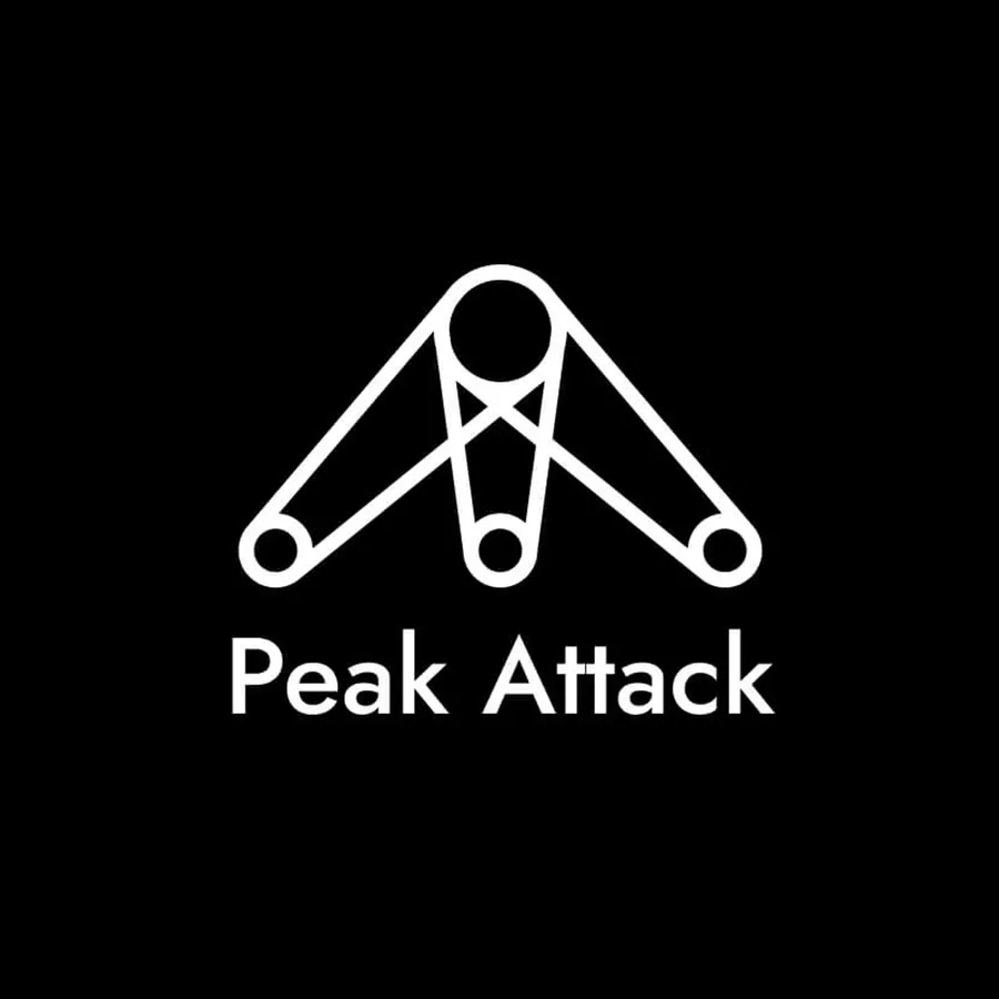
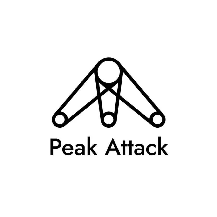
  • Logo draft: a belt routed as a triangle, below it “Peak Attack” in a grotesqueLogo draft: a belt routed as a triangle, below it “Peak Attack” in a grotesqueLogo draft: a belt routed as a triangle, below it “Peak Attack” in a grotesqueLogo draft: a belt routed as a triangle, below it “Peak Attack” in a grotesque
Different approaches, one clear idea: the animation shows seven directions, mirrored in the brand's core colors. Black. Red. White. A play with contrasts out of which the final form slowly emerges.

Four typefaces, one tone

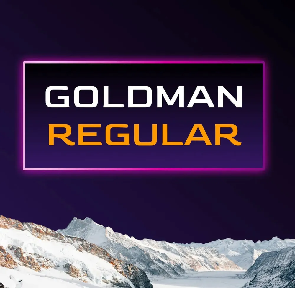
Type sample of Goldman Regular in a neon frame above a mountain panorama
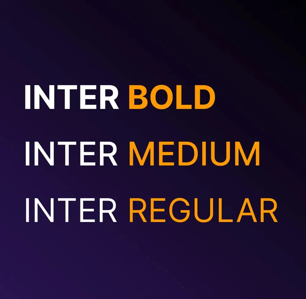
Type sample of Inter in Bold, Medium and Regular
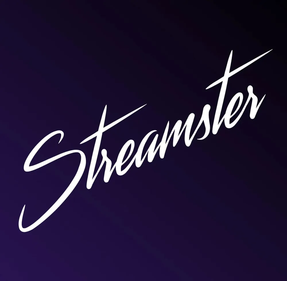
The word “Streamster” as gestural handwriting
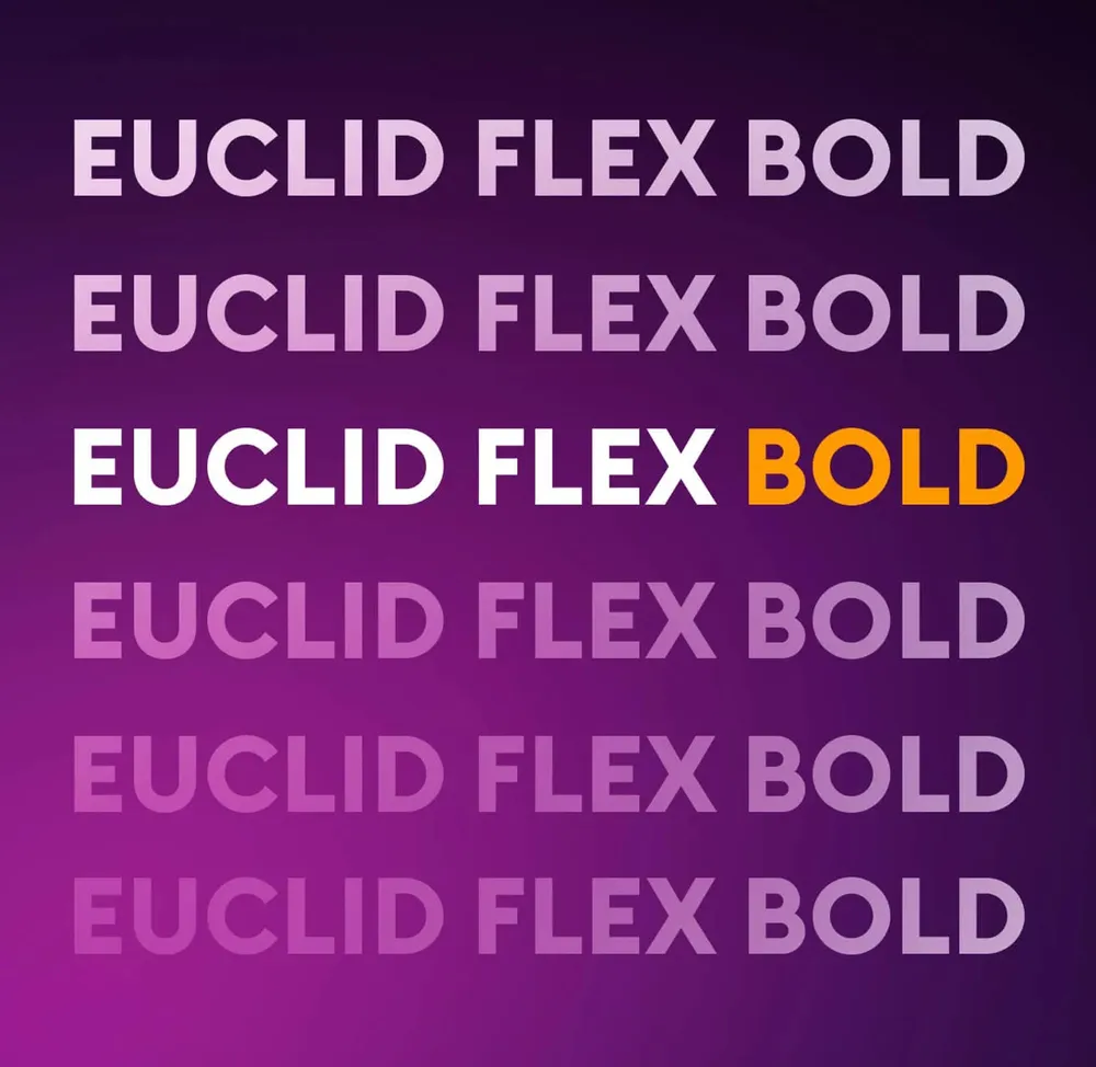
Type sample of Euclid Flex Bold, six times on top of each other in decreasing opacity
Clear in its message, precise in its build: Peak Attack combines sans-serif grotesques such as Inter, Goldman and Euclid Flex with the gestural handwriting of Streamster. Somewhere between tech, scene and handshake.

3D as a language, not as an effect
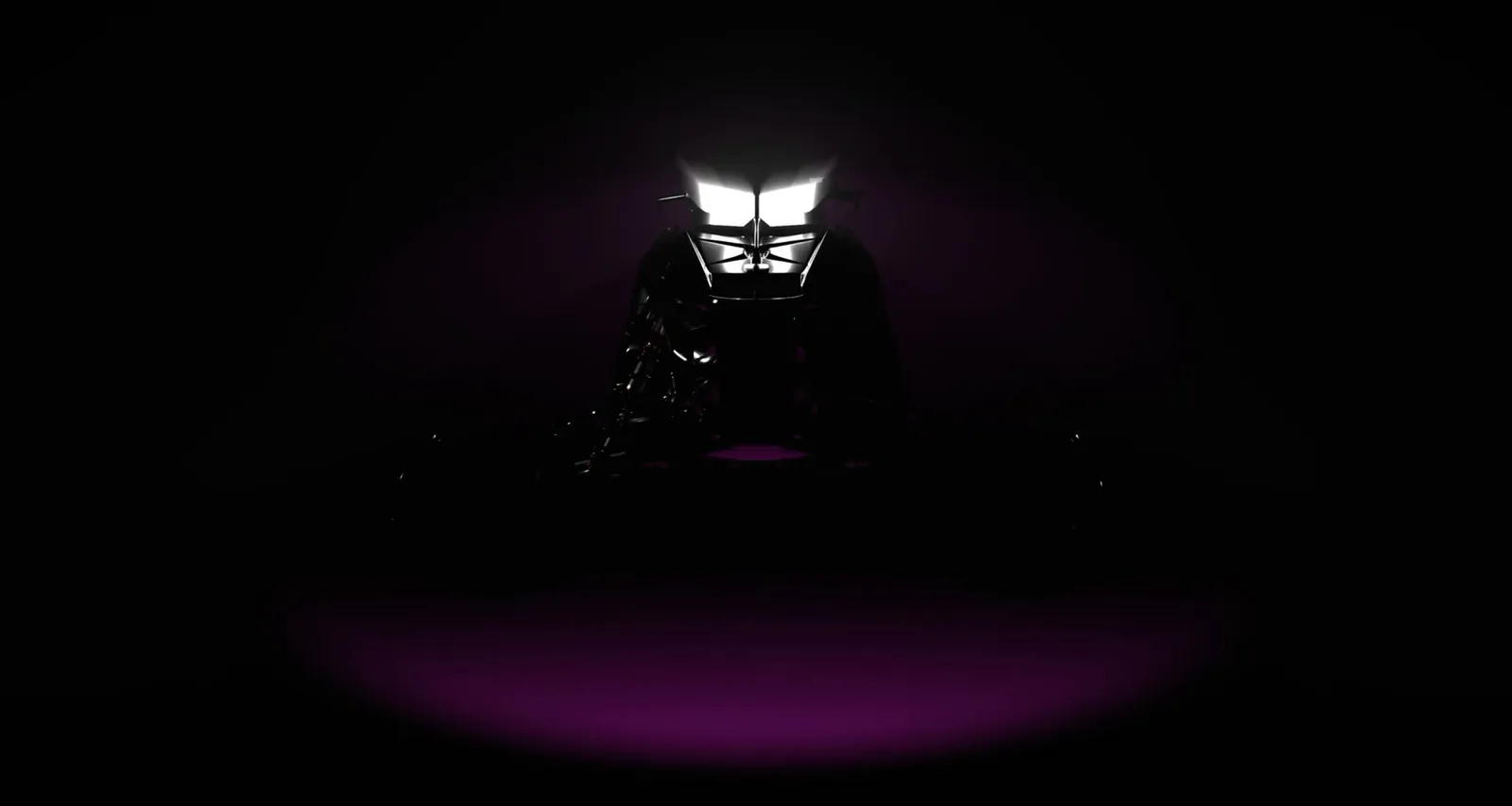
A snowmobile turns out of the darkness into the frame in the beam of the headlights
Headlights cut into the frame out of the darkness. The scene turns, contours become volume, until the snowmobile stands fully in space. 3D not as an effect, but as staging.

A sleeve instead of a band

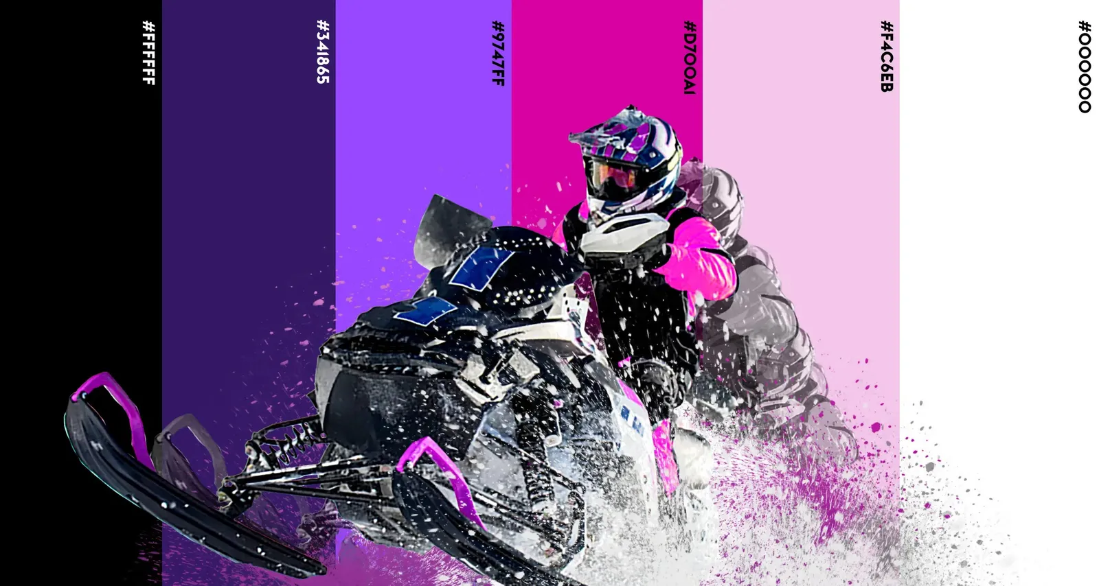
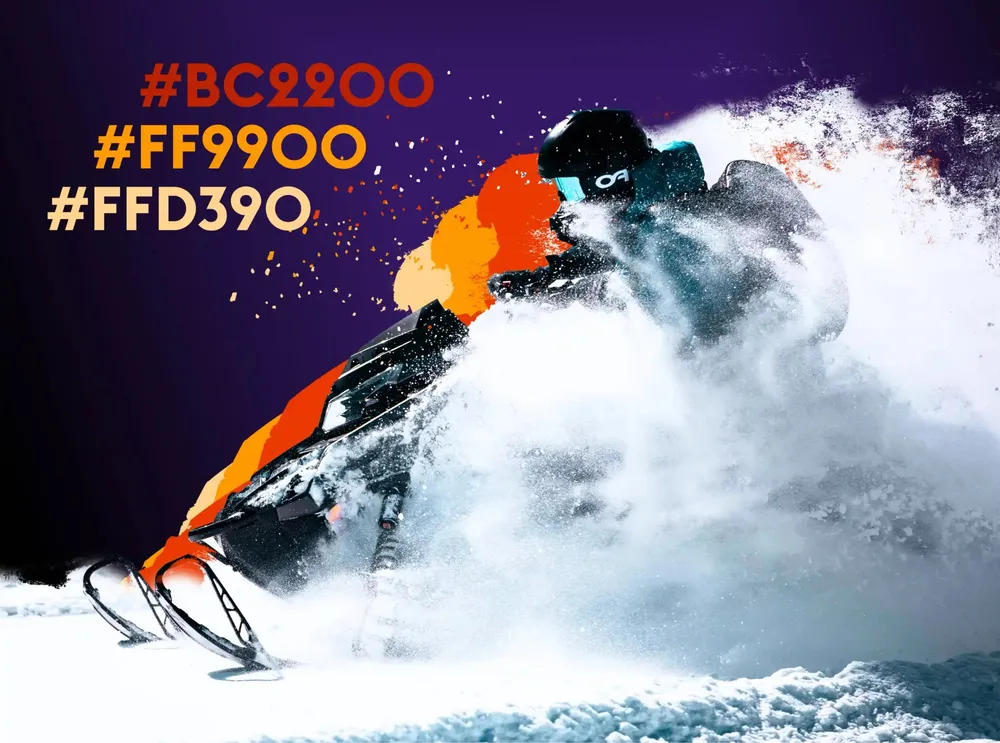
The brand's orange accent values next to a snowmobile in a cloud of snow
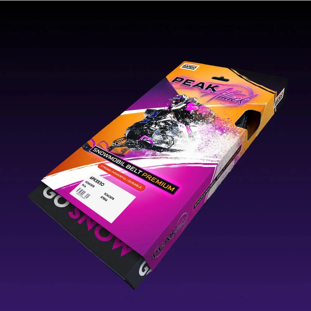
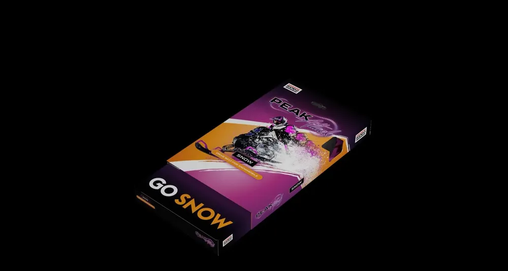
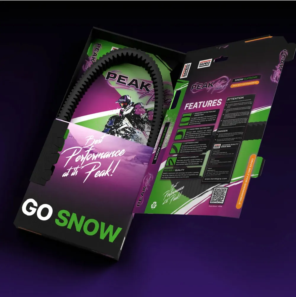
The packaging in magenta and black, printed with “Go Snow”
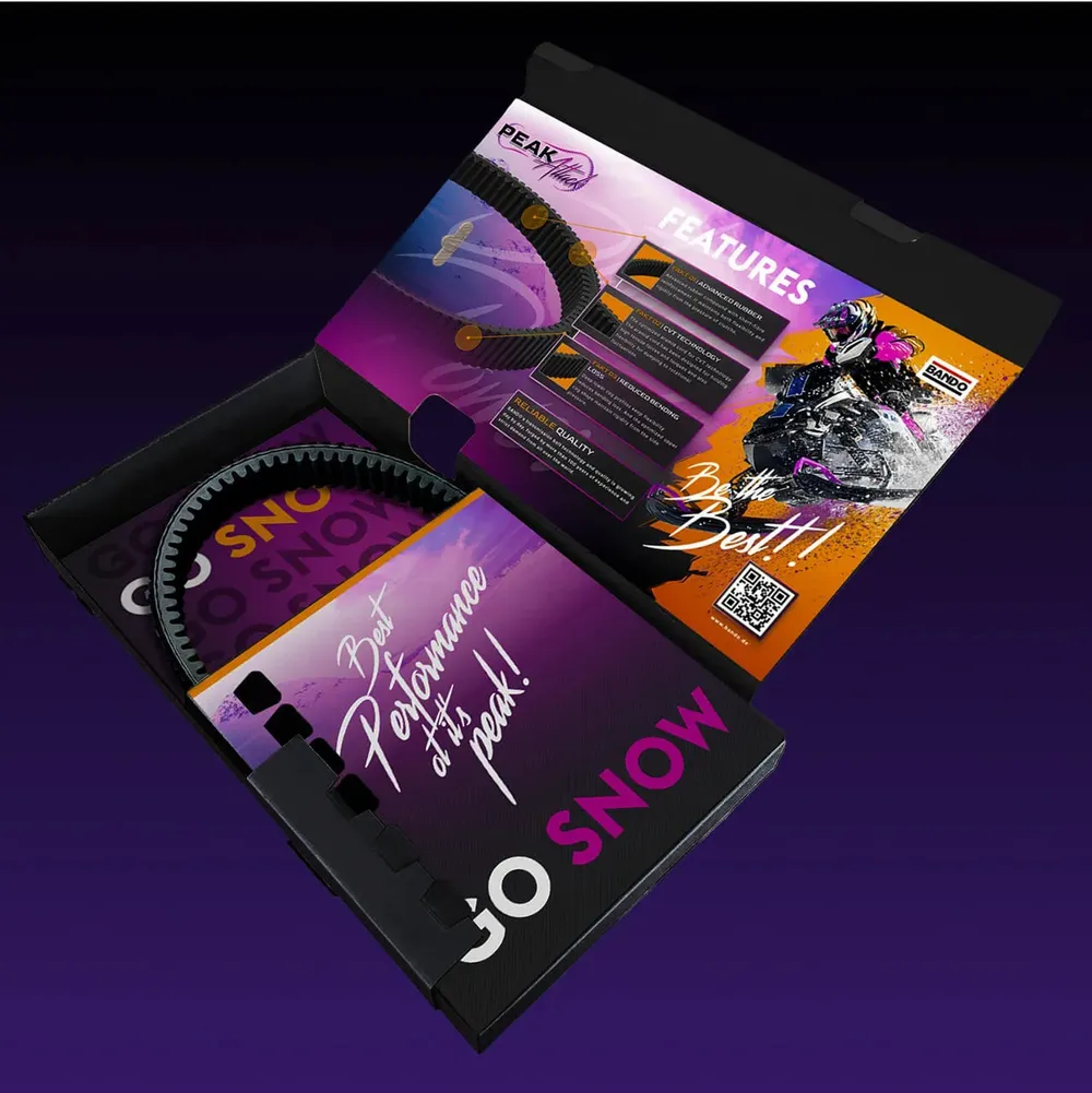
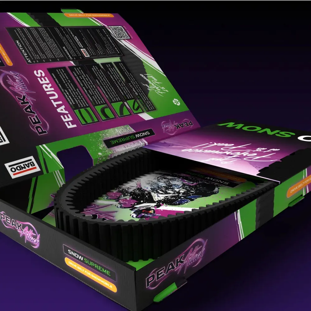
The opened packaging with the drive belt inside
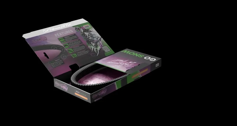
The packaging turns in space and shows how it folds
Countless sizes, one system: the new packaging for Peak Attack solves the complexity with a well-considered, dynamic sleeve – clever, functional and strong in appearance.

A language that calls out

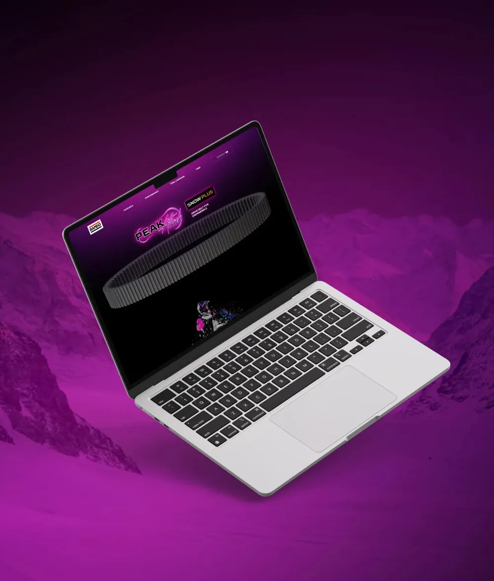
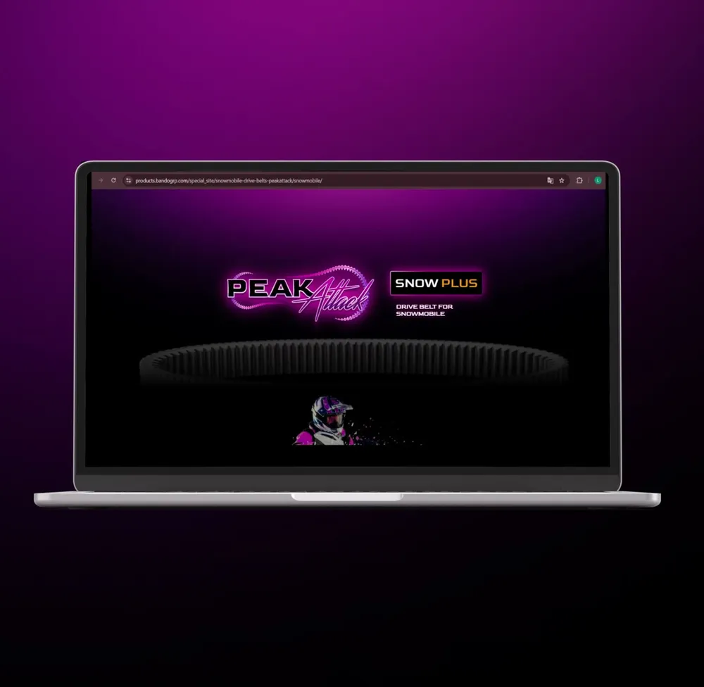
Laptop showing the landing page against a magenta background
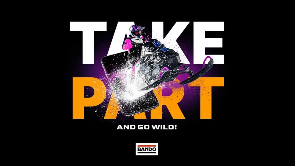
Ad “Take part and go wild” with a snowmobile in a spray of snow
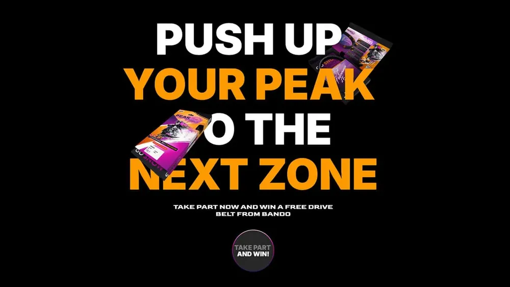
Ad “Push up your peak to the next zone” with the packaging
The new tone of voice doesn't talk about technology. It calls out! Direct, wild, energetic. Where Bando stays matter-of-fact, Peak Attack goes all in – with a language that asks no questions.

The belt leads through the page

The landing page scrolls through, the drive belt stays in frame as a leitmotif
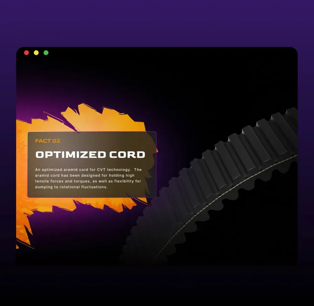
“Optimized Cord” section with the belt in detail
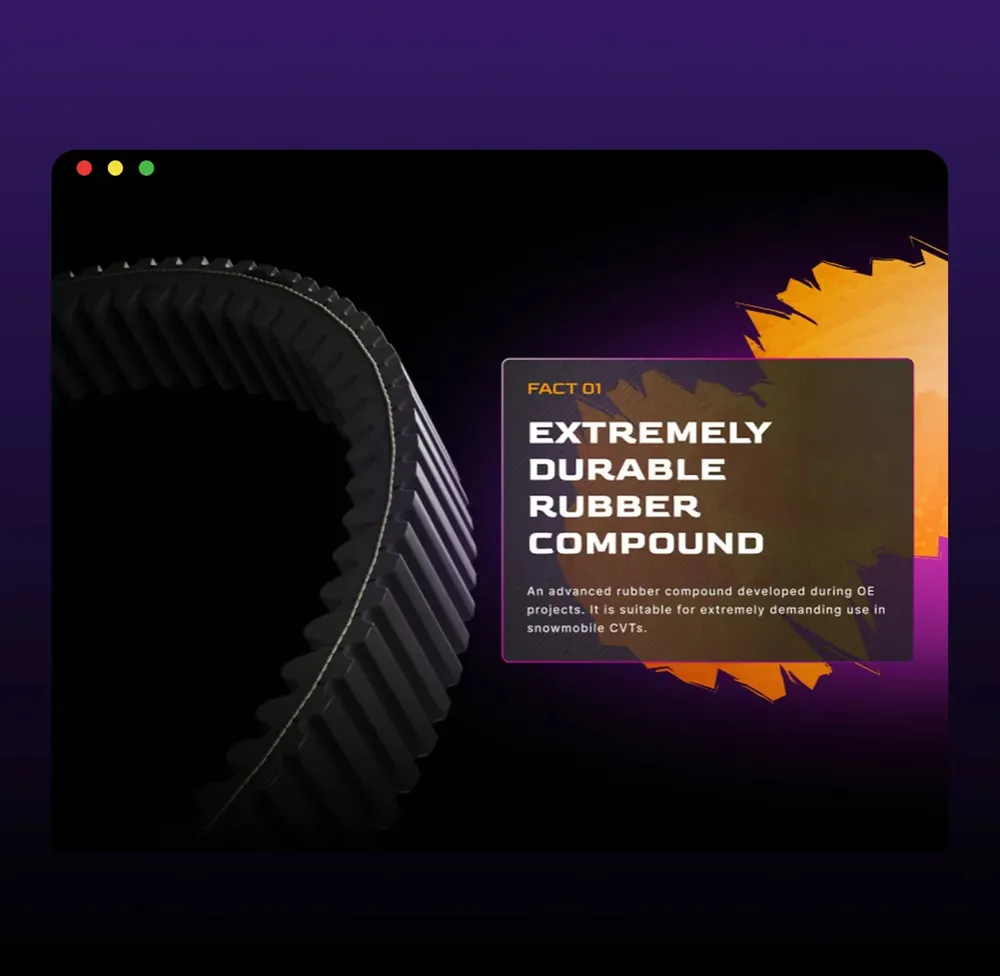
“Extremely durable rubber compound” section
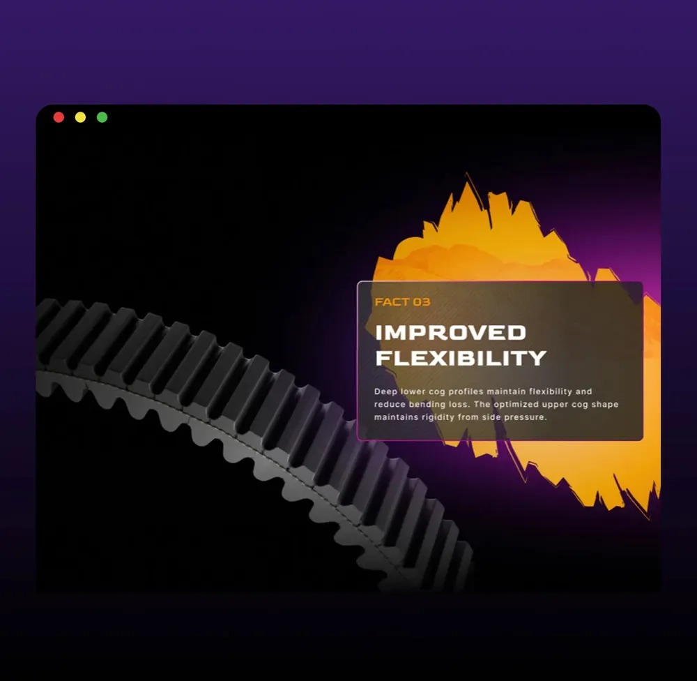
“Improved flexibility” section
The new landing page doesn't simply deliver content, it stages it. Guided by the 3D belt, which navigates through form, scene and tension. The customer journey becomes a flow, the product the leading actor.

Did our work inspire you?

Tell us about your project, short and to the point. It makes no difference whether you bring a rough idea or a polished concept.

The same brand, a different level
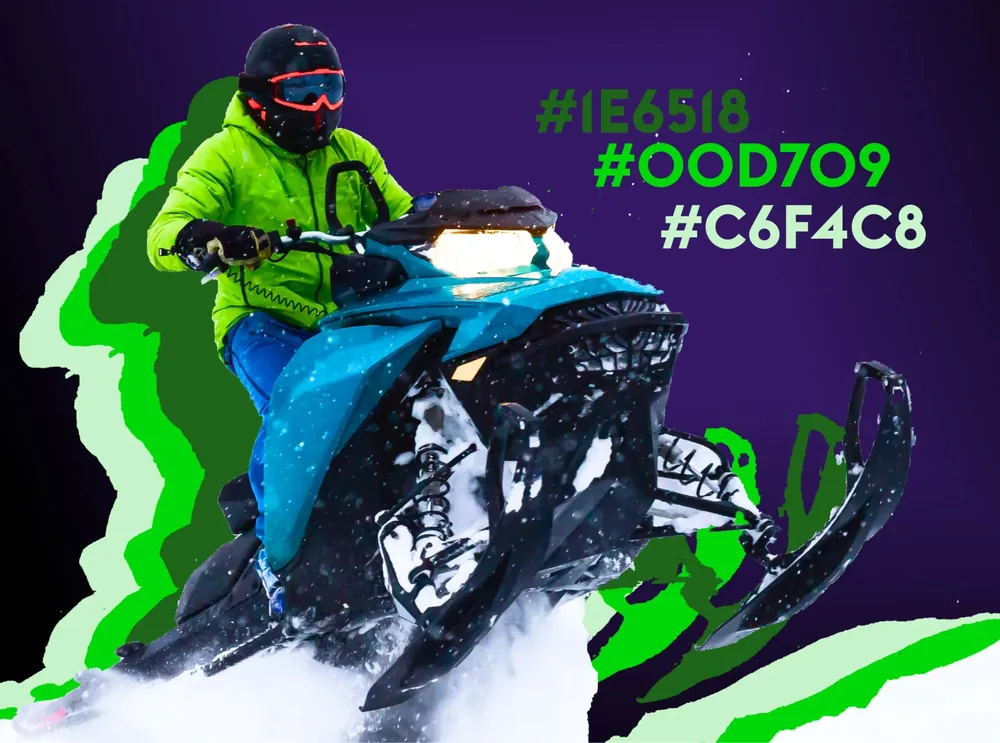
The green accent values of the premium line next to a rider in the snow
The premium packaging in green and black
The opened premium packaging printed with “Go Snow”
The premium packaging in green turns against a dark background
Still Peak Attack, but a different level. The packaging varies in its accent color – not over the top, but effective. It marks the higher-grade product line without getting any louder.

Every surface an impulse

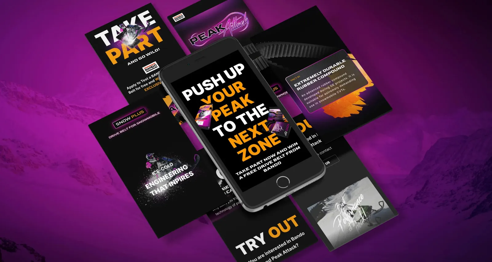
Several campaign visuals and phone views side by side against a magenta background
Every section a statement. Every surface an impulse. Every view a call to action. Built for one goal: conversion. No detours. No compromises.

Scene, not standard

Bando wanted more presence. Not at some point, but now. And not just anywhere, but where it really kicks off: action sports — in markets where others have long been communicating.

We approached Bando. With one clear idea: when market share is at stake, fine-tuning isn't enough. What it takes then is a brand that speaks where others trot out platitudes.

Peak Attack is exactly that. A premium brand that doesn't have to explain why it is better — you see it straight away. No more paper band, but packaging with presence.

To make that visible, we translated everything into 3D. Not as a gimmick, but as a language. The belt isn't shown, it is staged.

The finished landing page went out internally — first to the USA, then to Japan. And it landed everywhere. No frills, direct, to the point.

Peak Attack has to happen exactly where this world is lived: in the stories, in the reels, in the language of the community. Scene, not standard.

Client
Bando
Studio
Creative Agency WAGEMUT
Services
3D Visualization, Branding, Brand Strategy, Film & Motion Design, Naming, UI/UX Design
Industry
Manufacturing & Industry, Technology