Case Study
A bottle as a travel companion
Poura — website, 3D and motion for a premium ginger essence
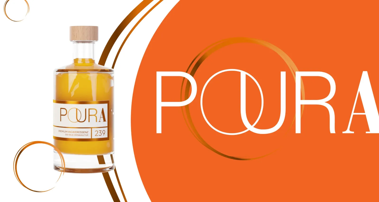
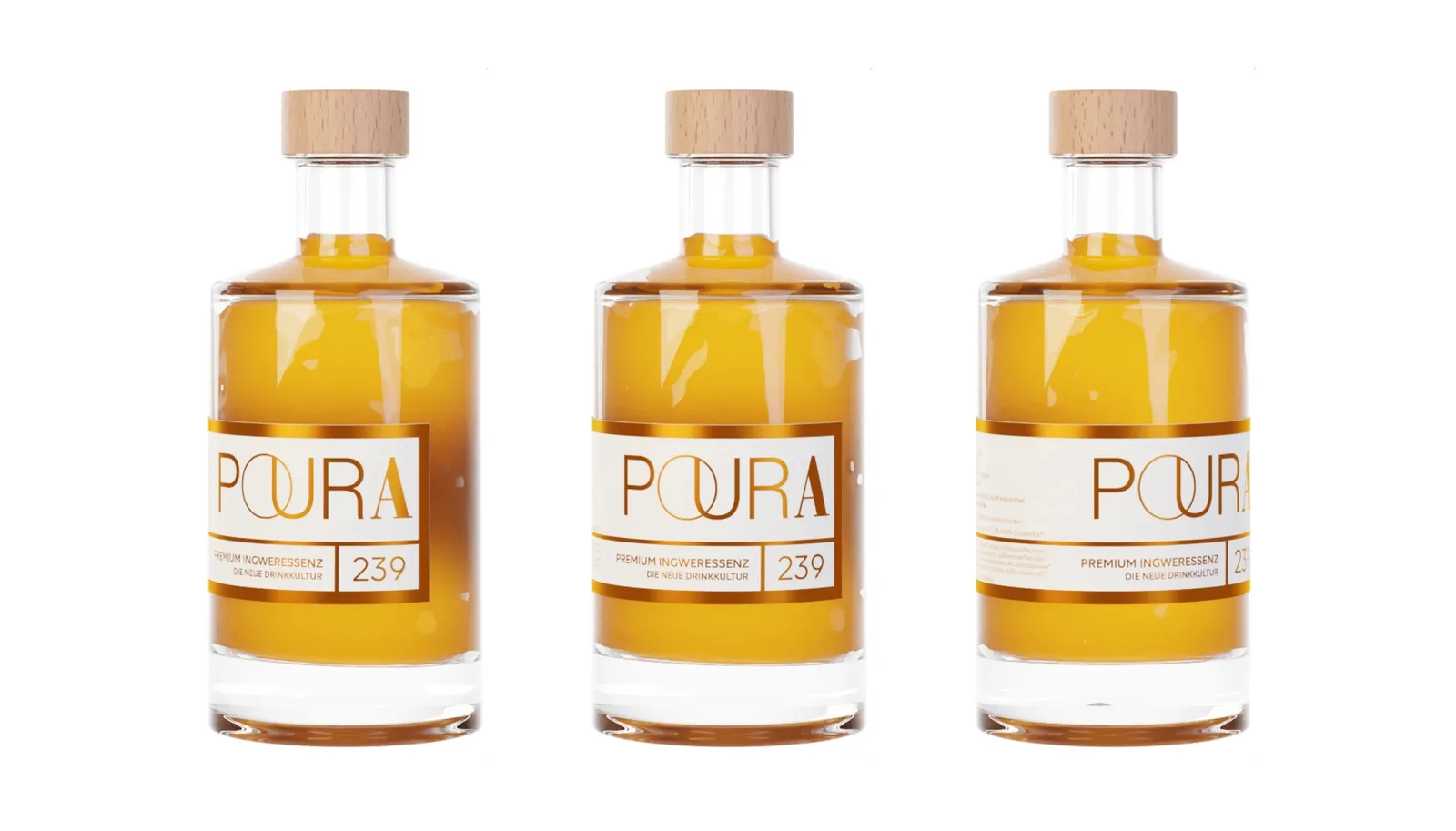
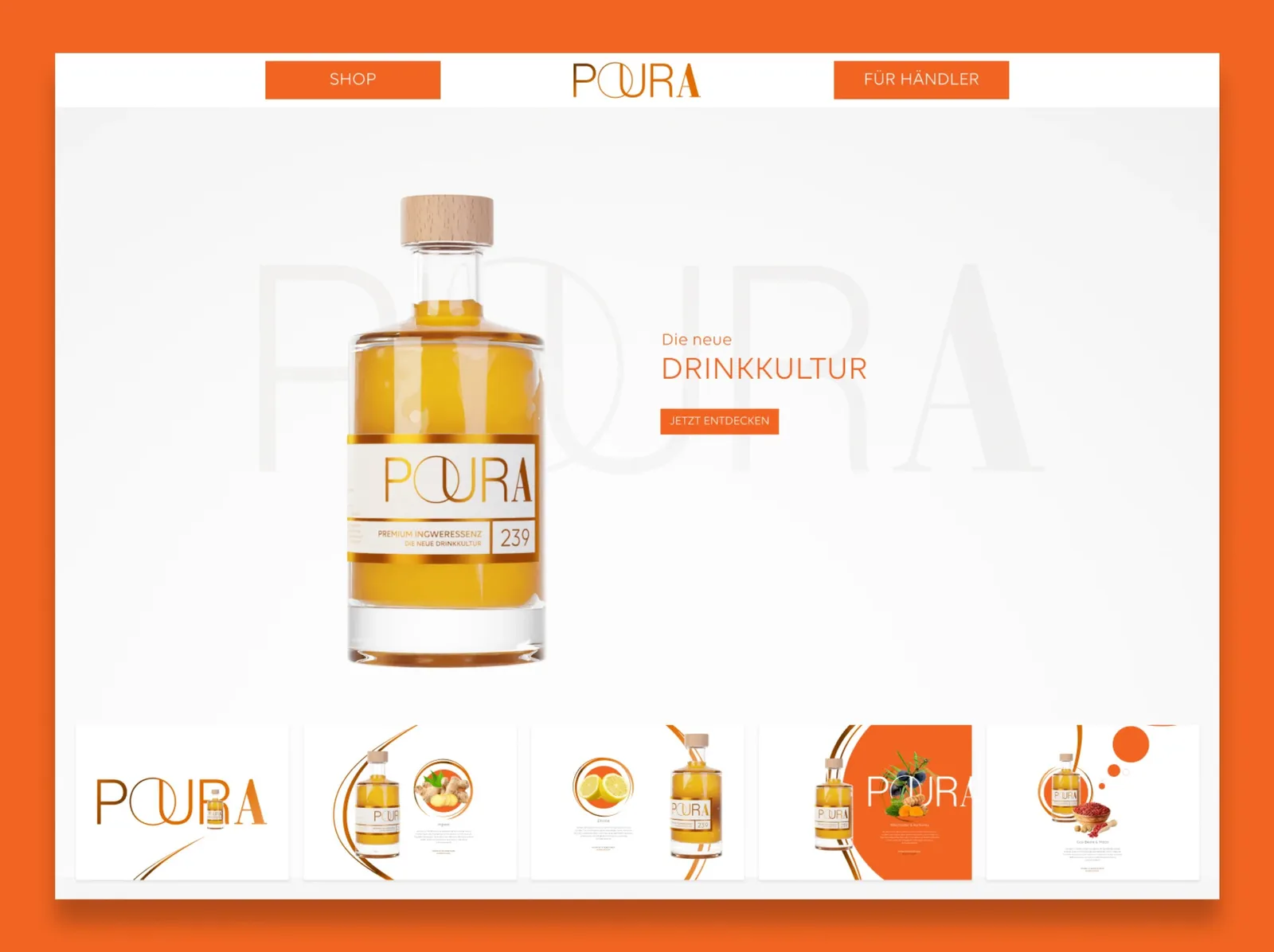
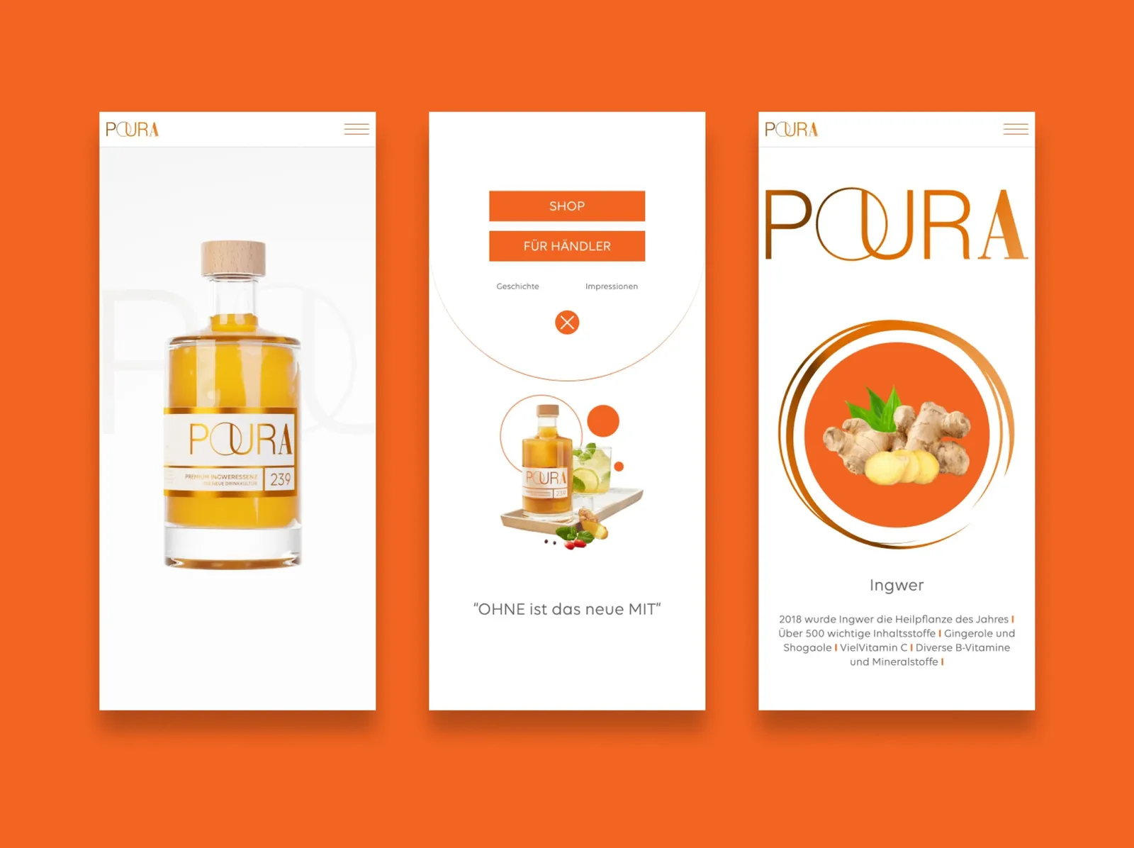
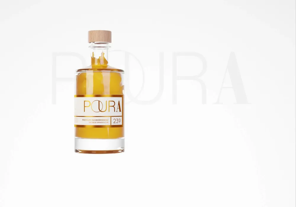
Poura is a premium ginger essence that looks more like a perfume than a drink. The website picks that up: a 3D-animated bottle accompanies visitors across the whole page, the round O from the logo becomes a design element, and everything is in white and orange. Awwwards honored the site with an Honorable Mention.
An extra mile for the quality upgrade
Staging is everything
360 degrees around the bottle
Honorable Mention at Awwwards
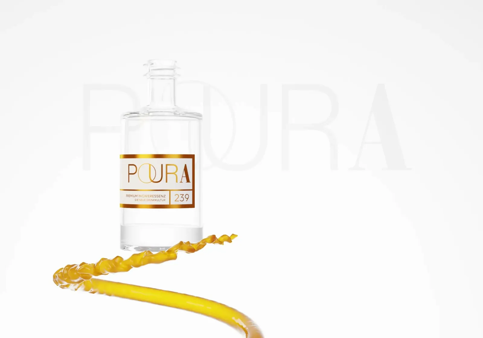
The movement carries the feeling
Bottle and ingredients tell it together
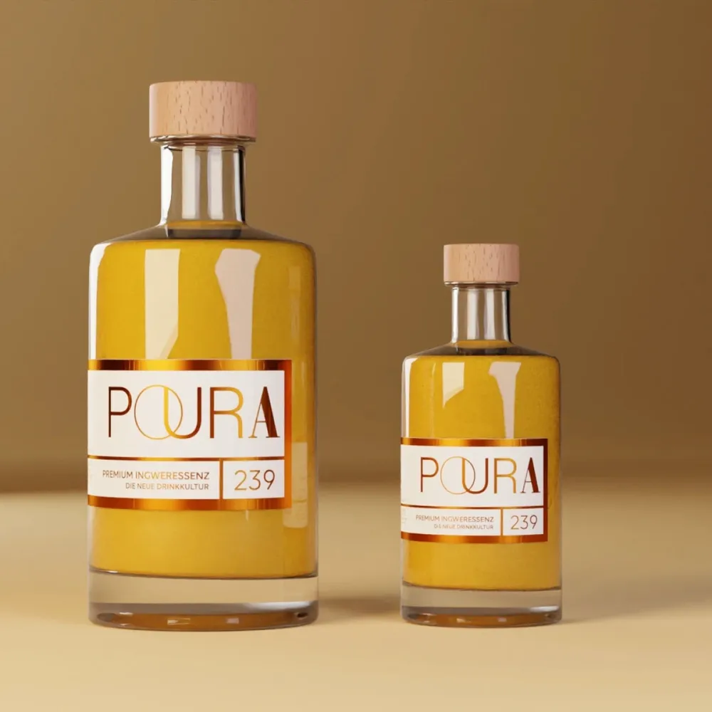
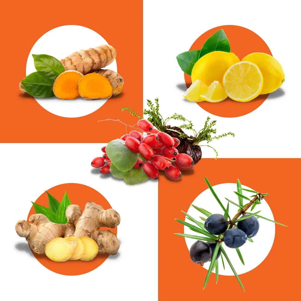
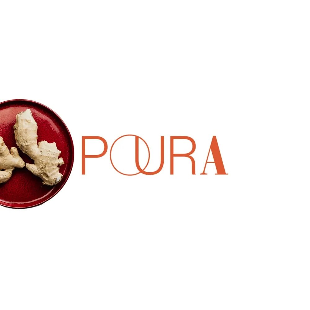
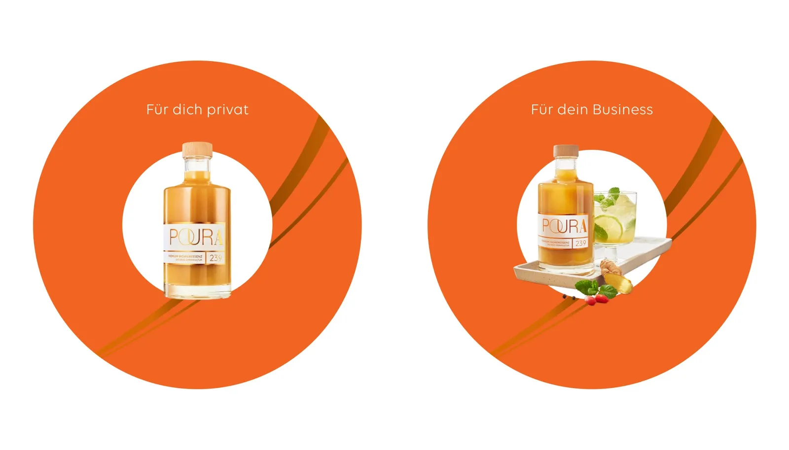
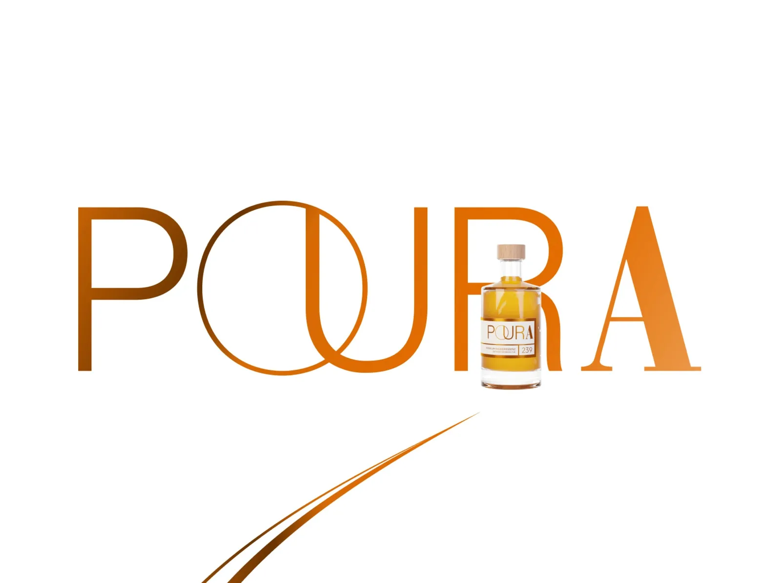
The O becomes a design element

The start of the journey
What's inside is up front
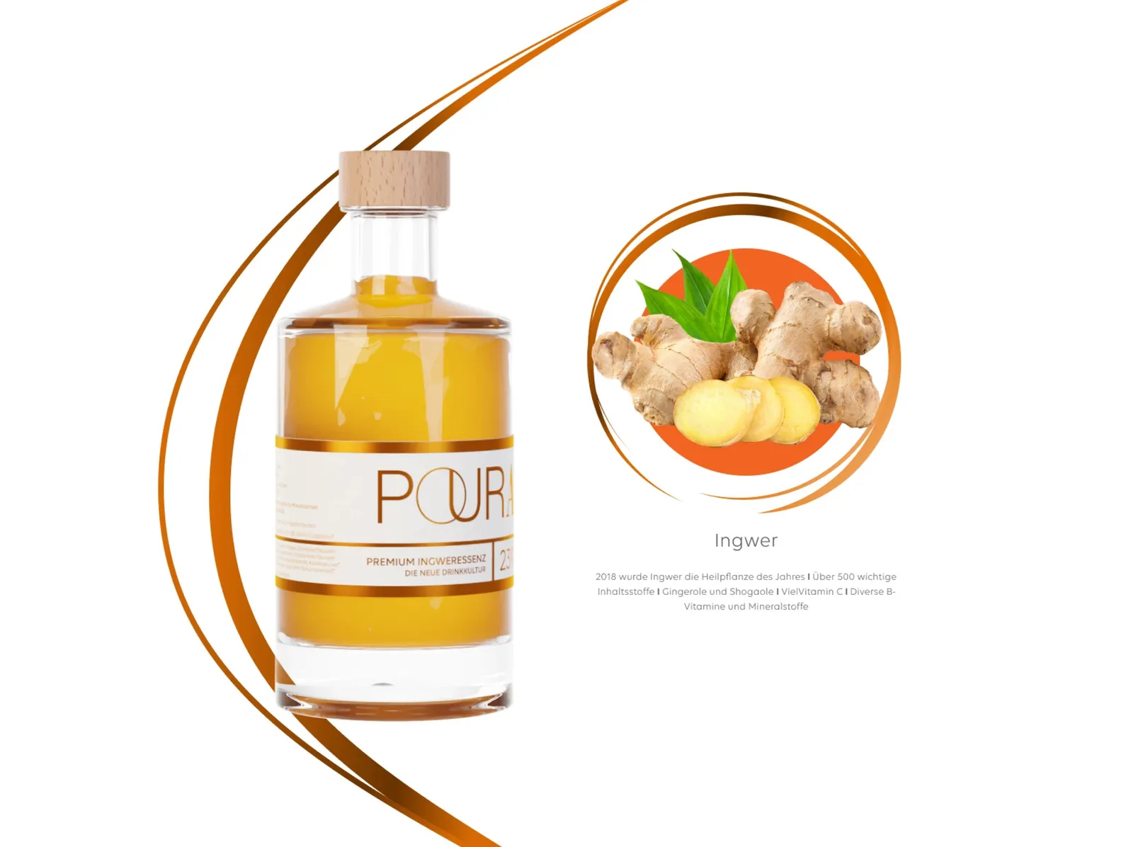
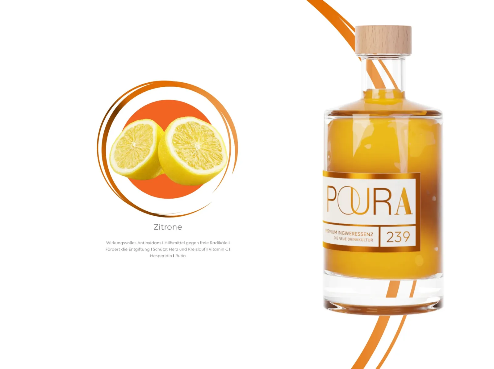
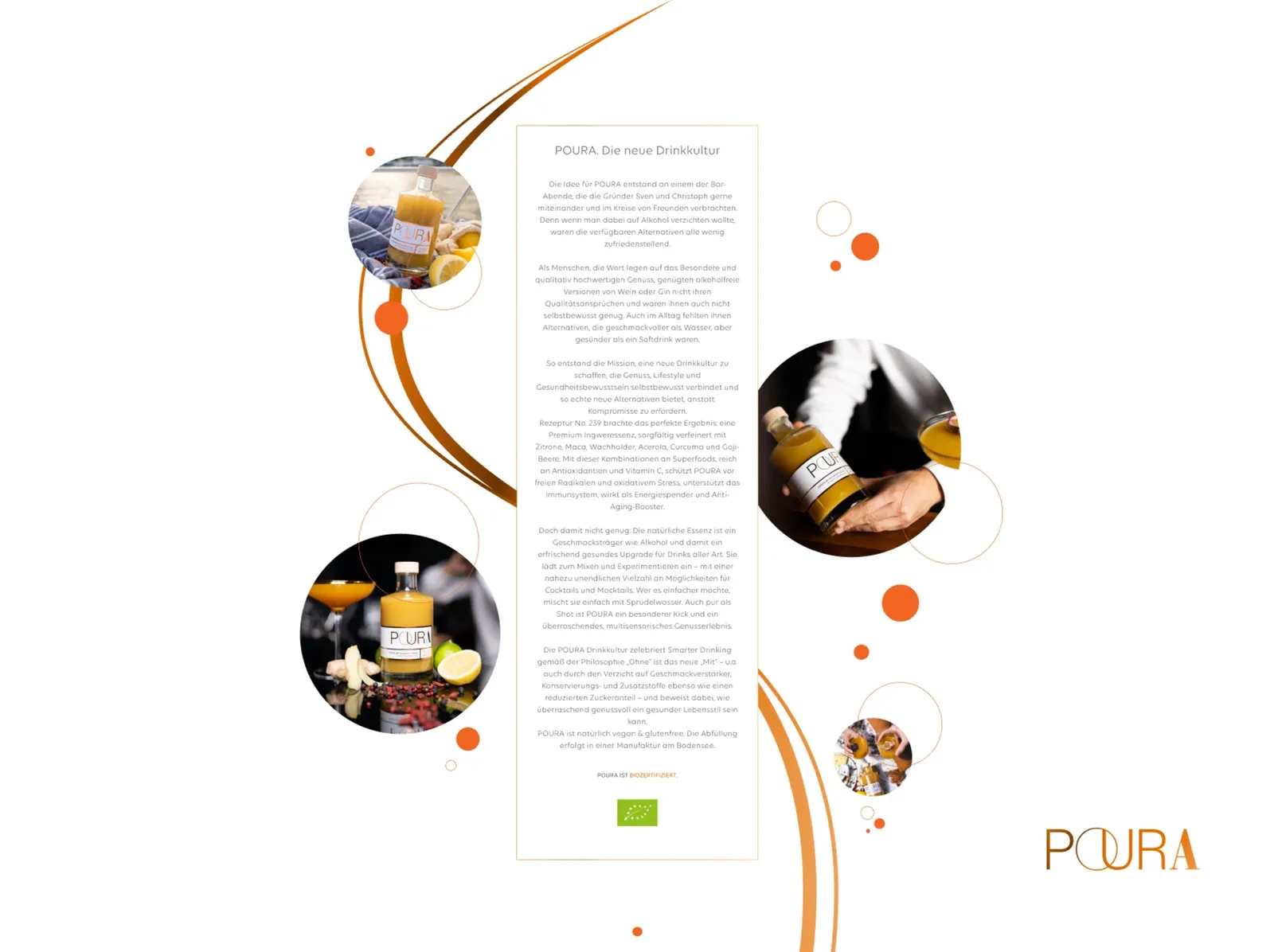
The story bubbles up too
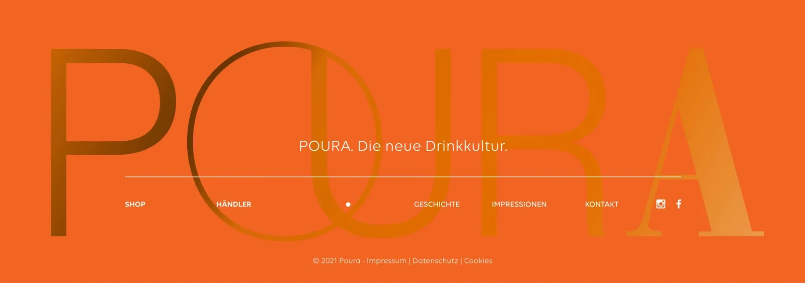
All the way into the footer
On the phone as well
A look behind the scenes
Designing the website for Poura really got our creative studio moving! It was clear from the start: we did not want just an ordinary website, but one that brings the essence of Poura to life in every animation and every pixel. And hey, the result is something to see!
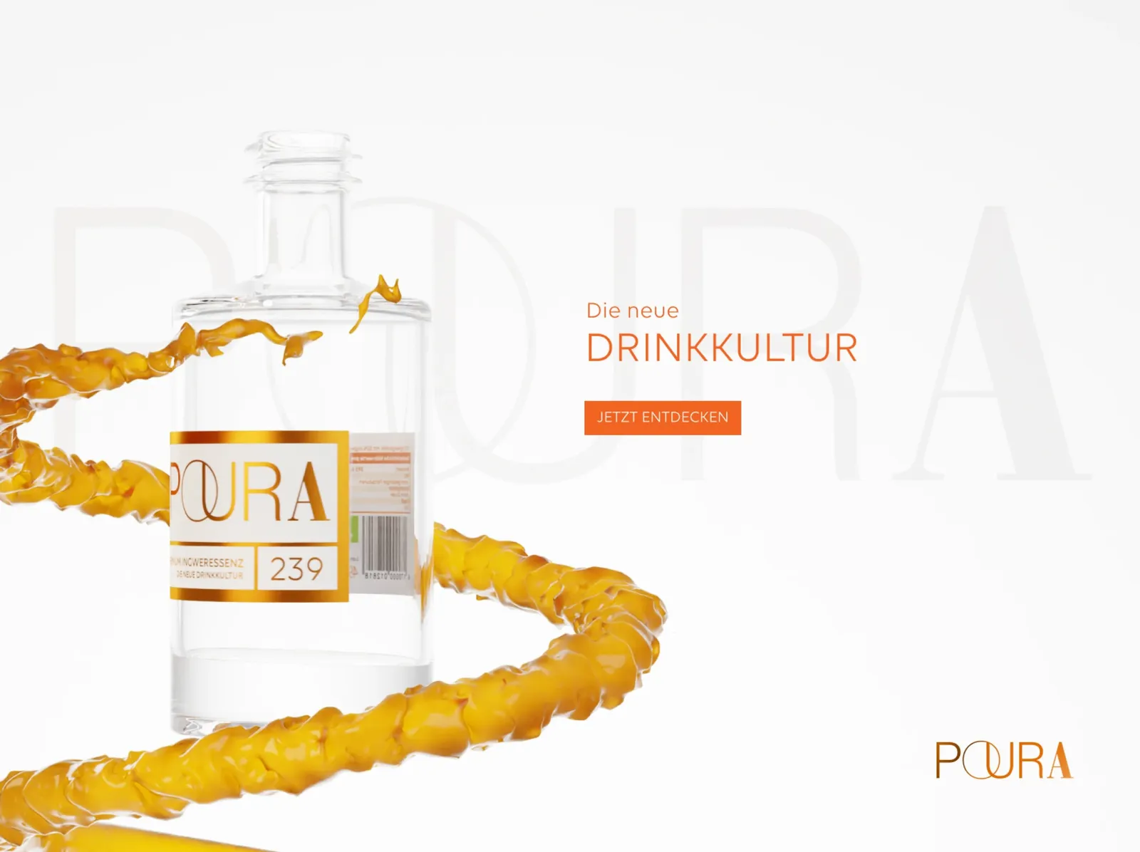
The starting gun is a breathtaking header in which the bottle is put in the spotlight with a slick 3D animation. We turned the bottle as if it were throwing its own party — a treat for the eyes! Over the course of the animation, the bottle fills up with contents that reflect Poura's heart and soul. And believe us, that was as much fun as it looks!
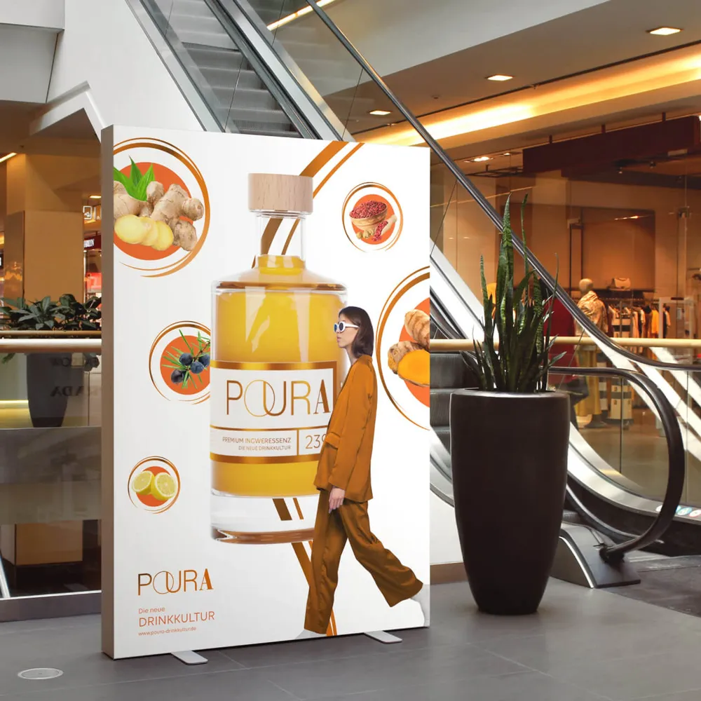
The website alone is an adventure: every section reveals more and more of Poura. From the specially selected ingredients to the attention to detail — we embedded all of it in a one-of-a-kind design. We introduced the 3D bottle as a personal travel companion that follows you along the page.
By the way, that round element from the “O” in Poura? Not just a pretty detail, but now a firmly integrated design element as well, which we have spread across the entire page. It gives the page that mega-cool dynamic that is simply fun!
The look of the website is minimalist, in white and orange tones that harmonize perfectly with Poura's vibes. We wanted the page to feel just as refreshing as what is in the bottle. Every pixel was designed with an extra helping of love — just like Poura itself.
Our intensive work on the Poura website paid off in every respect. Proud as we were, we uploaded the site to Awwwards. The response was simply overwhelming — our design approach and the unique execution drew the attention of the Awwwards community. Our efforts were honored with the coveted title “Honorable Mention”.
For us this was not only a confirmation of our creative work, but also proof that our design vision and the commitment we put into the Poura website really can achieve the results we are after. The Poura website remains a shining example of our abilities as a creative studio and a constant spur to keep creating exceptional designs that not only catch the eye but also excite the target group.
- Client
- Poura
- Studio
- Creative Agency WAGEMUT
- Services
- Brand Strategy, Graphic Design, UI/UX Design, Web Design, 3D Visualization, Film & Motion Design, E-Commerce & Online Shops
- Industry
- Food & Beverage
Share our work
Hospitality & Leisure
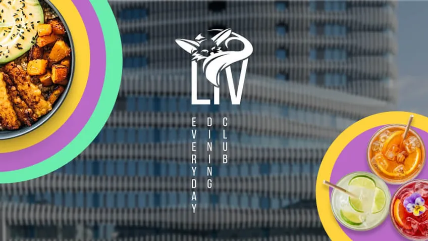
Liv Dining Club
The branding for the robot restaurant on the ground floor of the RKM 740 in Düsseldorf-Heerdt covers the logo, color scheme, typography and menu.
Hospitality & Leisure
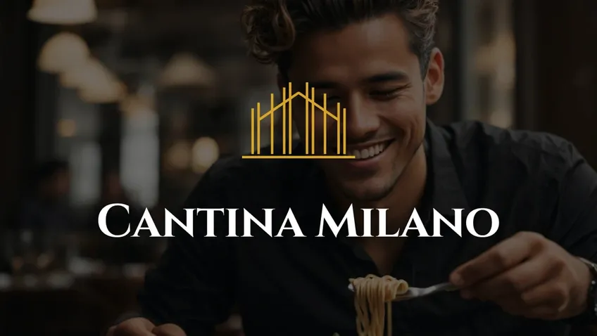
Cantina Milano
A logo taken from the gable of the building, three colors, two typefaces: branding and website for the gourmet restaurant Cantina Milano.
Professional Services
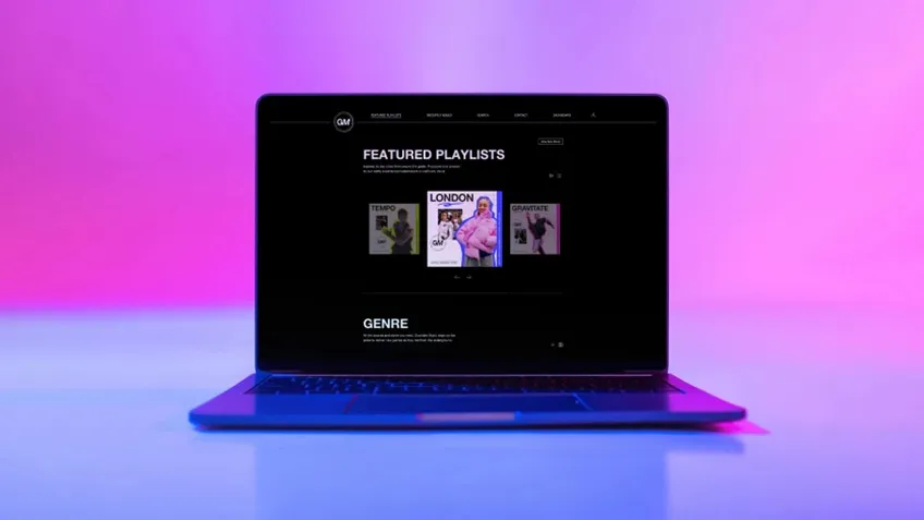
Gravitate Music
An invite-only platform for professional music productions out of London: a player with soundwaves, stems to download and a color for every genre.