Skip to content

Case Study

A brand for the robot restaurant in the RKM 740

Butter Butter GmbH — Liv Dining Club, Düsseldorf-Heerdt

For the Liv Dining Club on the ground floor of the RKM 740 in Düsseldorf-Heerdt we built the brand from the ground up — from the naming through a logo family with a stylized fennec fox to the menu, the window graphics and the style guide. The identity brings together Levantine cuisine, wabi-sabi and a contemporary self-service.
  • Hospitality & Leisure
  • Food & Beverage
  • Naming
  • Branding
  • Graphic Design
  • Print Media
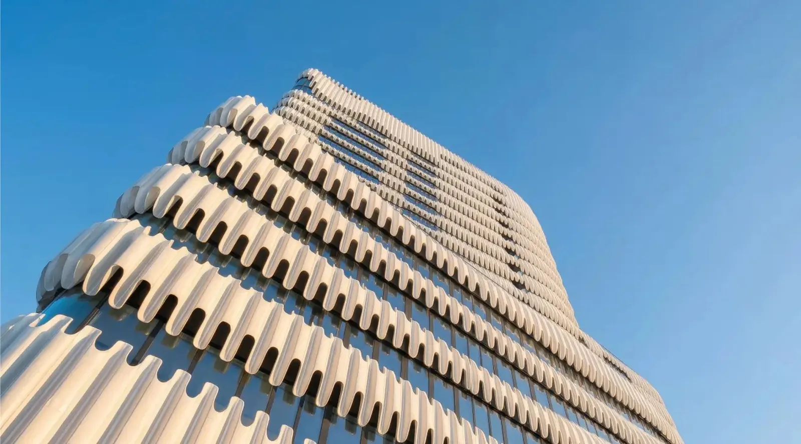
The undulating concrete facade of the RKM 740 office building in Düsseldorf-Heerdt against a blue sky

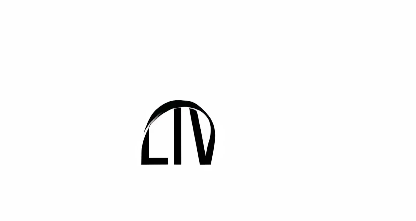
The wordmark builds itself

Animation in which the LIV wordmark builds up out of a curved black arc
A single arc becomes the LIV wordmark — the animation shows off the movement that the logo mark carries too.

A fennec fox as the pictorial element
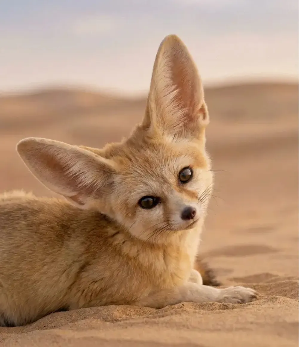
A fennec fox lies in the desert sand, its big ears upright
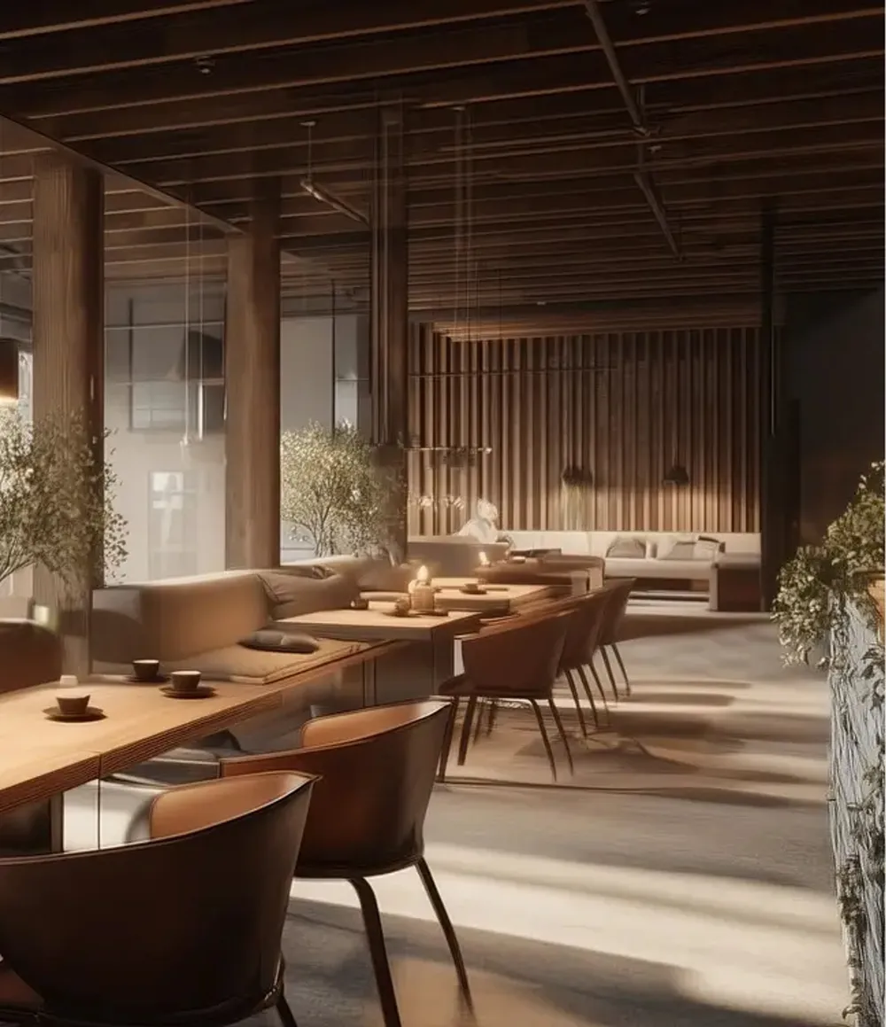
Visualization of the restaurant interior with wooden slats, long tables and plants
The project developed and defined the main logo and a consistent logo family, including clear exclusion zones and binding usage guidelines. The defining pictorial element is a stylized fennec fox. Its origins in the Arab world point to the brand's Syrian roots, while the Asian-inspired eyes give the mark a friendly, cheeky and contemporary character and at the same time carry a sense of closeness and familiarity.

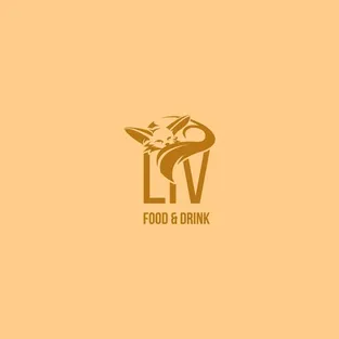
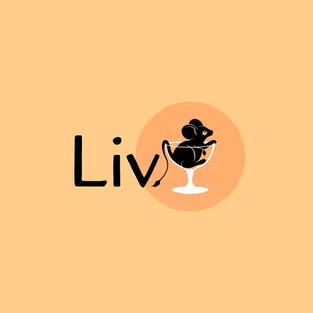
Twenty-four ways to one mark
  • Logo variant for the Liv Dining Club: gold fox mark above the LIV wordmark, with “Food & Drink” below it, on light sand yellow
  • Logo variant for the Liv Dining Club: black “Liv” wordmark next to a cocktail glass in an orange circle, on light sand yellow
  • Logo variant for the Liv Dining Club: white LIV wordmark with a seated fennec fox silhouette and “Food & Drink”, on turquoise
  • Logo variant for the Liv Dining Club: symmetrical fox mask made of red and white feathers above the serif LIV wordmark and “Dining Club”, on dark green
  • Logo variant for the Liv Dining Club: light fox mark above the LIV wordmark with “Food & Drink”, on golden brown
  • Logo variant for the Liv Dining Club: white “Liv” wordmark next to a cocktail glass in an orange circle, on golden brown
  • Logo variant for the Liv Dining Club: turquoise LIV wordmark with fox silhouette and underlined “Food & Drink”, on white
  • Logo variant for the Liv Dining Club: feather fox mask next to the serif LIV wordmark in red, on light blue
  • Logo variant for the Liv Dining Club: black fox mark above the LIV wordmark with “Food & Drink”, on white
  • Logo variant for the Liv Dining Club: black “Liv” wordmark next to a cocktail glass in an orange circle, on white
  • Logo variant for the Liv Dining Club: black LIV wordmark with fox silhouette and “Food & Drink”, on white
  • Logo variant for the Liv Dining Club: feather fox mask next to the serif LIV wordmark, on white
  • Logo variant for the Liv Dining Club: white fox mark above the LIV wordmark with “Food & Drink”, on black
  • Logo variant for the Liv Dining Club: white “Liv” wordmark next to a cocktail glass in an orange circle, on black
  • Logo variant for the Liv Dining Club: white LIV wordmark with fox silhouette and “Food & Drink”, on black
  • Logo variant for the Liv Dining Club: feather fox mask next to the light serif LIV wordmark, on black
  • Logo variant for the Liv Dining Club: white fox mark above the LIV wordmark with “Food & Drink” on two lines, on petrol blue
  • Logo variant for the Liv Dining Club: white “Liv” wordmark next to a cocktail glass on a speckled orange shape, on golden brown
  • Logo variant for the Liv Dining Club: white fox mark in front of an orange circle above the LIV wordmark, on turquoise
  • Logo variant for the Liv Dining Club: feather fox mask next to the serif LIV wordmark, on dark green
  • Logo variant for the Liv Dining Club: gold fox mark above the LIV wordmark without an added line, on light sand yellow
  • Logo variant for the Liv Dining Club: white “Liv” wordmark next to a cocktail glass on a speckled orange shape, on light sand yellow
  • Logo variant for the Liv Dining Club: turquoise fox silhouette above the LIV wordmark with “Food & Drink”, on white
  • Logo variant for the Liv Dining Club: the feather fox mask on its own as the mark, on light blue
Several logo variants secure flexible use on every surface and in every medium.

Black and white as a decision
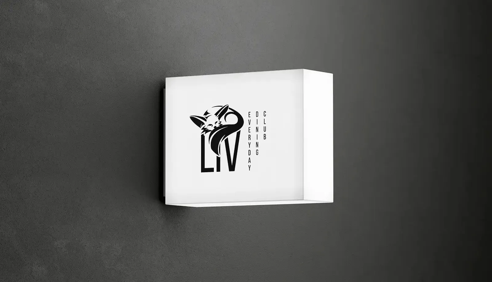
White light box with the Liv logo on a dark concrete wall
For the final logo we decided on a black-and-white version. It emphasizes minimalism and simplicity. The female fennec fox as the central motif symbolizes care, life and the ability to turn any place into a home. Her big ears stand for natural imperfection (wabi-sabi), her curled-up posture conveys belonging and well-being – core values of LIV.

A family instead of a logo

  • The final Liv mark: a black fox head whose tail flows into the wordmark
  • Mark and LIV wordmark stacked as a compact combination mark
  • Combination mark with “Everyday Dining Club” added on three lines to the right of the wordmark
  • Combination mark with “Everyday Dining Club” added vertically
  • Horizontal combination mark with the mark, the LIV wordmark and a two-line addition
Mark and typography combine freely — depending on how much room the application gives them.

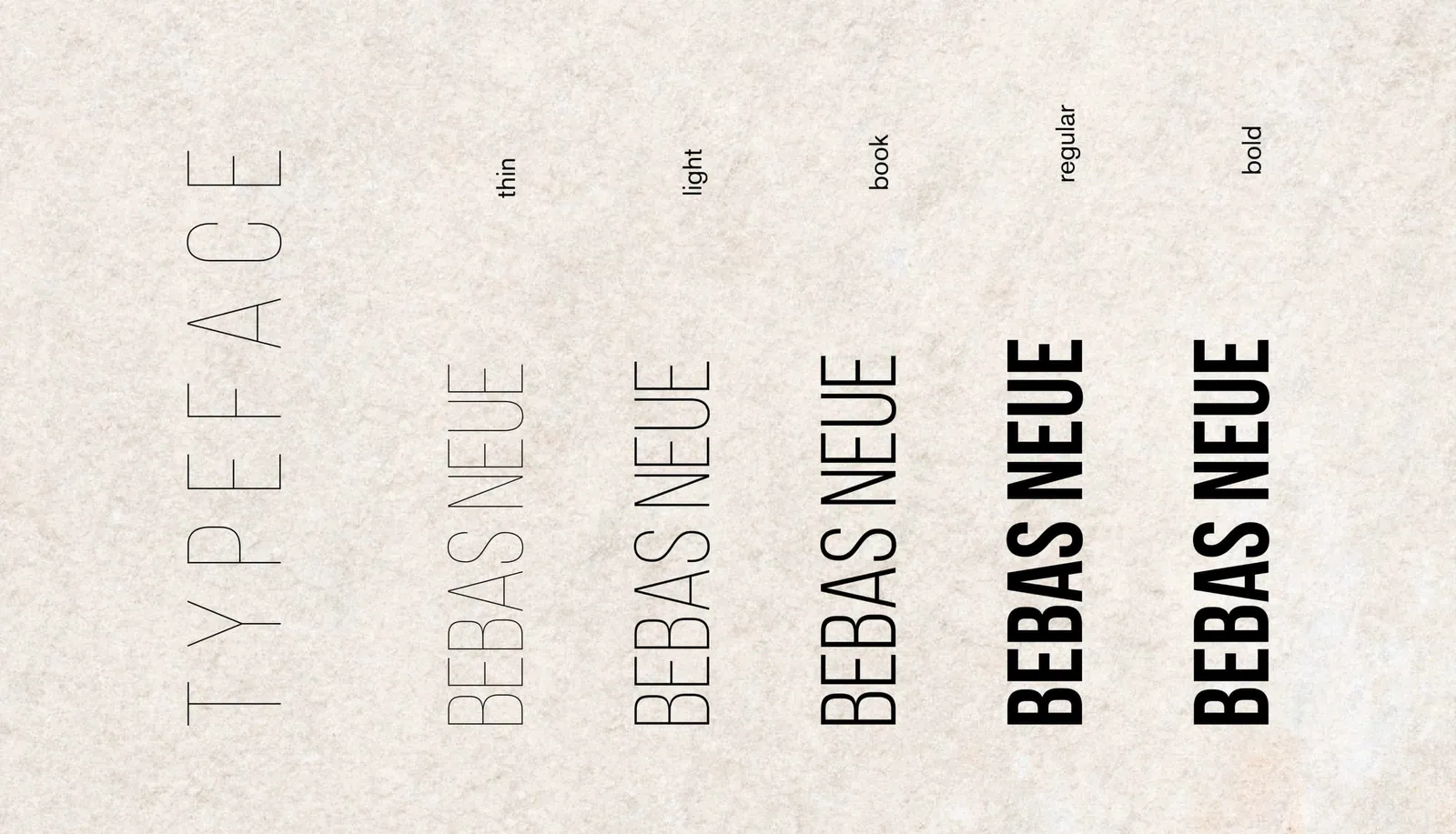
Bebas Neue for the wordmark

Type specimen of Bebas Neue in the thin, light, book, regular and bold weights
The primary font for the wordmark and the leading typography is “Bebas Neue”, which conveys clarity, modernity and a strong visual presence.

Wood, stone and a clear mark

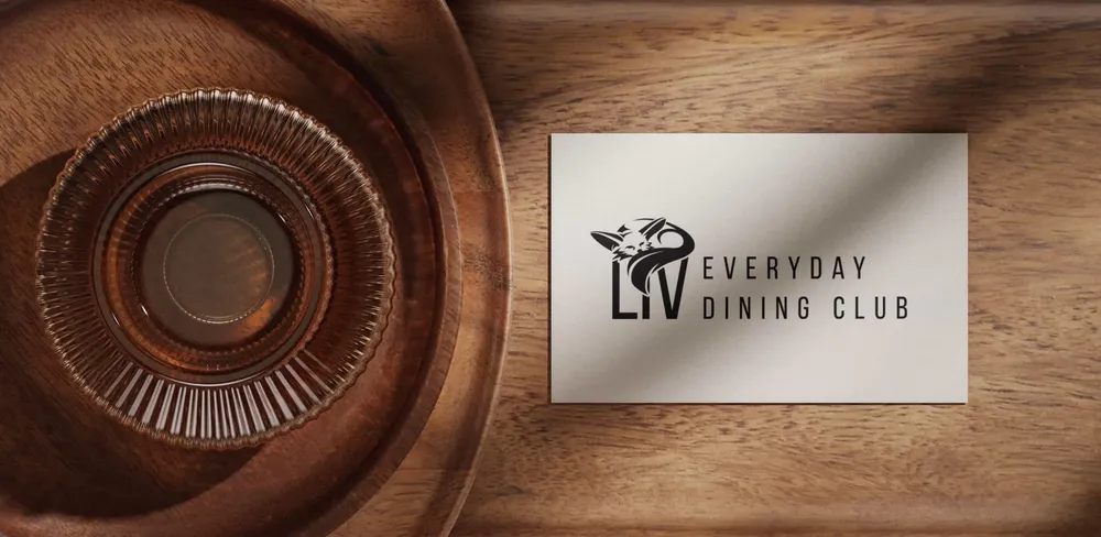
Business card with the Liv logo on a turned wooden bowl
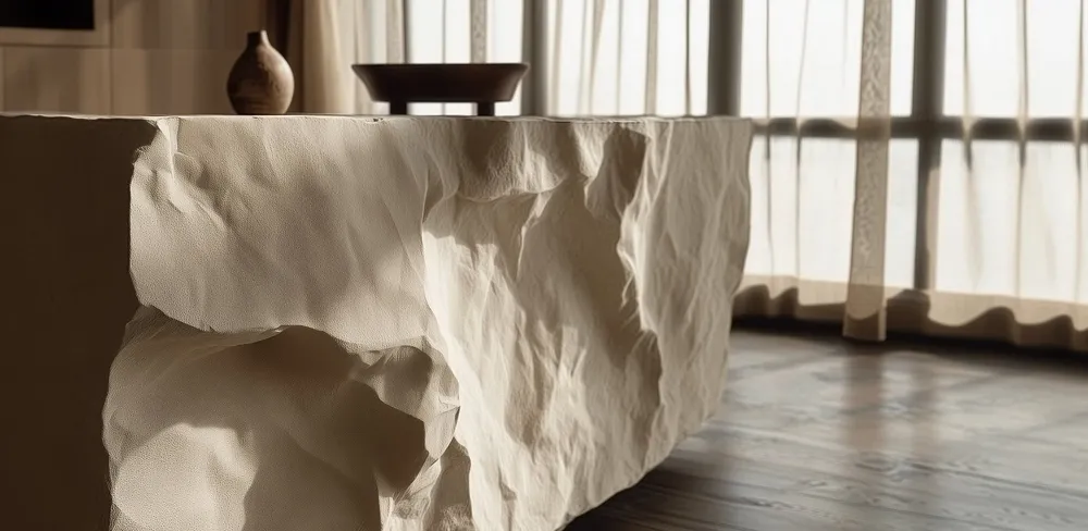
Roughly hewn light stone table in front of a window flooded with light
The logo works in every medium and fits harmoniously into the robot restaurant, which combines natural materials with modern technology.

A style guide holds it all together

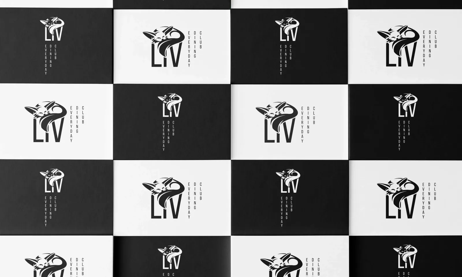
Cards in black and white arranged like a chessboard, each with a different combination of mark and wordmark
The logo family with its variable combinations of mark and typography allows flexible use of the logo for the different applications in the restaurant. On top of that, a style guide was produced that clearly defines the logo, color scheme, typography and style elements.

From the T-shirt to the bag

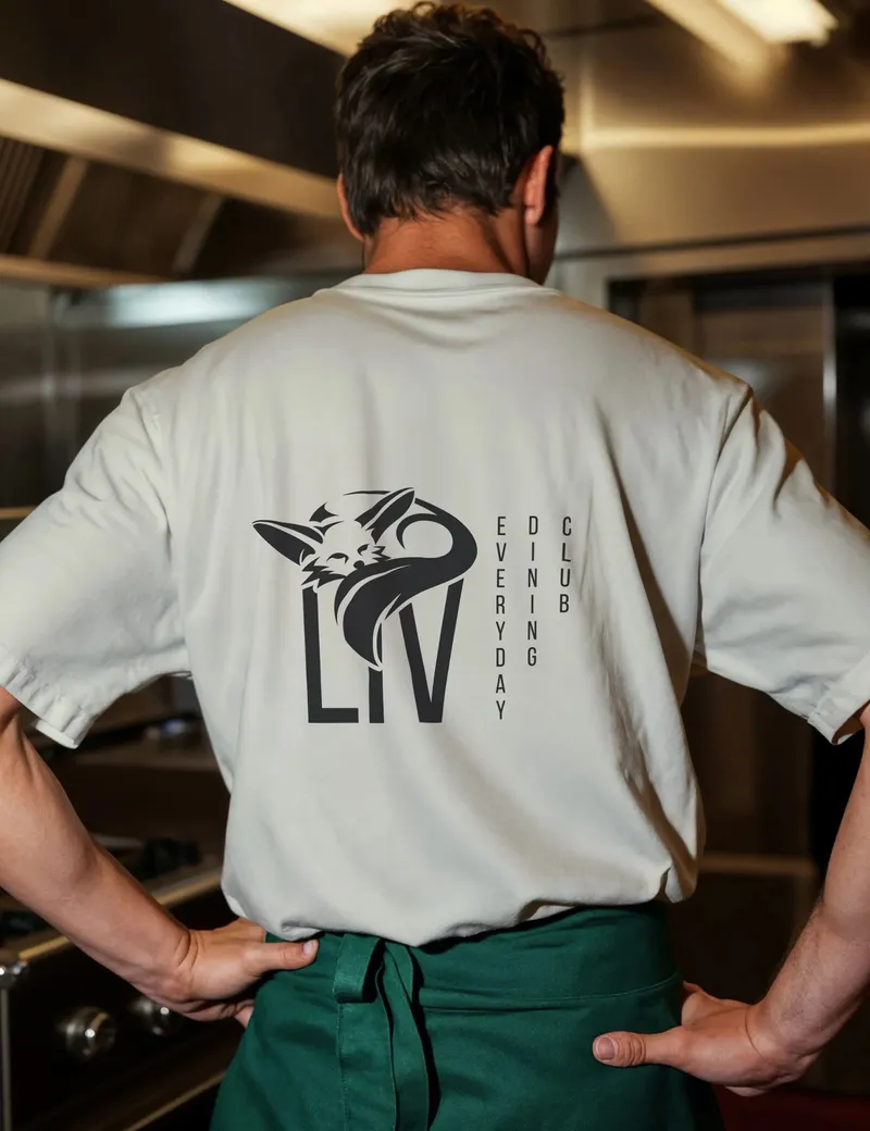
Kitchen staff seen from behind in a light T-shirt with the Liv logo on the back
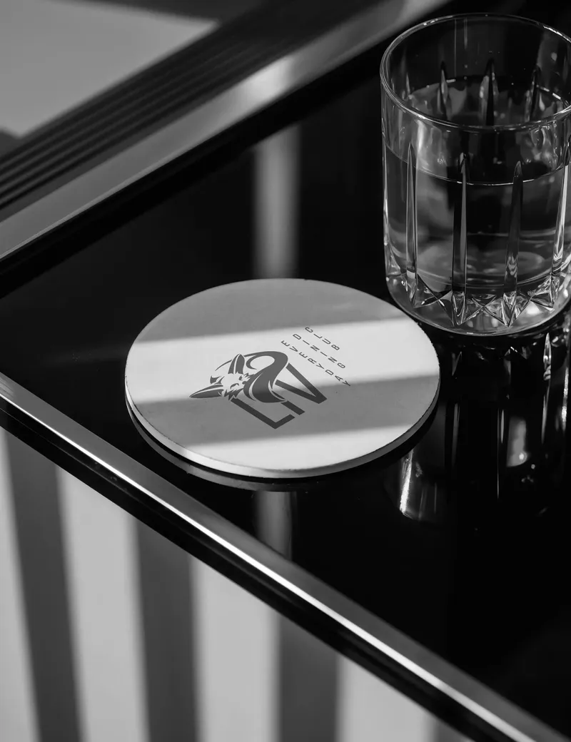
Round coaster with the Liv mark next to a glass of water on a dark counter
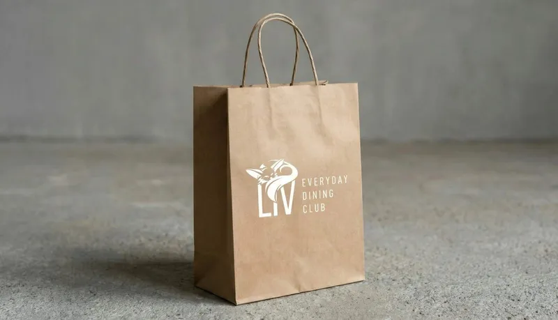
Kraft paper carrier bag with the white Liv logo
Workwear, coasters and carrier bags carry the same mark — pared back enough to hold up on any material.

Did our work inspire you?

Tell us about your project, short and to the point. It makes no difference whether you bring a rough idea or a polished concept. We look forward to your enquiry.

Four pages of menu

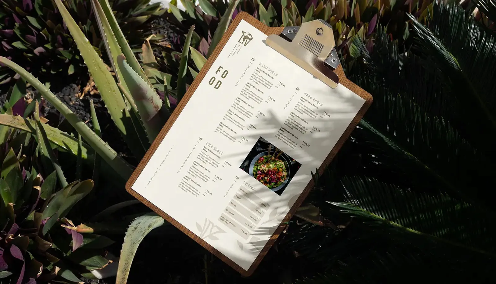
Food menu on a clipboard, surrounded by tropical plants
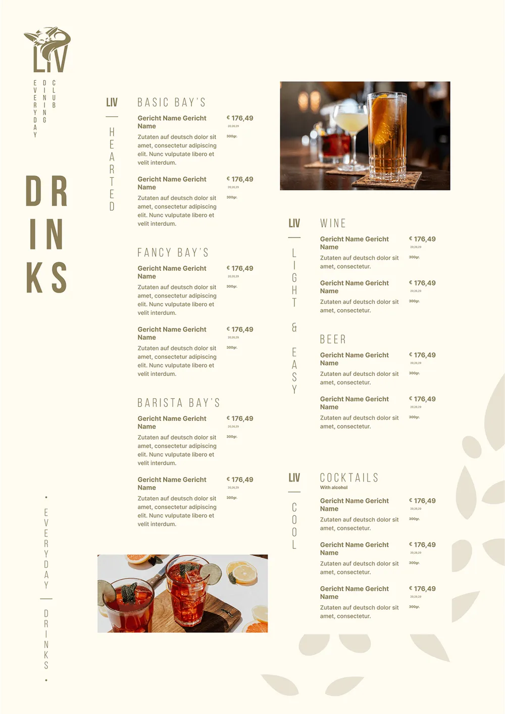
For the robot restaurant, a menu of up to four pages was designed that picks up the visual identity and carries the brand identity consistently into the guest experience.

A banner as an eye-catcher

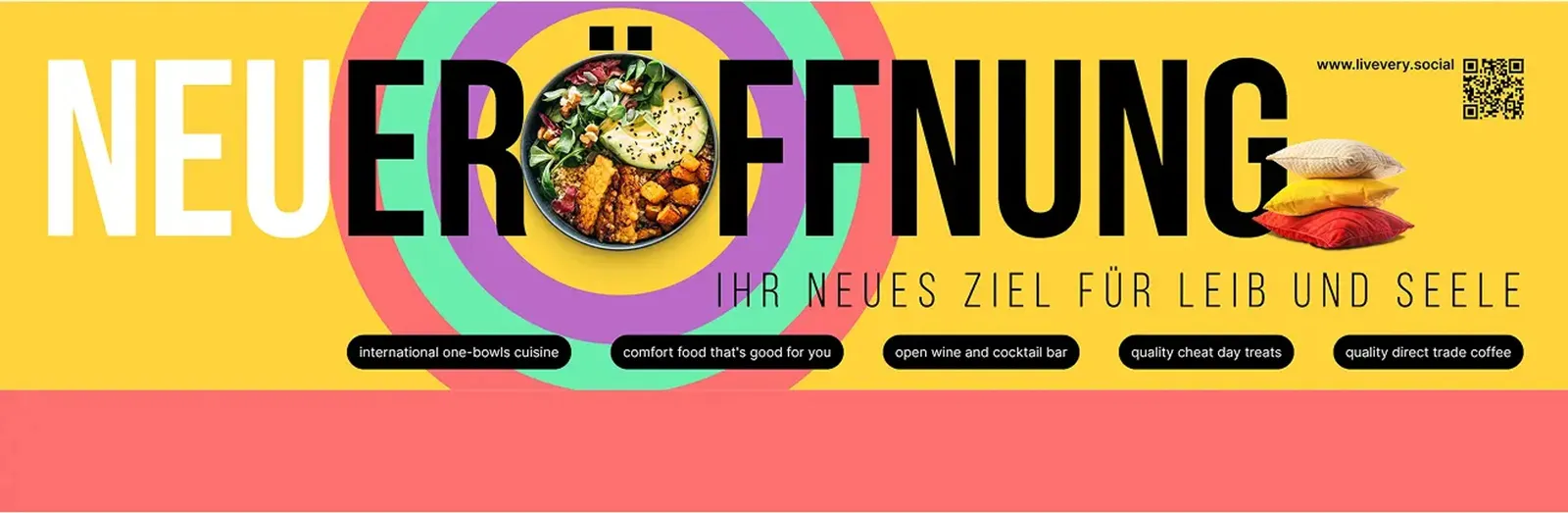
Advertising banner with the word “Neueröffnung” in yellow and red, plus dishes and a QR code
For the opening, the banner hangs on the building: dishes, a QR code and the wordmark in yellow and red — the first thing passers-by see of LIV.

Color for the windows

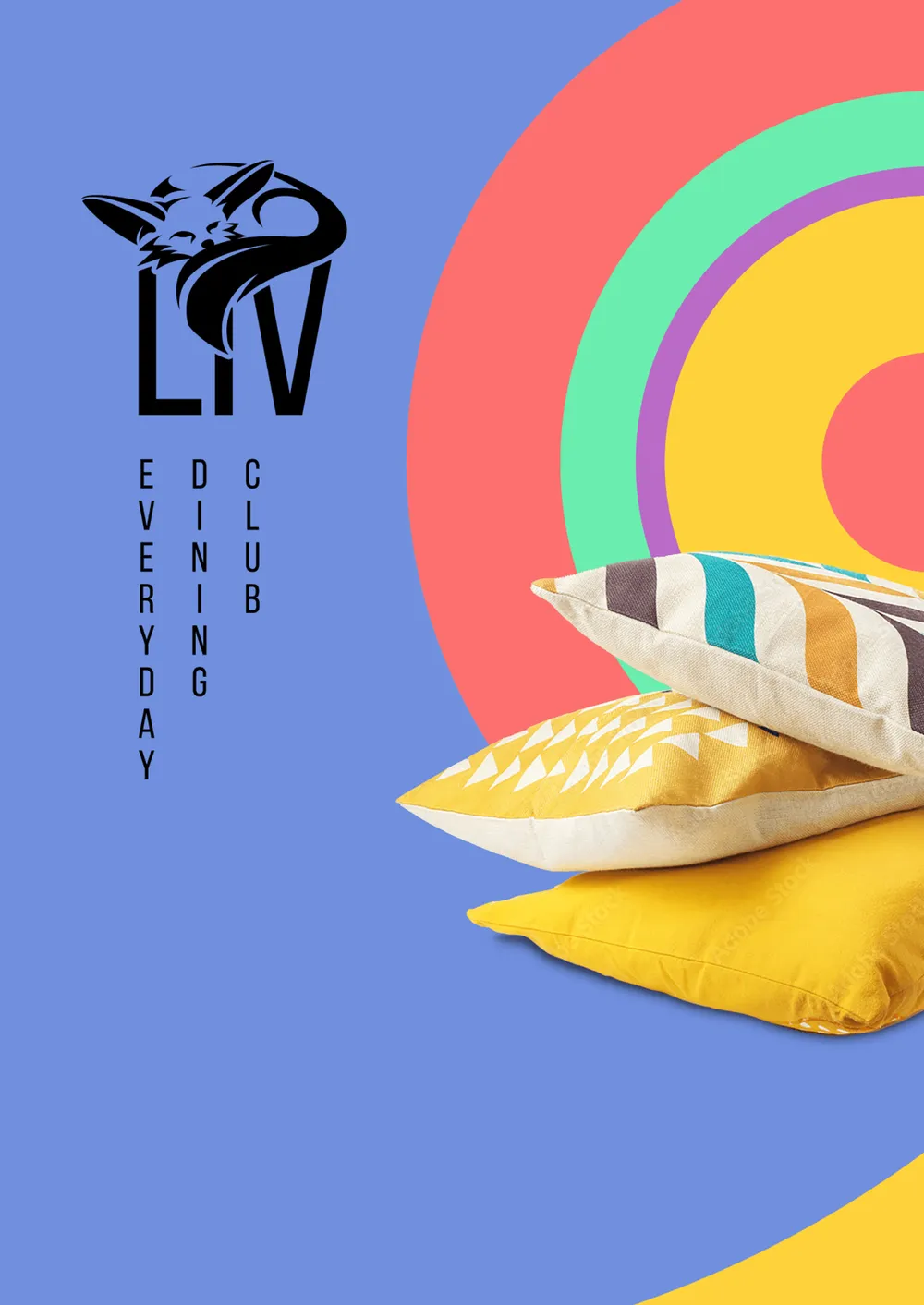
Window graphic in blue with concentric arcs of color and patterned cushions
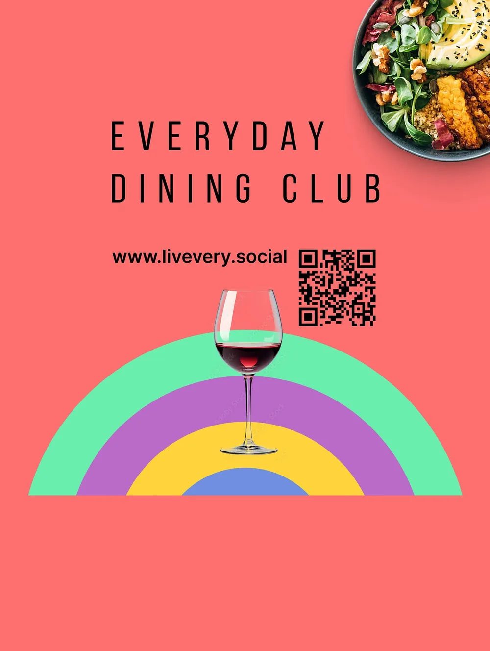
Window graphic in red with a wine glass in front of a rainbow of color arcs
The window graphics in different variants and colors set a colorful accent that shows the variety of Levantine cuisine and natural elements in a modern style, and at the same time conveys a feeling of home and relaxation.

Arrived at the building

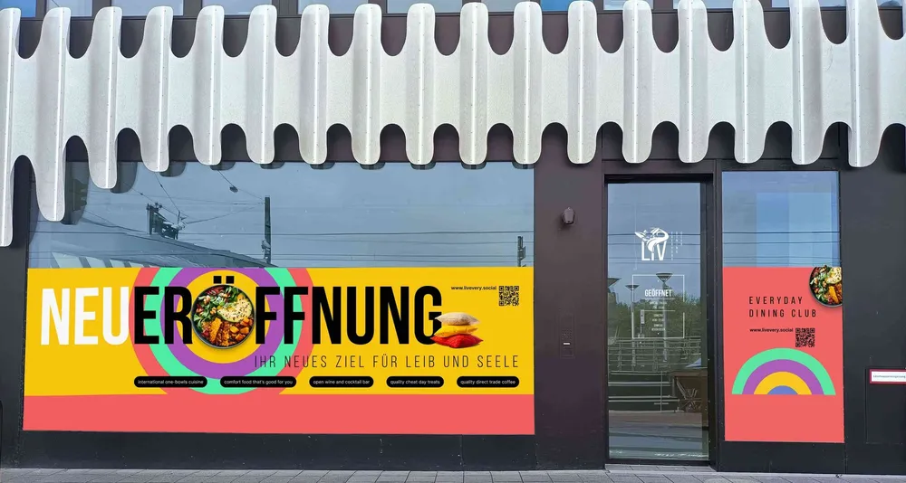
Ground floor of the RKM 740 with the opening banner and the graphics on the windows
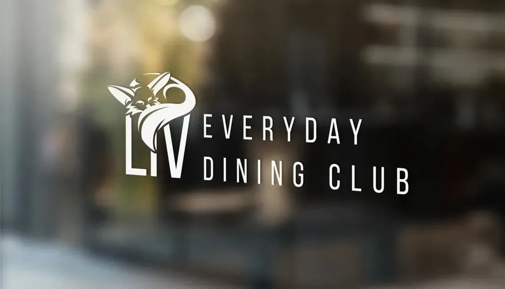
The Liv logo as white vinyl on a window pane, with the dining room blurred behind it
The bright window graphics on the RKM 740 and the logo on the exterior windows look dynamic and fit perfectly into the extraordinary facade architecture.

Where taste meets atmosphere

LIV combines nature and modernity in a way all its own. Organic shapes, wood and sustainability shape the appearance, while technology works subtly in the background as an enabler and creates a harmonious link between bohemian style, wabi-sabi and biophilia. The design reflects Levantine cuisine and conveys a feeling of home – a cozy living-room atmosphere for guests.

At the center of the identity stands the fox in the logo: a symbol of care, life and transformation. The final black-and-white design unites minimalism and clarity with timeless elegance and makes LIV unmistakable.

From the naming through the logo to the complete style guide, LIV came about in an iterative process. Every choice of color – from bright turquoise through sand and earth tones to dark brown and beige – as well as every shape and every detail was carefully tested to make the personality of the brand tangible: free, lively, natural and modern at the same time.