Case Study
Italian with charm
Cantina Milano — branding and website for a gourmet restaurant
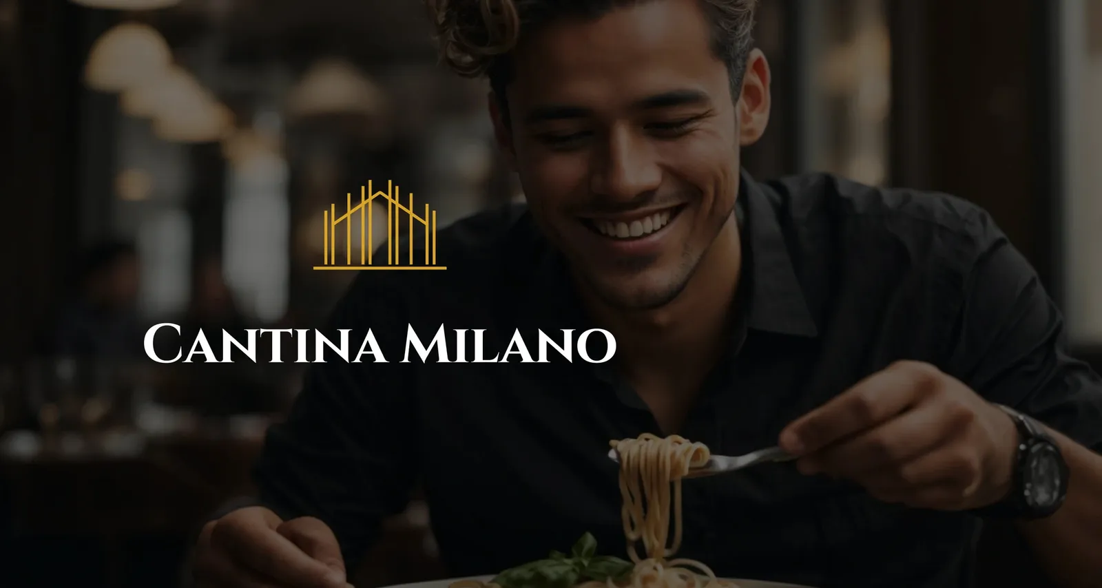
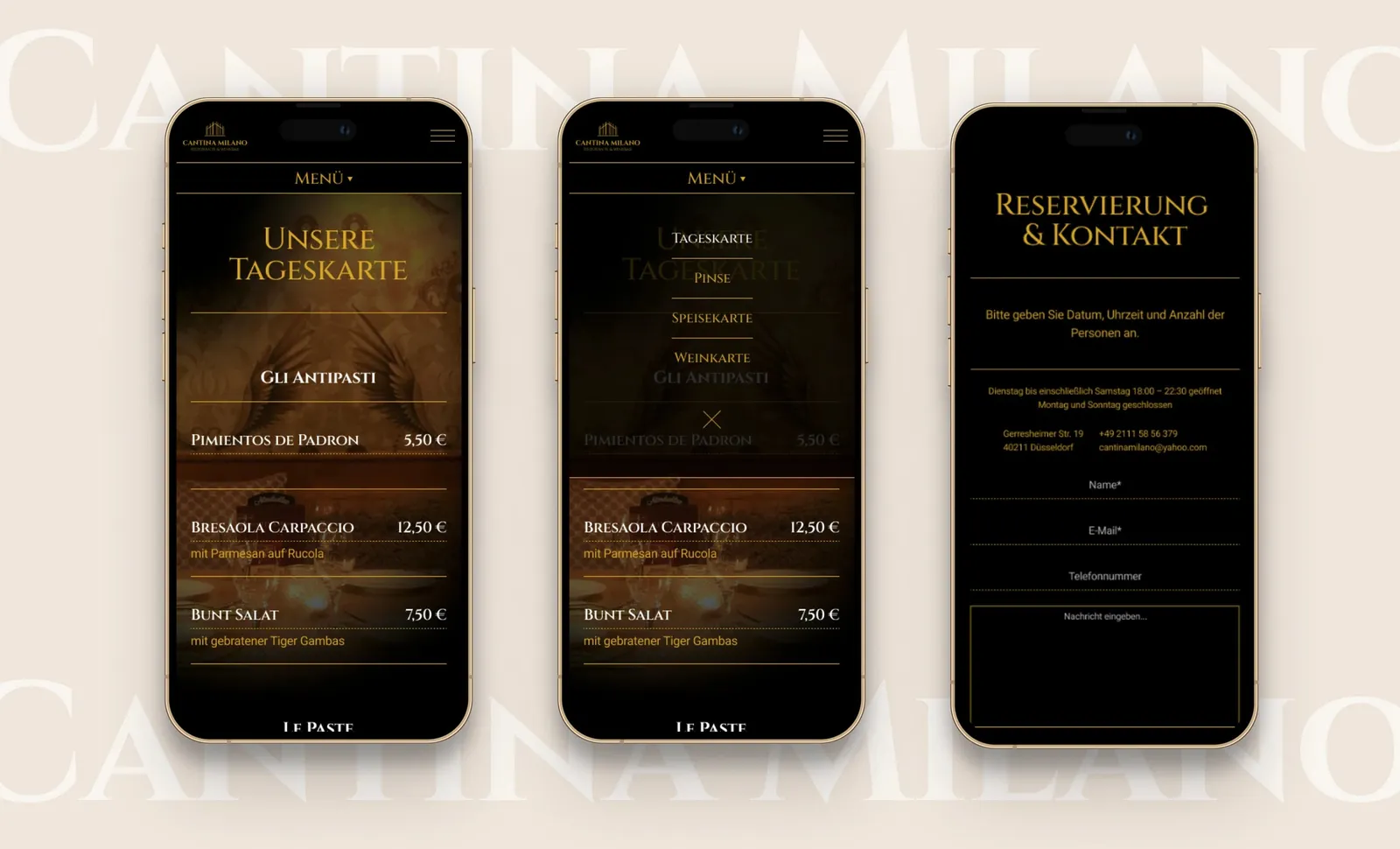
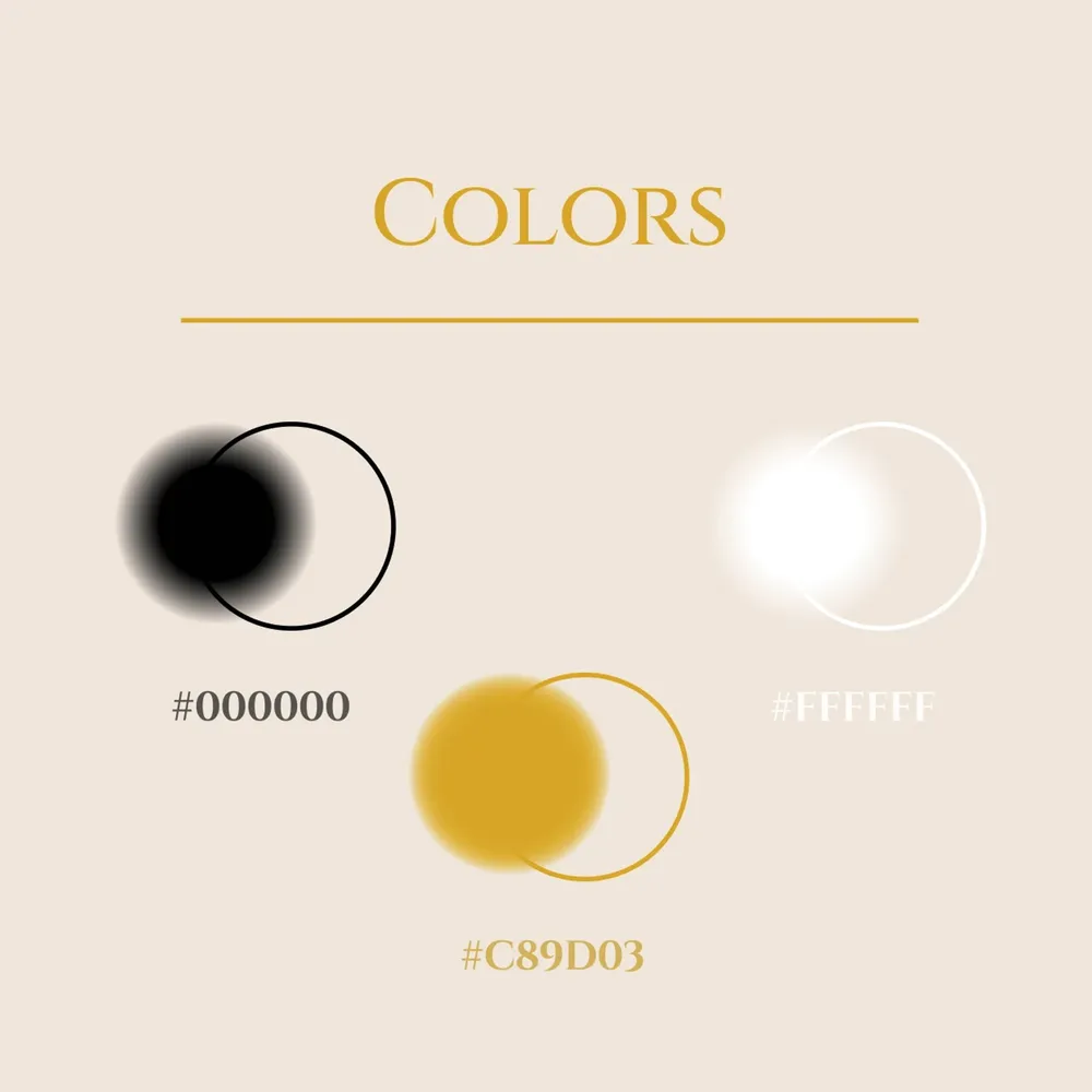
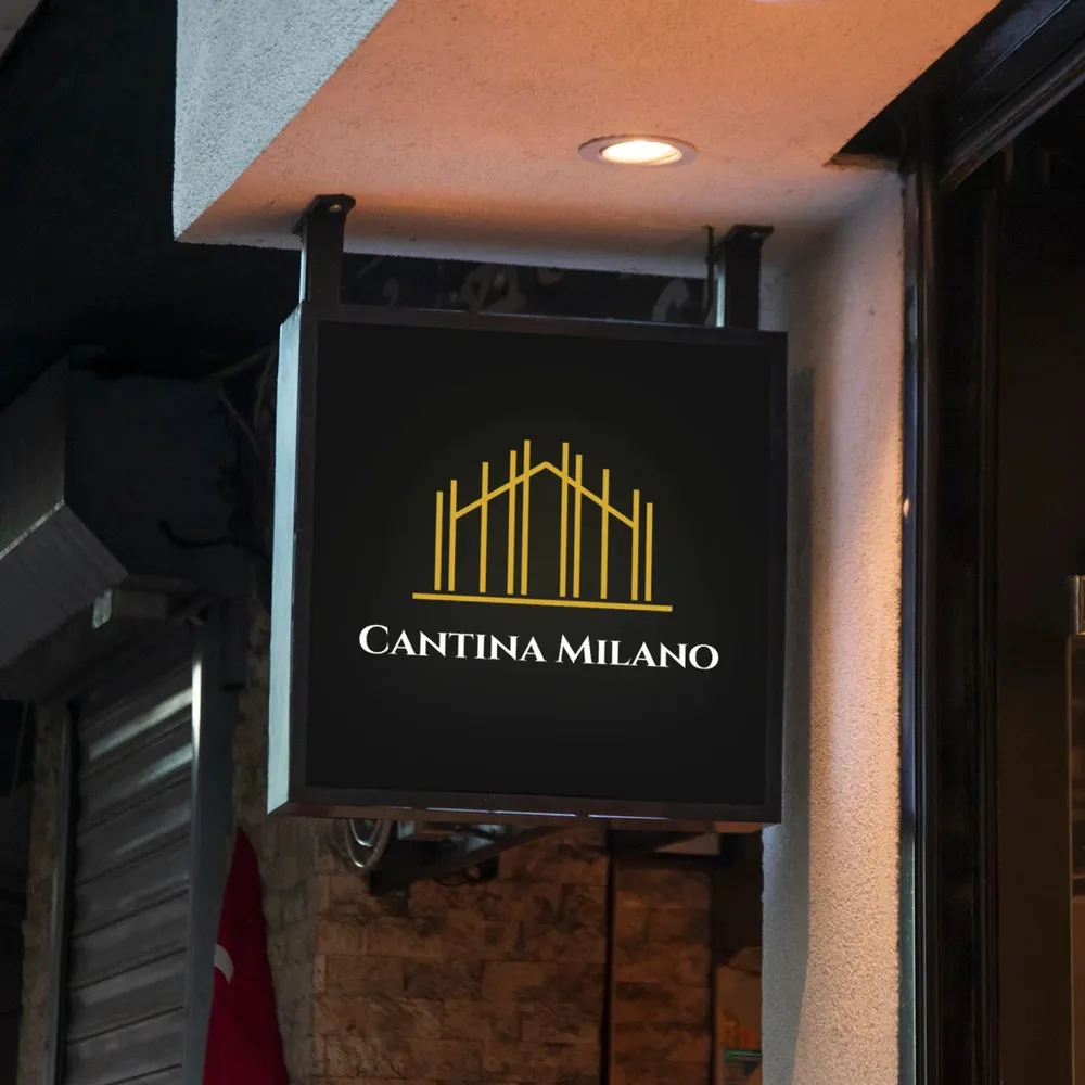
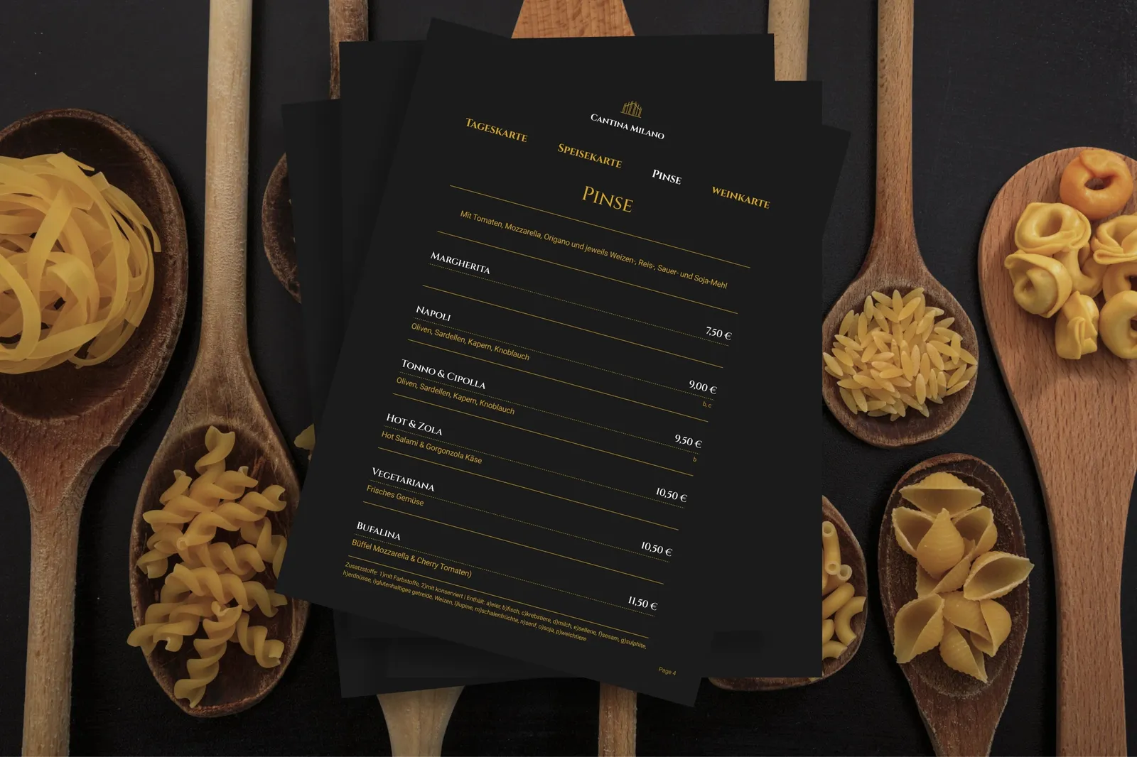
Italian with charm: for the gourmet restaurant Cantina Milano we created an identity that does not claim elegance but shows it — a logo taken from the gable of the building, three colors, two typefaces and a website on which the photos of the restaurant lie in the dark. From the pavement sign to the menu, the same design principle carries through.
Fine lines instead of hard edges
Three colors, two typefaces
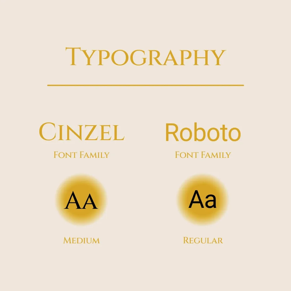
Calm, but not tame
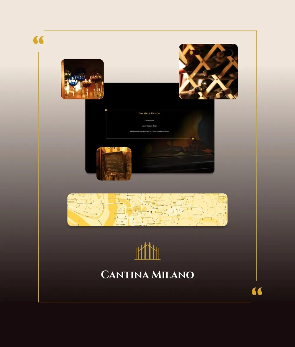
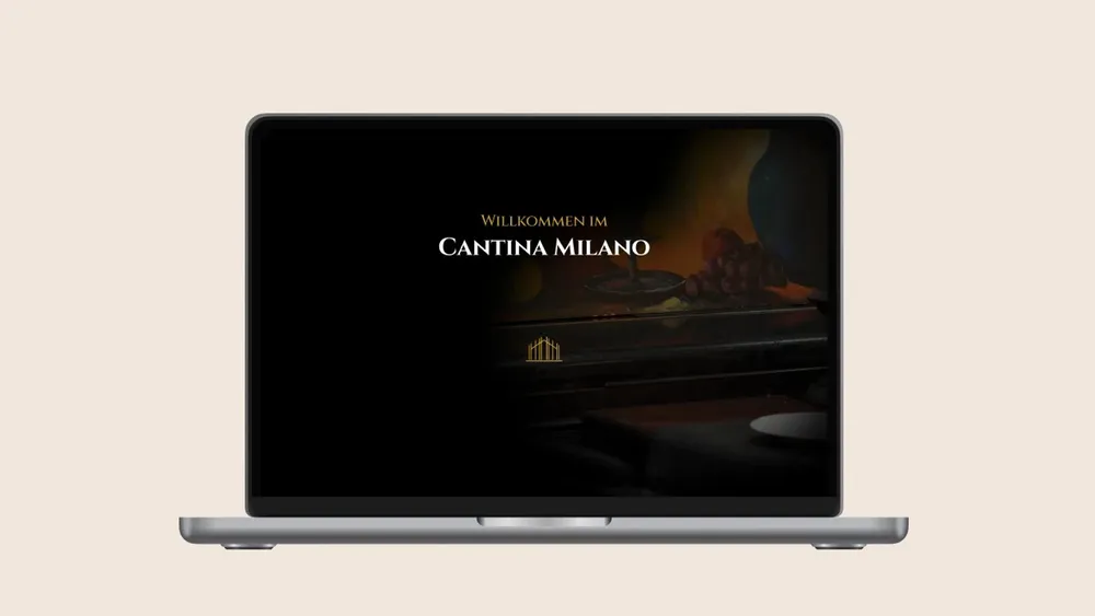
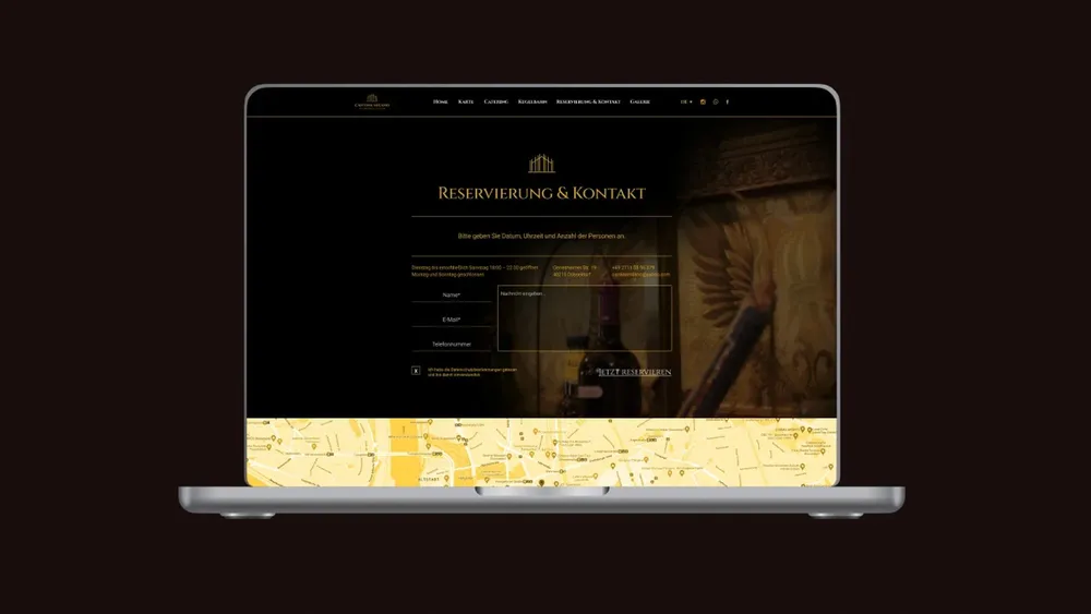
Always the same darkness

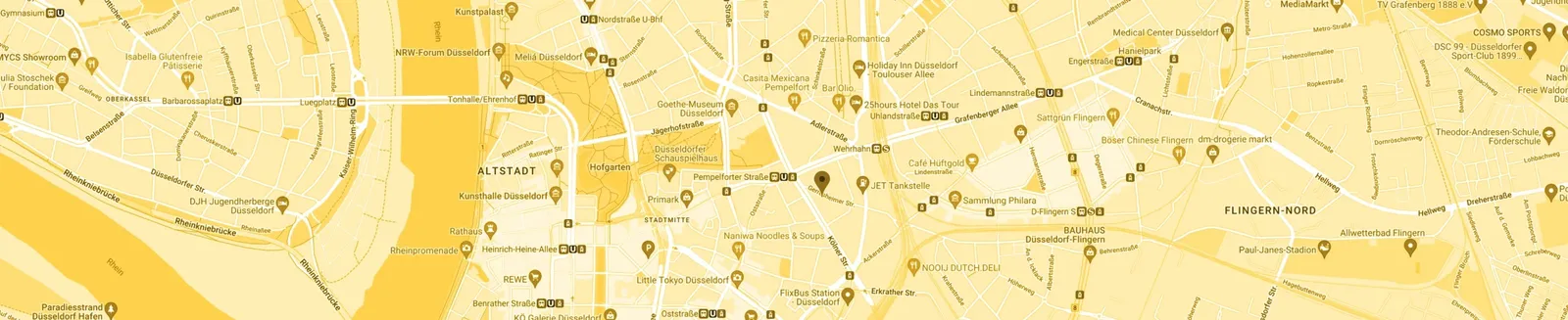
Gold right into the map
Perfecto offline too
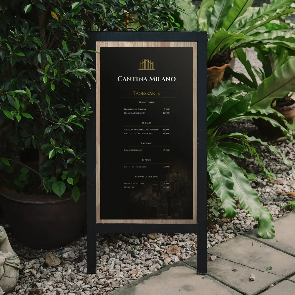
Matte with a glossy print
The creative process
In this case study we take you along on a wild ride of creative ideas and unexpected turns.
Not always, but sometimes — as in this particular case at Cantina Milano — we start out with a clear vision, one the client inspired in us with the briefing. We throw ourselves into the project, develop moods and work far beyond them, driven by the dopamine that this creative rush, a design high, gives us.
But who would have thought that we would have to throw it all overboard and set out like detectives in search of the perfect design solution?
While we lose ourselves in the depths of the creative process, we sometimes find our own paths, which lead us away from the original route. And you know what? That’s a good thing! Because it is exactly here, in this loop of experimenting and discovering, that the best ideas come about. See exhibit A: the design running alongside here.
Let us let you in on a little secret — sometimes the journey is just as exciting as the destination. It is as if we were looking for a treasure without knowing where it is buried. Well, the clients do try to explain to us where it lies buried. But they blindfold us for it, hand us a spoon to dig with and speak the directions over the loudspeaker systems of Deutsche Bahn’s train stations.
But when we do find it, the treasure — our goal — it feels as if we had conquered the world. In our case study you can see that even when we leave the path we set out on and work out something completely different together with our clients, two brilliant designs come of it. One of them goes online at the end of the day, the other exists only in our memory — well, or in this case study. Because at the end of the day it is about creating something that everyone involved is happy with. Sometimes that does mean our own preference takes a back seat, but at the end of the day it is not our website. And how does the saying go? “The customer is king!”
Do come along with us on this journey and let yourself be surprised by the unexpected turns and the surprising results. Because in design there are no fixed rules — only endless possibilities and a lot of fun along the way.
- Client
- Cantina Milano
- Studio
- Creative Agency WAGEMUT
- Services
- Branding, Graphic Design, UI/UX Design, Web Design
- Industry
- Hospitality & Leisure, Food & Beverage
Share our work

Hospitality & Leisure
Liv Dining Club
The branding for the robot restaurant on the ground floor of the RKM 740 in Düsseldorf-Heerdt covers the logo, color scheme, typography and menu.
Food & Beverage
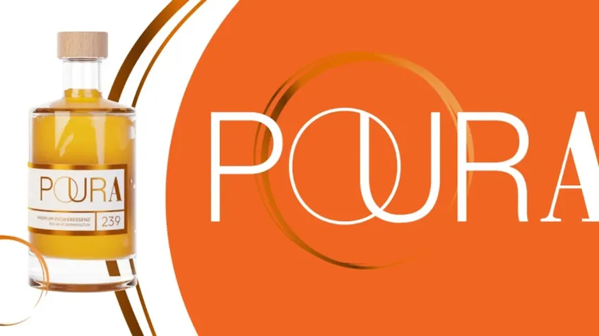
Poura
A 3D-animated bottle accompanies visitors across the whole page: website and moving image for the premium ginger essence Poura — with an Awwwards Honorable Mention.

Education
FOX SUMMIT
Action-packed web design for a new audience: Fox Summit shows how digitally strong holiday camps can be today.