Skip to content

Case Study

Loud, without scaring anyone off

Laser Me Out — brand identity and website for London's laser clinic

Three designers had failed before us. For Laser Me Out we developed three moods out of a workshop, chose the boldest and built a whole brand world from it: neo-brutalism, 3D line art with a winged laser head and a website as dynamic as the brand.
  • Beauty & Fitness
  • Pharma & Healthcare
  • Branding
  • Graphic Design
  • UI/UX Design
  • Web Design
  • 3D Visualization
  • Brand Strategy
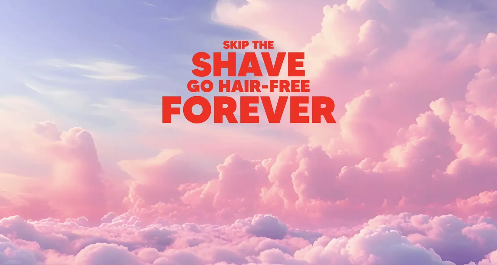
Landing page sequence: “Skip the shave, go hair-free forever” above a sky full of clouds

Three moods, one wins out

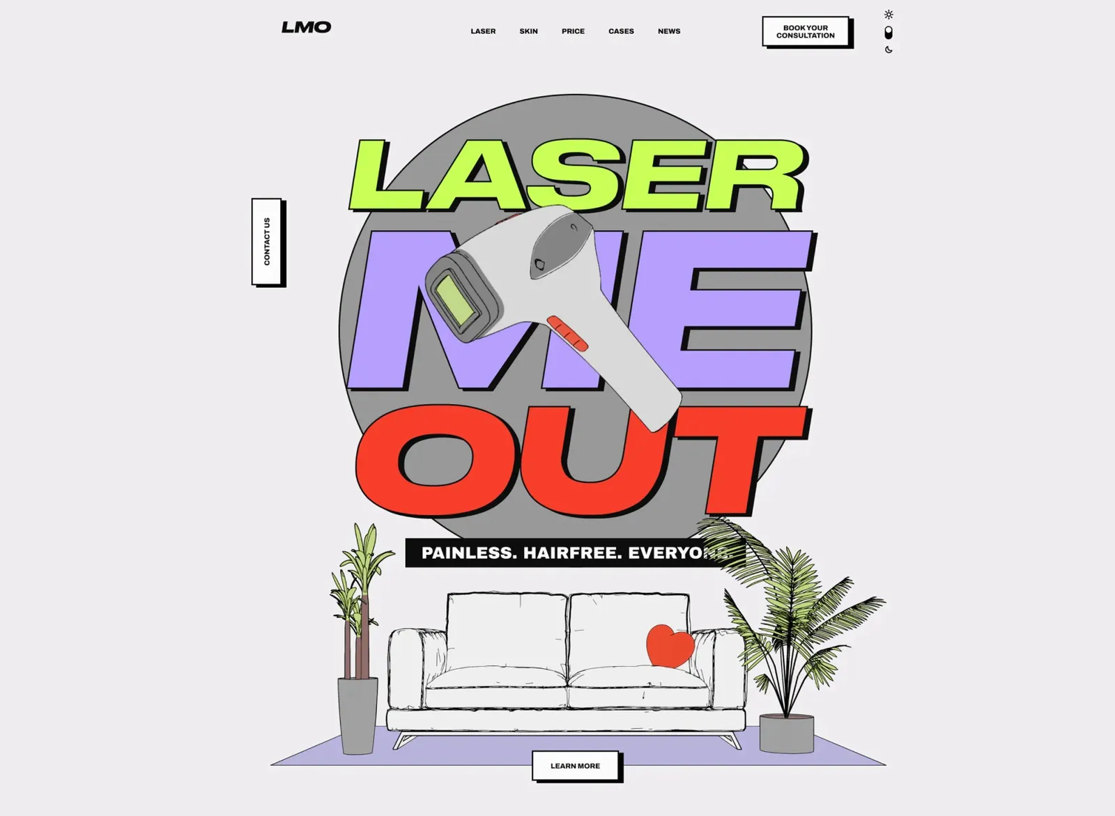
Homepage draft in grey and neon green: the laser head lies across the “Laser Me Out” lettering, with a sofa as line art below
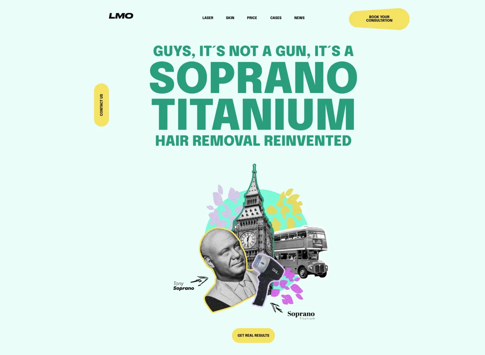
Homepage draft in mint green with the line “Guys, it’s not a gun, it’s a Soprano Titanium” and a collage of Big Ben, a double-decker and a portrait
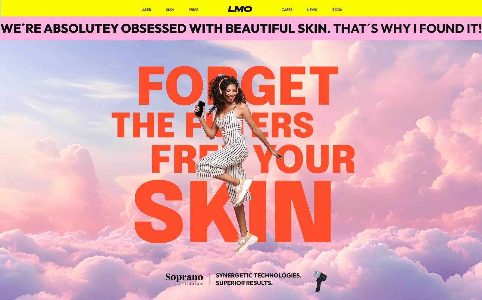
Homepage draft with a pink cloudy sky, a yellow navigation bar and the line “Forget the filters, free your skin”
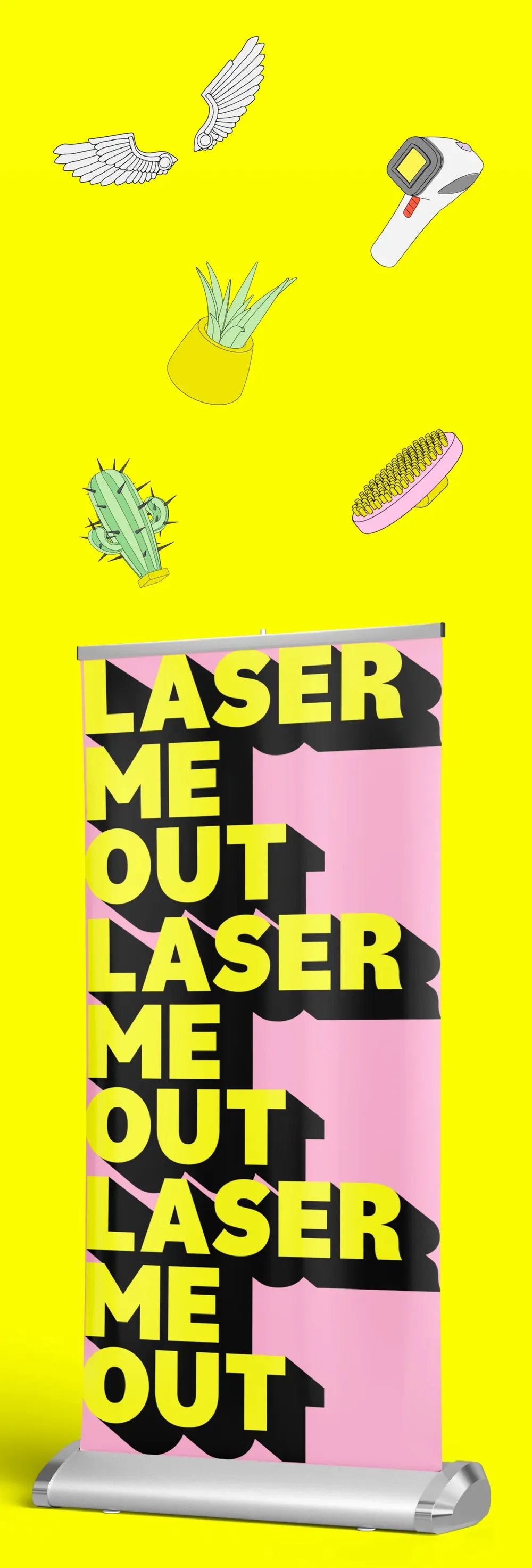
Three moods, one style: clean, bold, raw, edgy, In Your Face! From clear lines and strong contrasts to maximum visual escalation. Neo-brutalism, uncompromising and direct.

The rendering becomes a drawing

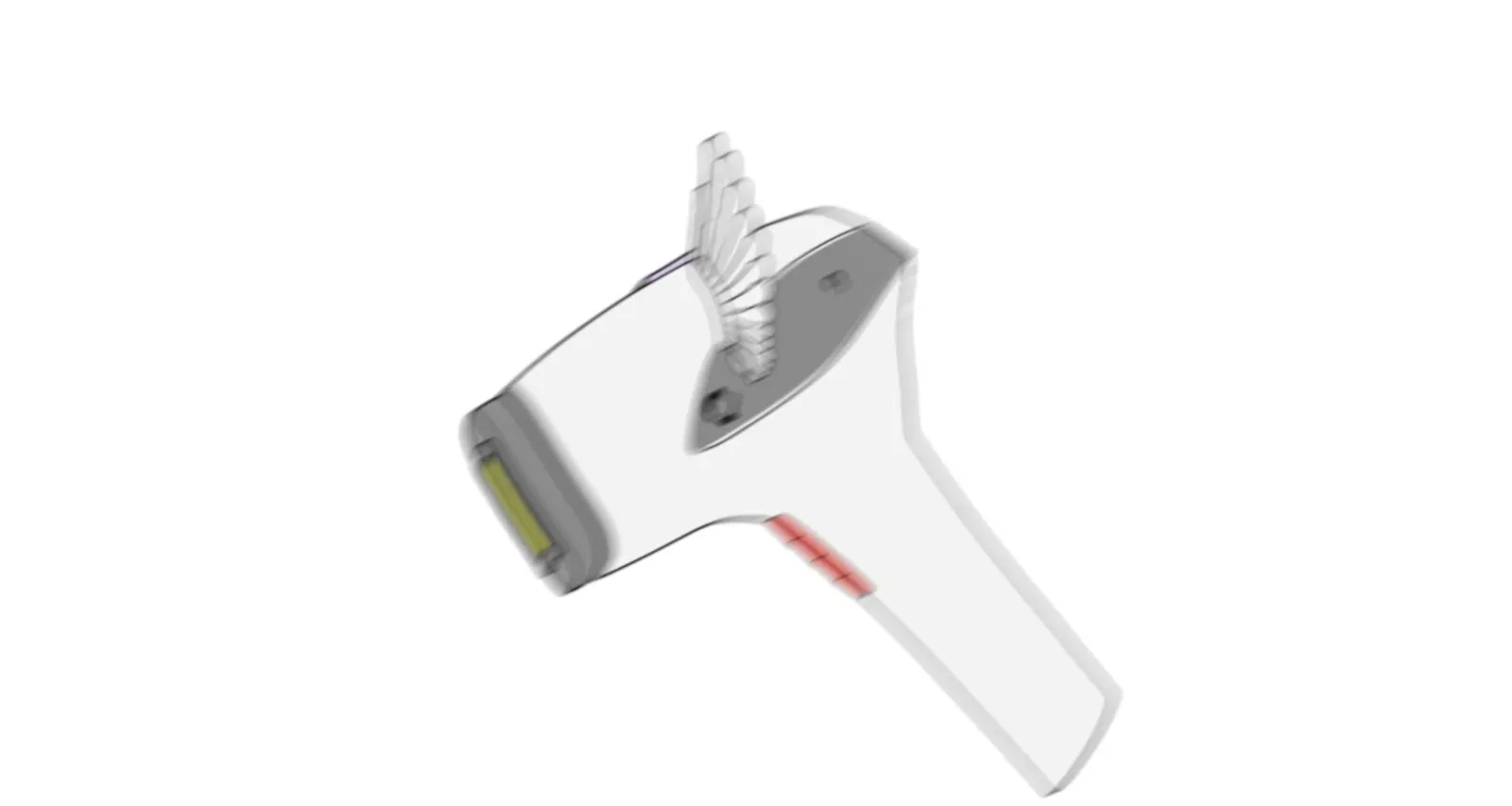
The 3D laser head rotates and turns into a line art drawing
From 3D to line art. Reality becomes design. The laser head, the cactus and company turn from detailed 3D renderings into a minimalist comic style, clean, raw, iconic.

A laser head gets wings

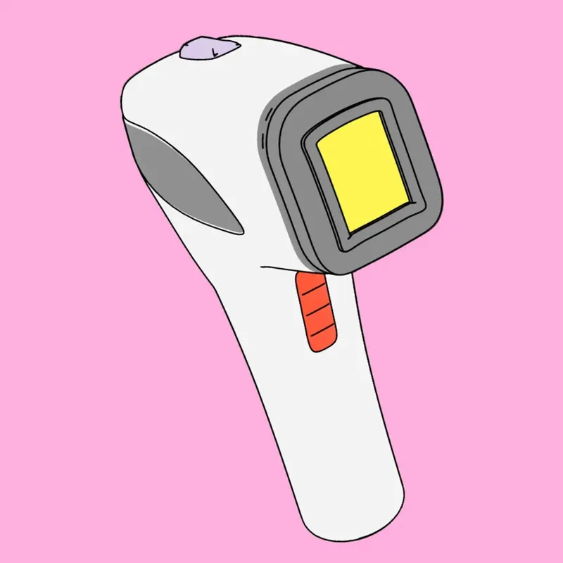
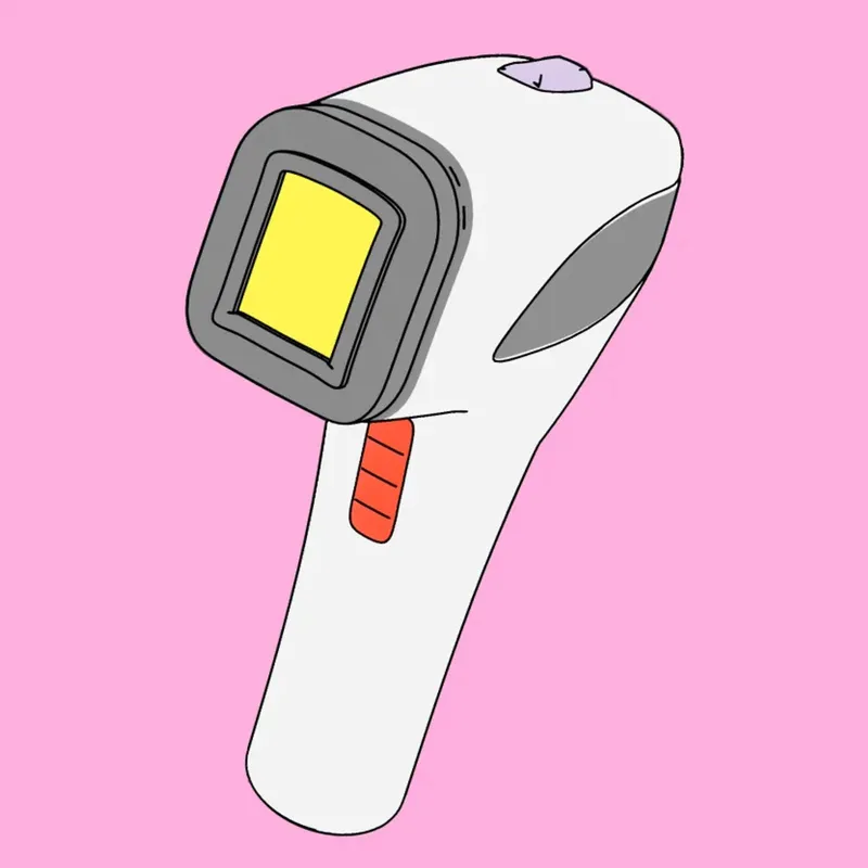
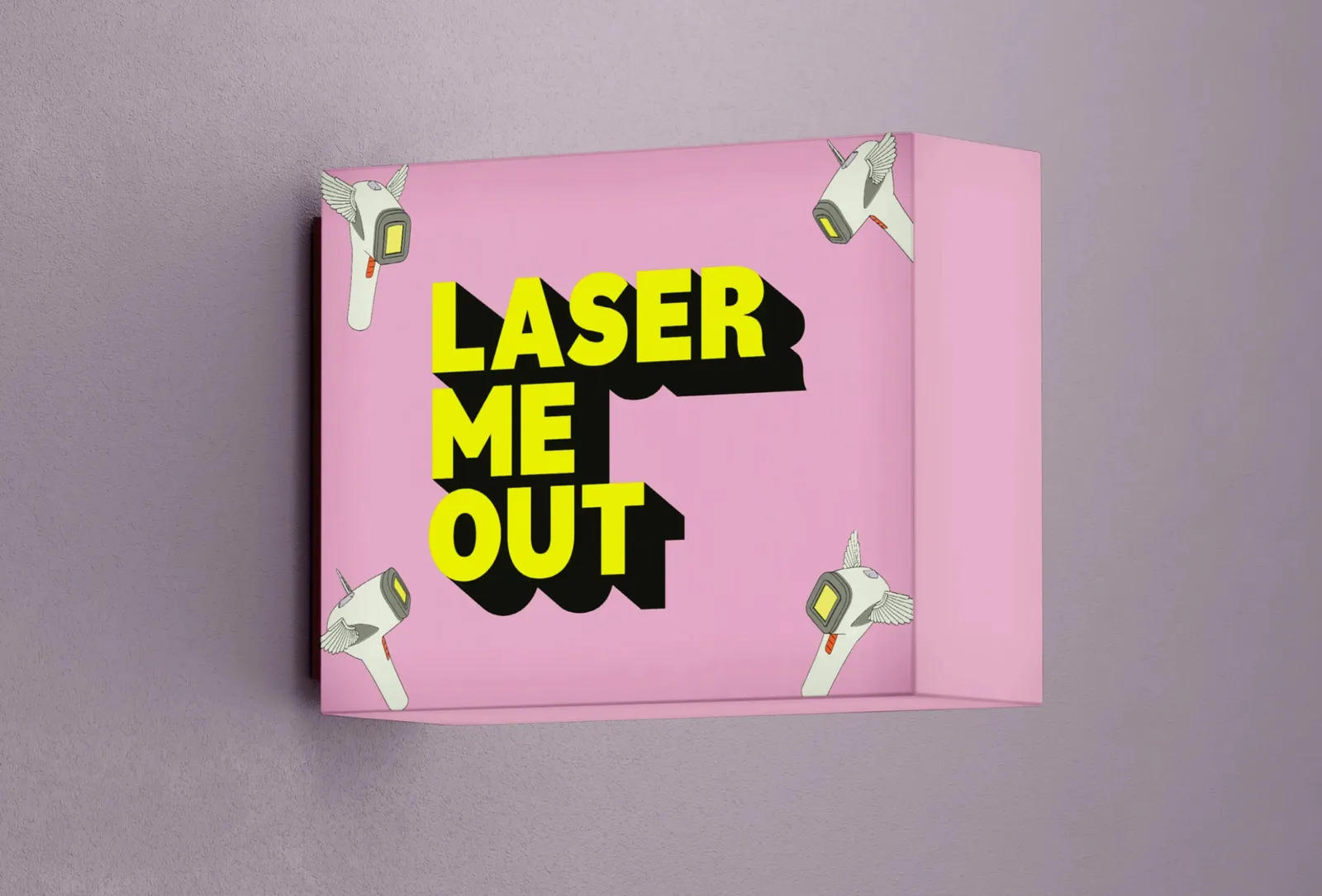
The laser head as line art on pink, its window glowing yellow
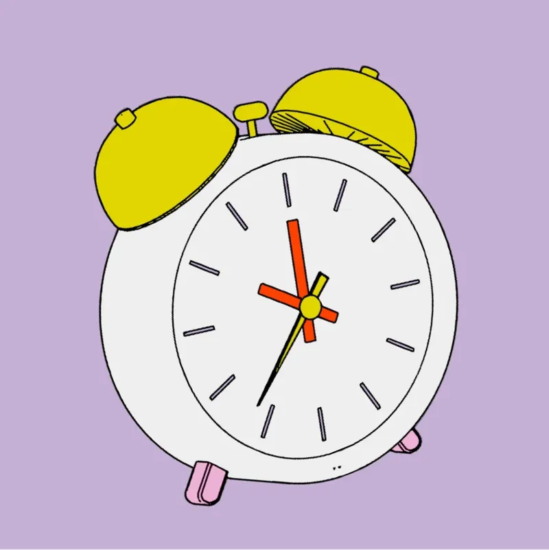
An alarm clock with yellow bells as line art on lilac
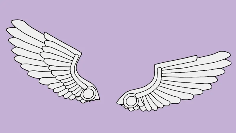
A pair of white wings as line art on lilac
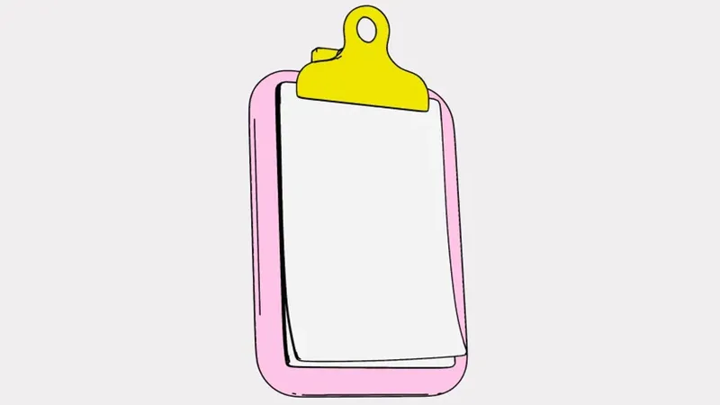
A pink clipboard with a blank sheet as line art
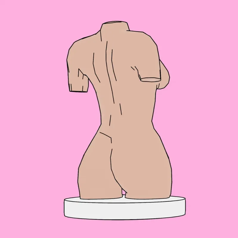
A torso as an antique bust, seen from behind, as line art on pink
The same laser head from another direction, window facing left
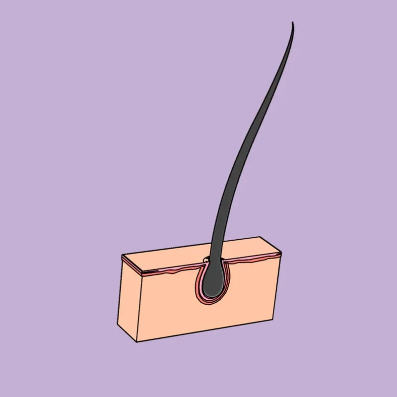
A hair in a cross-section of the skin, as line art on lilac
At Wagemut it is not only Red Bull that gives you wings! The client's idea took shape: a laser head with wings. First the individual 3D line art assets were developed, then combined.

Red meets yellow

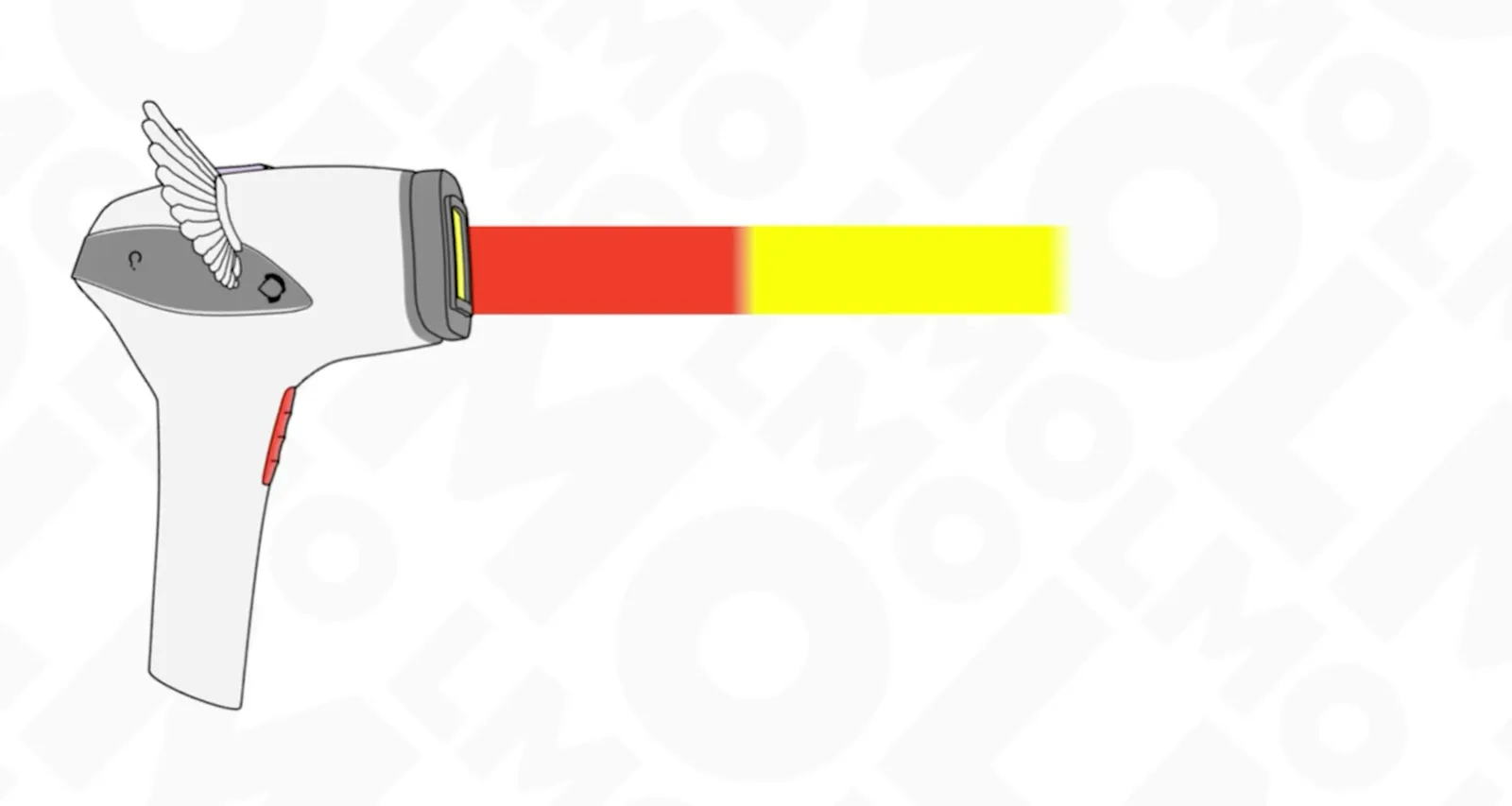
The winged laser head fires a red and yellow beam across the LMO pattern
We developed a color concept that radiates power and energy: intense red meets high-energy yellow, complemented by warm accents. A bold look that makes the brand unmistakable.

Made Tommy, straightforward and loud

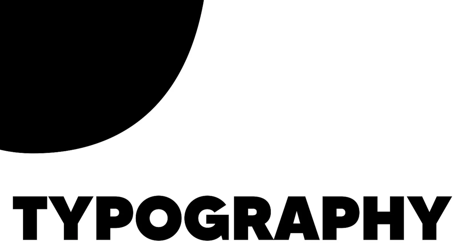
Type specimen of Made Tommy, showing the word “Typography” in black on white
With "Made Tommy" we chose a powerful, modern sans-serif that underlines the neo-brutalist look. Distinctive, straightforward and flexible – it gives the brand expression and presence.

From the screen onto paper

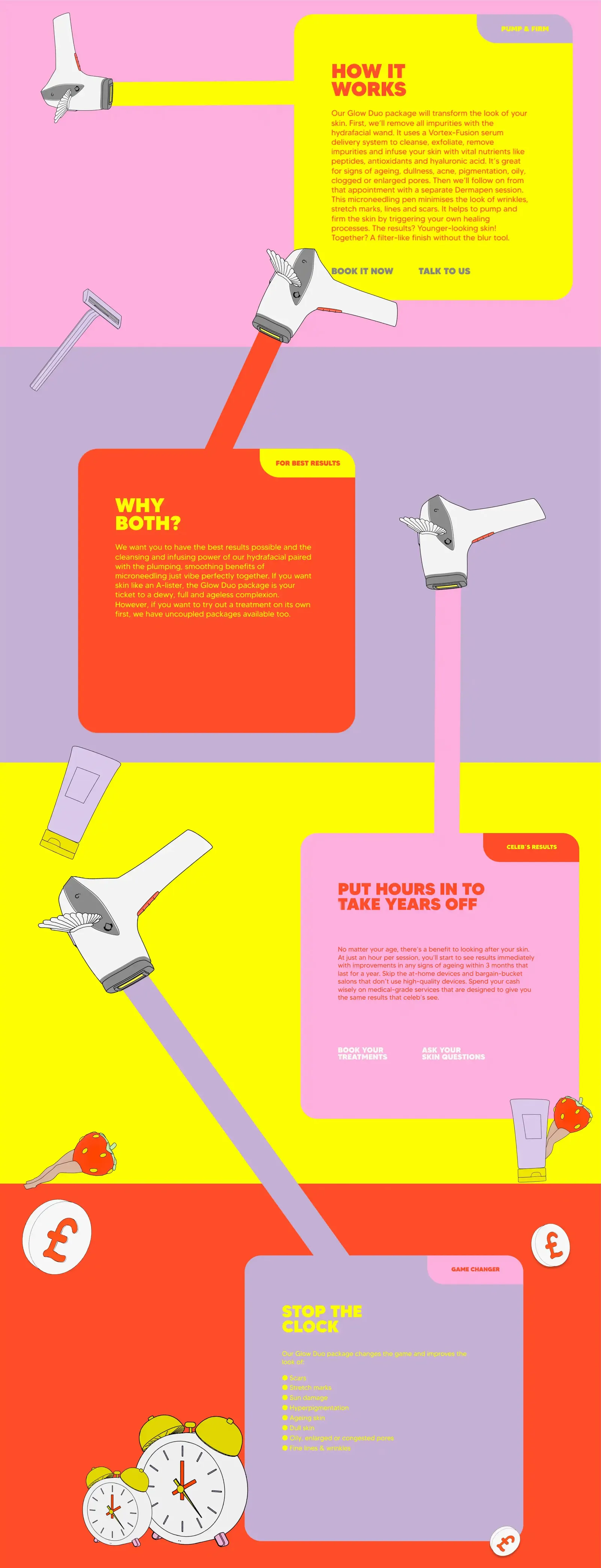
Stacked info cards in yellow, lilac and pink with headings such as “How it works” and “Stop the clock”
From screen to handout: designed digitally, but with print in mind. The tiles fit seamlessly into the web design and at the same time work as high-quality info cards in the clinic.

Did our work inspire you?

Tell us about your project, short and to the point. It makes no difference whether you bring a rough idea or a polished concept.

The laser head in wireframe

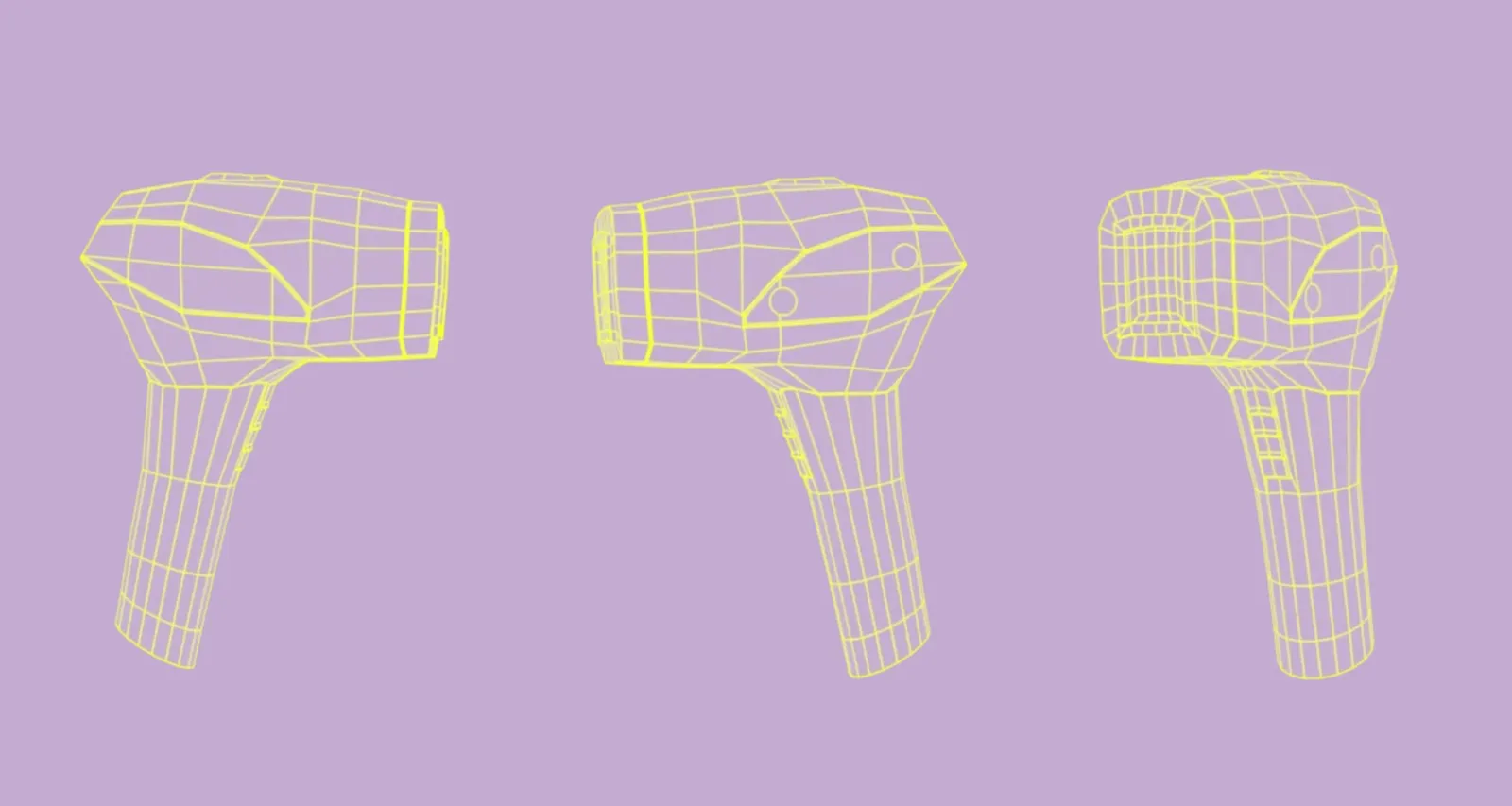
Three views of the laser head as a yellow wireframe model on lilac
3D wireframe of the laser head. Pretty fancy, right?

The same design language, everywhere
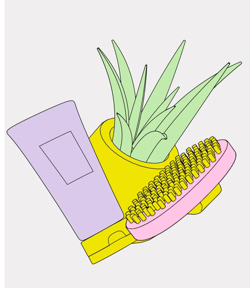
Tube, aloe vera pot and brush as a line art group
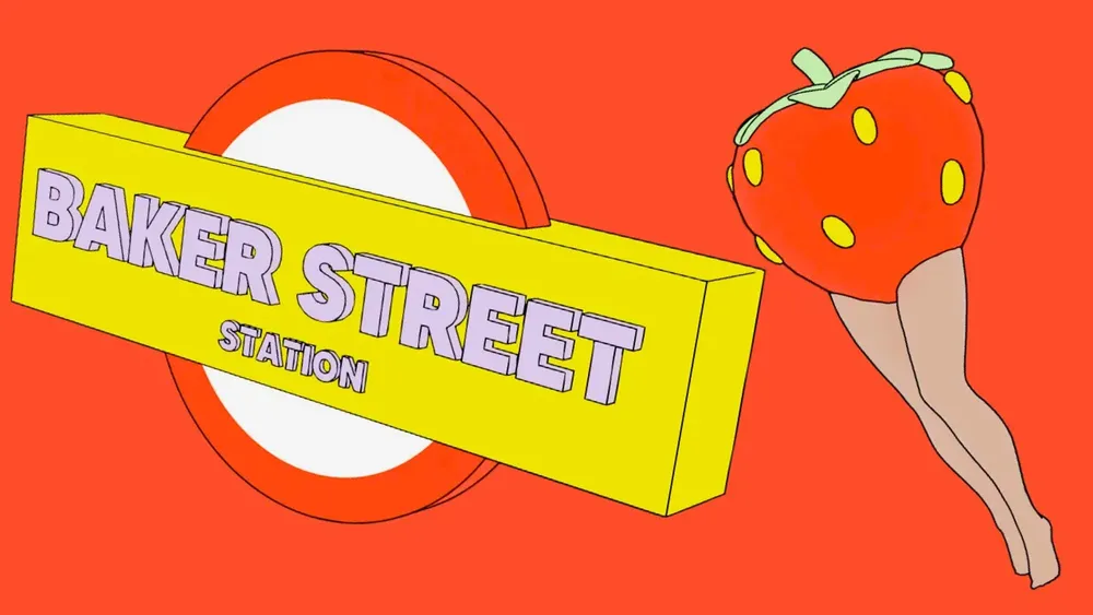
The sign of Baker Street Underground station, next to it a leg with a strawberry, as line art on red
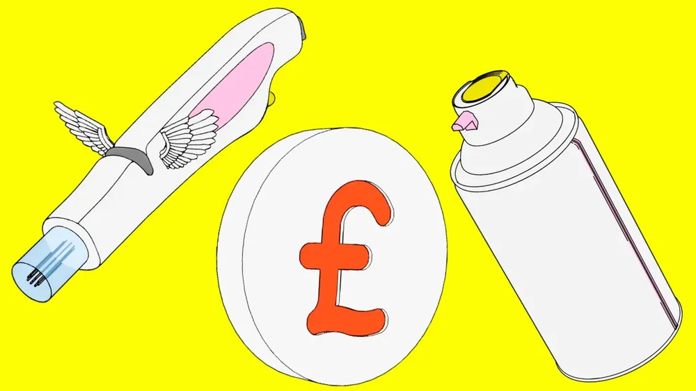
Razor with wings, a pound coin and a spray can as line art on yellow
The style runs all the way through. Even more 3D line art assets that reinforce the visual concept. Every element follows the same pared-back, distinctive design language.

The proof on a cactus

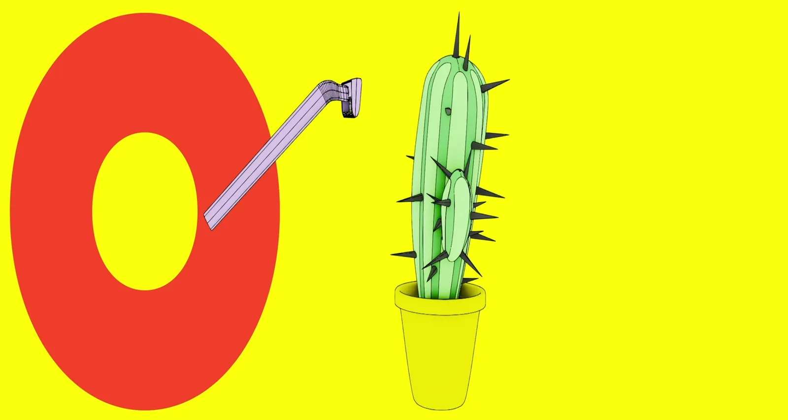
A razor runs over a potted cactus, the spines disappear
Pain-free? Want proof? A razor glides over a cactus and the spines disappear. A playful animation that visualizes LMO’s promise: even the impossible becomes soft and smooth without pain. The Soprano Titanium makes it possible.

Skin for everyone

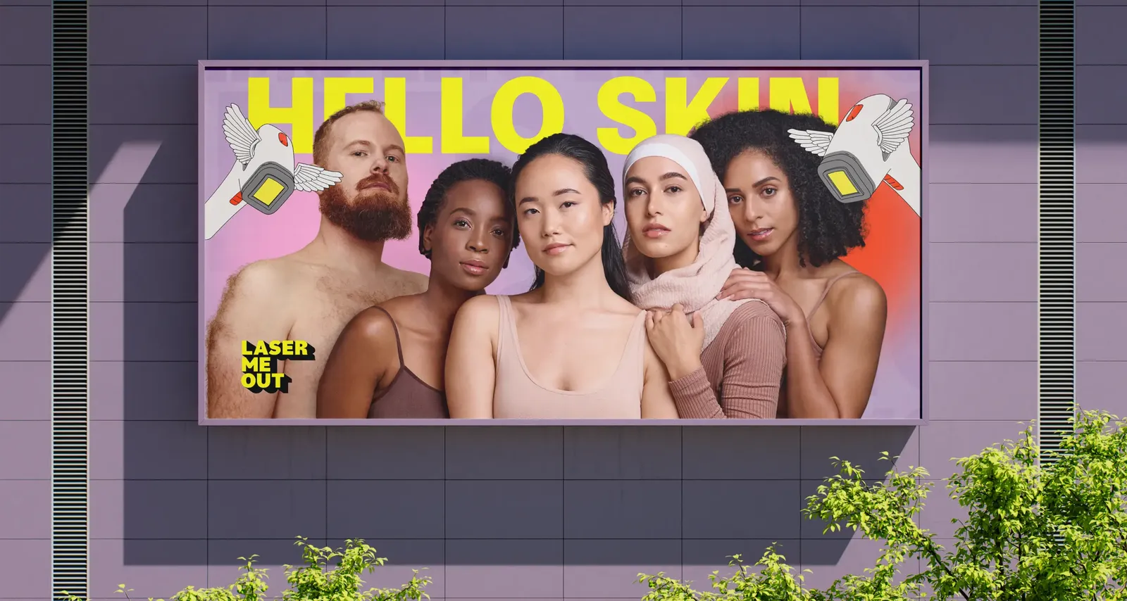
Advertising board on the side of a building: five people of different backgrounds beneath the word “Hello Skin”
AI-generated, masterfully retouched. Well? Can you tell who is real and who is not? Technology and craft united behind one message: beauty is there for everyone.

From the screen onto the street

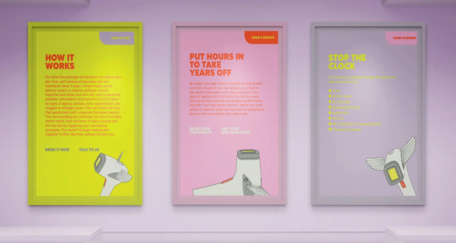
Three framed posters on a lilac wall, each with the winged laser head
From screen to street. The design unfolds its effect in real space, alive, tangible, present. This is how LMO could look in the cityscape: loud, confident and unmistakable.

Right into the packaging

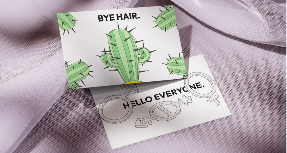
Two cards on lilac fabric: “Bye hair.” with cacti and “Hello everyone.” with gender symbols
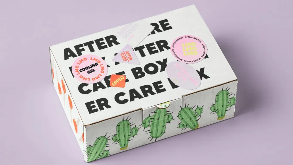
White aftercare box with a cactus pattern and stickers applied
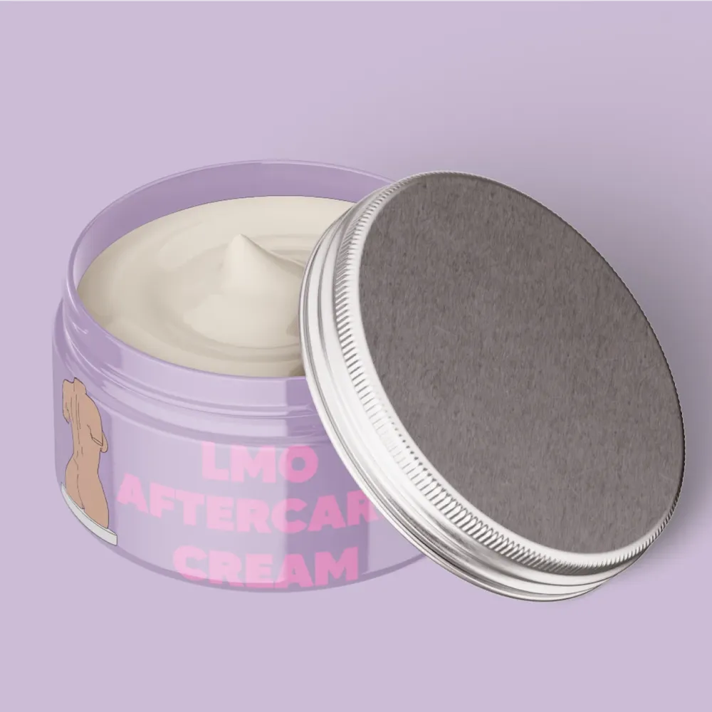
Opened jar of LMO Aftercare Cream in lilac
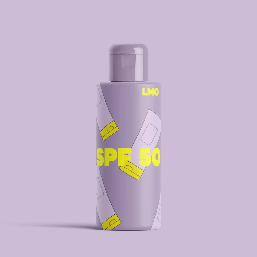
Lilac “SPF 50” bottle with yellow lettering
Thought through down to the last detail. The corporate design is applied to creams, business cards and more. Consistent, distinctive and unmistakable.

And into the phone

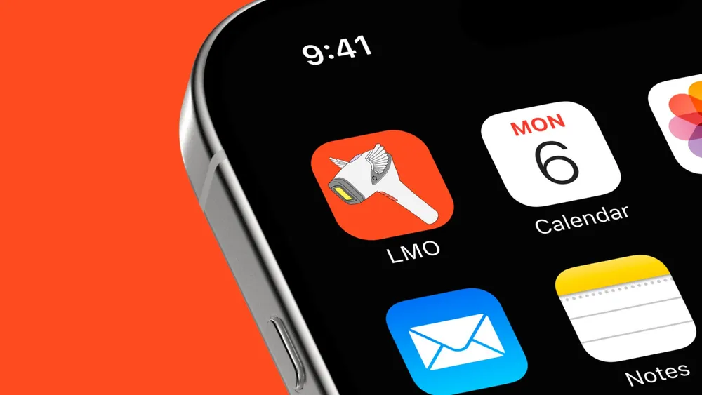
App icon with the winged laser head on a smartphone home screen
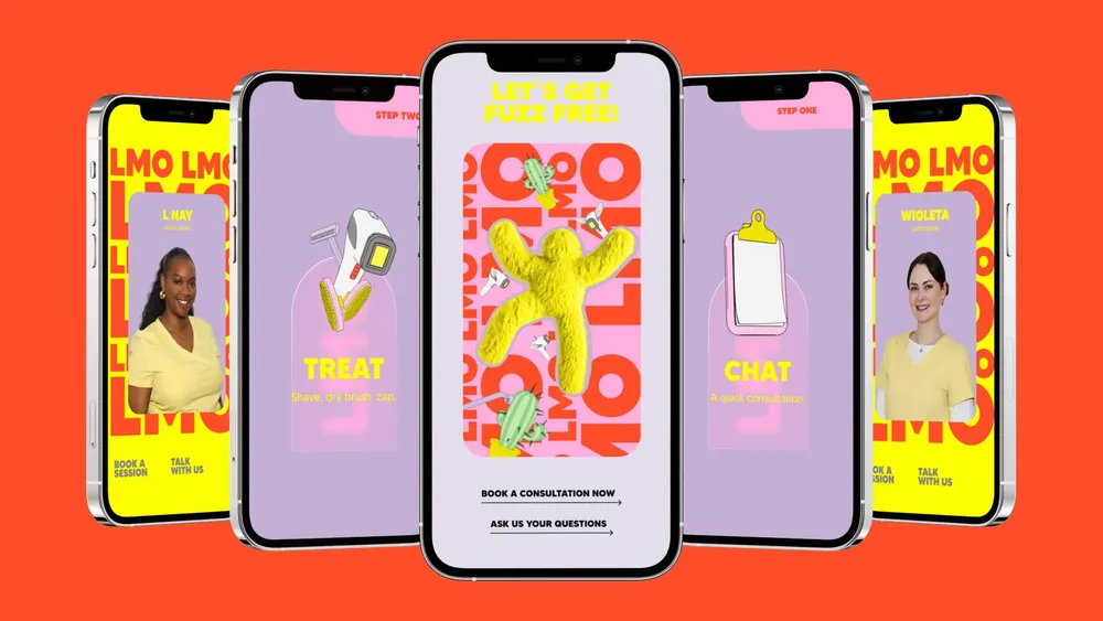
Five smartphones with story views of the brand, among them “Let’s get fuzz free!”
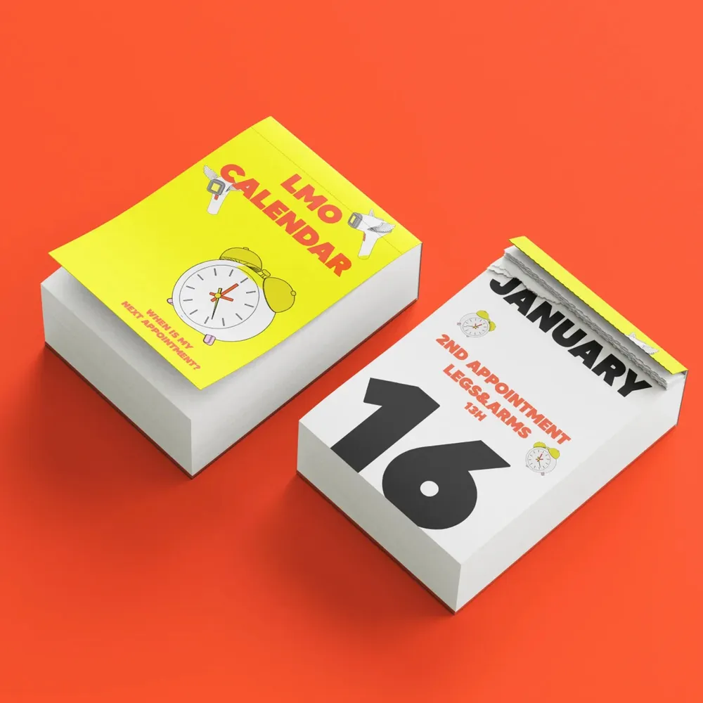
Tear-off calendar “LMO Calendar” in yellow and white on a red background
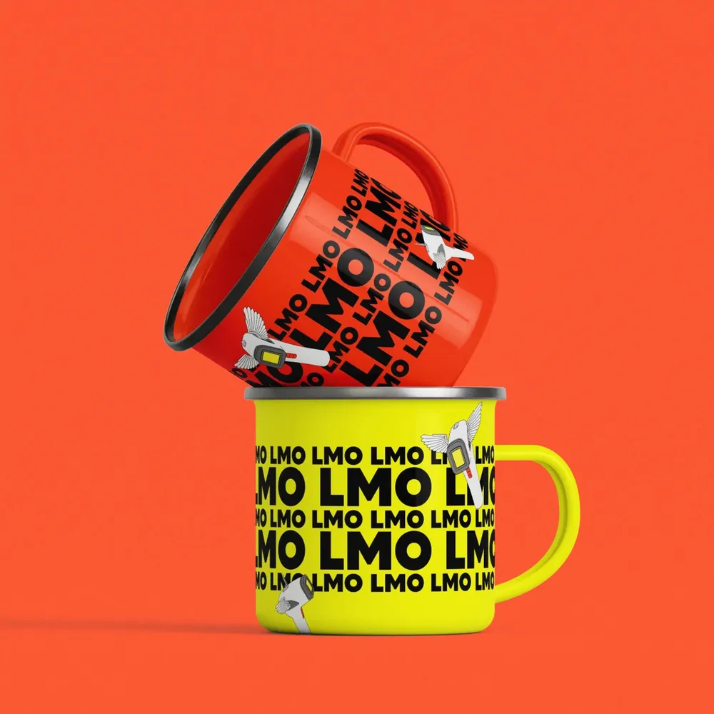
Two enamel mugs in red and yellow with the LMO lettering pattern
From the app icon through stories to the calendar and the mugs: the brand works at small scale too — and as merch people wear by choice.

One foundation, many directions

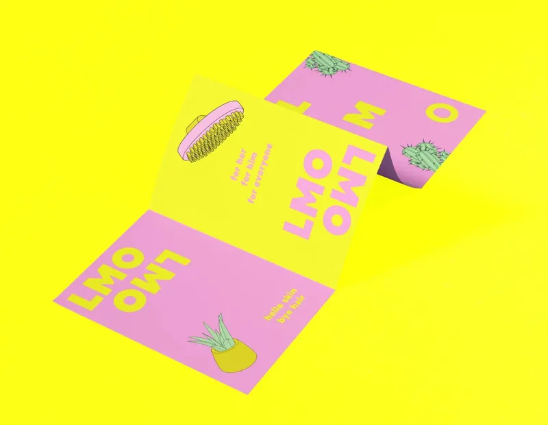
Unfolded flyer in pink and yellow on a yellow background
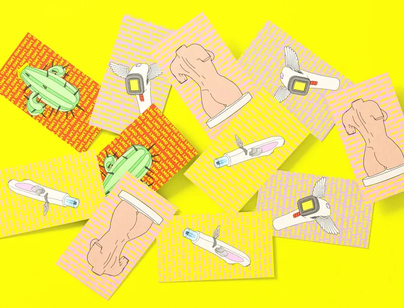
Scattered cards with line art motifs on a yellow background
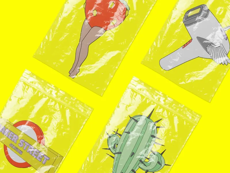
Four zip-lock bags with line art prints on yellow
The new design provides a foundation for endless ways of using it, without losing its charm.

Challenge accepted — and mastered

Some projects are special from the start – not just because of the creative challenge, but because of the people behind them. Laser Me Out was exactly that kind of case. Our client had already worked with several designers – but none of them could realize her vision. Her standards were high, her eye critical. For us that was no obstacle, but an invitation.

Instead of just designing away, we first set up a workshop to dive deep into the brand. It was quickly clear: loud, uncompromising, “In Your Face” – no half measures! To make that direction tangible, we developed three moods, and the boldest of them won the race.

The first design phase was a creative firework. Neo-brutalism at its peak, full of energy, with bold colors, hard typography and maximum presence. But after the first draft came the first big learning: too loud, too extreme, too direct. A genuine balancing act – the brand should provoke, but not scare people off. So we refined the look, sharpening the edges instead of blunting them.

In parallel there was a second challenge: the copy. Originally written as an extensive brochure, it had been carried over to the website one to one. Our experience told us straight away: that will not work. Only when the project was nearly finished did the realization come from the client herself. Together we cut it back, structured it and focused on the essentials.

Throughout the whole process we created not just a visual concept but a complete brand experience. From the bold color concept through the typography to the use of 3D line art assets – every detail works digitally and holds up in real life.

The result? A brand that does not hide but speaks for itself – loud, confident and unmistakable.

Client
Laser Me Out
Studio
Creative Agency WAGEMUT
Services
Branding, Graphic Design, UI/UX Design, Web Design, 3D Visualization, Brand Strategy
Industry
Beauty & Fitness, Pharma & Healthcare