Skip to content

Case Study

The stopgap becomes a brand

Fox Summit — holiday camps for children and teenagers

For Fox Summit we turned a static stopgap page into a website of its own — with an icon system built from the abstracted fox head, seven brand colors, a visual language of its own and a page that speaks directly to its young audience.
  • Education
  • Hospitality & Leisure
  • Entertainment
  • Branding
  • Graphic Design
  • UI/UX Design
  • Web Design
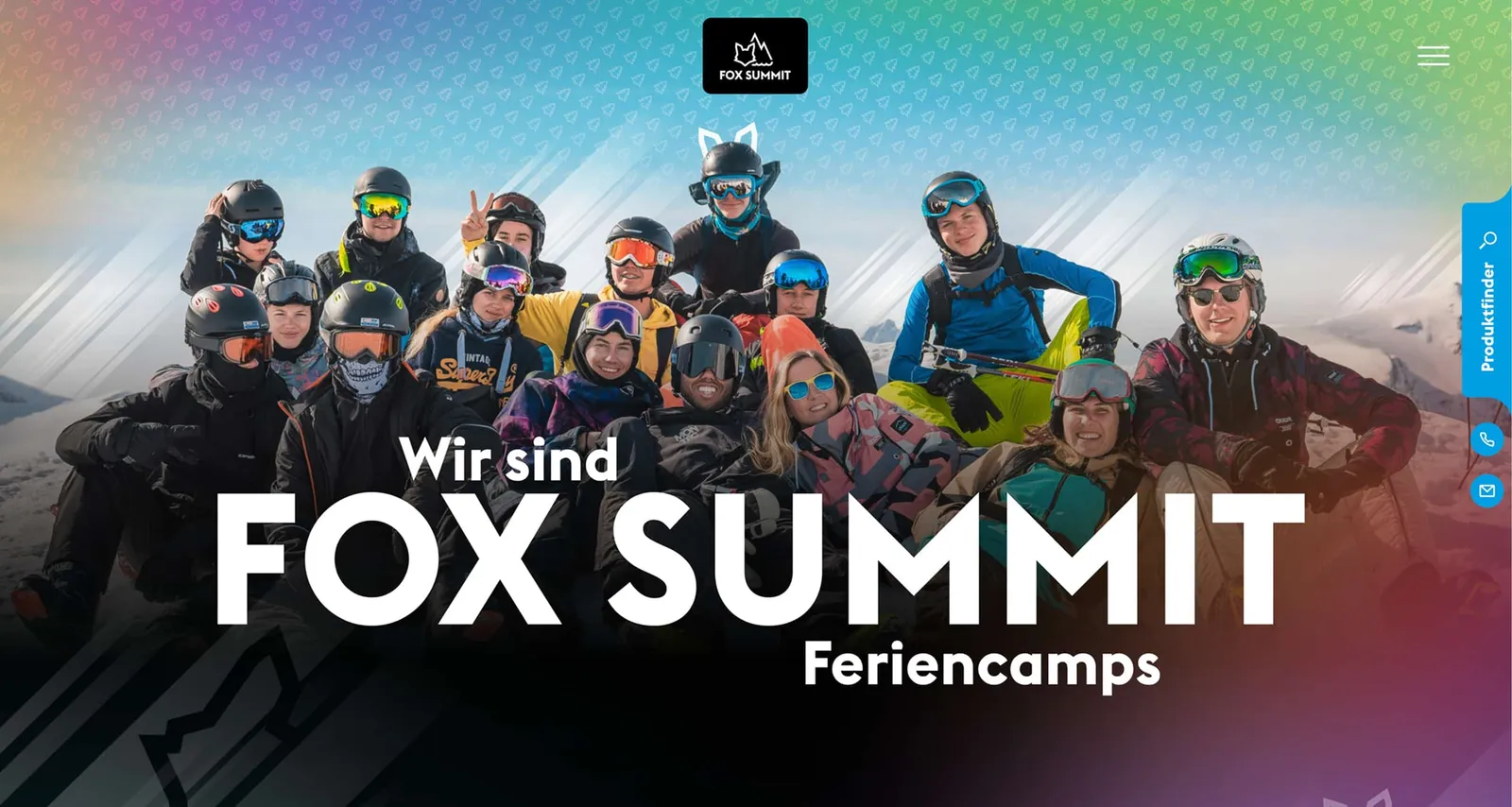
Fox Summit homepage: a group of teenagers in ski gear in front of a mountain panorama, with “Wir sind FOX SUMMIT Feriencamps” above

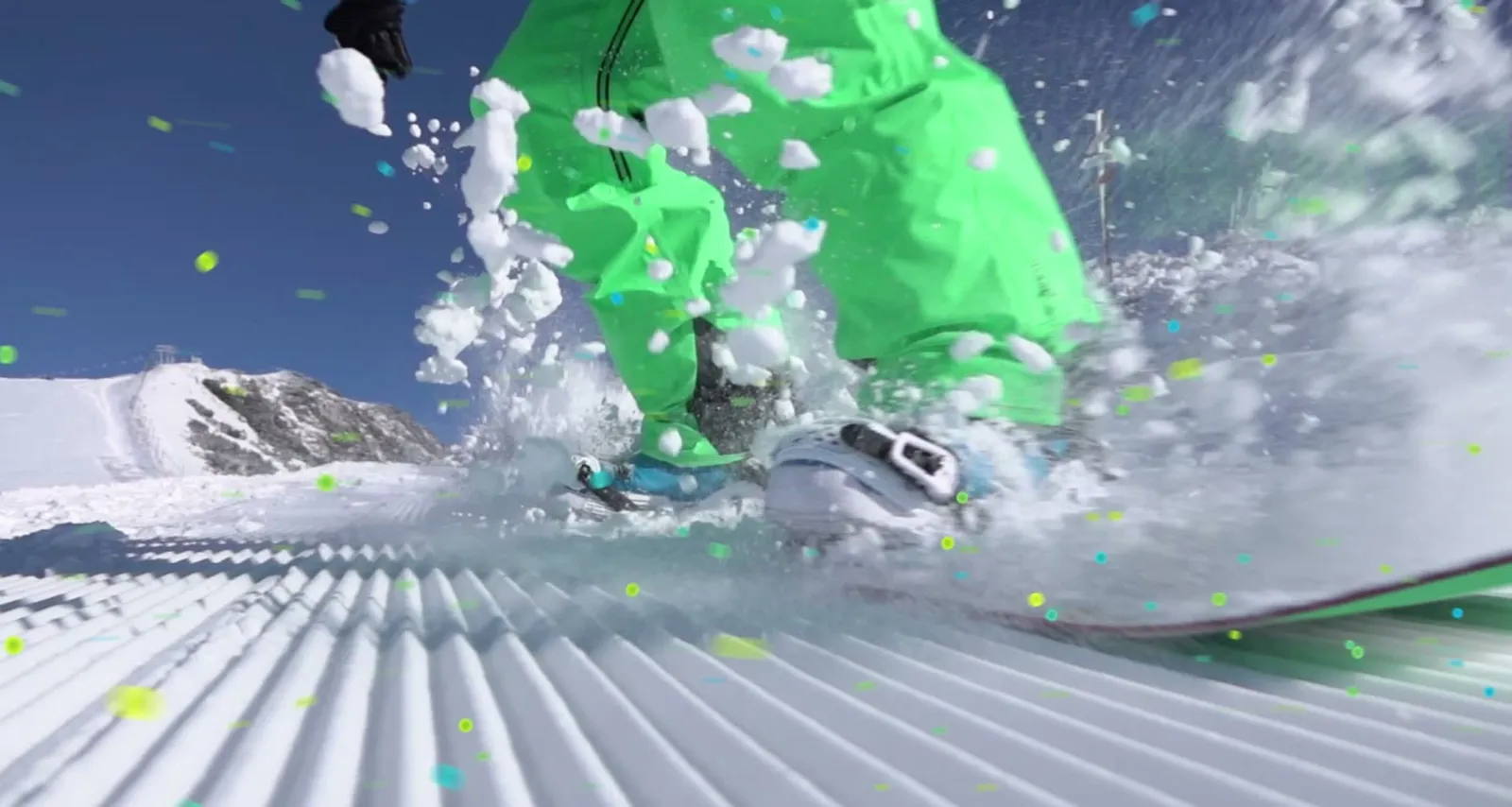
Snow in your face

Animation in which swirling snow reveals the Fox Summit logo
Snow in your face! Or is it a logo animation? When action and branding become one, no second look is needed.

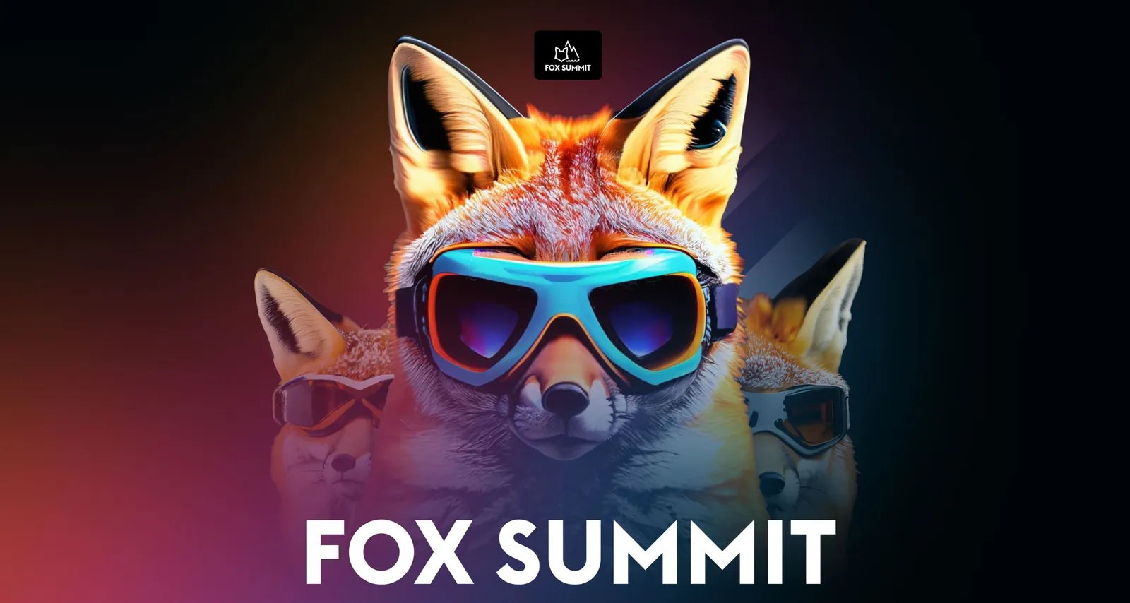
More than a mascot

A fox wearing mirrored ski goggles against a dark background, with the FOX SUMMIT lettering below
More than a mascot: the AI-generated fox combines brand character, recognition and visual presence.

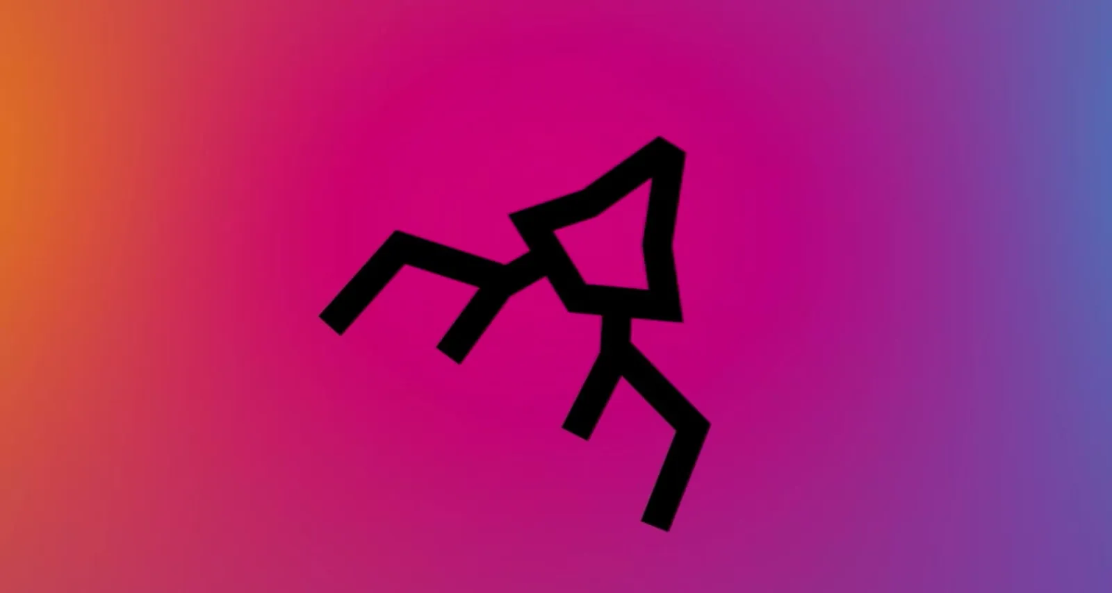
One symbol becomes a language

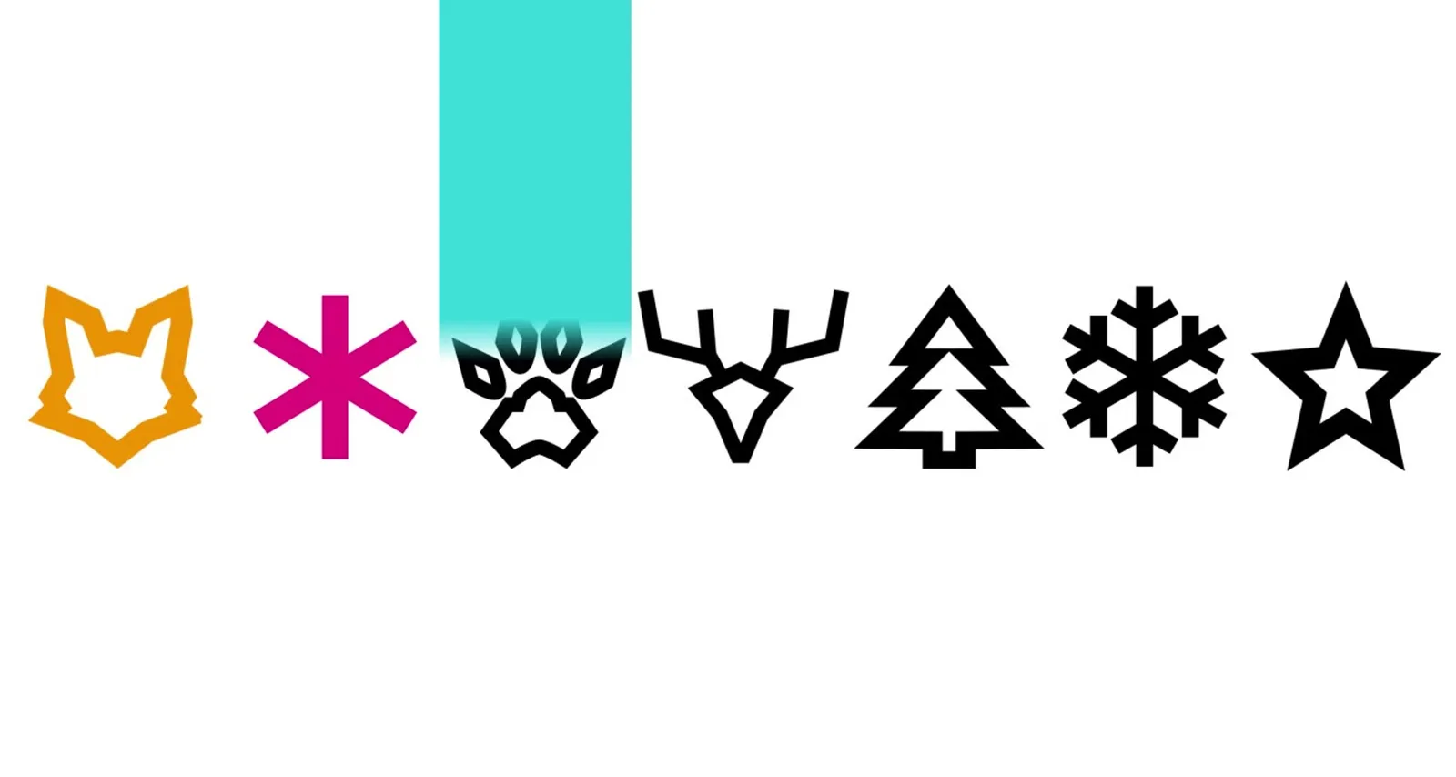
Animation in which the fox, antler and paw icons flow into one another
All key visuals, one style: the logo element becomes a visual language that carries the entire design. Fox, antlers and bear paw (and more) merge into the new symbolism of Fox Summit.

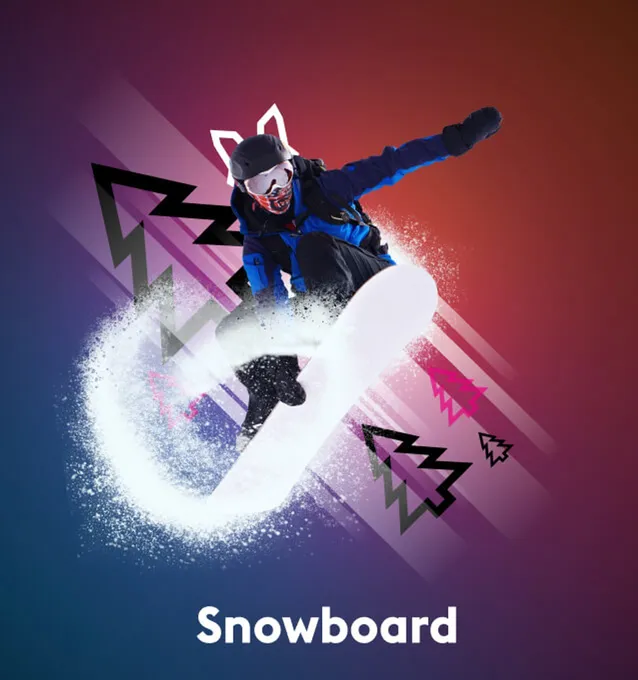
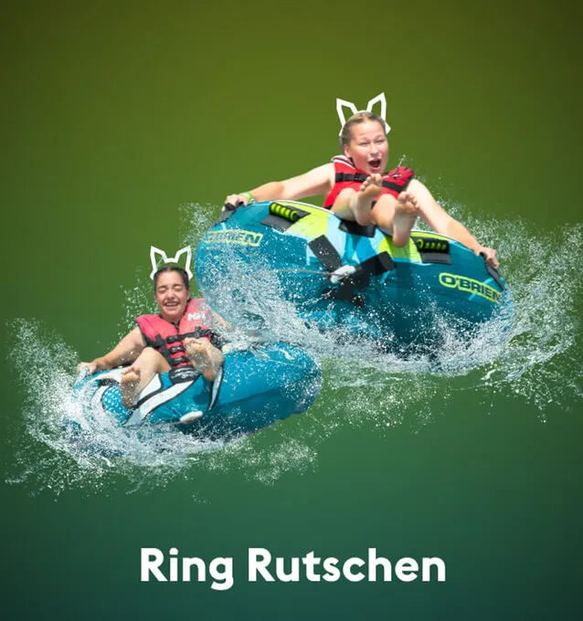
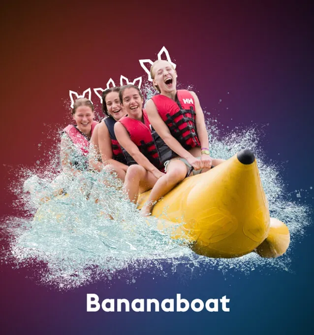
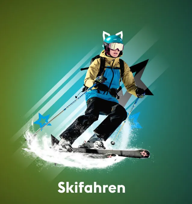
Every activity in the spotlight

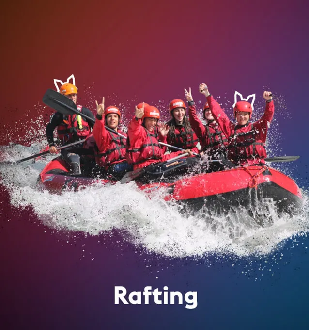
The slider stages every activity. Retouching, lighting and movement turn pictures into an experience. That is how the imagery becomes a dynamic world that pulls you outdoors.

Gradients instead of colorlessness

Gradient from orange through magenta to blue
Gradient from yellow through green to blue
Gradients instead of colorlessness. The new design goes for dynamism and depth where pale areas used to dominate. The gradients are more than a stylistic device, they create atmosphere and guide the eye.

Seven colors with names

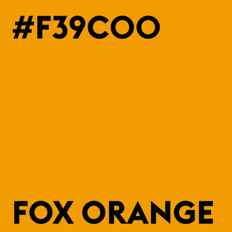
Color tile Fox Orange, #F39C00
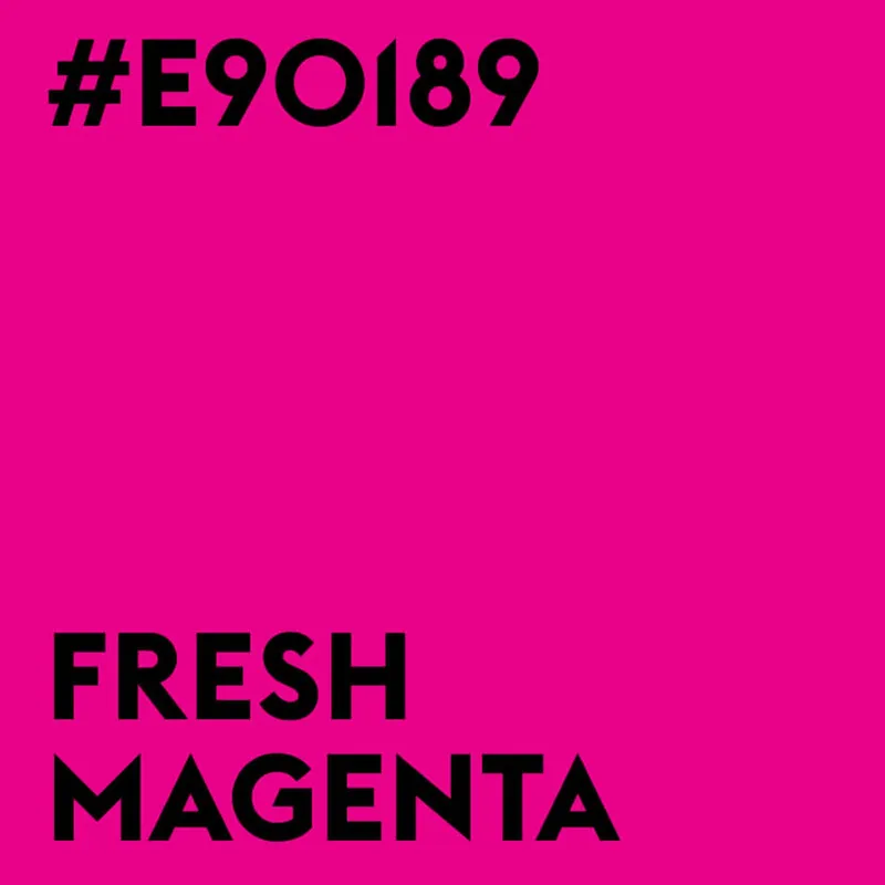
Color tile Fresh Magenta, #E90189
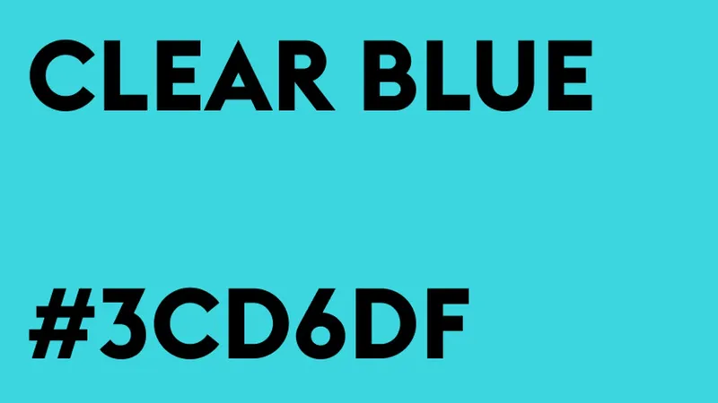
Color tile Clear Blue, #3CD6DF
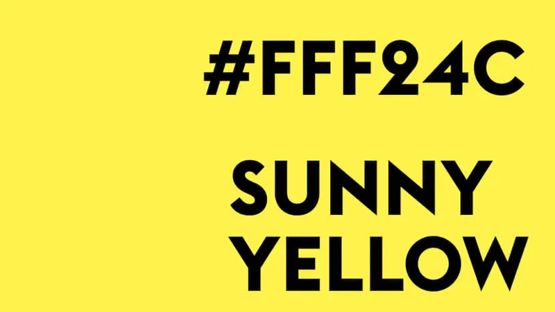
Color tile Sunny Yellow, #FFF24C
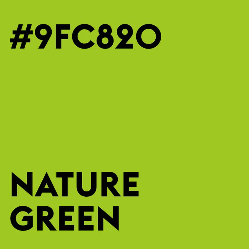
Color tile Nature Green, #9FC820
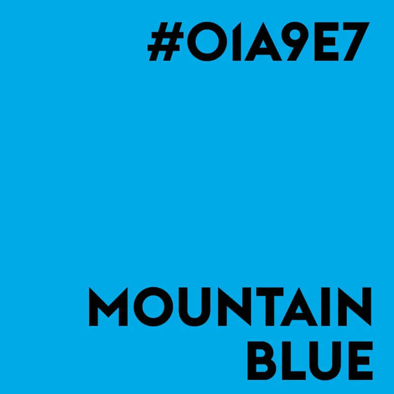
Color tile Mountain Blue, #01A9E7
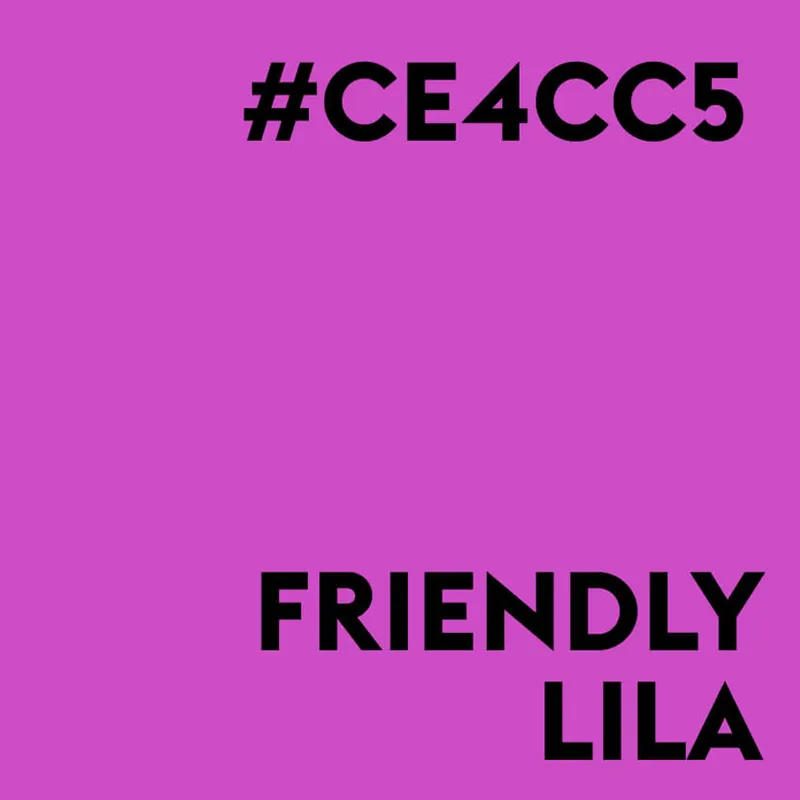
Color tile Friendly Lila, #CE4CC5
The new color world feels lively, bold and unmistakable, and it meets the audience exactly where it moves. Strong tones, high contrast and a dynamic color system create a visual environment that is allowed to think as loudly as its audience.

Colors and symbols at a glance

Animation in which icons and brand colors appear one after another
All key visuals and main colors at a glance. Simple means, big effect, as an extension of the corporate design by our colleagues at dombek—bolay, also from Düsseldorf.

Icons become patterns

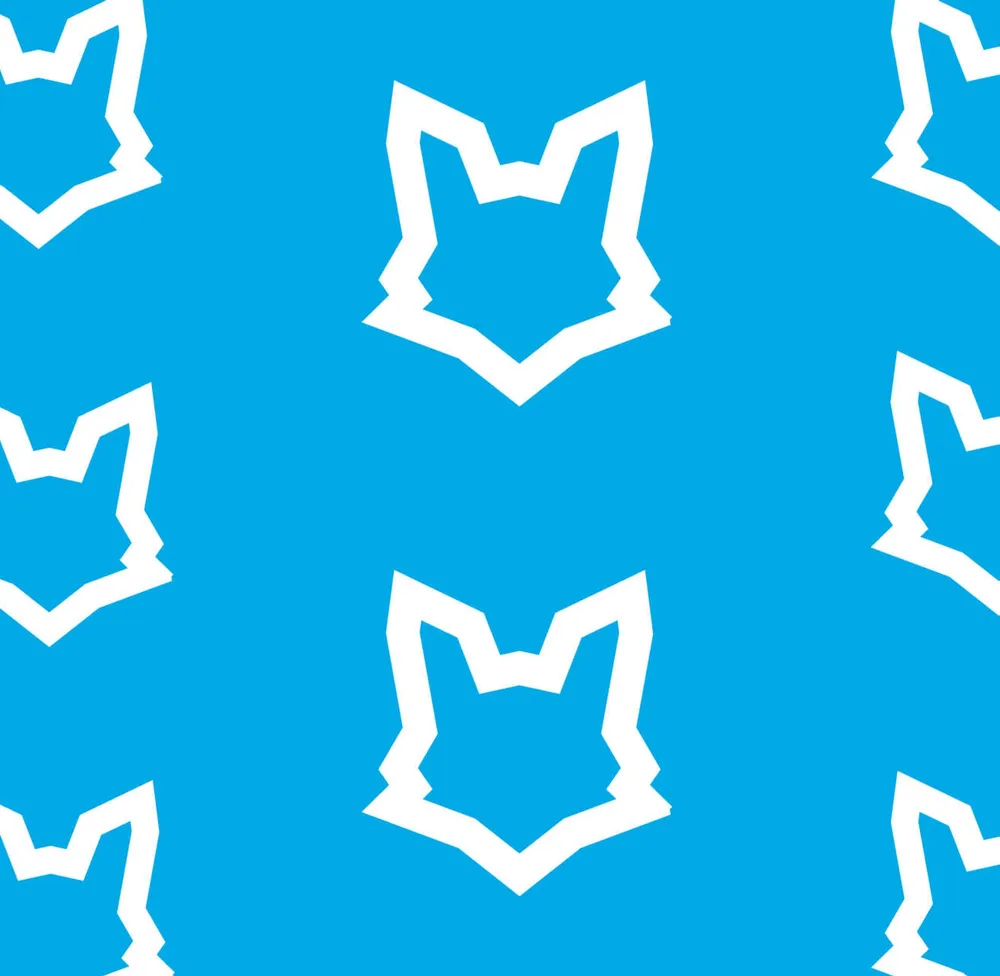
Pattern swatch with white fox heads on blue
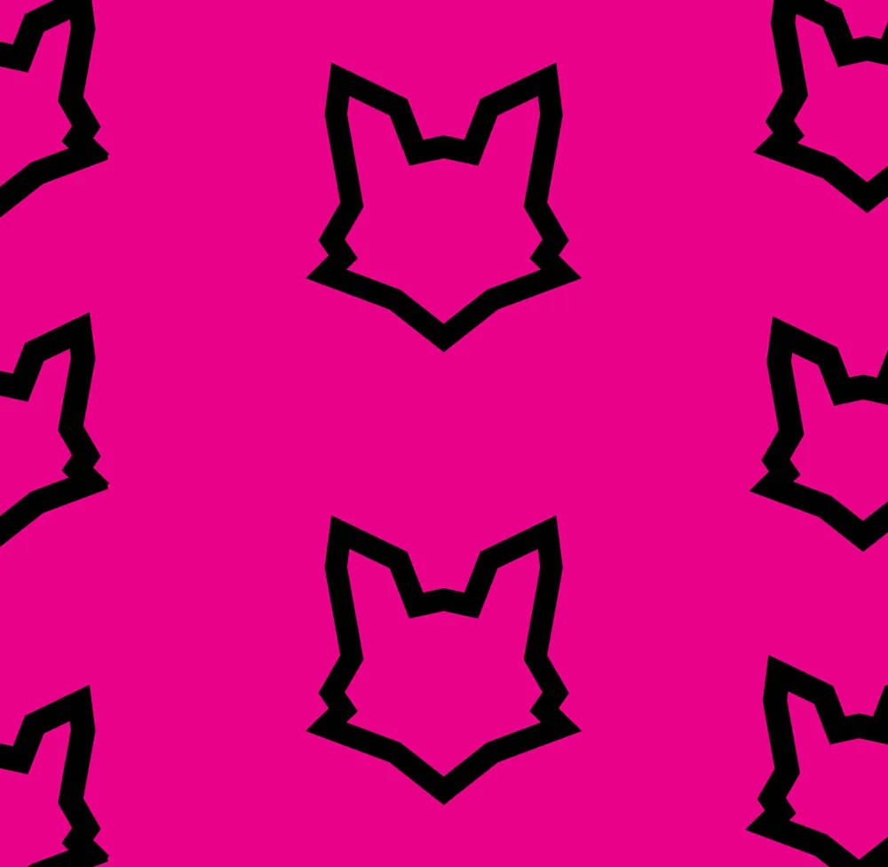
Pattern swatch with black fox heads on magenta
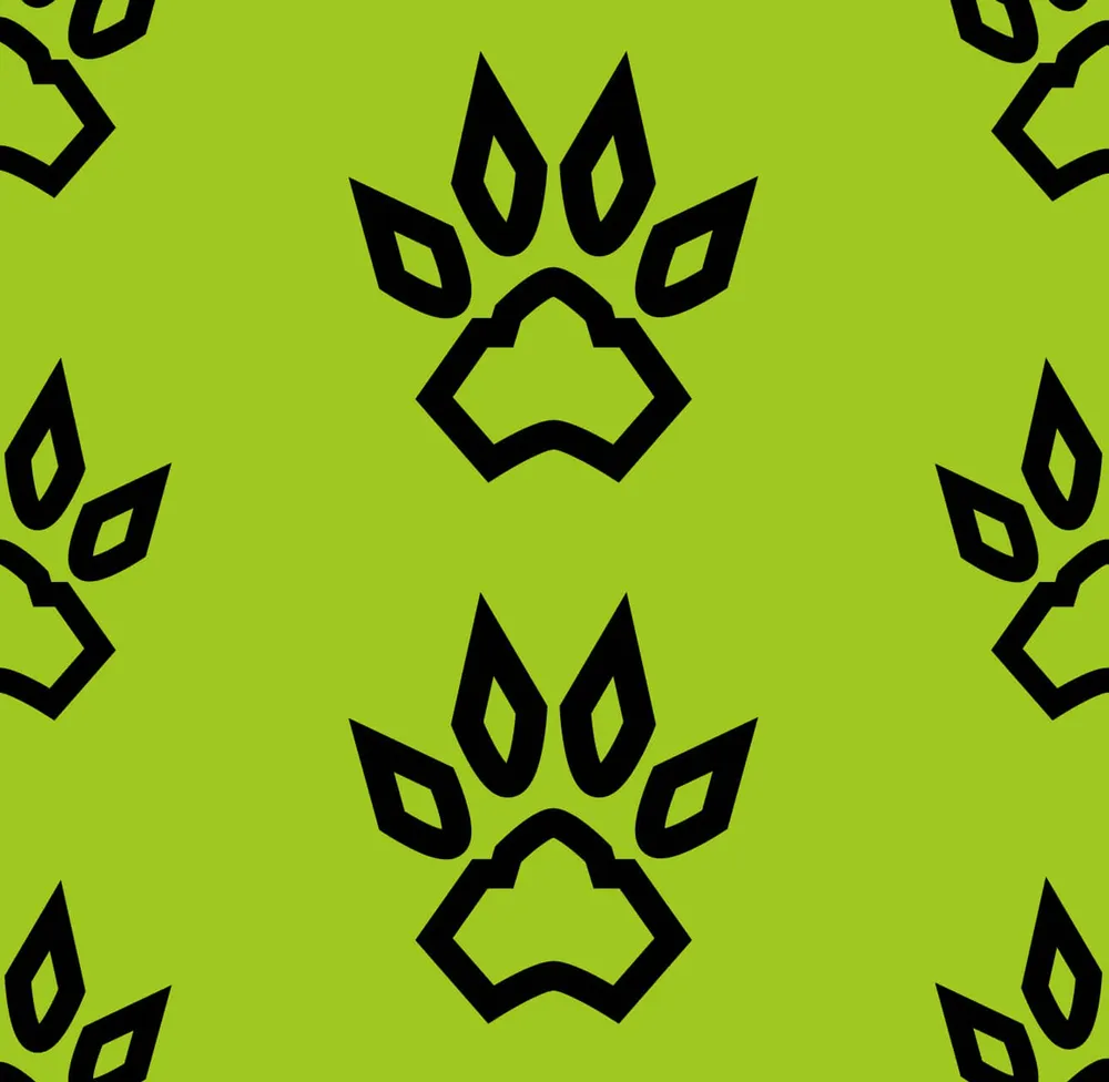
Pattern swatch with black paws on green
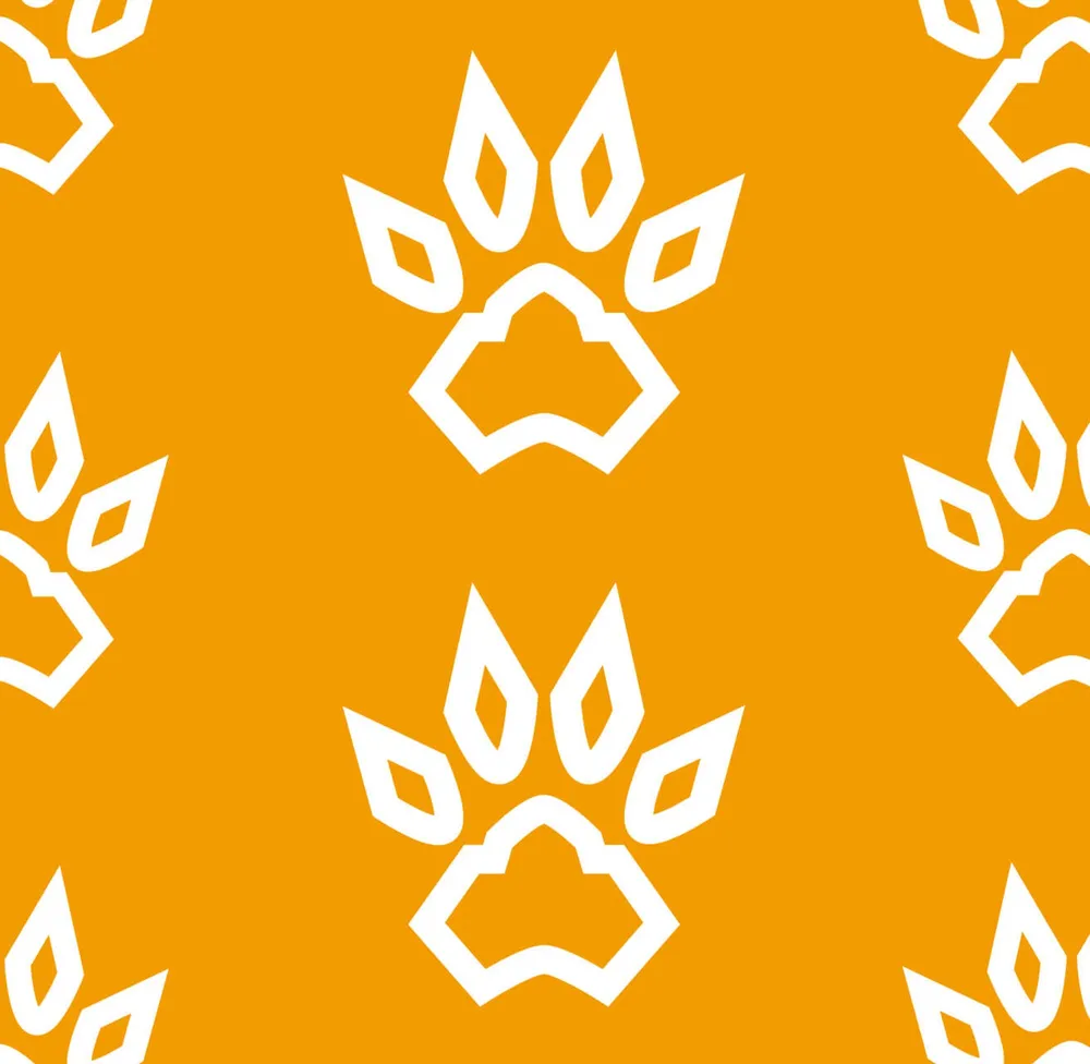
Pattern swatch with white paws on orange
The color palette and the icons open up countless design possibilities.

Three typefaces, clear roles

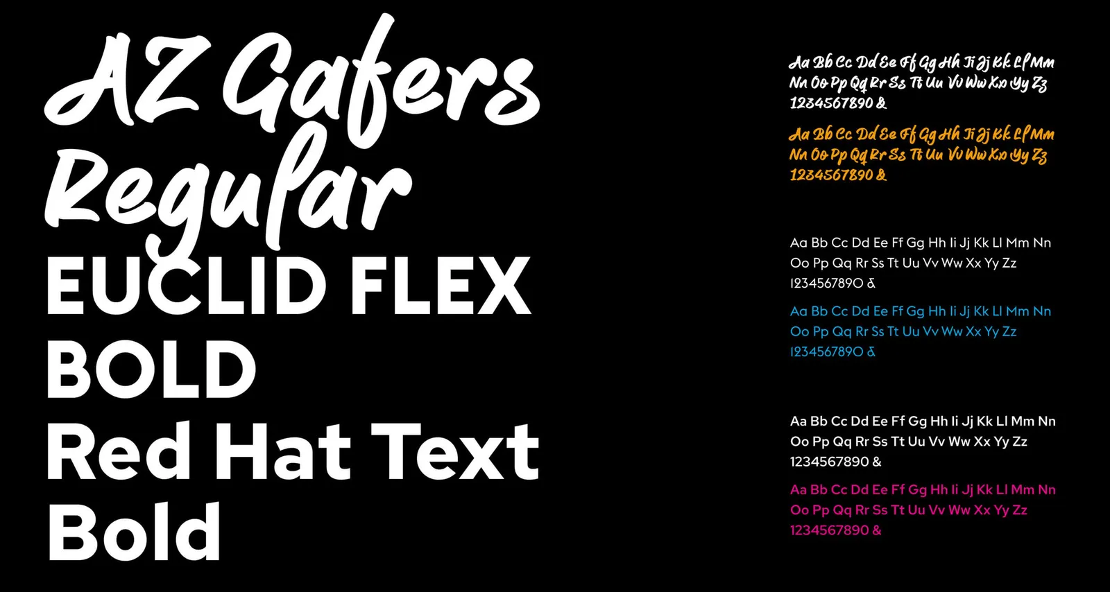
Type specimens of AZ Gafers, Euclid Flex Bold and Red Hat Text Bold on a black background
AZ Gafers provides character in the background, Red Hat Text and Euclid Flex bring structure and legibility to the design.

Orange books, blue advises

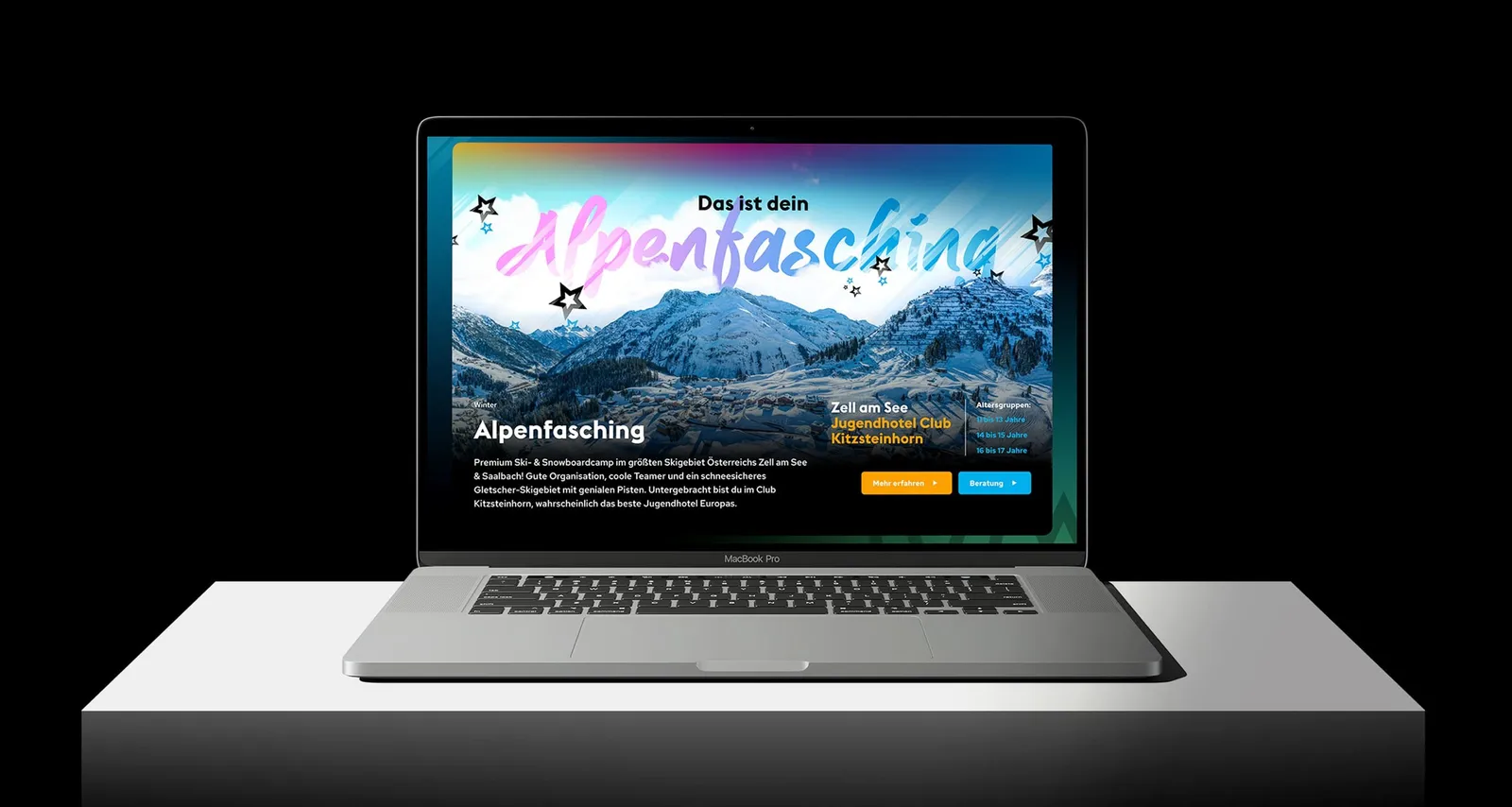
Laptop showing the “Alpenfasching” page on a dark background
Clearly guided, clearly decided! Orange pulls straight into booking, blue opens the space for advice. The choice of color follows no gimmick, it follows the customer journey.

Every activity gets its stage

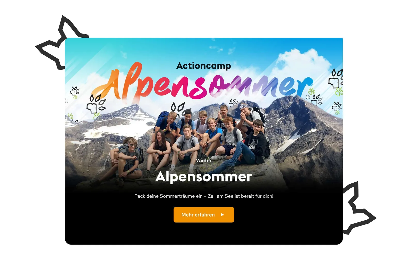
Card design “Alpensommer” with a group photo in front of a mountain lake
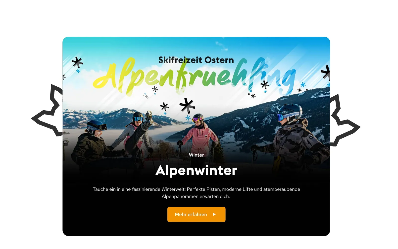
Card design “Alpenwinter” with skiers in the snow
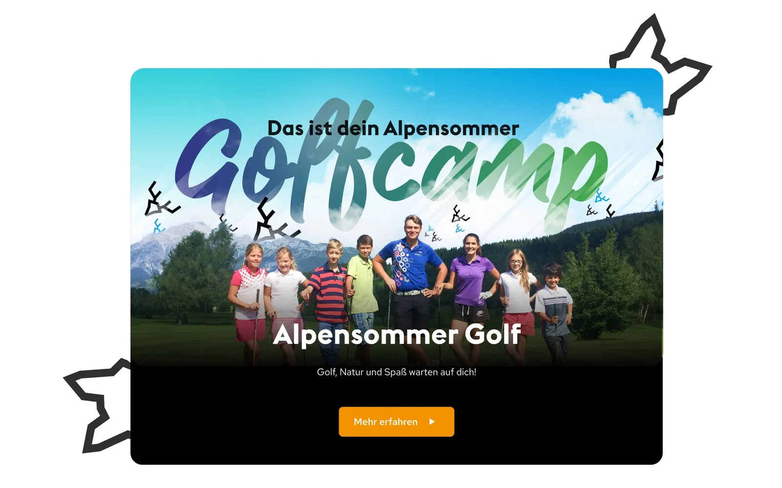
Card design “Golfcamp” with teenagers on the green
Every activity gets its stage. Visually strong, atmospherically staged and immediately relatable for the audience. That way orientation does not feel like information, it feels like anticipation.

Bold, direct, recognizable

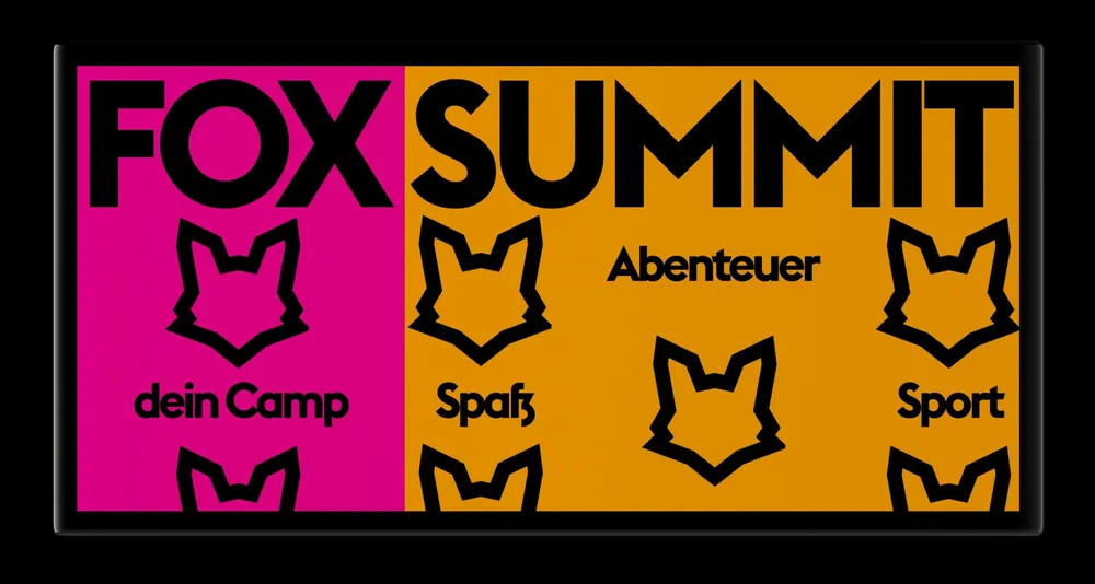
Display board in magenta and orange with the FOX SUMMIT lettering and the icons
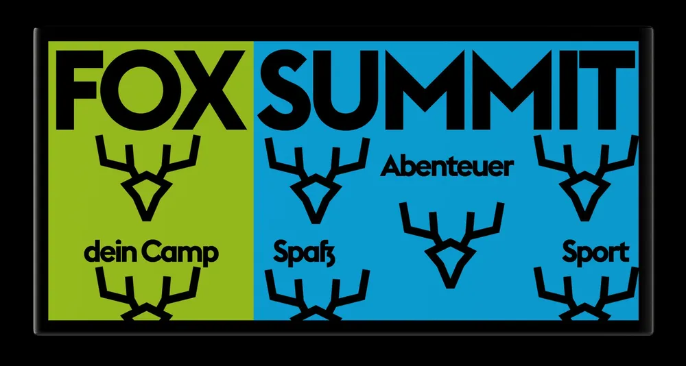
The same board in green and blue
Whether in reddish tones or bluish ones: the design is bold, direct, recognizable. The visual language also works as digital signage and becomes a visible surface.

An eye-catcher on mobile too

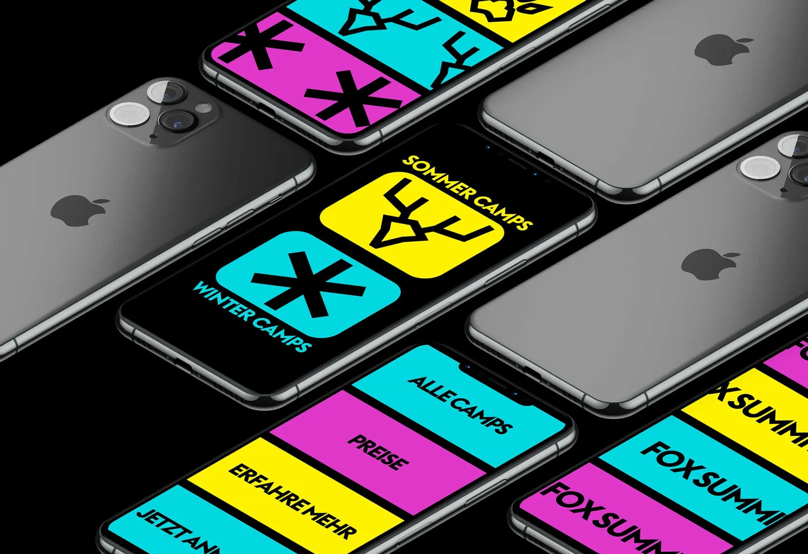
Several iPhones side by side with colorful app tiles for winter and summer camps
This is what the sections or buttons of a Fox Summit app could look like, but one thing is clear: an eye-catcher on mobile too.

Did our work inspire you?

Tell us about your project, short and to the point. It makes no difference whether you bring a rough idea or a polished concept.

Access is designed

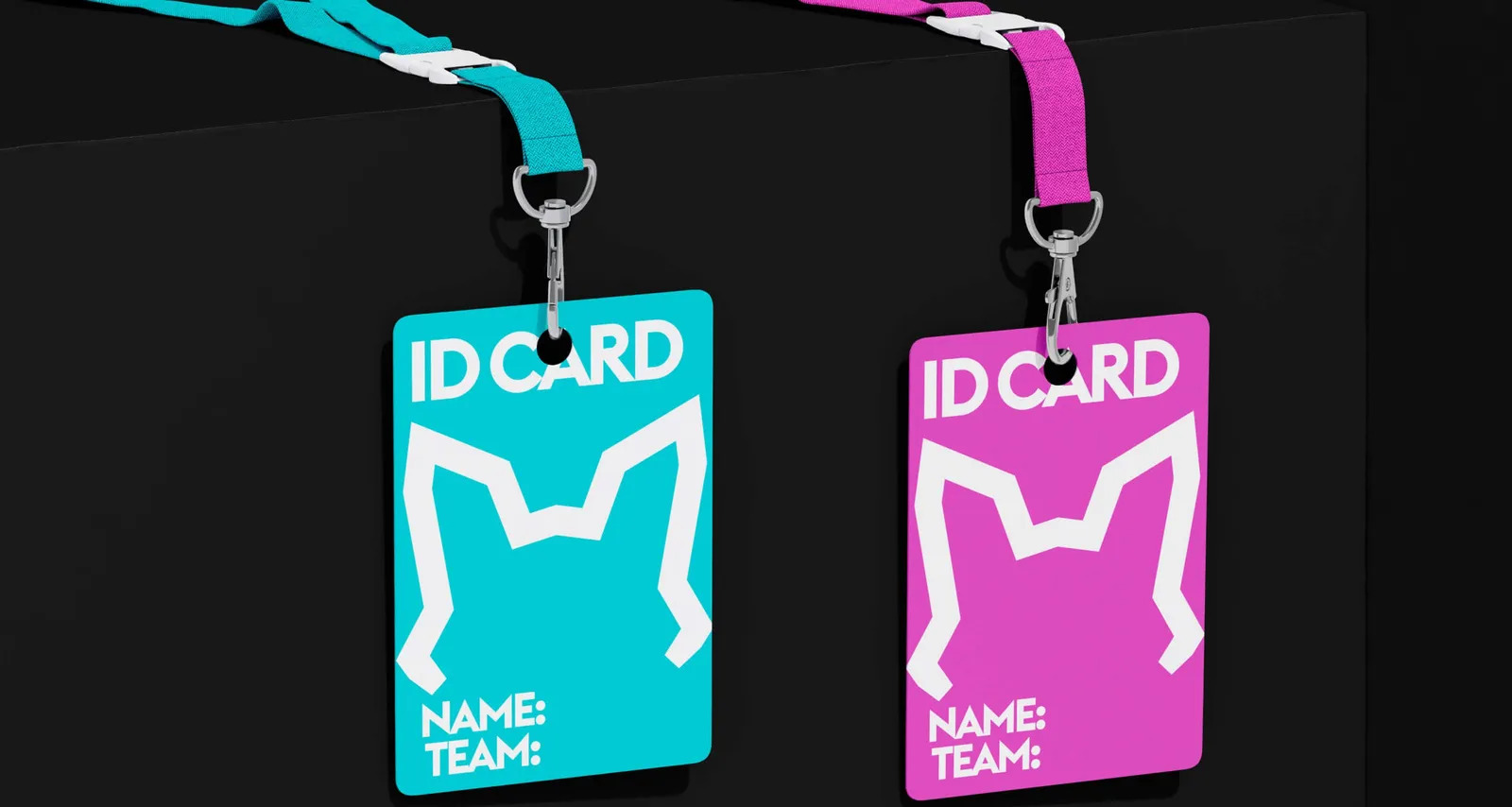
Two ID cards on lanyards in turquoise and magenta, with the fox head as a cut-out
This is what a ticket to the adventure world could look like: with visibility, clarity and the recognition value of the brand. Access like this is not administered, it is designed.

A format that can do more than stick

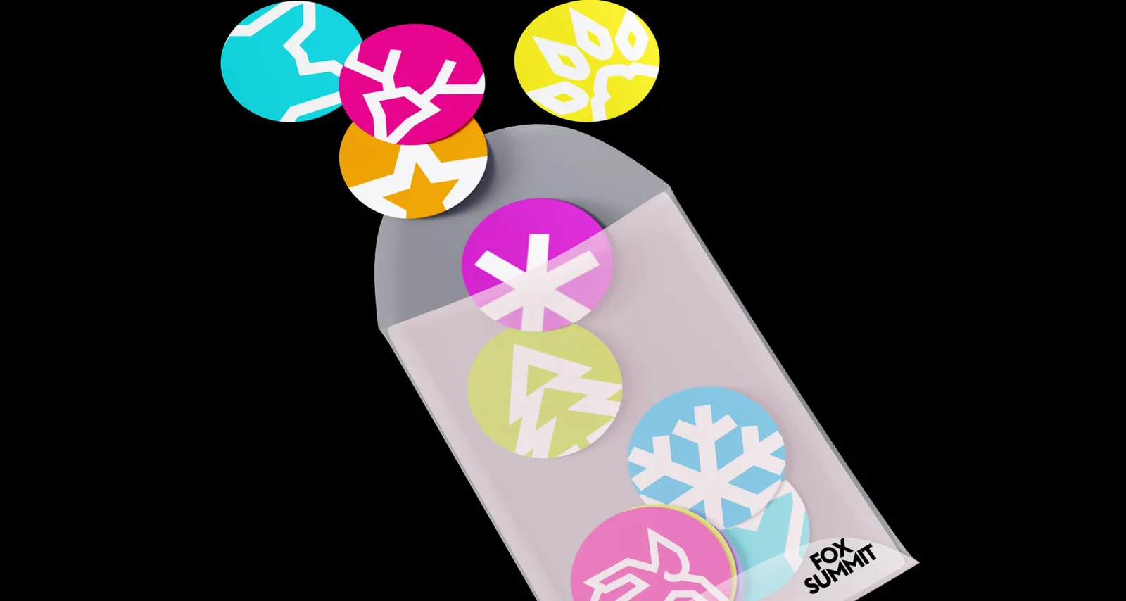
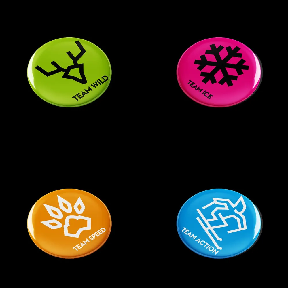
Round stickers in the brand colors falling out of an envelope
A format that can do more than stick. As stickers, the symbols unfold their potential wherever the audience shows up.

The fox has to be on it

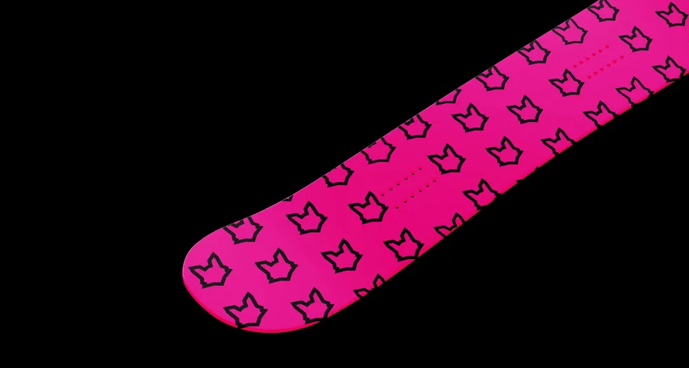
Snowboard in magenta with an all-over fox head pattern
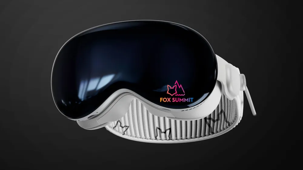
Ski goggles with a mirrored lens and Fox Summit lettering
Fancy a new board? Sure, but the fox has to be on it — and the matching ski goggles with it. You have to turn up at camp with style.

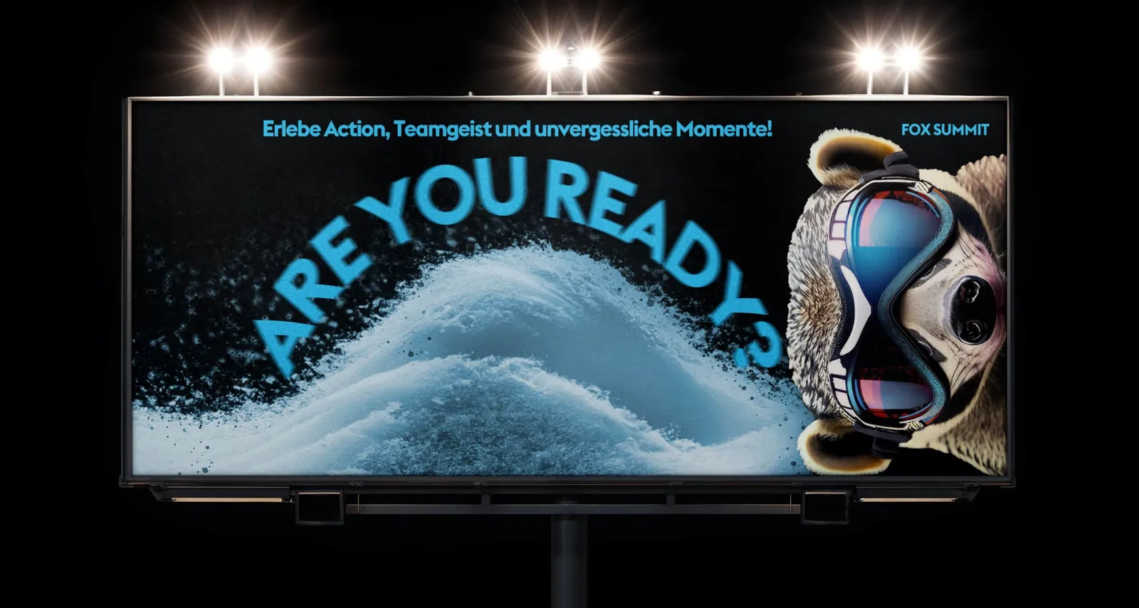
Peekaboo! Here I am!

Illuminated billboard at night with the question “Are you ready?” and the fox in ski goggles
On the bus ride to camp, seeing a billboard like this would be something special, wouldn't it?

Action-packed web design for a young audience

When Fox Summit got in touch, it was quickly clear that the existing website was not a showcase but merely a redirect. A static landing page without real content.

What was missing was everything that makes a brand tangible. No way in, no tone of address, no sense of what Fox Summit actually means. Our job was to change that.

The creative way in came through the icons. From the abstracted fox head in the logo we developed a visual system that step by step grew into the basis of the brand communication.

The moment the visual language took shape, it became clear how much of the design is told through color. We did not simply define colors, we built a rhythm.

The images deliver the emotional core. Snow, water, movement, light — every shot was filled with life instead of merely meeting a standard.

The result is a digital presence that speaks with its audience and has no need to hide. Fox Summit has not just become reachable, it has become visible.

Client
Fox Summit
Studio
Creative Agency WAGEMUT
Services
Branding, Graphic Design, UI/UX Design, Web Design
Industry
Education, Hospitality & Leisure, Entertainment