Skip to content

Case Study

A brand that makes closeness visible

Hoofprint — naming, brand and Shopify shop for personalized horse art

For Hoofprint we developed a brand that makes the bond between people and horses visible — from the naming to the logo, color world, typography and the shop. At its heart is the Hoof Designer: upload a photo, choose a style, and your own work of art is ready on a sweatshirt, cushion or mug.
  • Retail & Wholesale
  • Arts & Culture
  • Branding
  • Brand Strategy
  • Naming
  • E-Commerce & Online Shops
  • UI/UX Design
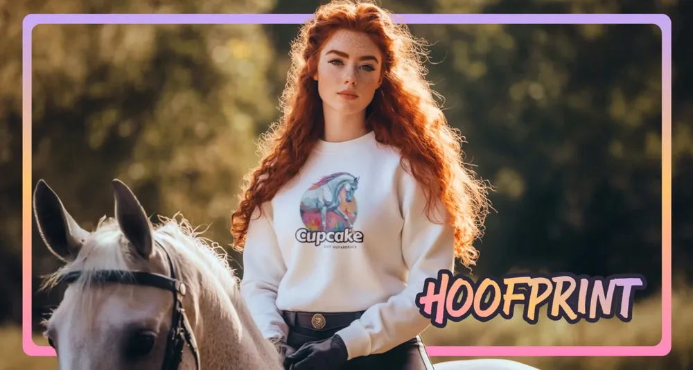
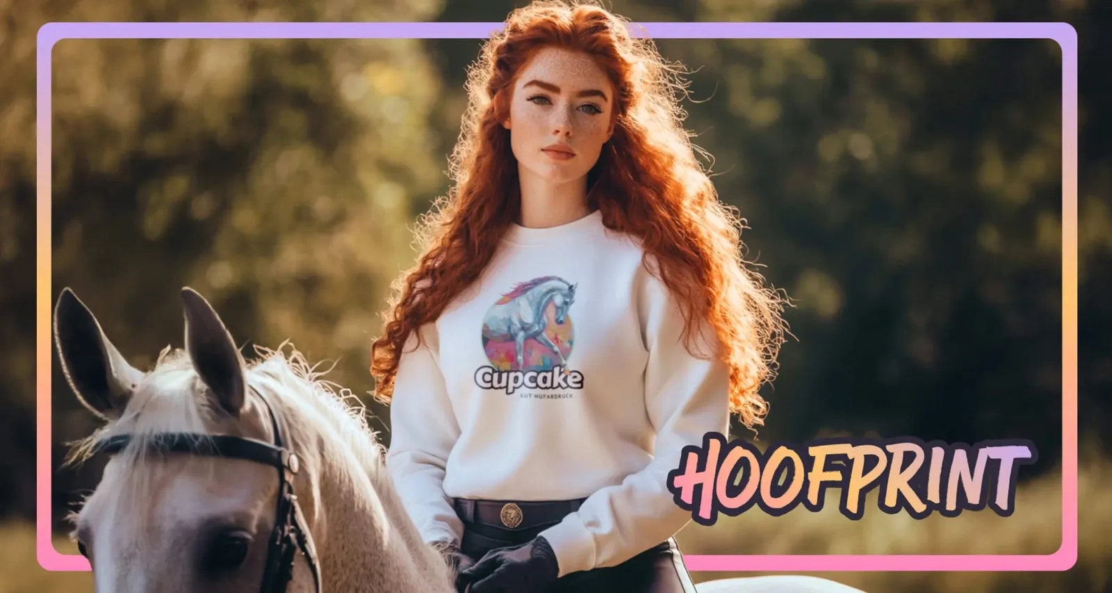
Rider on a grey horse, in a sweatshirt with the painted portrait of her horse and the Hoofprint lettering

Everything revolves around the love for the horse
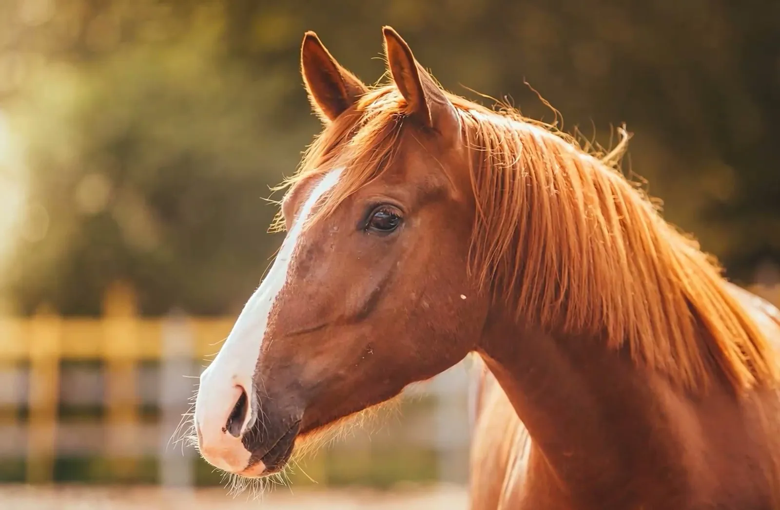
Close-up of a chestnut horse at the fence, its mane backlit
Everything revolves around the love for the horse. And the design makes that love visible.

An H with attitude

The Hoofprint mark: a hand-drawn H in dark blue with a white outline on a gradient of orange, pink and violet
The HOOFPRINT lettering in capitals, with a gradient from pink to orange
The logo in use: rider on a grey horse in a sweatshirt with the portrait of her horse
Boldly staged and clearly positioned. The logo carries the attitude of the brand in every variant, from the favicon to the big stage.

Eight colors, eight ideas

Animation in which the brand colors blend into one another as stripes
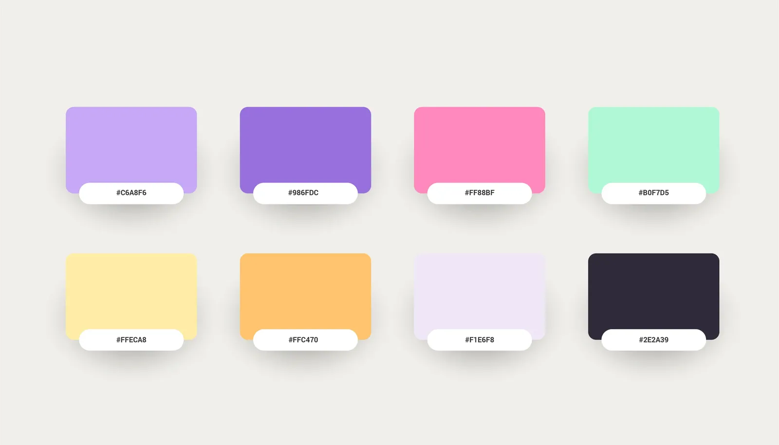
Color palette of eight tiles with hex values, from lilac through pink and mint to anthracite
The color world is not just a matter of feeling, it is precisely defined. Every color stands for an idea that has become part of the brand.

Nunito Bold for the stage

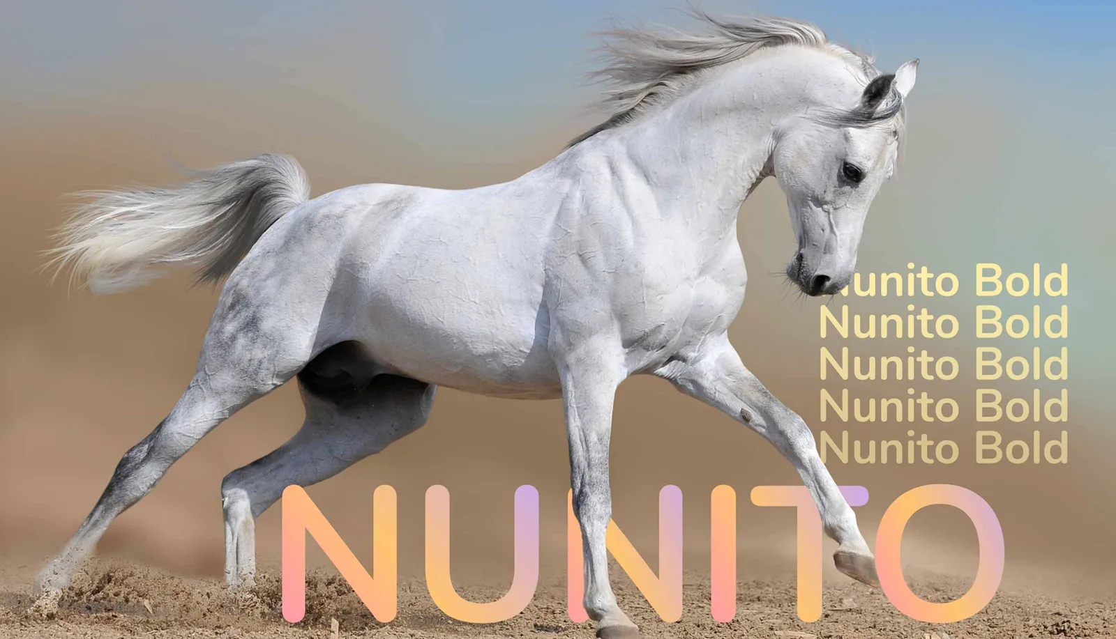
Type specimen of Nunito Bold over a galloping grey horse
Confident in its appearance, clear in its message. Nunito Bold sets the accents and gives the visual identity a firm footing. It catches the eye before the content begins.

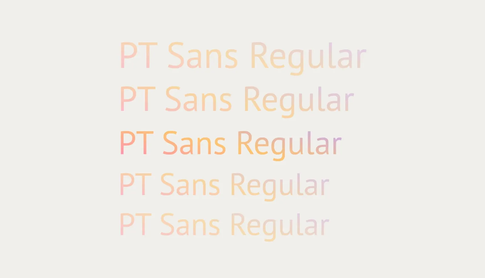
PT Sans for the text

Type specimen of PT Sans Regular in five shades of orange
PT Sans Regular is light, restrained and easy to read. It takes over where Nunito has opened up the space. The interplay works like a dialogue of form and content, loud and quiet in perfect alternation.

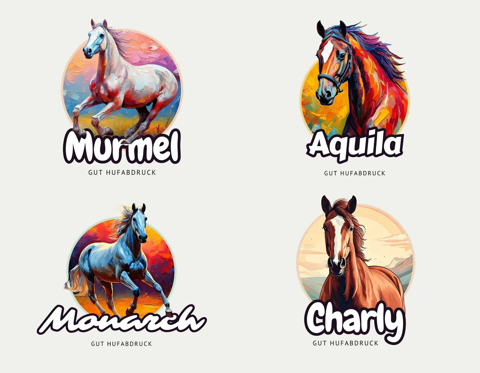
Every horse a one-off

Four painted horse portraits as round stickers with the names Murmel, Aquila, Monarch and Charly
Different styles, changing moods, always personal. What makes each horse special stays visible and turns every picture into a one-off, just as every horse is a one-off.

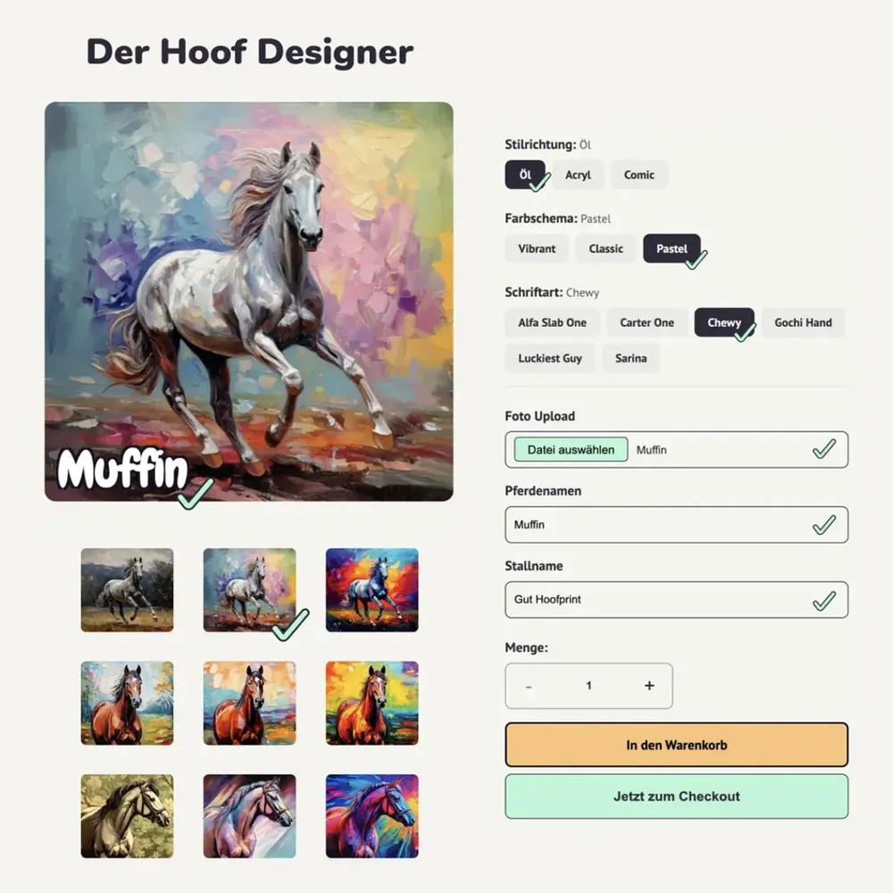
The Hoof Designer

Interface of the Hoof Designer: the preview of the artwork on the left, the choice of style, color scheme and typeface on the right
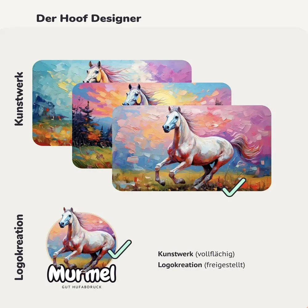
The two output routes in the designer: artwork across the full area or a cut-out logo creation
The Hoof Designer makes personalization tangible. Everything is built to be easy to understand and effortless to use.

The same appearance, every format

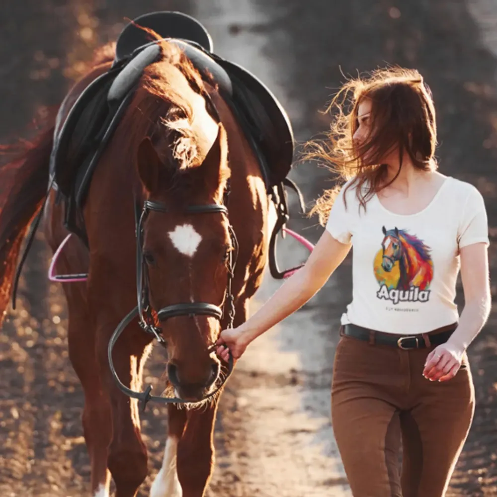
  • Story clip: a wearer shows her shirt with the portrait “Aquila”
  • Story clip with the question “Do you love your horse?” over a backlit shot
  • Story clip “5 Fun Facts” over a herd in a flower meadow
  • Story clip: a wearer in an olive green shirt with the portrait “Pegasus”
  • Story clip: the “Charly” design on a light sweatshirt
  • Story clip in which the brand colors run into one another as areas of color
On social media, too, the appearance stays clear and recognizable. The design runs through every media format and makes sure the brand stays present and builds trust.

Oil brings depth

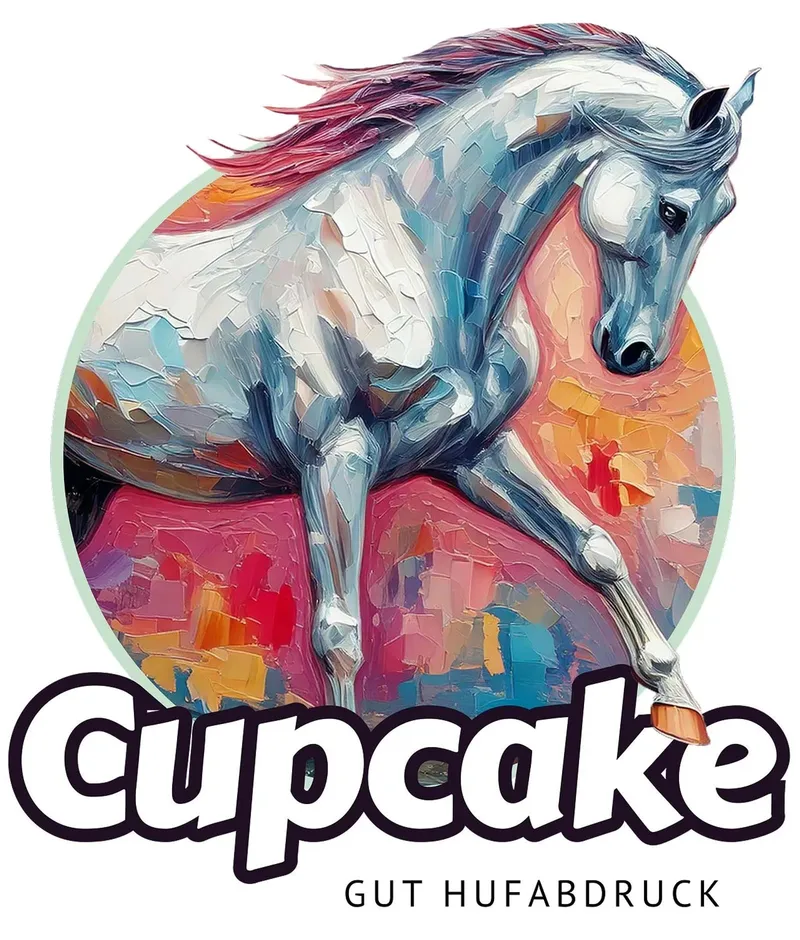
Painted horse portrait “Cupcake” as a round sticker in an oil look
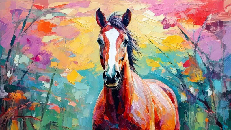
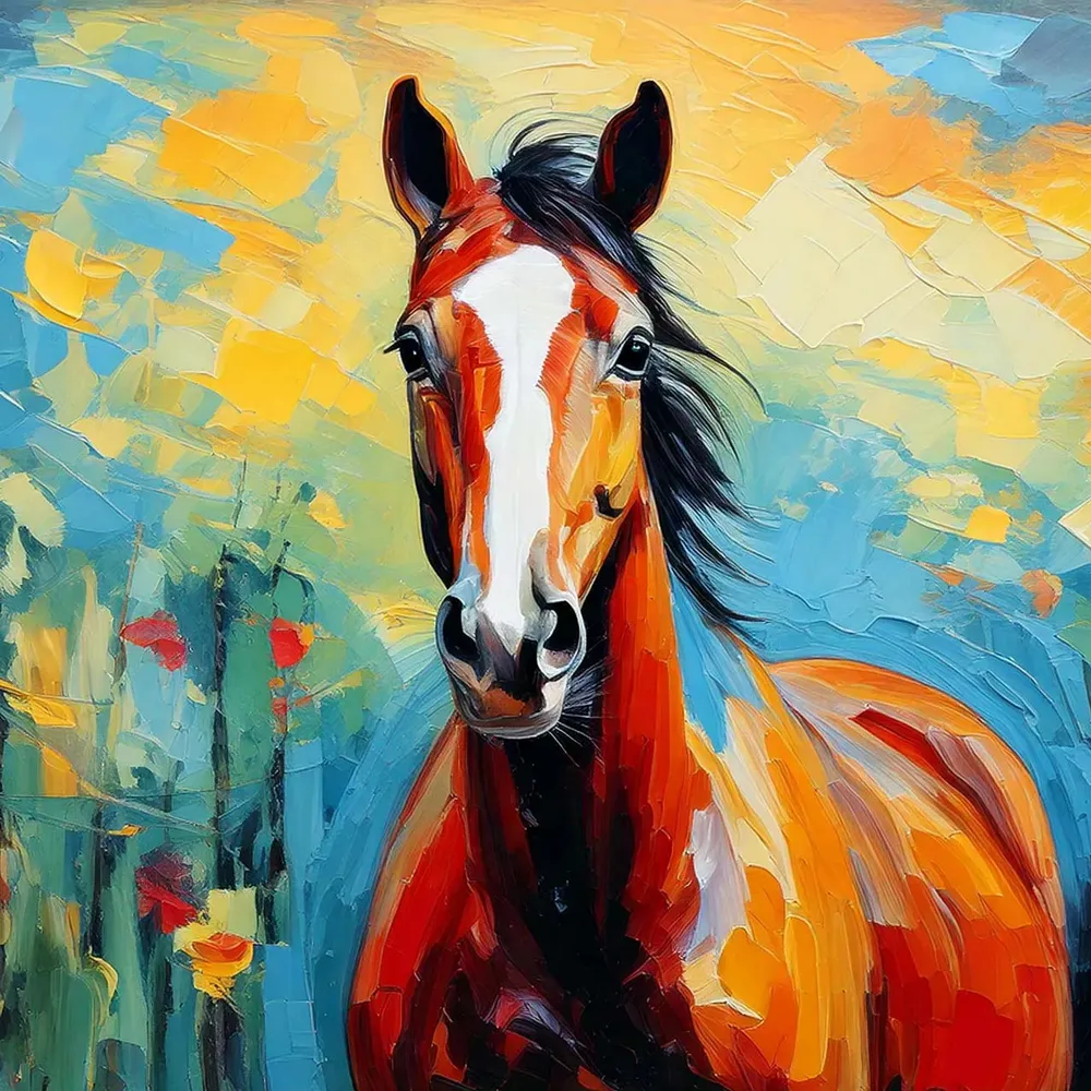
Oil painting of a chestnut horse in front of a meadow in bold palette-knife colors
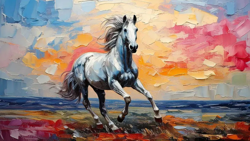
Oil painting of a galloping grey horse on the beach at sunset
Oil brings depth and calm. The surface feels alive, the subject gains weight. The style gives the picture a particular gravity that stays — simply classic.

From photo to oil painting

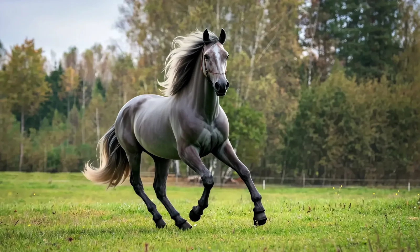
A photo of a grey horse in the pasture turns into an oil painting
Oil style transformation: it feels like a look into a memory. Softly carried and deeply anchored. The picture starts to tell a story and makes visible what stays.

Comic reduces without losing anything
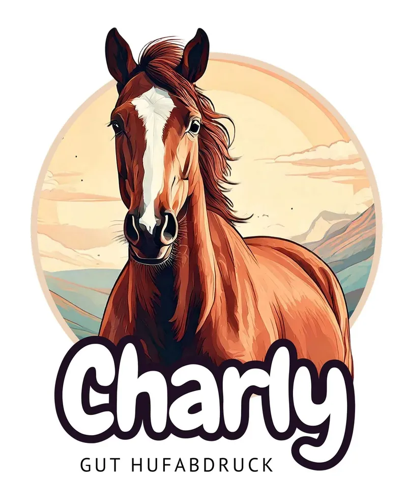
Comic portrait “Charly” as a round sticker in front of a mountain panorama
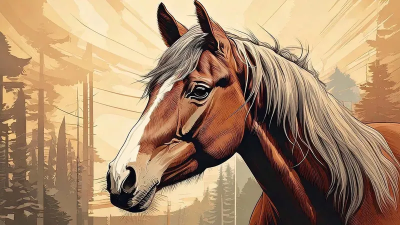
Comic illustration of a horse’s head in front of stylized conifers
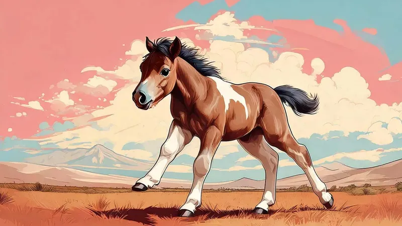
Comic illustration of a foal at a gallop against a pink sky
Comic reduces without losing anything. The form becomes clear, the expression stays. The style plays with the original and takes the horse into a new and exciting world.

Reality becomes character

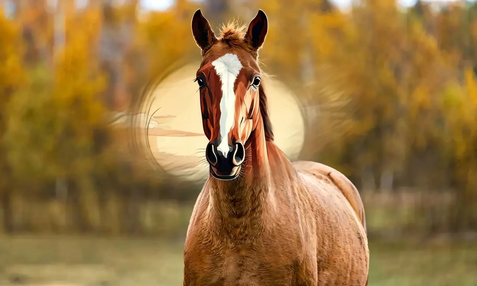
A photo of a chestnut horse in autumn leaves becomes a comic illustration
There is something playful about the transformation. Reality becomes character, detail becomes expression. The horse stays recognizable all the same.

Acrylic sets edges

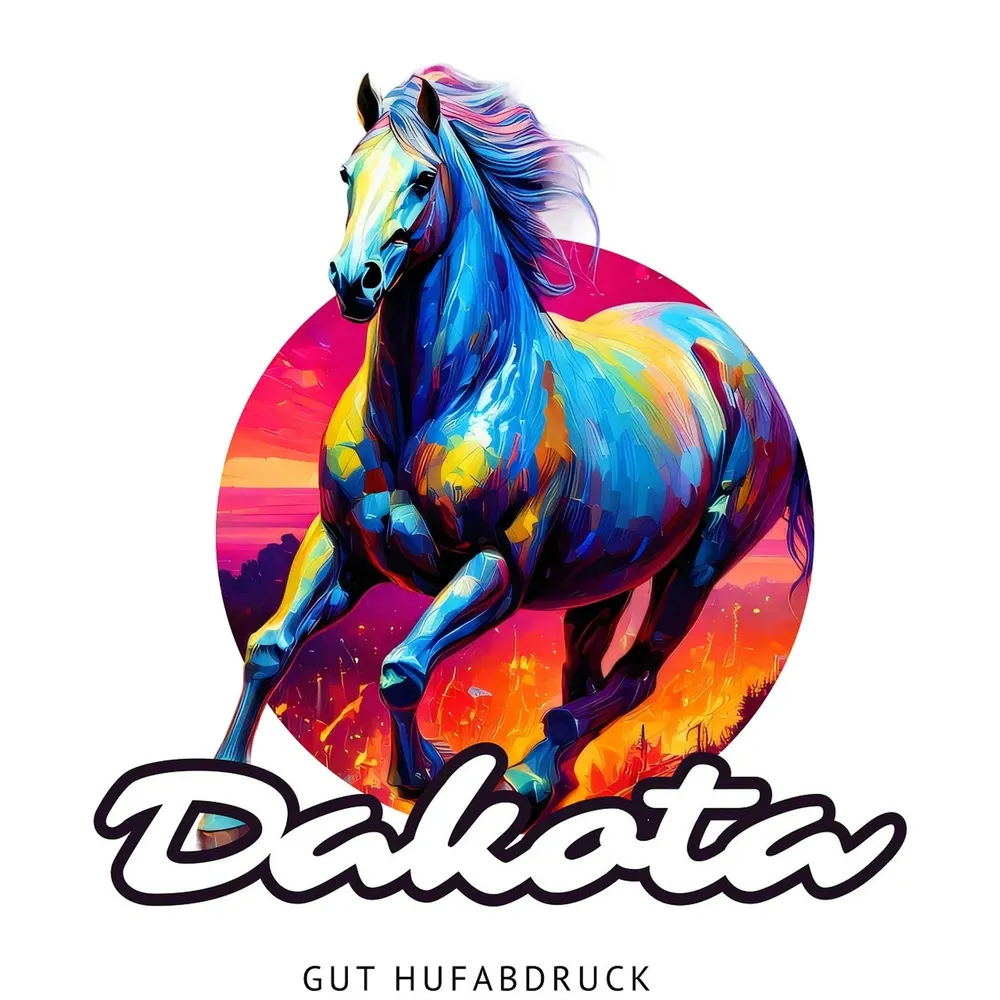
Acrylic portrait “Dakota” as a round sticker in blue and magenta
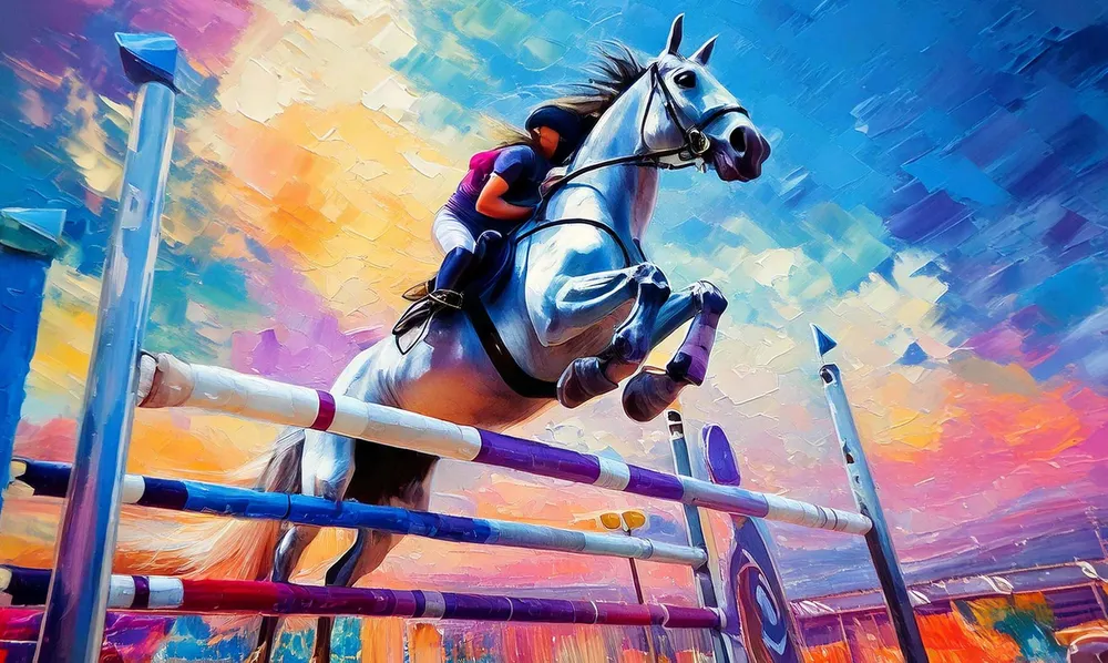
Acrylic painting of a horse’s head in bold palette-knife areas
Acrylic feels direct and powerful. The areas of color are clearly placed, every line palpable. This style brings tension into the picture without overloading it.

Every product carries a memory

Acrylic painting of a show jumper going over a fence
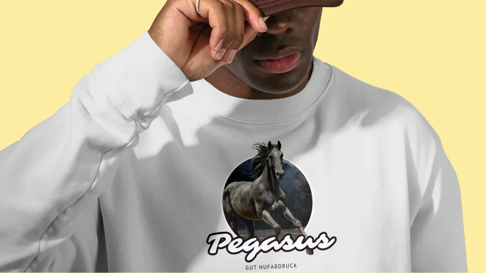
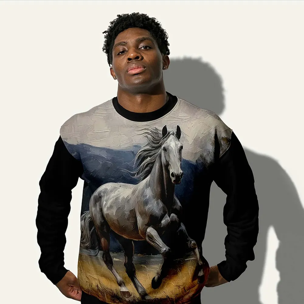
A sweatshirt with the “Pegasus” design shown from every side
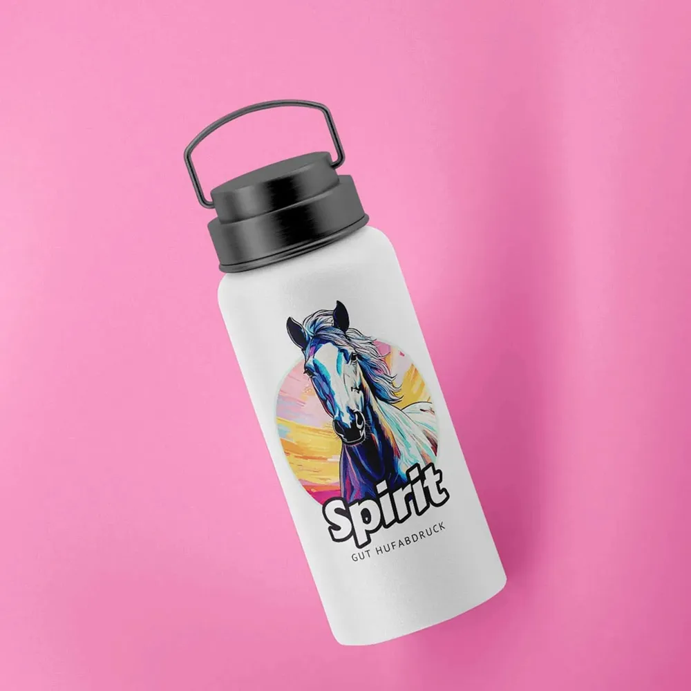
White water bottle with the “Spirit” design on a pink background
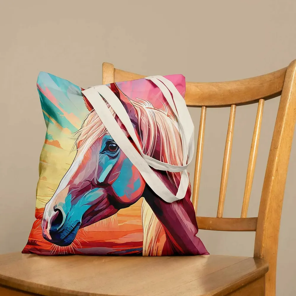
Cushion with a painted horse design on a wooden chair
Every product becomes a surface for something personal. What counts is not the material, but the memory it carries.

From the shirt to the hat

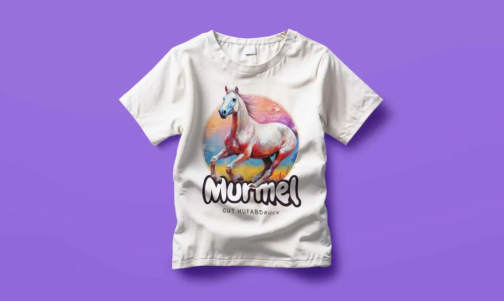
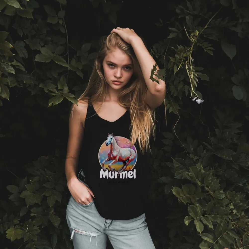
White T-shirt with the “Murmel” design on a violet background
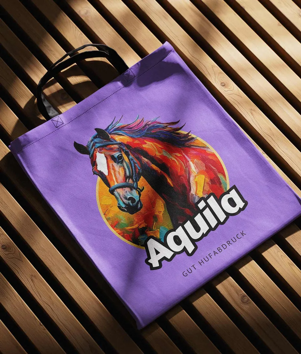
Violet tote bag with the “Aquila” design on a wooden bench
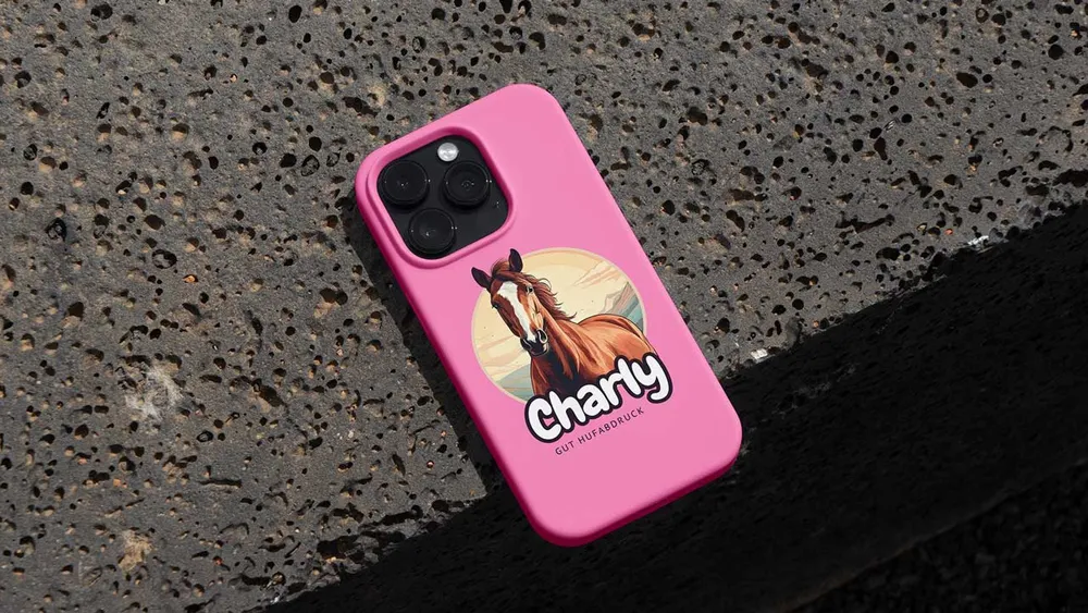
Pink phone case with the “Charly” design on dark asphalt
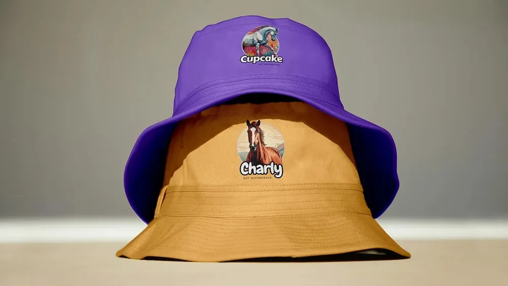
Reversible bucket hat in violet and ochre with two horse designs
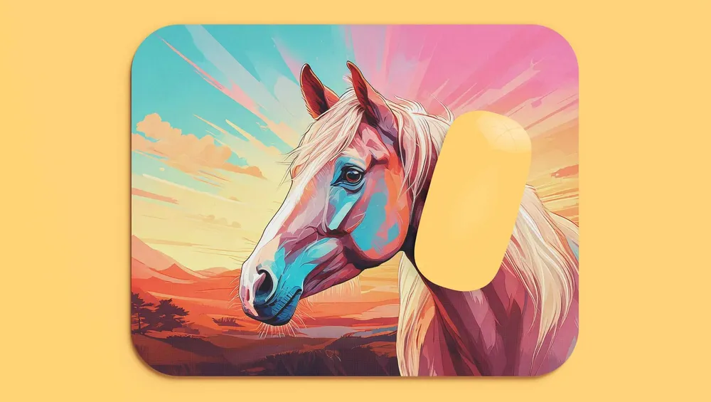
Mouse pad with a comic horse in front of a sunset
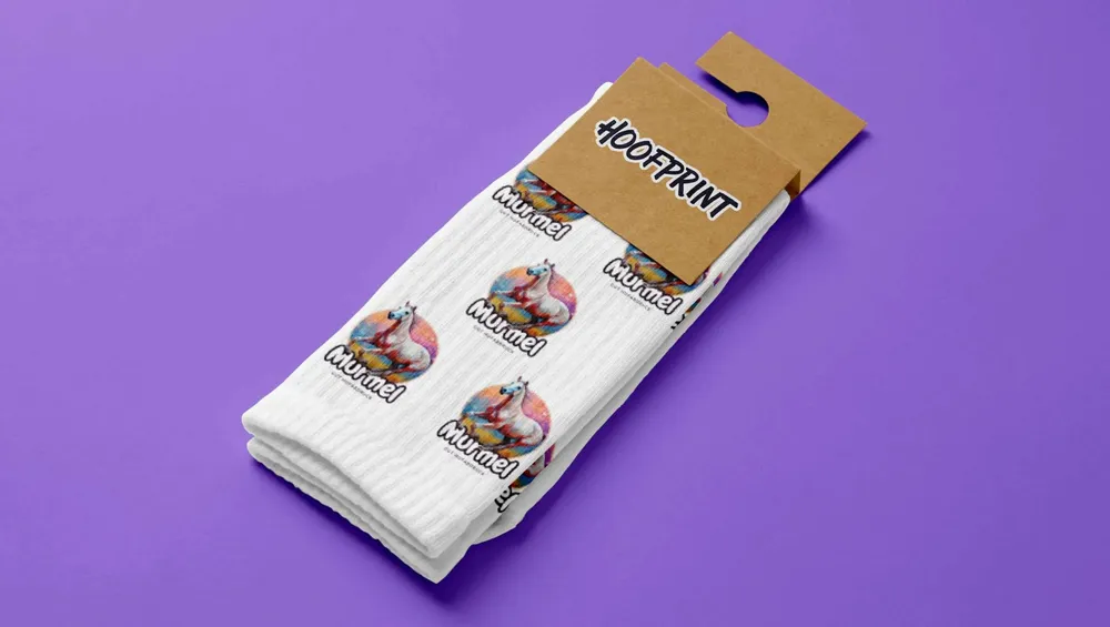
White socks with small horse designs in their kraft paper band
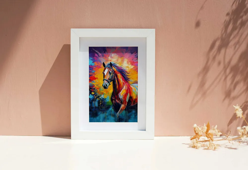
Framed oil painting of a horse on a dusty pink wall
The same visual language on every carrier: what works on the sweatshirt works on the bag, the case and the hat too.

Because we know what real closeness looks like
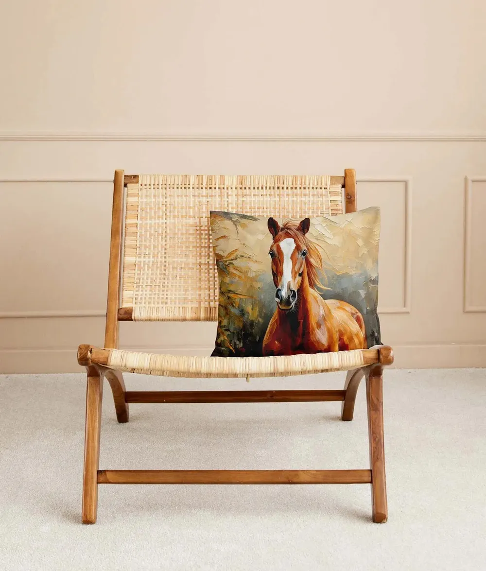
Cushion with a horse design on a light rattan chair
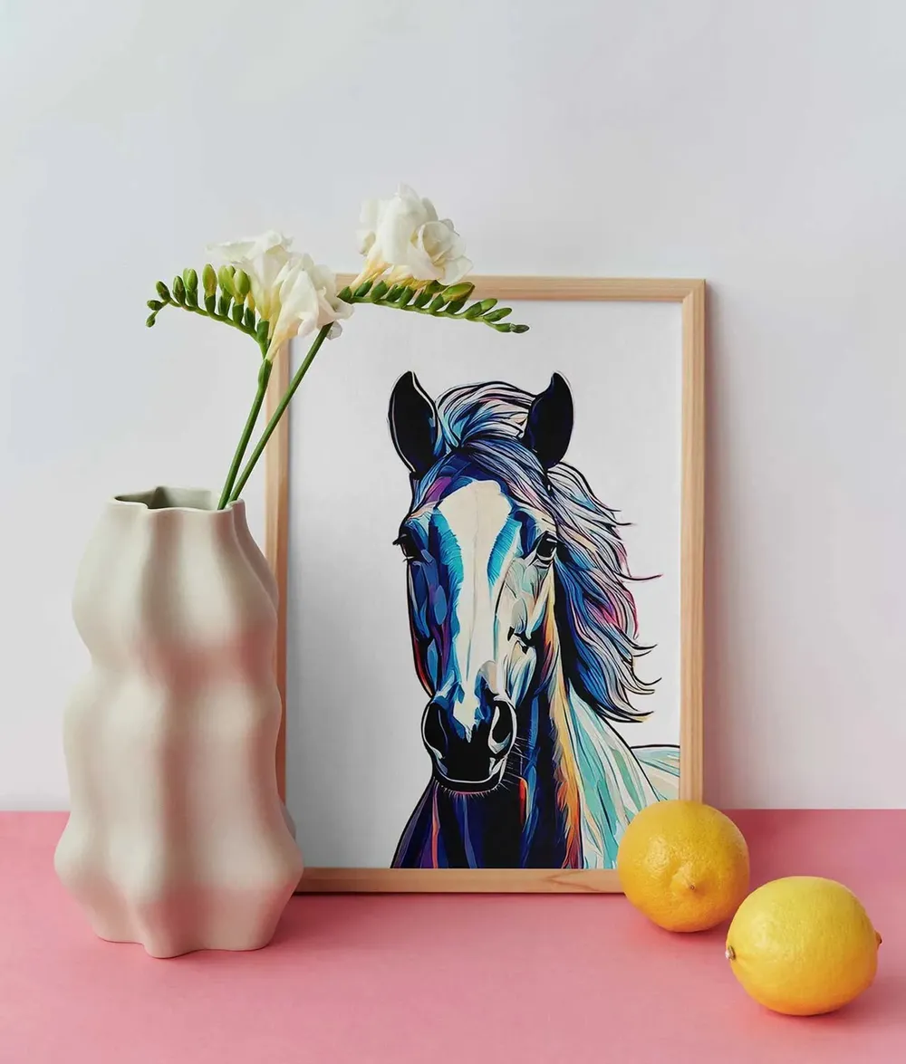
Framed horse picture next to a vase of white blossoms
Hoofprint turns a bond into an identity. What you feel is given a face and finds its place in the real world. Personal, visible, unmistakable and of course … a little bold.

Did our work inspire you?

Tell us about your project, short and to the point. It makes no difference whether you bring a rough idea or a polished concept.

Hoof Hoof Hooray!

Hoofprint grew out of an idea that goes straight to the heart. The bond with your own horse was not simply to be depicted, it was to be made tangible. It was never only about products, it was about emotions. About what remains once the moment has passed.

And we were to make exactly that feeling visible. To design a platform that does not work like a typical shop, but like an extension of that relationship. Personal, intuitive, with no distance. Not explaining, but accompanying.

The Hoof Designer became the heart of the whole platform. A tool that does not look like technology, but can be felt. Every step was designed so that users notice no hurdles: upload a photo, choose the style, done.

Visually there were no compromises either. The color world was deliberately chosen to be bold, dynamic and luminous. Not cool, but familiar. A mixture of restraint and presence that leaves room for what belongs at the center: the horse.

With Hoofprint we did not just design a brand, we translated a feeling. Not into claims or campaigns, but into structures, flows and images that land exactly where they belong.

Client
Hoofprint
Studio
Creative Agency WAGEMUT
Services
Branding, Brand Strategy, Naming, E-Commerce & Online Shops, UI/UX Design
Industry
Retail & Wholesale, Arts & Culture