Skip to content

Case Study

Web design and brand identity for a business analytics platform

Virtivity GmbH — APOLLO for the CFO office

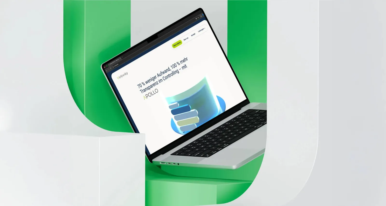
For Virtivity GmbH we developed the company website for the business analytics platform APOLLO — including a logo redesign, brand identity and UI/UX concept. The platform's value proposition, 70% less effort and more transparency in controlling, runs through the site from the opening image to the trade fair stand.
  • Professional Services
  • Technology
  • Branding
  • Graphic Design
  • Exhibition Design
  • Product Photography & Content
  • Web Design
Laptop showing the Virtivity home page in front of green studio surfaces, with the APOLLO value proposition on the screen

Built responsive, not retrofitted

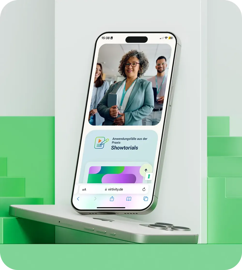
Virtivity website on a smartphone: showtorials with use cases from practice
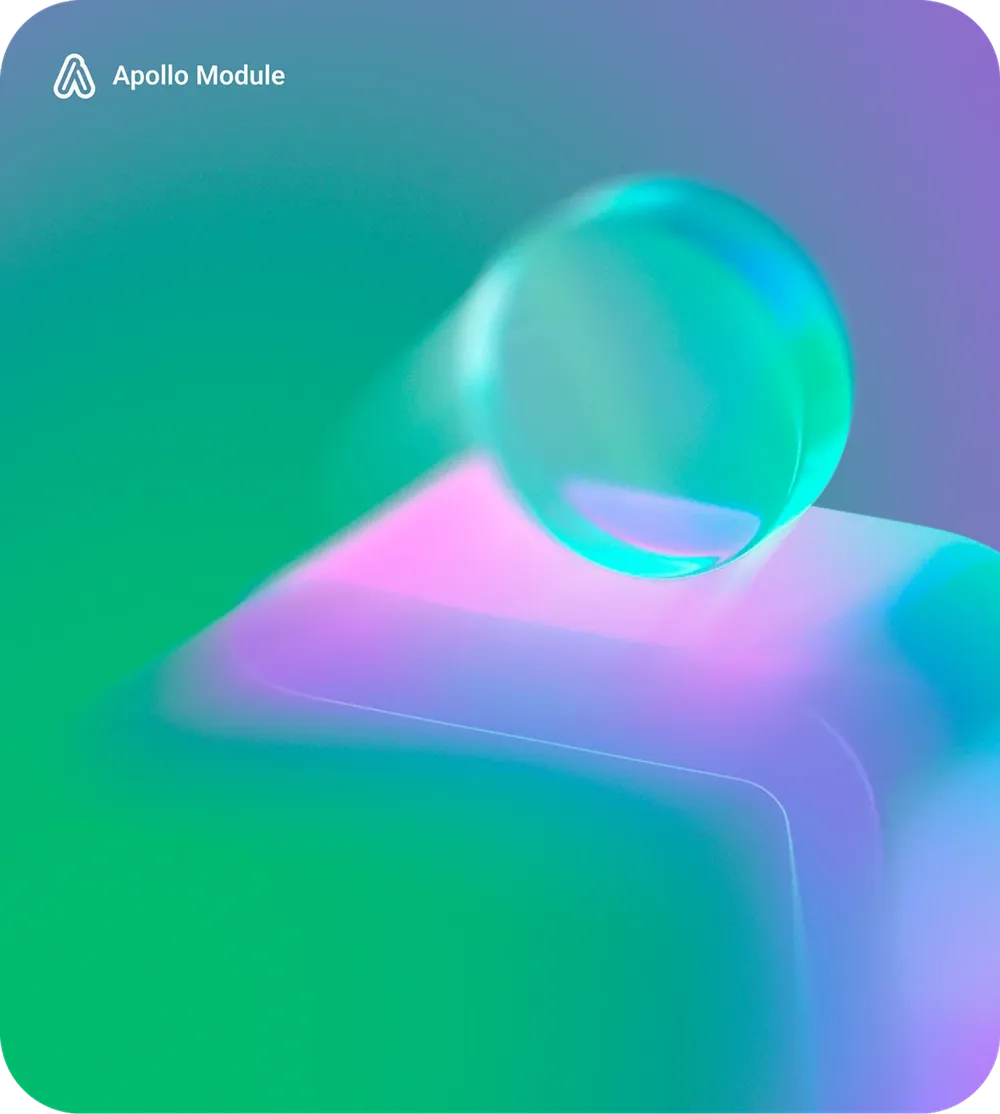
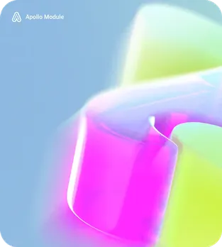
Key visual of the Apollo module: turquoise and violet 3D shape on a colored gradient
The content was built responsively for mobile and tablet devices and gives a clear overview of all tools and management functions, with intuitive operation and simple controls.

70% less effort as a promise above the fold
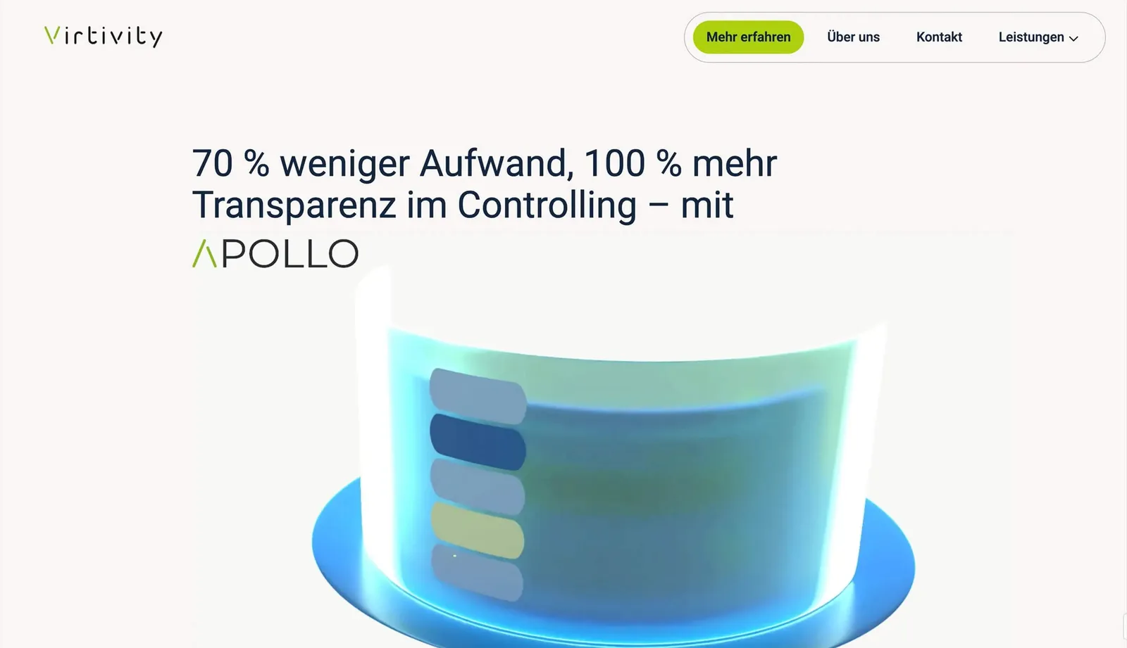
Animated Virtivity home page with the statement “70% less effort, 100% more transparency in controlling” and a rotating 3D chart
The home page puts the central value proposition — 70% less effort and 100% more transparency in controlling — right next to the animated product image. Soft, round shapes, a clear block structure and photos convey friendliness and easy communication.

The logo mark in motion

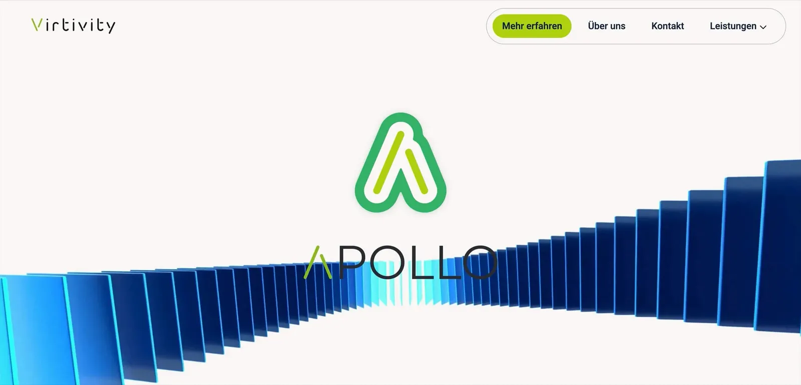
Animation in which a wave of blue bars forms into the APOLLO logo
Animations illustrate the APOLLO modules and functions and make what the software can do tangible at a glance.

Colored blocks instead of a wall of text
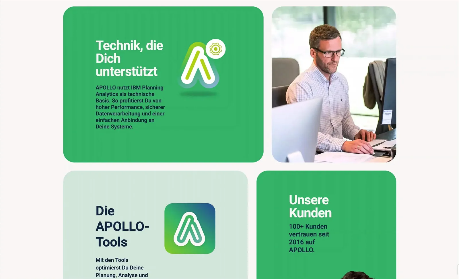
Scroll across green content blocks covering technology, APOLLO tools and customer voices
On the APOLLO page, colored text blocks, photorealistic images and icons alternate, so that planning, forecasting and analysis become clear and simple for the user.

Strong contrasts, pastel gradations
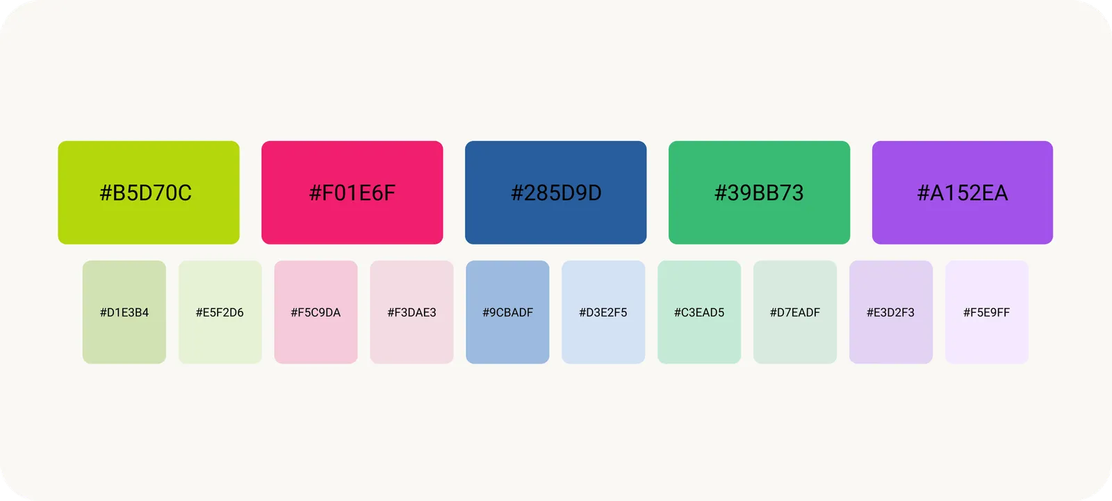
Color palette with five strong base tones in lime, pink, blue, green and violet plus ten pastel gradations
Strong contrasting colors and pastel gradations make APOLLO stand out as a modern business analytics solution and give the brand a clear, expressive identity.

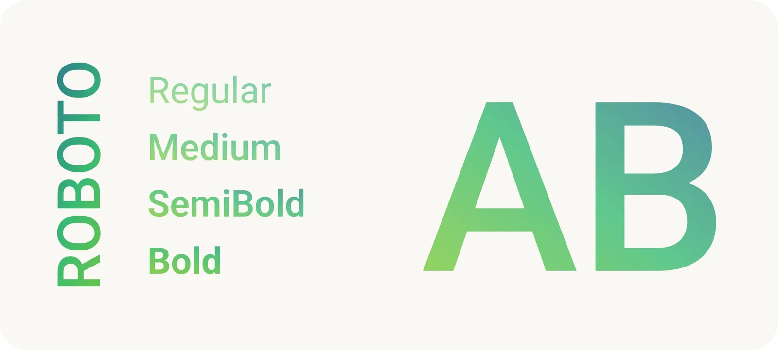
Roboto for the typography

Type specimen of Roboto in the Regular, Medium, SemiBold and Bold weights
Roboto was chosen for the typography – a timeless classic that wins with clear lines, is perfectly suited to web design and guarantees optimal legibility.

3D icons for every tool

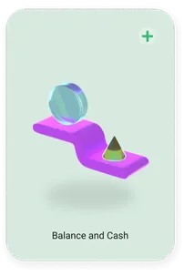
  • Icon card “Balance and Cash” with a violet ramp and a colored cone
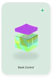
  • Icon card “Bank Control” with a violet lid above a glass cube
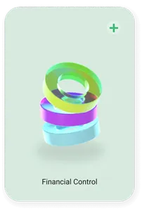
  • Icon card “Financial Control” with nested rings
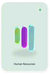
  • Icon card “Human Resources” with three upright capsules
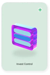
  • Icon card “Invest Control” with stacked transparent panels
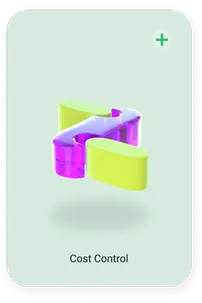
  • Icon card “Cost Control” with a folded ribbon
  • Icon card “Target Setting” with a ring and a sphere
  • Icon card “Reporting” with layered surfaces
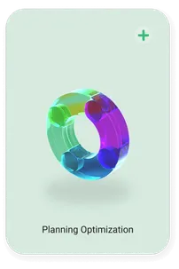
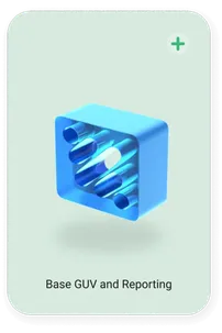
3D icons of the tools on offer were used as the central design element for visually structuring extensive content.

Did our work inspire you?

Tell us about your project, short and to the point. It makes no difference whether you bring a rough idea or a polished concept — let us have a chat.

3D icons as orientation in the interface
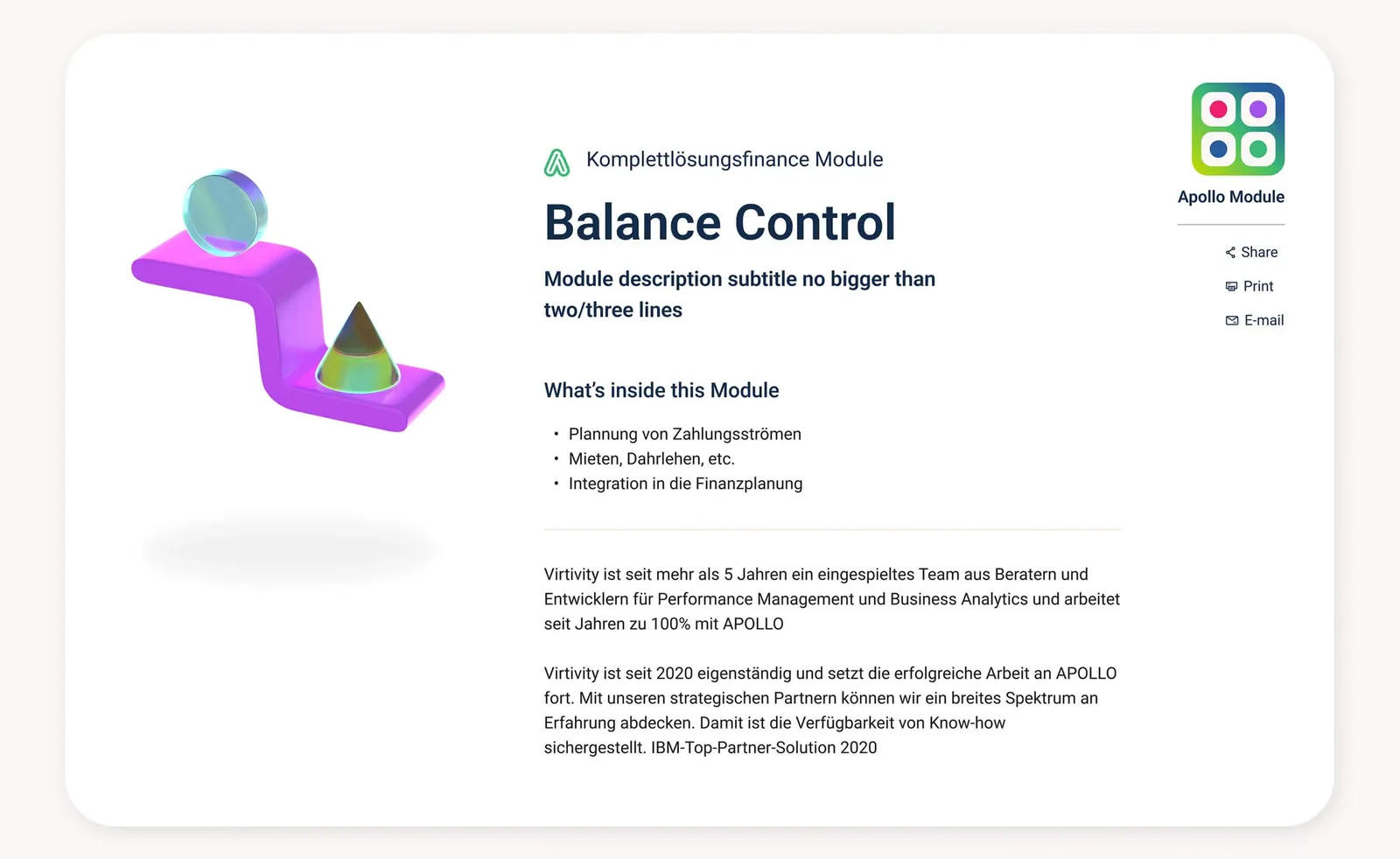
Balance Control module page with 3D icon, short description and list of functions
Combined with the strong color palette, the 3D icons improve clarity and strengthen the UI design. Animations also draw users' attention to the website.

3D blocks as visual anchor and structure

  • Blurred 3D capsules in lime on a violet gradient
  • Blurred cube in turquoise and green on a pink gradient
  • Blurred capsules in turquoise on an orange and pink gradient
  • Blurred ring in green and turquoise on a blue gradient
  • Blurred shape in violet and lime
  • Blurred ring in pink and turquoise
  • Blurred capsules in blue and green
  • Blurred loop in lime on a violet background
As a further visual element, striking blocks with blurred icons were designed that visually support and complement the controlling requirements.

Building blocks for long content pages
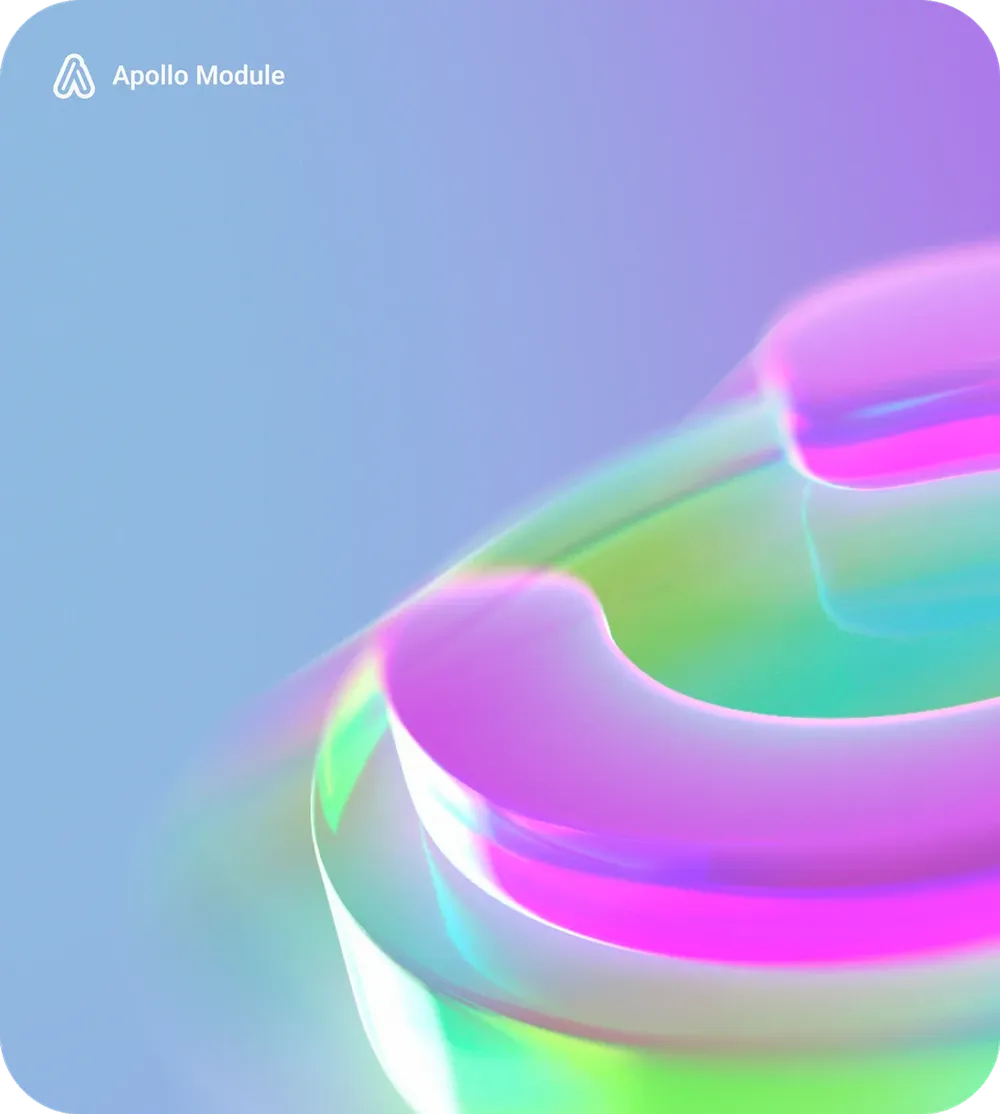
Image block with a blurred 3D shape in pink and green, the Apollo Module brand at the top left
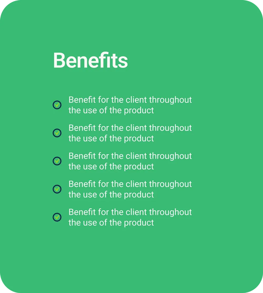
Green content card with the heading Benefits and five ticked bullet points
Colored text cards and image blocks with blurred 3D shapes break up long pages and keep the change between explanation and image in a steady rhythm.

Showtorials show it in practice

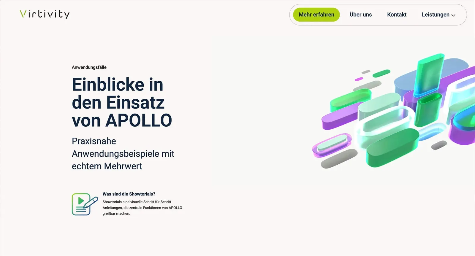
Page “Insights into using APOLLO” with floating 3D shapes and the explanation of showtorials
Animated 3D elements run through the entire website, create visual highlights and make the digital brand presence dynamic and memorable.

The company behind the platform

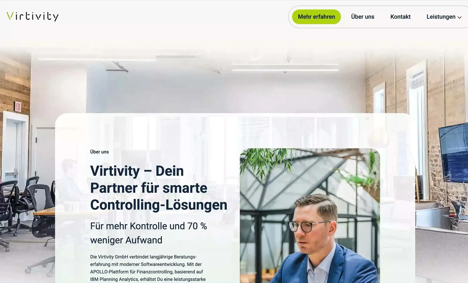
About page “Virtivity – your partner for smart controlling solutions” with a photo at the workplace and the sections Values, Mission and Why
The development of the website aimed to raise awareness of the new business analytics platform. The clear focus was on transparent communication, openness in dialogue and working together as partners.

A trade fair stand that carries the brand further
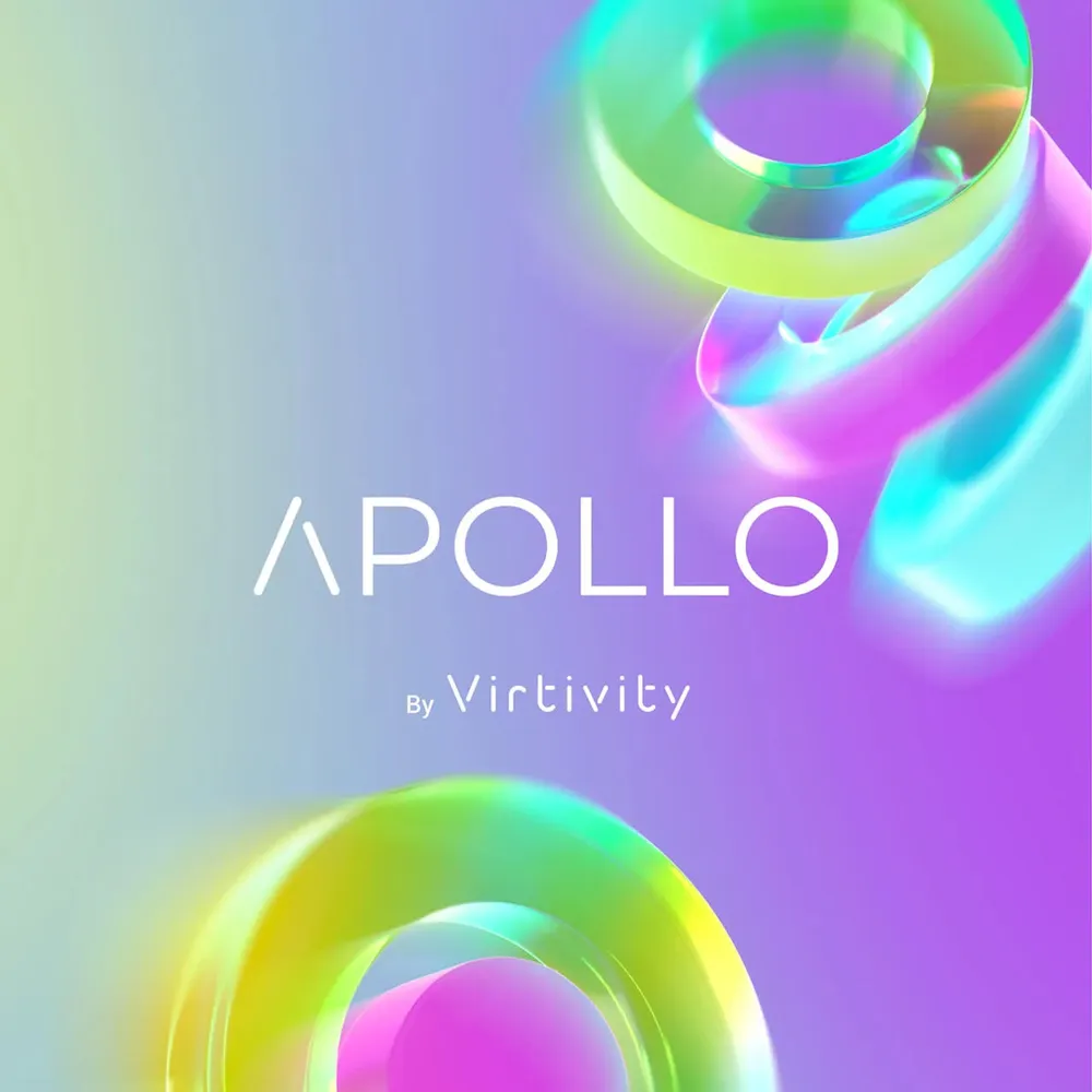
Key visual APOLLO by Virtivity with glass 3D rings on a violet gradient
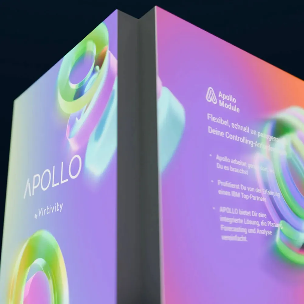
Close-up of the trade fair stand wall with the APOLLO logo and the overview of the Apollo modules
Virtivity's trade fair stand for APOLLO
Virtivity's trade fair stand for APOLLO from another angle
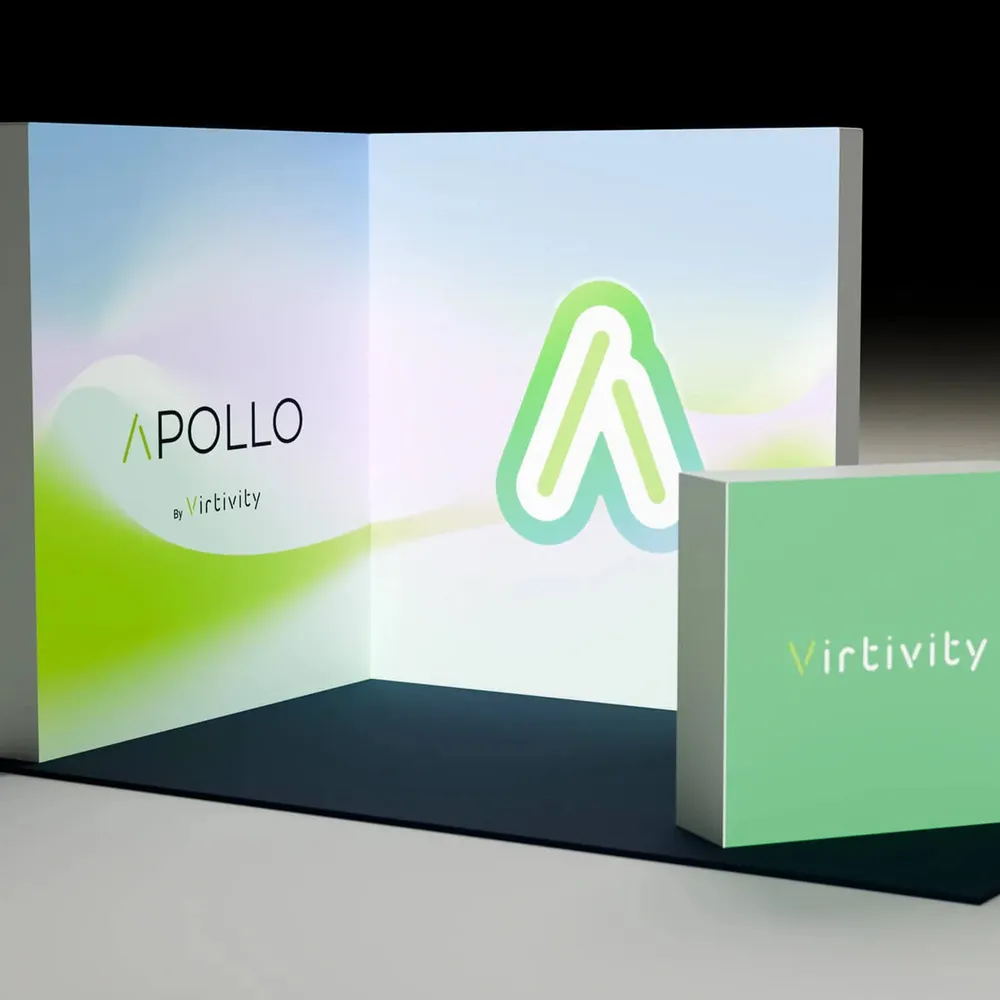
The project also included developing a visual stand concept for presenting APOLLO. The result is a striking, visually strong trade fair stand with high recognition value. By swapping front and back, the trade fair stand can be set up more individually.

Your partner for business analytics

The project comprised building the company website for APOLLO by Virtivity – the business analytics platform for the CFO office that makes planning, forecasts and reporting considerably simpler and more reliable. It also covered a redesign of the logo and a new visual brand identity. The well-thought-out UI and UX concept ensures a modern, intuitive user flow and clear orientation.

Visual constants such as strong contrasting colors, rounded content blocks, 3D icons and animations structure the content, highlight tools and functions and make the platform vivid and interactive.

On top of that, a visual stand concept was developed for presenting APOLLO. The attractive, visually strong trade fair stand raises brand awareness and underlines Virtivity's transparent, dialogue-driven and partnership-based approach.