Case Study
An AI logo becomes a brand
notificAI — brand, design and platform for the algorithmic job search
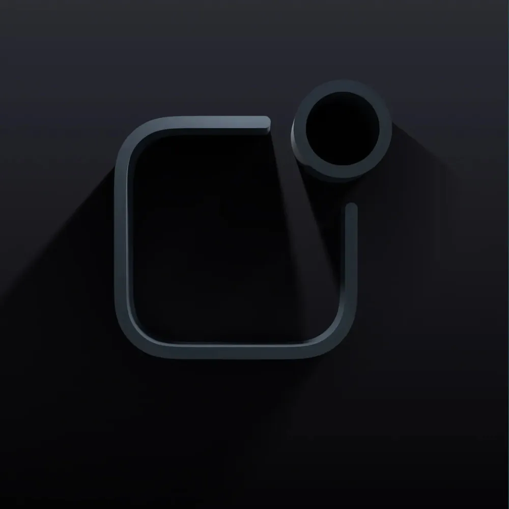
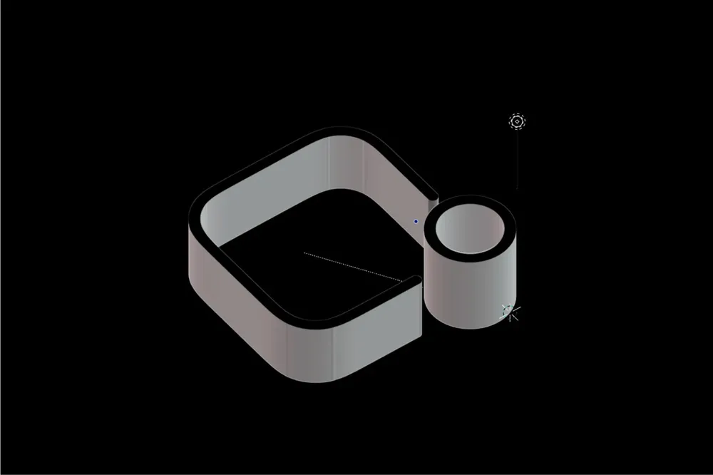
The Düsseldorf startup notificAI uses an algorithm to search every job ad published on the web — with no recruitment agency in between. The founding team brought along a 2D logo that had been AI-generated for cost reasons. It became a whole brand: color world, font pairing, icons, 3D renderings, imagery and a platform that guides users through the customer journey all the way to a subscription.
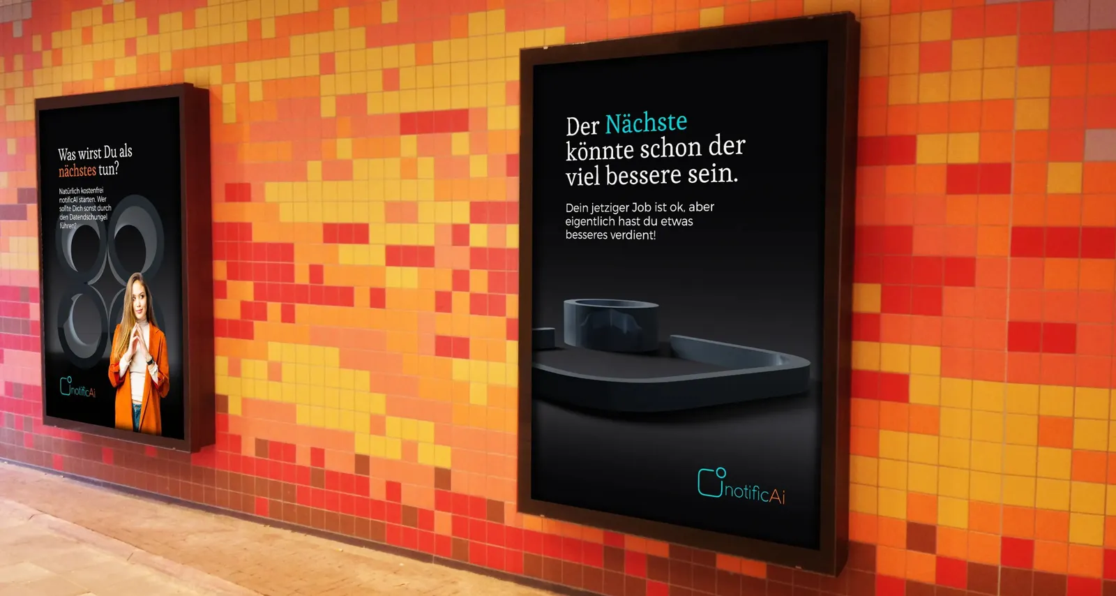
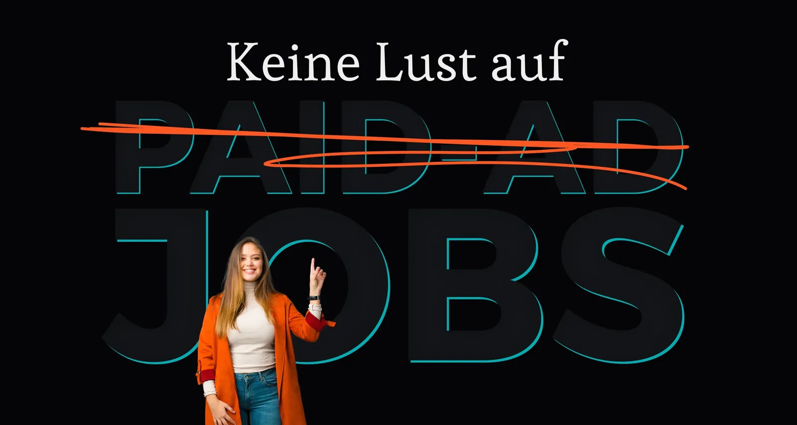
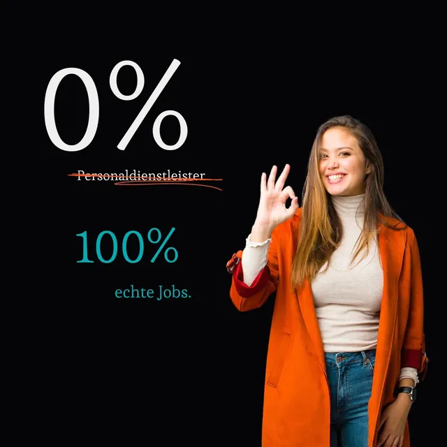
Done with paid-ad jobs
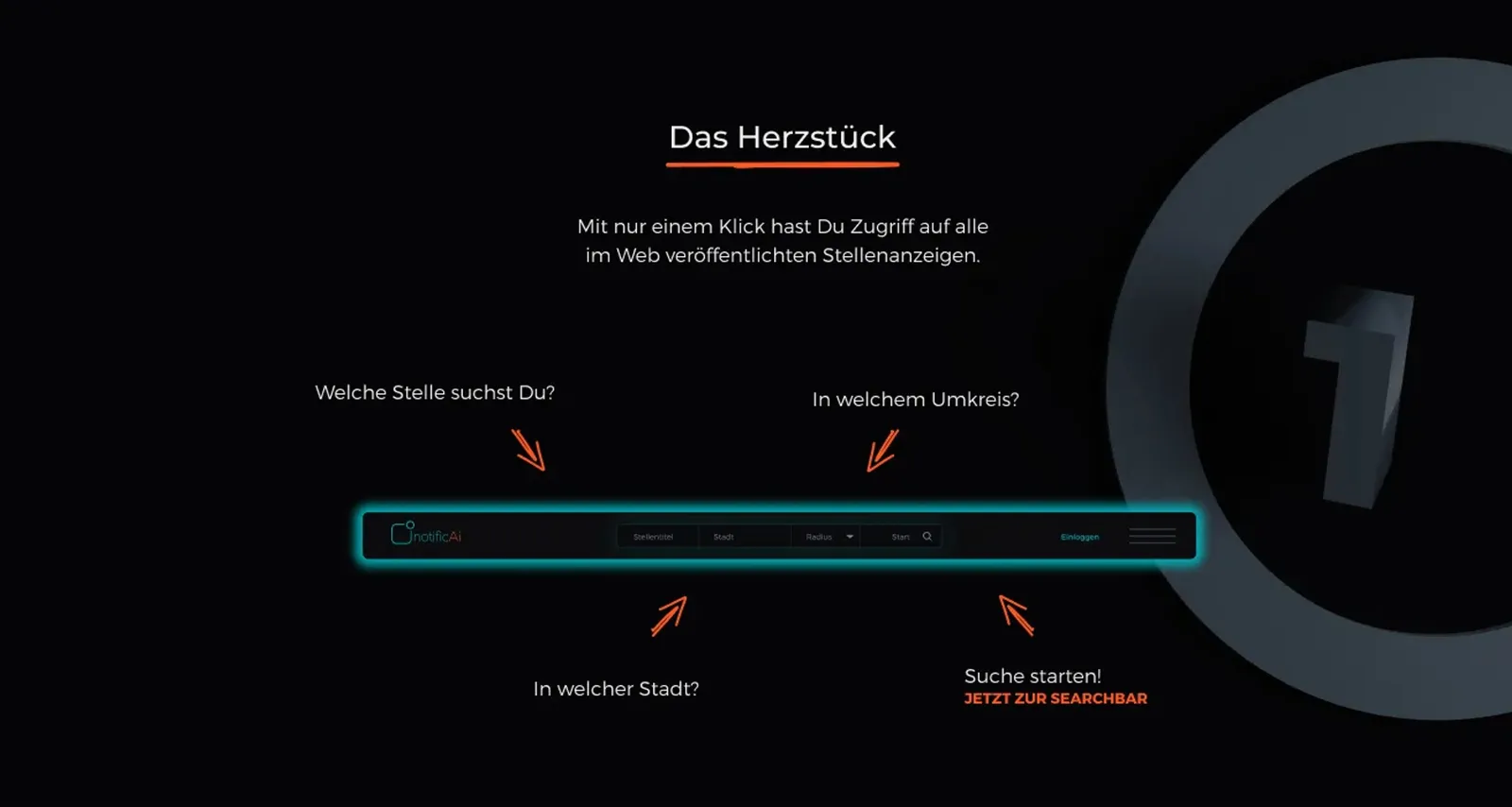
Three steps to the job
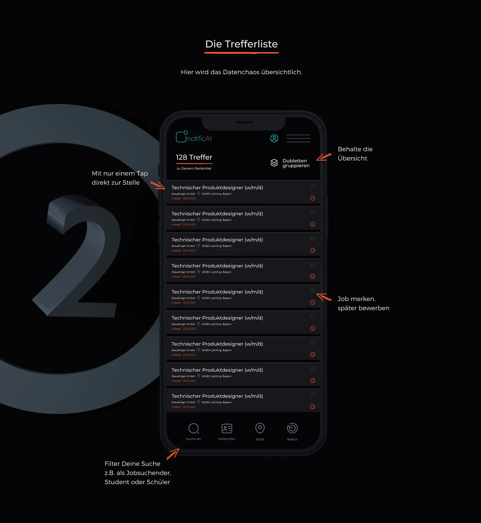
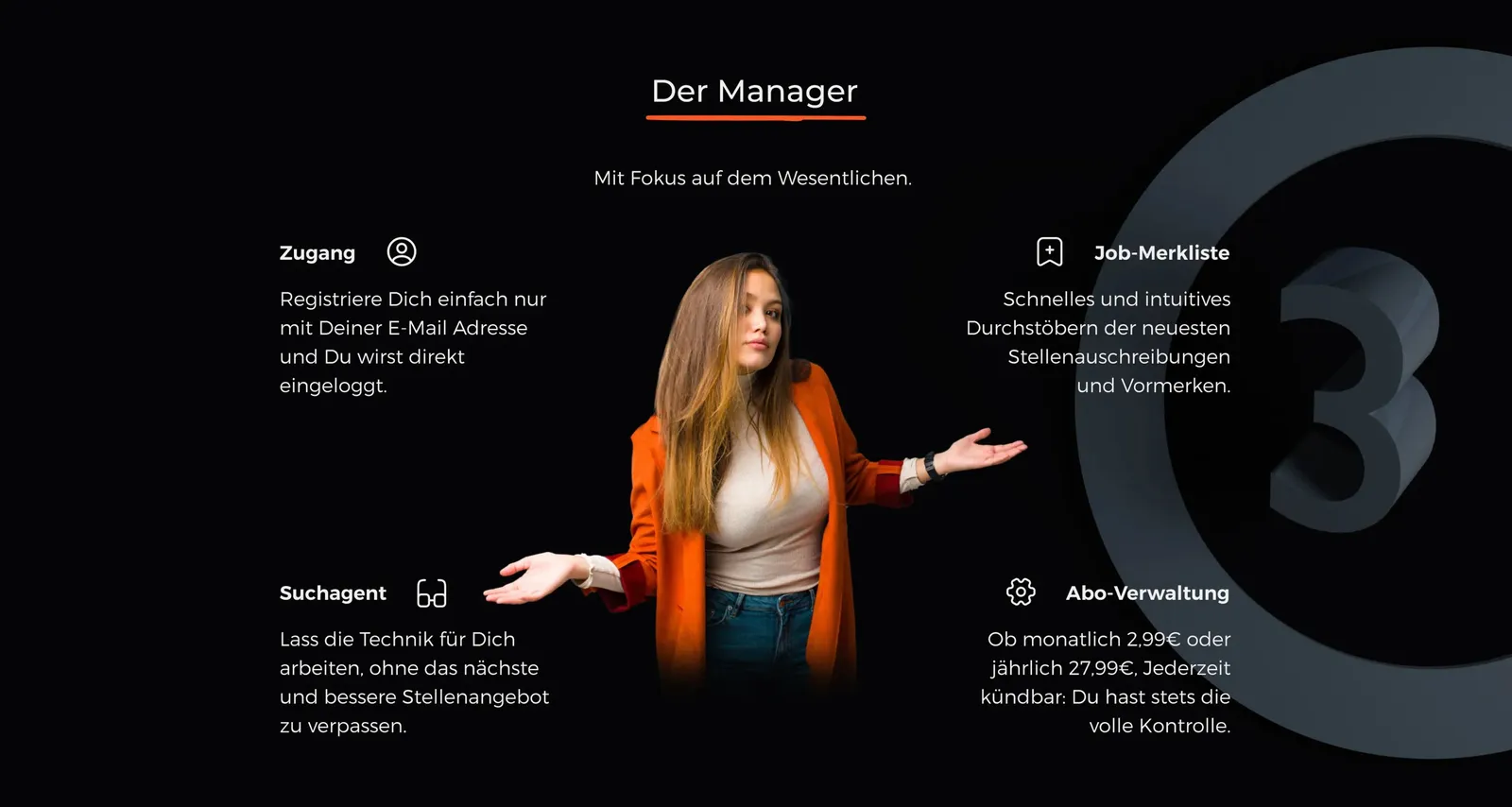
Results list and manager
2D becomes 3D

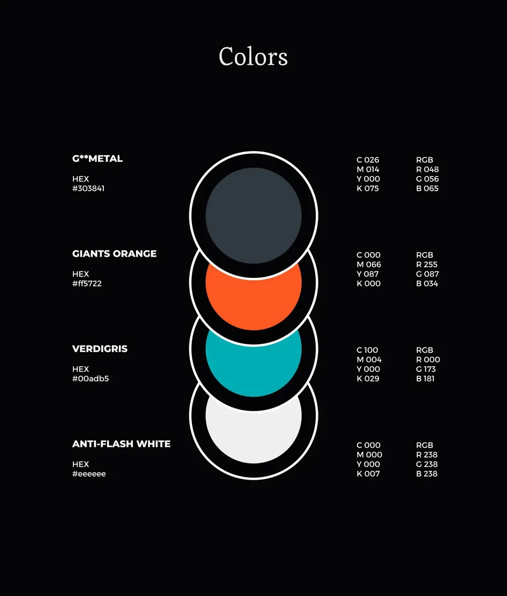
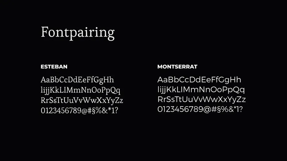
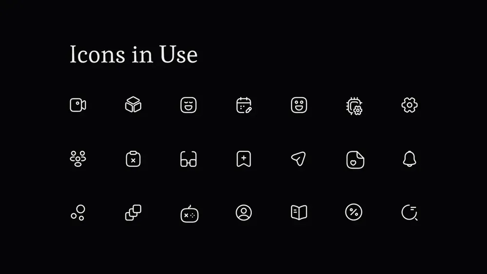
Colors, fonts, icons
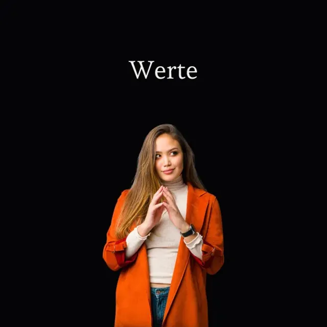
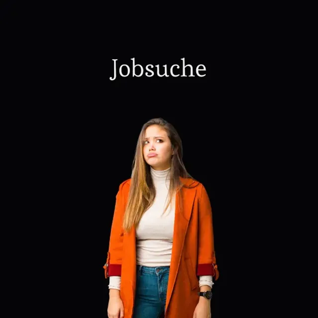
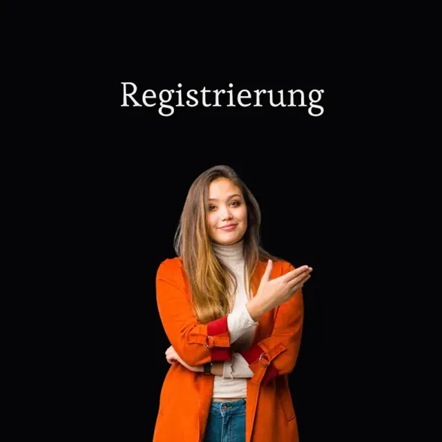
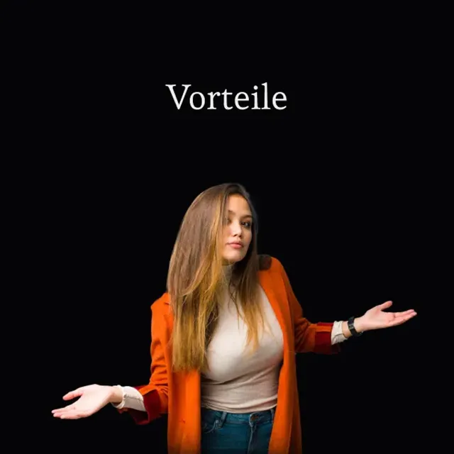
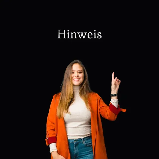
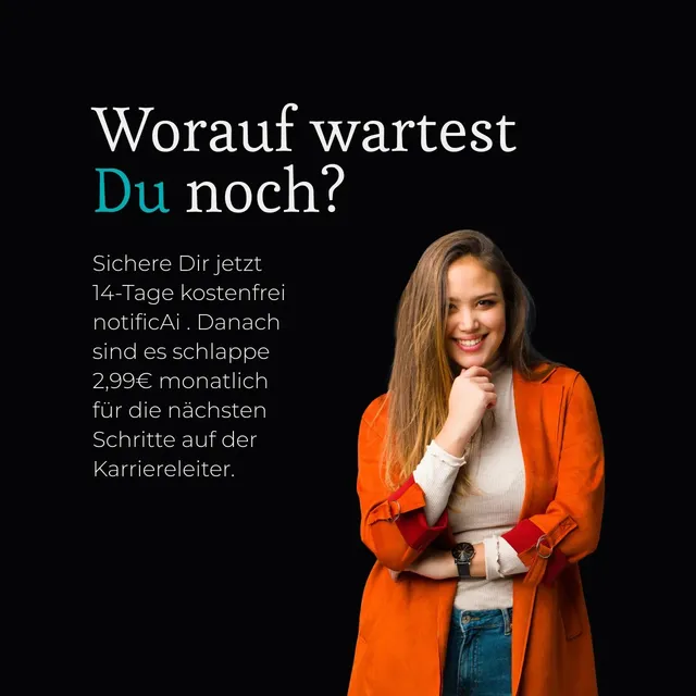
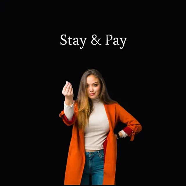
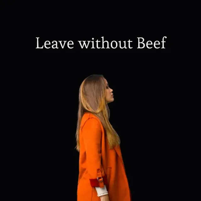
A face for every situation
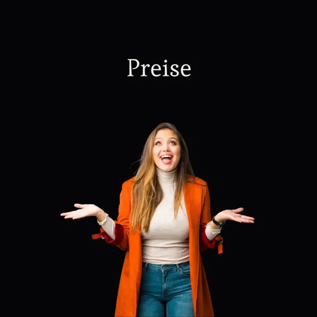
Scrolling turns it spatial
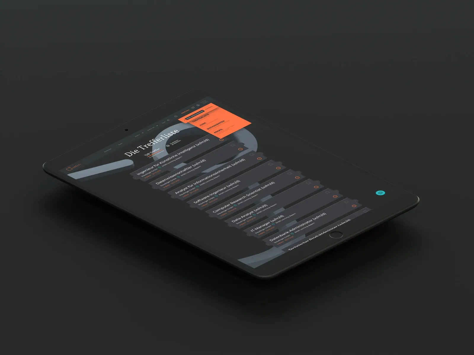
On the iPad as well
The logo has to go on everything
A startup rethinks the job search
When the founding team of notificAI came to our studio on the left bank of the Rhine, they already had an AI logo, generated for cost reasons, and a great idea for how to make the job search more user-friendly with an algorithm-based approach. A small development team had worked on the backend for it, and now it was time to give the newly founded company a face and to put the focus on usability and user experience.
Our client wanted a modern, conversion-strong and above all stylistically appealing job search platform that turns users into paying customers. For that, a design had to be developed from the ground up that guides users through relevant content with a well-considered customer journey, invites them to interact and ultimately converts them. In design and user experience, the focus was on the main target group: job-seeking digital natives aged 18 to 45 who are used to a modern and unconventional tone. The client asked us to take benchmarks such as Apple, Blinkist, Netflix, Pleo, PayPal and Airbnb as our guide. On top of that, users had to be shown the added value of the service so that they would use it permanently, or rather subscribe to it.
The design of the site and its structural set-up were to be developed with intuitive menu navigation in mind. The site was to be search engine optimized and laid out for usability in both its meta structure and its architecture. The platform was to be available in German only and to adapt to different screen sizes.
The client received the custom design they had asked for from us. We developed the user experience and built a Webflow including wireframes. We created a color palette and paired matching fonts and icons. Not to be forgotten is the working out and communication of unique selling points and of the benefits for users. Copy such as headlines, paragraphs and taglines, followed by the design of key visuals and 3D renderings, added up to a holistic concept.
- Client
- notificAI GmbH
- Studio
- Creative Agency WAGEMUT
- Services
- Brand Strategy, Graphic Design, UI/UX Design, Web Design, Product Photography & Content
- Industry
- Professional Services
Share our work
Technology
Decadis
As an innovative SaaS provider from Koblenz with an international clientele including Apple, Siemens and Daimler, established and emerging business areas were brought together in a new visual identity.
Professional Services
Virtivity
Building the company website with a redesign of the logo, a clear brand identity and a well-thought-out UI and UX concept for a modern and intuitive user experience.
Retail & Wholesale
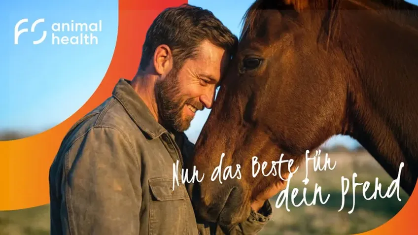
FS Animal Health
Redesign of an online shop for horse products with a focus on UX, clear product pages and a well-considered site structure for an optimal shopping experience.